5 Useful Tools To Provide Effective Data Visualization For Translators
Introduction
Language translators are in a world of their own. Our task involves meticulous preparation and quality checks before the final touches are put. We have a small set of applications and online tools that we use to check the quality of our work.
It’s quite possible that these tools have repeatedly saved you from working all night. I know I definitely fall in this category, as I use CAT and other tools on a daily basis! By automating my workflow and helping with checks and other things, these tools and applications have helped me spend more time focusing on the more important stuff.

One thing that I’m always interested in – leveraging more useful apps for translation. It makes a ton of sense to me because the tools I use are actually helping me to be more productive and deliver quality work for clients.
Recently, I’ve come across a fascinating topic: the role of visualization in helping translators to come up with more accurate and creative translations. And that’s the idea behind this article.
The Role of Visualization in Translation
So, as I was looking for more options to try out, I found this paper called “Translation through Visualization.” It was written by a professor from Johannes Gutenberg University in Germany, who talked about one important aspect in professional translation: problem-solving.
Let’s face it, the job of a translator involves a lot of problem-solving, and this is where we need to be good.
According to the document, one thing that could help translators to solve problems more effectively is visualization.
Let me give you a simple example.
Let’s suppose that you’re translating a technical manual involving a complex engine. Obviously, there are lots of different parts of that engine that you have to translate correctly, but, to do so, you need to understand how the entire machine works.

What an interesting project to work on, right?
Sure, the best way is to refer to pictures, schematic drawings, videos, and other visuals depicting the engine. By analyzing them, you can actually understand the role of each component, therefore, be in a better position to deliver a more accurate and quality translation.
We use visuals to communicate complex machines because our mind is good at processing them. In fact, about 65 percent of the population are visual learners, so they prefer to learn and remember information through visual communication.
So, chances are that you’re one of them, too, so you’d appreciate some visuals to aid with delivering quality translation.
In addition to helping with the accuracy, visuals are also great at fostering creativity in translation. For example, looking at a situation, object, person, poster, or whatever can inspire to come up with a creative translation.
According to the document, a translator cannot always rely on words to capture the essence of something, so using visuals is an excellent tool for helping with that.
That’s why I decided to create this list of tools for visualization of data and text that you can use to extract meanings and make your work easier.
Data Visualization Tools for Translators
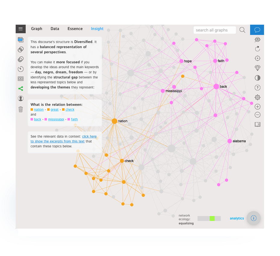
InfraNodus
A Textexture project, InfraNodus has been created with one purpose: convert text and data into a visual summary for discovering insights. It works through a number of powerful network analysis algorithms and text analysis tools to generate a network graph, which the translator can use to improve their thinking process.
Using InfraNodus is actually pretty simple:
- Add a text or data to the tool (integration with Google, Twitter, Gephi, and Twitter are available, too)
- The tool converts the input into a graph where the connections between the co-occurrences in the textual content are shown
- The most important data or text are shown larger to help with navigation through the graph. The words with similar meaning or those that occur more often are grouped into separate clusters with unique colors
- Navigating through InfraNodus’s features is easy when the graph is complete. For example, by going to the Insight main menu item, you’ll get access to analytical features. You can use them to identify structural gaps in the graphs, understand meanings and contexts, and generate new ideas on how to approach translating the text
The experiences of translators with InfraNodus have been positive, too.
“After trying InfraNodus myself, I can say that it could be used to create easy-to-navigate mindmaps, visualize the notes that you made to reveal the main concepts,” says Janusz Gostkowski, a translator from TheWordPoint. “And, of course, I can visualize data to get help with understanding the context.”
“Here’s my advice: do your best not to cram lines in your visualization just for the sake of it,” shares Joanna Awona, a content localization expert from Profitner. “You might easily end up with tons of unrelated data points.”
One last thing: keep in mind that InfraNodus supports 7 languages: English, French, Spanish, Swedish, Russian, and Portuguese.
2. SDL Trados (and Plugins)
SDL Trados is a must-have tool in every professional translator’s arsenal. Personally, I started using it many years ago and I still use it for a lot of my projects, especially those involving data tables and other complex content types.

Trados is a CAT (Computer Assisted Translation) software that is also an excellent tool for data visualization. Getting a visual overview of the translated document is available as you work on it from View > Preview (shown by a red arrow in the below image).
The preview of the document is shown in the bottom right corner.

The function opens the document with your progress as shown, so you can see how the translated data and copy looks visually. The window with the previous looks small here, but you can expand it to get a more detailed view.
So, this way you can visualize data as you translate, which helps with the overall understanding of the content, structure, and formatting.
Plugins
SDL has an app store for Trados that you should definitely check out. In addition to such useful tools like multiterm glossaries, vocabulary management, and publication mappings, it also has data visualization plugins like TAUS DQF.
In addition to helping with tracking quality and productivity, it also allows creating custom visual reports regarding your performance. It analyzes all projects you’ve worked on and generates tables, graphs, and other visuals in a report similar to the one below.
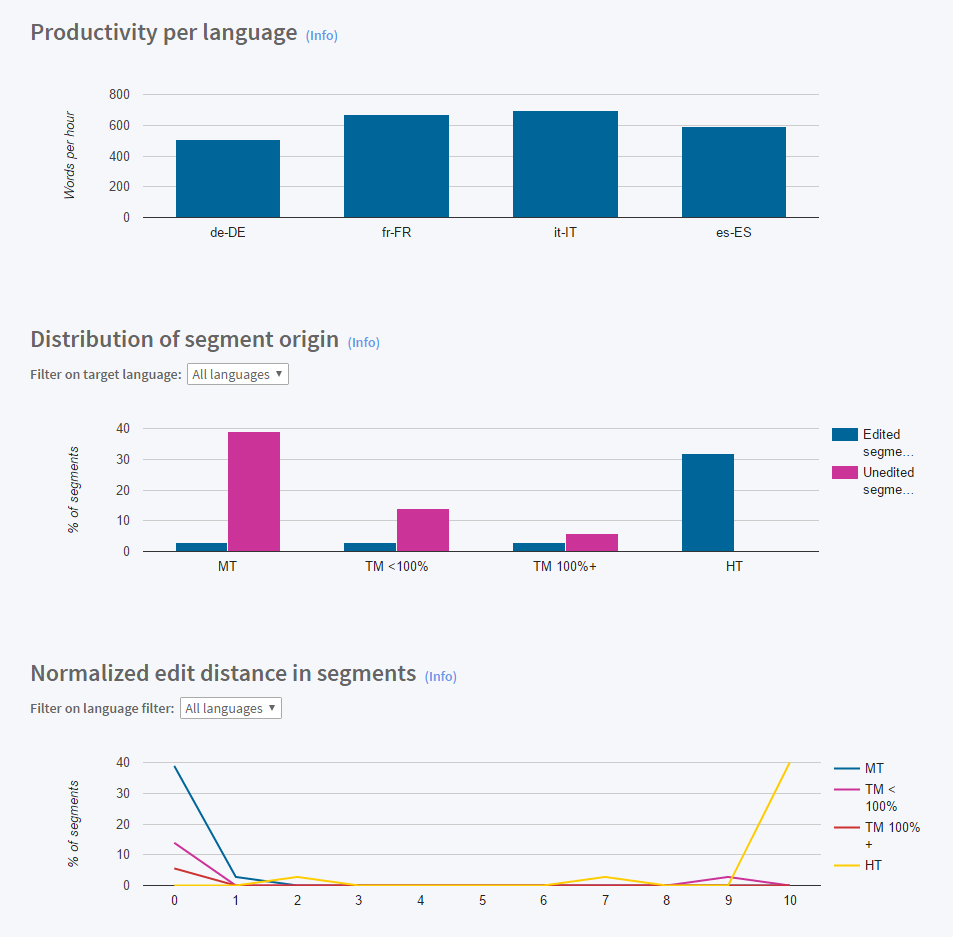
This can help with monitoring your work and discovering where you might be underperforming or not meeting your personal goals.
3. OverviewDocs
Initially built for investigative journalists, OverviewDocs is an open-source visualization and analysis tool for processing textual documents (however, only you can view the documents you upload). It supports a wide range of file types and many languages as well and includes its own search engine for discovering documents.
The WordCloud feature is one of the most interesting features for translators. It’s basically a plugin that is able to search through thousands of documents to create word clouds for categorizing and discovering texts with the same word.
However, translators aren’t the only ones using the WordCloud. According to Michael Domm, the head of the marketing department at OmniStar, a referral marketing software, they tracked documents for positive customer feedback indications and discovering the best-performing affiliates.
Another worthy feature is text visualization. To help you get acquainted with it, OverviewDocs comes with a few default texts (but you can also start processing your own texts right away).

Also, you can look for multiple search terms in documents at once, which could be useful to discover content in poorly scanned texts.
4. Text Analyzer
While not entirely a text visualization tool, Text Analyzer is a useful option for getting detailed text-related stats and information. For translators, it could become a go-to tool for quoting, text complexity assessment, word frequency, and other stats.
I’ve analyzed Shakespeare’s text and here’s the list of stats generated by the tool:
- Word counts
- Number of different words
- Readability according to Gunning Fox Index (an average of the number of words per sentence and the number of long words per word)
- Complexity Factors (lexical density)
- Average syllables per word
- Min/max sentence length
- Frequency and top words (the user can look for specific words, too)
- Word length stats
- Word phrases frequency
Text Analyzer also allows getting stats for web pages.
5. Infogram
Infogram is a stylish tool for data visualization, able to create infographics, reports, slides, maps, dashboards, and social media visuals with your data. Just input your data and select the type of visual that you’d like to create, and Infogram will generate quality content.
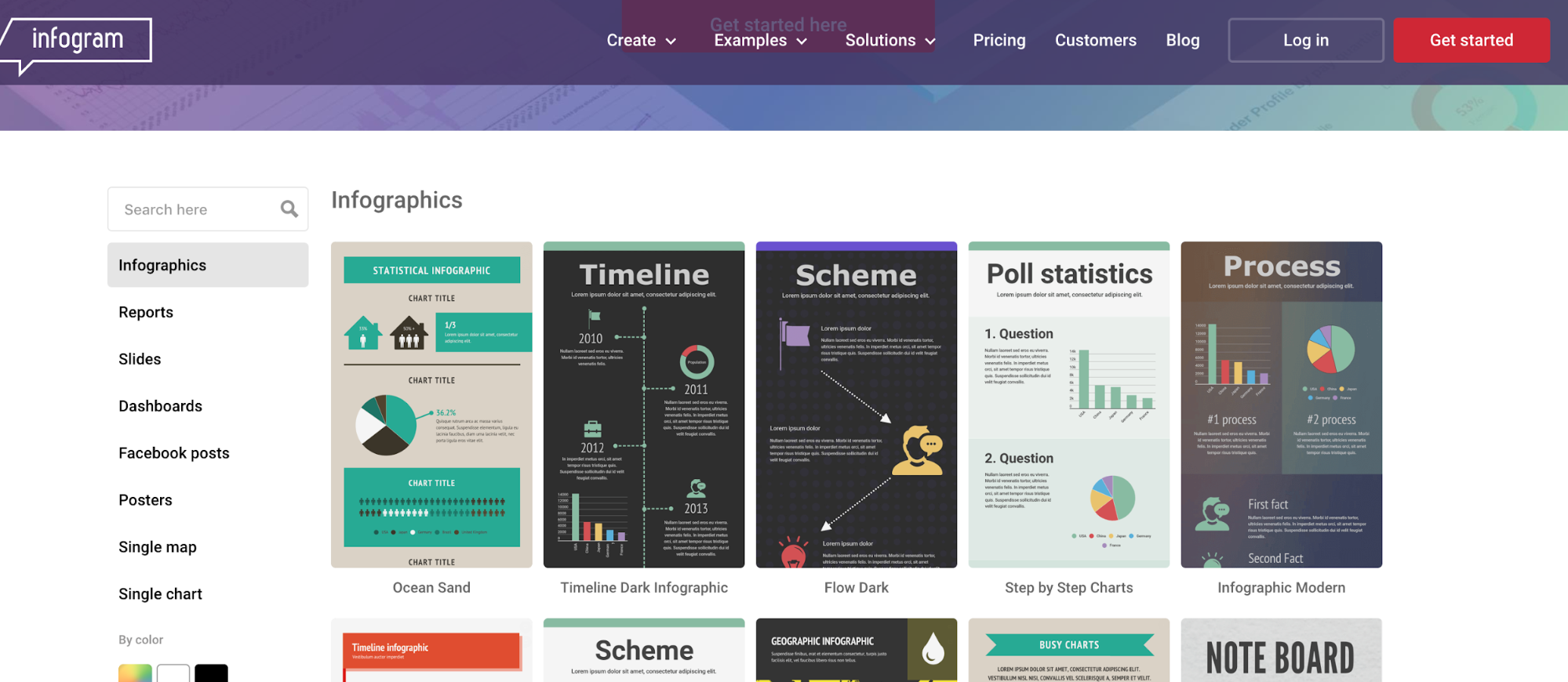
The good thing is that Infogram comes with a range of templates for your content, so you won’t have to think about how to represent the data. Not only can the tool help you with understanding texts, but it also represents your work in a compelling, easy-to-understand way.
End Notes
The visual representation of the content of a long and complex text document is something that many translators can benefit from. Whether it’s a preview generated in Trados or a conversion into a word cloud, data visualization tools can help decipher both structured and unstructured data.
I hope that at least some tools from this list will also improve your productivity and save you tons of time!
About the Author

Anna Medina
Anna is a specialist in different types of writing. She graduated from the Interpreters Department, but creative writing became her favorite type of work. Now she improves her skills while working as a freelance writer and translator for TheWordPoint and has free time for another work, as well. She always does her best in the posts and articles.


