If a picture can paint a thousand words, how many is a dynamic picture worth? A lot of words, according to business owners, sales and purchasing professionals who use dynamic dashboards regularly.
Among the biggest challenges for business managers is wading through the massive amount of information generated across the entire company. Smart companies bolt-on business intelligence software to their ERP which syncs all the data into a single source of truth.
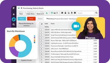
Business intelligence software such as Phocas, helps users uncover the data insights that drives their business and present the findings in dashboards, that can be easily built to meet the needs of your business.
Building dashboards
You don’t need to be technical to create a powerful dashboard in Phocas.
To build a dashboard in Phocas, you simply go into the dashboard area, name it and get started. You fill the dashboard by using widgets, these clever tools are the conduits to your data in the Phocas database. By clicking on the widget function, you are able to select from a number of in-built queries you may want to include in your dashboard. (e.g. Year to Date Sales Summary or Rolling 12 Month Sales by Customer Type). Once you select from hundreds of options, you then choose whether you want it displayed as a chart or graph and save.
You can create as many dashboards as you like, customize them and share them with other users. There are a number of ways to change the look and feel of a dashboard. Most of this customization can be done either while you are building a dashboard, or with an existing dashboard.
You can set your dashboard to update with any new data, either immediately or at selected intervals.
To view how simple it is to create a dashboard, view the video below.
Using dynamic and interactive dashboards
A variance catches your attention in the dashboard and you want to follow your train of thought, so you drill down into the underlying information to find out what is driving what you are seeing on the surface.
To make the dashboard ‘come alive’, you open the dashboard in Phocas that you are reviewing, maybe it is the Sales Dashboard which includes key metrics such as Current vs Previous Period Sales , Sales Pipeline, No Sales, Average Deal Size, Forecast Accuracy.
You decide that you want to see all the above metrics by a particular Sales Representative in the business, so you do this by adding a new widget and making it selectable. You go back to widgets, and then find the Sale Representative dimensions and add this. You can now view all the metrics from the perspective of each Sales Rep and send them specific recommendations directly to their email, so they can take immediate action.
To make your dashboard dynamic watch this video:
Information is power. With real-time access to the exact data you need, you make the best strategic, tactical, and operational decisions.