The four C’s for alerts
Context
Cogency
Communication
Control
The tendency with reporting, and information dashboard design in particular, is to cram as much information on the page as possible. It is a problem that Avinash Kaushik describes with typical candor:
“This one of the core reasons why most dashboards are ’crappy’, i.e. they are data pukes that provide little in terms of context and even less in terms of actionable value.”
We offer tools to make data presentation as clear as possible (Juicebox, chart chooser). Sometimes clean isn’t enough; a more dramatic approach is needed.
One option is to shift the focus from all the data to emphasizing changes in the most critical data points. By pulling out the important exceptions, you can make it easier for your audience to digest what matters and take action.
Stephen Few says in his book Information Dashboard Design:
“The best way to condense a broad spectrum of information to fit onto a dashboard is in the form of summaries and exceptions…given the purpose of a dashboard to help people monitor what’s going on, much of the information it presents is necessary only when something unusual is happening; something that falls outside the realm of normality, into the realm of problems and opportunities. Why make someone wade through hundreds of values when only one or two require attention? We call these critical values exceptions.”
Alerts are a mechanism to turn the focus to the exceptions, outliers, and data highlights. Whether embedded in the dashboard or presented separately, alerts can be the extra layer of abstraction that makes a dashboard useful. Unfortunately, alerts are hard to get right. I’ve arrived at four C’s for effective alerts—context, cogency, communication, control. Here’s a checklist to consider as you build alerts into a dashboard or report:
1. Context
Users need to understand how an alert is defined and how it fits into the larger picture.
□ Are the parameters well defined? An alert is commonly defined by the following factors: measure (e.g. revenue), dimension (e.g. time), delta (e.g month over month change), scope (e.g. Northeast region, Peanut-product line), threshold (e.g. increase or decrease of 10%).
□ Is the timing of the alerts actionable? One client explained to us that fluctuations in many of their metrics make monthly alerts too frequent—it would unnecessarily alarm people when, from their perspective, no significant trend had been established.
□ Is the change statistically significant? This is of particular importance when you are measuring deltas. A doubling of traffic from a referring site doesn’t mean much when it is moving from one to two visitors.
2. Cogency
An alerting system needs to avoid causing unnecessary alarm while delivering easy-to-understand information that can be acted upon.
□ Can the alerts be described in simple terms that even an executive can understand? Alerts should have a real-world meaning that users are familiar with. If an alert is based on a complex metric, for example, users will be confused as to the implications.
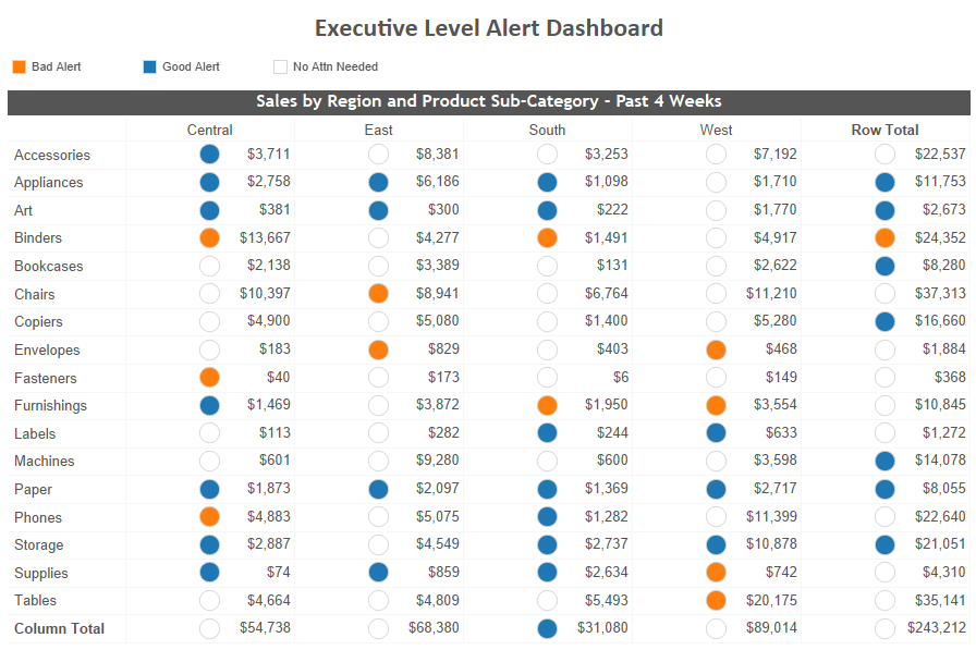
□ Is the alert actionable? In the best cases, alerts should point users to both the drivers of the alert and the actions that can address the situation. This system does neither:
□ Are the alerts so granular and/or frequently triggered that users will get alert fatigue? Excessive use of alerts will undermining their credibility. We saw this happen at one client where an IT-designed system threw off alerts like they were going out of style. The application went out of style the next year when users decided it was more distracting than useful.
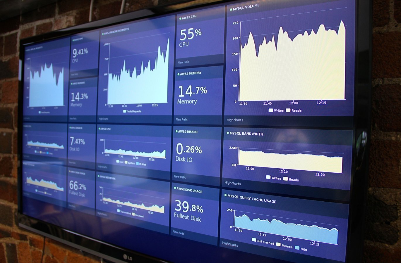
Too many alerts on this Tableau dashboard https://evolytics.com/blog/tableau-201-3-ways-to-add-alerts-to-your-dashboards/
3. Communication
Alerts must be designed to effectively capture attention and inform.

□ Is the alert placed in context? Google Finance does a nice job of putting news alerts within the stock chart.
□ Is it clear what the user should do next? Give the user a clear path to more information so they can understand the full context of the alert.
□ Does the sophistication of your alerts match the sophistication of your audience? I’ve found that it is better to start with some simple alerts so your audience can begin to learn what they mean and how to react. Over time, these alerts can become more refined and focused to capture complex situations.
□ Does the alert draw the eye without being visually overwhelming or annoying? Here’s an article about how to “reduce visual noise” in your designs.
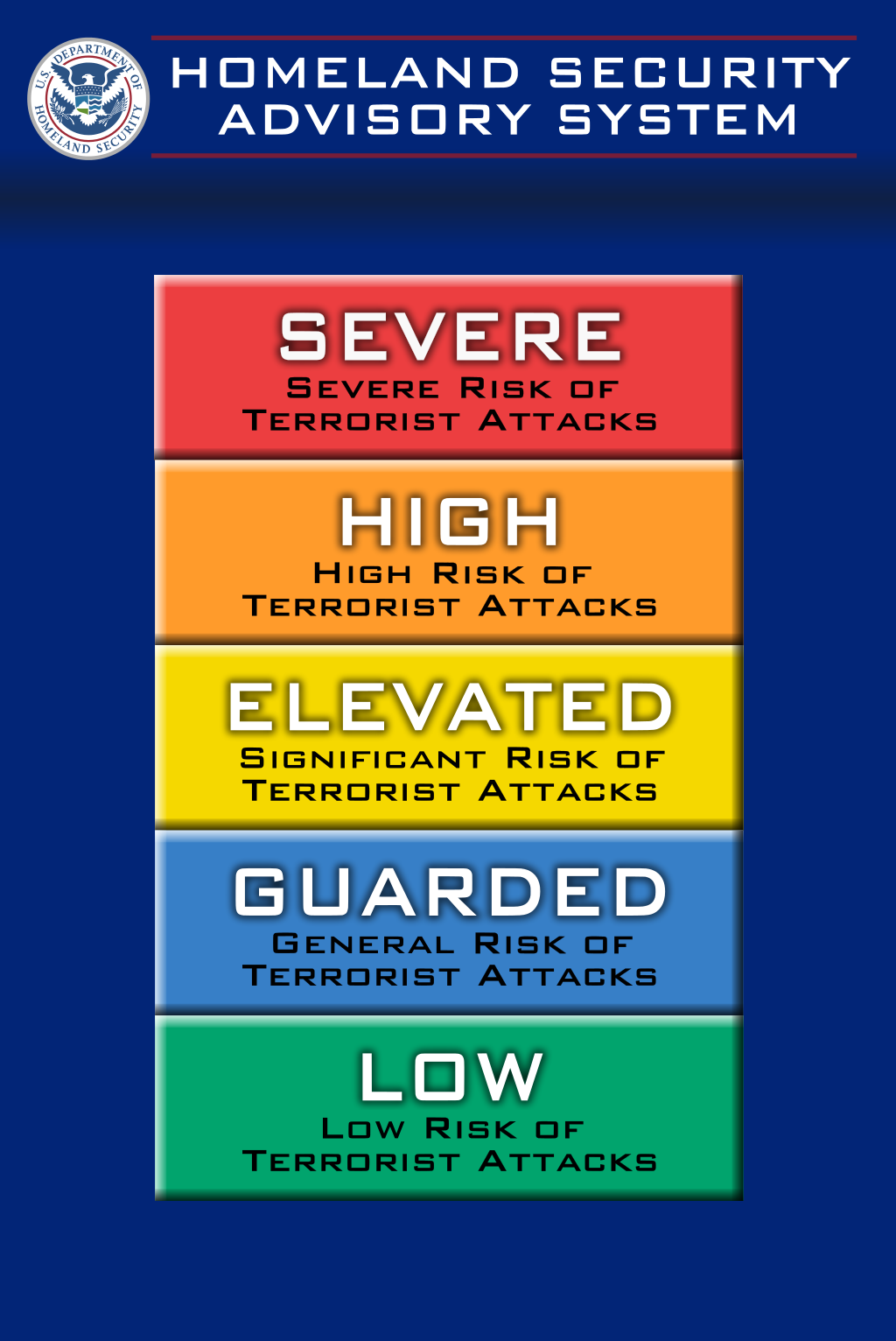
□ Is color used appropriately? Red means bad. Yellow is sorta bad. Green means good (but “good” things don’t need to be alerts). It isn’t particularly fair for color-blind folks, but these conventions are deeply rooted.
□ Have you found the best mechanism for presenting alerts? Alerts can be sent through e-mail, as texts, through messaging platforms like Slack, blasted over the office intercom system, or posted to the wall in the bathroom. What is the most convenient and appropriate medium to reach your audience?
4. Control
Advanced alert systems should give users the ability to customize and manage alerts.
□ Can the user identify the important alerts for them, and avoid the others? As hard as you may try in designing the dashboard or report, you aren’t in the shoes of the users. They will learn what they want to pay attention to and what information is extraneous.
□ Can the user adjust the parameters? With more sophisticated dashboards, you want to give users the ability to adjust parameters to hone in on the exceptions that really require action.
□ Can the user analyze alert frequency and trends? I’ve never seen a system that does this, but having the ability to view and analyze alert history seems critically important to provide a holistic view of performance.