A Guide to Understanding Convolutional Neural Networks (CNNs) using Visualization
Introduction
“How did your neural network produce this result?” This question has sent many data scientists into a tizzy. It’s easy to explain how a simple neural network works, but what happens when you increase the layers 1000x in a computer vision project?
Our clients or end users require interpretability – they want to know how our model got to the final result. We can’t take a pen and paper to explain how a deep neural network works. So how do we shed this “black box” image of neural networks?
By visualizing them! The clarity that comes with visualizing the different features of a neural network is unparalleled. This is especially true when we’re dealing with a convolutional neural network (CNN) trained on thousands and millions of images.

In this article, we will look at different techniques for visualizing convolutional neural networks. Additionally, we will also work on extracting insights from these visualizations for tuning our CNN model.
Note: This article assumes you have a basic understanding of Neural Networks and Convolutional Neural Networks. Below are three helpful articles to brush up or get started with this topic:
- A Comprehensive Tutorial to learn Convolutional Neural Networks from Scratch
- An Introductory Guide to Deep Learning and Neural Networks
- Fundamentals of Deep Learning – Starting with Artificial Neural Network
You can also learn CNNs in a step-by-step manner by enrolling in this free course: Convolutional Neural Networks (CNN) from Scratch
Table Of Contents
- Why Should we use Visualization to Decode Neural Networks?
- Setting up the Model Architecture
- Accessing Individual Layers of a CNN
- Filters – Visualizing the Building Blocks of CNNs
- Activation Maximization – Visualizing what a Model Expects
- Occlusion Maps – Visualizing what’s important in the Input
- Saliency Maps – Visualizing the Contribution of Input Features
- Class Activation Maps
- Layerwise Output Visualization – Visualizing the Process
Why Should we use Visualization to Decode Neural Networks?
It’s a fair question. There are a number of ways to understand how a neural network works, so why turn to the off-beaten path of visualization?
Let’s answer this question through an example. Consider a project where we need to classify images of animals, like snow leopards and Arabian leopards. Intuitively, we can differentiate between these animals using the image background, right?
Both animals live in starkly contrasting habitats. The majority of the snow leopard images will have snow in the background while most of the Arabian leopard images will have a sprawling desert.
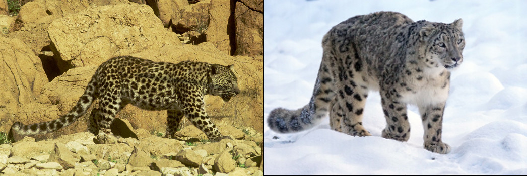
Here’s the problem – the model will start classifying snow versus desert images. So, how do we make sure our model has correctly learned the distinguishing features between these two leopard types? The answer lies in the form of visualization.
Visualization helps us see what features are guiding the model’s decision for classifying an image.
There are multiple ways to visualize a model, and we will try to implement some of them in this article.
Setting up the Model Architecture
I believe the best way of learning is by coding the concept. Hence, this is a very hands-on guide and I’m going to dive into the Python code straight away.
We will be using the VGG16 architecture with pretrained weights on the ImageNet dataset in this article. Let’s first import the model into our program and understand its architecture.
We will visualize the model architecture using the ‘model.summary()’ function in Keras. This is a very important step before we get to the model building part. We need to make sure the input and output shapes match our problem statement, hence we visualize the model summary.
Below is the model summary generated by the above code:
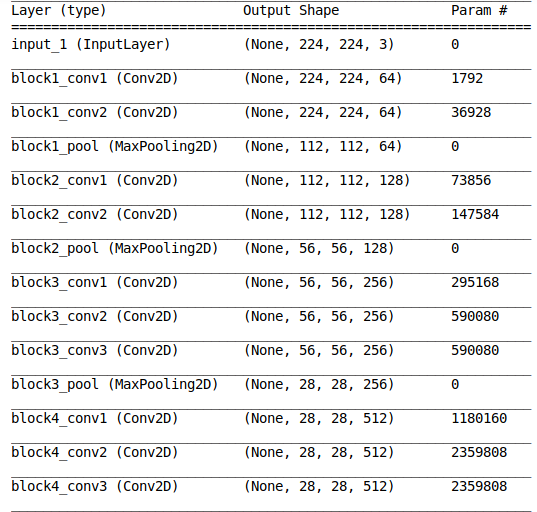
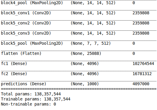
We have a detailed architecture of the model along with the number of trainable parameters at every layer. I want you to spend a few moments going through the above output to understand what we have at hand.
This is important when we are training only a subset of the model layers (feature extraction). We can generate the model summary and ensure that the number of non-trainable parameters matches the layers that we do not want to train.
Also, we can use the total number of trainable parameters to check whether our GPU will be able to allocate sufficient memory for training the model. That’s a familiar challenge for most of us working on our personal machines!
Accessing Individual Layers
Now that we know how to get the overall architecture of a model, let’s dive deeper and try to explore individual layers.
It’s actually fairly easy to access the individual layers of a Keras model and extract the parameters associated with each layer. This includes the layer weights and other information like the number of filters.
Now, we will create dictionaries that map the layer name to its corresponding characteristics and layer weights:
The above code gives the following output which consists of different parameters of the block5_conv1 layer:
Did you notice that the trainable parameter for our layer ‘block5_conv1‘ is true? This means that we can update the layer weights by training the model further.
Visualizing the Building Blocks of CNNs – Filters
Filters are the basic building blocks of any Convolutional Neural Network. Different filters extract different kinds of features from an image. The below GIF illustrates this point really well:
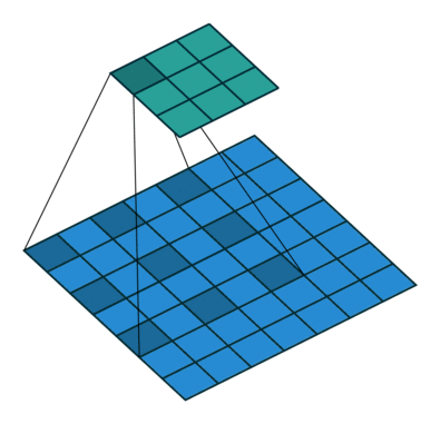
As you can see, every convolutional layer is composed of multiple filters. Check out the output we generated in the previous section – the ‘block5_conv1‘ layer consists of 512 filters. Makes sense, right?
Let’s plot the first filter of the first convolutional layer of every VGG16 block:
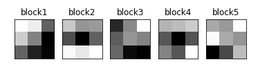
We can see the filters of different layers in the above output. All the filters are of the same shape since VGG16 uses only 3×3 filters.
Visualizing what a Model Expects – Activation Maximization
Let’s use the image below to understand the concept of activation maximization:

Which features do you feel will be important for the model to identify the elephant? Some major ones I can think of:
- Tusks
- Trunk
- Ears
That’s how we instinctively identify elephants, right? Now, let’s see what we get when we try to optimize a random image to be classified as that of an elephant.
We know that every convolutional layer in a CNN looks for similar patterns in the output of the previous layer. The activation of a convolutional layer is maximized when the input consists of the pattern that it is looking for.
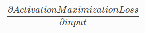
In the activation maximization technique, we update the input to each layer so that the activation maximization loss is minimized.
How do we do this? We calculate the gradient of the activation loss with respect to the input, and then update the input accordingly:
Here’s the code for doing this:
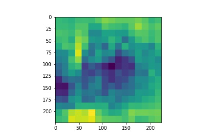
Our model generated the below output using a random input for the class corresponding to Indian Elephant:
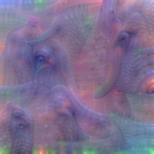
From the above image, we can observe that the model expects structures like a tusk, large eyes, and trunk. Now, this information is very important for us to check the sanity of our dataset. For example, let’s say that the model was focussing on features like trees or long grass in the background because Indian elephants are generally found in such habitats.
Then, using activation maximization, we can figure out that our dataset is probably not sufficient for the task and we need to add images of elephants in different habitats to our training set.
Visualizing what’s Important in the Input- Occlusion Maps
Activation maximization is used to visualize what the model expects in an image. Occlusion maps, on the other hand, help us find out which part of the image is important for the model.
Now, to understand how occlusion maps work, we consider a model that classifies cars according to their manufacturers, like Toyota, Audi etc.:
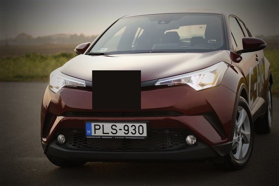
Can you figure out which company manufactured the above car? Probably not because the part where the company logo is placed has been occluded in the image. That part of the image is clearly important for our classification purposes.
Similarly, for generating an occlusion map, we occlude some part of the image and then calculate its probability of belonging to a class. If the probability decreases, then it means that occluded part of the image is important for the class. Otherwise, it is not important.
Here, we assign the probability as pixel values for every part of the image and then standardize them to generate a heatmap:
The above code defines a function iter_occlusion that returns an image with different masked portions.
Now, let’s import the image and plot it:

Original Image
Now, we’ll follow three steps:
- Preprocess this image
- Calculate the probabilities for different masked portions
- Plot the heatmap
Heatmap
Really interesting. We will now create a mask using the standardized heatmap probabilities and plot it:
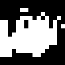
Mask
Finally, we will impose the mask on our input image and plot that as well:
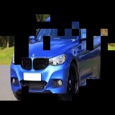
Masked Car
Can you guess why we’re seeing only certain parts? That’s right – only those parts of the input image that had a significant contribution to its output class probability are visible. That, in a nutshell, is what occlusion maps are all about.
Visualizing the Contribution of Input Features- Saliency Maps
Saliency maps are another visualization technique based on gradients. These maps were introduced in the paper – Deep Inside Convolutional Networks: Visualising Image Classification Models and Saliency Maps.
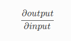
Saliency maps calculate the effect of every pixel on the output of the model. This involves calculating the gradient of the output with respect to every pixel of the input image.
This tells us how to output category changes with respect to small changes in the input image pixels. All the positive values of gradients mean that small changes to the pixel value will increase the output value:
These gradients, which are of the same shape as the image (gradient is calculated with respect to every pixel), provide us with the intuition of attention.
Let’s see how to generate saliency maps for any image. First, we will read the input image using the below code segment.
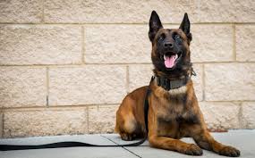
Input Image
Now, we will generate the saliency map for the image using the VGG16 model:
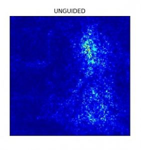
We see that the model focuses more on the facial part of the dog. Now, let’s look at the results with guided backpropagation:
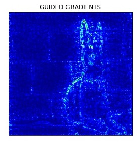
Guided backpropogation truncates all the negative gradients to 0, which means that only the pixels which have a positive influence on the class probability are updated.
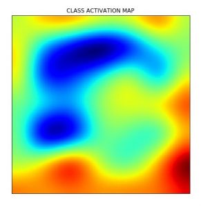
Class Activation Maps (Gradient Weighted)
Class activation maps are also a neural network visualization technique based on the idea of weighing the activation maps according to their gradients or their contribution to the output.
The following excerpt from the Grad-CAM paper gives the gist of the technique:
Gradient-weighted Class Activation Mapping (Grad-CAM), uses the gradients of any target concept (say logits for ‘dog’ or even a caption), flowing into the final convolutional layer to produce a coarse localization map highlighting the important regions in the image for predicting the concept.
In essence, we take the feature map of the final convolutional layer and weigh (multiply) every filter with the gradient of the output with respect to the feature map. Grad-CAM involves the following steps:
- Take the output feature map of the final convolutional layer. The shape of this feature map is 14x14x512 for VGG16
- Calculate the gradient of the output with respect to the feature maps
- Apply Global Average Pooling to the gradients
- Multiply the feature map with corresponding pooled gradients
We can see the input image and its corresponding Class Activation Map below:

Now let’s generate the Class activation map for the above image.
Visualizing the Process – Layerwise Output Visualization
The starting layers of a CNN generally look for low-level features like edges. The features change as we go deeper into the model.
Visualizing the output at different layers of the model helps us see what features of the image are highlighted at the respective layer. This step is particularly important to fine-tune an architecture for our problems. Why? Because we can see which layers give what kind of features and then decide which layers we want to use in our model.
For example, visualizing layer outputs can help us compare the performance of different layers in the neural style transfer problem.
Let’s see how we can get the output at different layers of a VGG16 model:
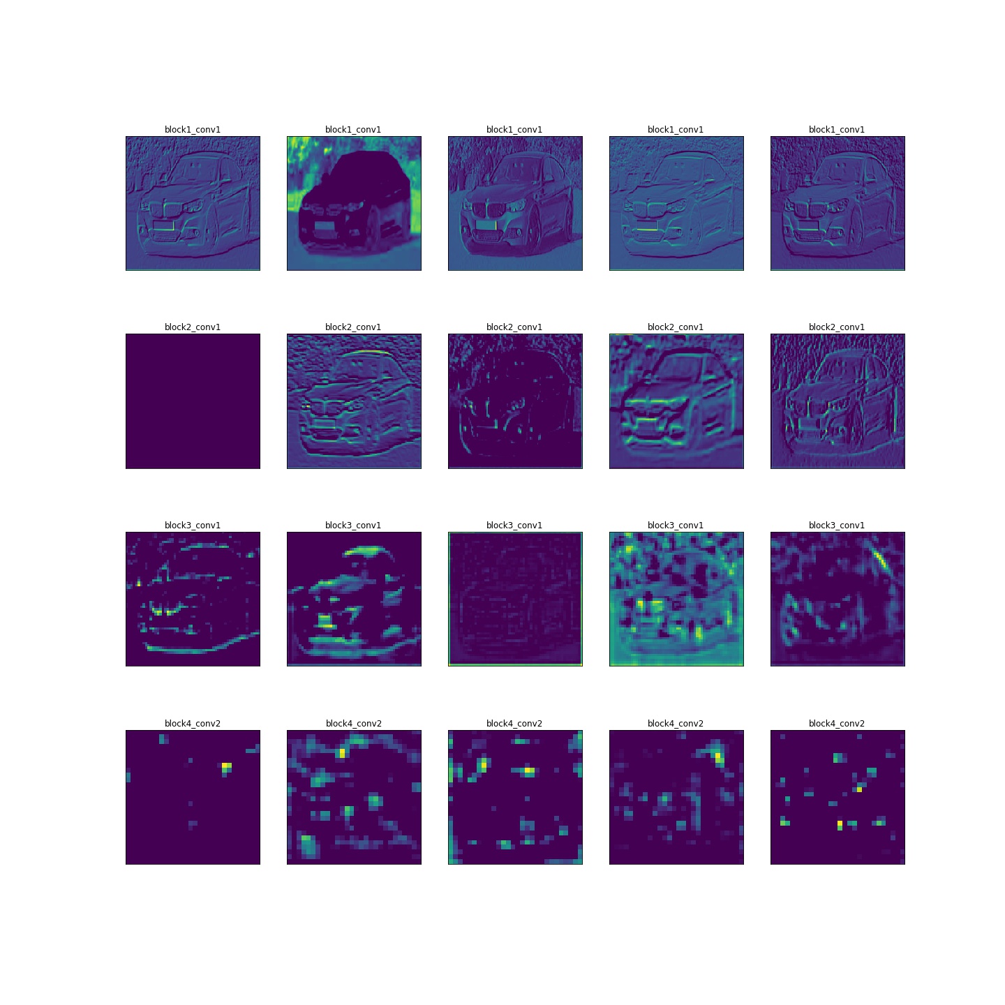
The above image shows the different features that are extracted from the image by every layer of VGG16 (except block 5). We can see that the starting layers correspond to low-level features like edges, whereas the later layers look at features like the roof, exhaust, etc. of the car.
End Notes
Visualization never ceases to amaze me. There are multiple ways to understand how a technique works, but visualizing it makes it a whole lot more fun. Here are a couple of resources you should check out:
- The process of feature extraction in neural networks is an active research area and has led to the development of awesome tools like Tensorspace and Activation Atlases
- TensorSpace is also a neural network visualization tool that supports multiple model formats. It lets you load your model and visualize it interactively. TensorSpace also has a playground where multiple architectures are available for visualization which you can play around with
Let me know if you have any questions or feedback on this article. I’ll be happy to get into a discussion!
A Data Science enthusiast and Software Engineer by training, Saurabh aims to work at the intersection of both fields.


This is lovely. Thank you for sharing.
A great article, thanks. Any ideas to visualize 3D convolutional neural networks?
Hi Xu, thanks. You can check out the following Github repo. https://github.com/OlesiaMidiana/3dcnn-vis
Thank you for the exposure. What a wonderful piece of work!
Hi, Dibia. Thanks.
Hello, Great article and I really appreciate your work. One question. How did you know that those are the "numbers" for indian elephant? If i want to visualize another animal, for example, how should i do? Thanks a lot.
Great article !