
Today’s guest post comes from Christine Leonard, a research and evaluation consultant located in Edmonton, Alberta. Christine is a graduate of Depict Data Studio’s online training program. Keep up the great work, Christine! –Ann
I do a lot of evaluation work as a consultant, but it’s usually more evaluation training, preparation, and capacity building than it is evaluation report writing.
Once every few years, I get a contract for which I have to produce a report. And I love to write, so they tend to get long. Of course, I have to put in every last detail, as a detail person. Don’t I?
And along comes Ann who says it can be done all differently.
What??? Ok. Open your mind, girl, and see what you can learn. Turns out you can teach this 53-year-old consultant new tricks, Ann!
I will show you how much better I am at presenting my results after taking the course, and I’m not even all the way through it yet.
There is so much left to learn still in Great Graphs, and I’m signed up for the Ann’s Excel course so I need to get started on that too.
One of my favourite evaluation instructors is Kylie Hutchinson, who wrote a great book about evaluation failures. In the great tradition of showing my past failures and also my ability to learn, here is some evidence of my progress.
I have organized the changes into three main areas: report style and colour schemes, graphs and qualitative data and I will show my work from three different evaluation reports I wrote (2012, 2018 and 2019).
Change #1: Report Style and Colour Schemes
Here’s what my reports’ styles and colour schemes looked like in my reports from 2012, 2018, and 2019.
2012
This image below is from an evaluation report I did in 2012 evaluating a domestic violence treatment program on two First Nation reserves.
I thought I was doing well having a fancy title page (meaning it had some coloured lines on it in a fancy box) and header/footer.
The whole thing was black and white except for the headings that were in green font.
I used a 100point font and single line spacing. It was very dense and wordy. So many words.
There was not a graphic or visual in the entire 39-page report.
Report style and colour scheme? What are you talking about?
2018
I started the Great Graphs course in the fall of 2018, so I was a few lessons in when I had to write my first evaluation report.
I had a sense from Great Graphs of colour scheme, using the agency’s colours, and making graphs look better.
But we hadn’t yet reached the detail in how to actually DO these gorgeous things that Ann was showing us, so this report is better than I used to produce but it was still sort of half-baked in terms of data visualization.
It was an evaluation of a national conference on drug use and drug policy; there was no agency or organization behind it except a planning committee, so there was no agency colour scheme to emulate.
The conference colour was the hot pink you see in the graphs below. I tried to use the hot pink as the main report colour at first, but it looked like bubble gum exploded all over the page, so I switched the main colour to blue and used the pink in the graphs.
You can see from the image below that I got a little better with the report colour scheme, using more colour than I did in the 2012 report.
Honestly, I revamped the conference report over and over, changing the shade of blues and pinks repeatedly I wanted to stick with their original pink but finding a lighter pink that wasn’t hideous was difficult. I couldn’t make up my mind and what worked in a simple graph got uglier when I added more elements to the graph. Or I would show it to someone and their feedback made me go change it all again. This is definitely where a style guide for the project would have come in very handy!
2019
But then I had to produce another evaluation report this summer, after having completed much more of the Great Graphs course.
This is an evaluation of a mentorship program for First Nations people on reserve who are involved in the criminal justice system and who have Fetal Alcohol Spectrum Disorder.
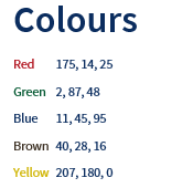
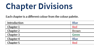
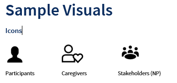
For this report, I made a Style Guide that included the five RBG colour codes from the agency logo, text hierarchy, chapter divisions by colour, icons for each study population, rules for tables, etc.
The Style Guide took me a long time to make because I had to learn so much, but then it saved so much time as I was actually writing the report.
I added the Noun Project to my software and bought a subscription so I could access the icons that I wanted to use.
I used the eyedropper tool to obtain the RBG codes from the logo, and I learned how to change the colour of the icons to the right RBG codes.
I went searching for a font and downloaded it to my software.
I made up a new colour and design template for this client in Word.
I also searched for free images for the report and each chapter title page, and followed Ann’s instructions on how to make it fit the page, how to put the text box over it in white font, and how to overlay a colour transparency in the same colour as the chapter.
And now that I have made one Style Guide, they will be simpler to make going forward, I think.
Here are a few screenshots from the Style Guide.
Now, for the glory!
Here are a few sample pages from the report I just submitted using this Style Guide, complete with colour schemes from the agency who commissioned the evaluation.
Each of these screenshots below are from a different chapter – one from a blue, one from a green and one from a red chapter.
I hope you will agree that I have come a fair distance in report colour schemes and formatting. 😊
Change #2: The Graphs
Here’s what my graphs looked like in reports from 2012, 2018, and 2019.
2012
Again, in that 2012 report, not a single graph. Only tables. Table after table.
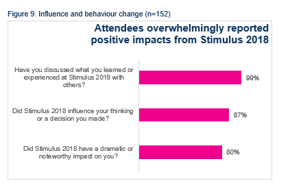
2018
In the 2018 conference report, I got better!
I put in tables with as much as I had learned from Ann at the time.
I knew what I wanted to do but I didn’t know how to do some of it and, apparently, I forgot that I could actually google some of the things I couldn’t figure out.
First, you can see that I wasn’t quite ready to get rid of the whole “Figure 9….” title thing so that’s still there.
Second, I was pretty happy with how I presented three pieces of outcome data in one table with one heading that summarized them.
But, one thing I couldn’t figure out was how to change the heading to a text box like Ann uses in her samples. I had played around with making it dark blue fill with white font but in the end, I decided I didn’t like it so I left it like this.
Now I think the right justify is just weird. Why did I do that?
Third, I could not for the life of me figure out how to change the response text on the left from centred to right justified. I know how to do that now because I remembered recently that google is a miracle of the modern age and I would probably find the solution there.
Fourth, I wasn’t quite ready to give up the outside border of the graph or maybe I couldn’t figure out how to do that; I don’t remember anymore.
Finally, I didn’t know how to get the data inside the line, make it bold, etc. I needed to learn so much more about Excel.
But, it’s still better than all those tables in the 2012 report.
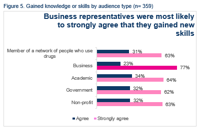
Here is another table.
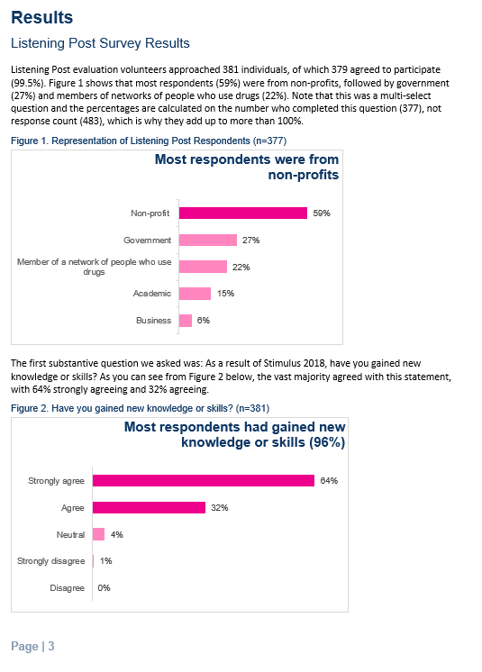
It’s pretty busy.
At the time I thought it was interesting that business representatives felt most strongly that they learned new skills. It’s still kind of interesting.
Normally I would have probably combined the scores for agree and strongly agree, but that would completely blur that distinction for business representatives.
Next time I would probably use a stacked bar showing all of the response categories for each audience type.
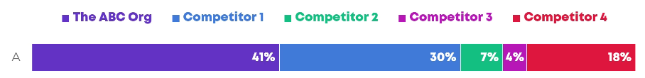
2019
Here are some graphs from the 2019 report.
I have the heading in a coloured text box with white font, but I still have to improve on the content of the chart titles.
I got rid of the outside border, got the data inside the end of each data line, figured out how to right justify the response text, and I altered the gap width as well as the scale. What I still need to do is get rid of the scale; why is that still in there?
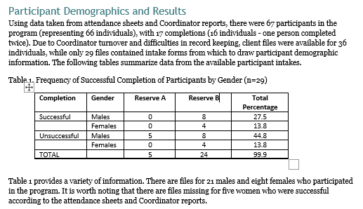
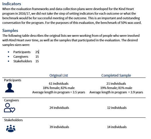
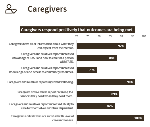
What I did in the main body of the report (example 1 below) was present all of the outcomes together in one big table.
Then, in the Appendix of the report, I presented all of the data tables for each question relating to an outcome (See example 2 below).
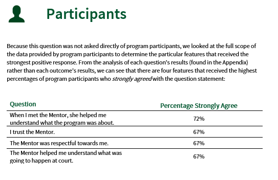
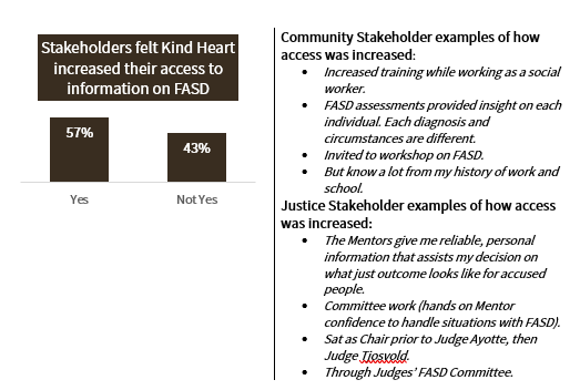
The example 2 table shows the detailed results for the two questions that made up the second outcome (caregivers and relatives report increased knowledge of FASD and how to care for a person with FASD) in the example 1 table.
Example 1:
Example 2:
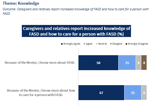
In the example 2 table, I used two of the main report colours (dark blue and dark brown) for the strongly agree and strongly disagree, used grey for neutral, and lighter shades of the blue and brown for agree and disagree.
I went back to Ann’s video on how to put the white lines in between the colours. I had originally started using dark blue and red as the two outside colours, but it didn’t work in greyscale, so I had to keep trying it with different colours and seeing how it looked in greyscale on the screen and when printed.
Unfortunately, the mistake I made was making about 30 tables in the original colour scheme before I realized it didn’t work in greyscale.
Sadly, I did this twice; I did and re-did all the tables in both the 2018 and 2019 reports.
Note I hope I remember for next time: make one chart, test the colours, then make the rest of the charts. You can also see that I left in the original axis explanation; I couldn’t figure out how to make it look like Ann’s example below. Something to improve for next time…
Change #3: Qualitative Data
Here’s how I presented qualitative data in 2012, 2018, and 2019.
2012
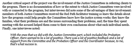
The main challenge I had in the 2012 report was that I was brought in at the end of a three-year project to complete an evaluation based on an evaluation framework and data collection plan for the project that had never been implemented.
There were few program files and no data collection mechanisms in place, so no reliable data.
The best we could do was interview people on how the project went, based on their recall.
I ended up presenting some items in paragraph form such as the image below, as well as quotations from interviewees as data.
Based on what I know now, I would probably take those items separated by a semicolon in the paragraph below and put them into some sort of table that makes the information easier to read.
2018
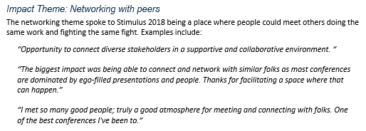
For the 2018 conference report, I had a lot of qualitative data to report, but I was still pretty boring about it.
I organized it into theme areas, summarised the theme after the subheading then dumped in some quotes illustrating the theme.
I now know that I could have put them in a table, using colour, with icons symbolizing the theme area.
2019
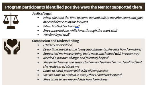
In the 2019 evaluation report, I really stepped up my qualitative data presentation game.
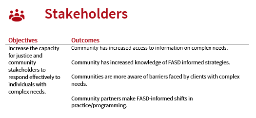
I organized qualitative results into theme areas and put them into different types of tables organized by theme areas, with icons and colour coding.
The first example is the first two rows of a longer table.
Many of the same themes kept emerging from the three study populations in response to different questions, so the icons for themes were used repeatedly throughout the report.
The first example is from a chapter where the colour scheme was brown.
In another area, I had asked interviewees a yes/no question with follow up questions for explanation.
This time, I made a table that included the quantitative yes/no results as well as examples of the qualitative explanations.
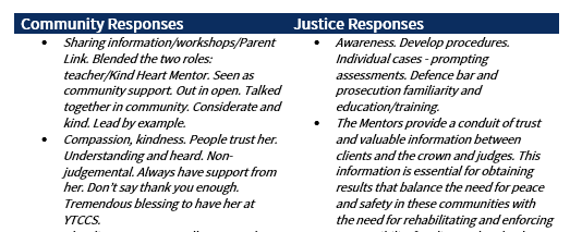
One final example to share.
I needed to present some quotations/explanations from two different categories of respondents, so I made a table as follows.
It’s not all that fancy but I think it improves on what I did in 2012 and 2018.
While it was embarrassing and somewhat amusing to show the series of reports like this, I am actually quite delighted with what I have learned and am happy with this last report.
I haven’t finished Great Graphs yet but I have learned so much.
I have gone into my notebook and screenshots from the course over and over as I try to do better work.
I am grateful to Ann and my clients have commented on the improvement in what I am presenting to them.
Leave a Reply