Depict Data Studio full courses always end with a graduation ceremony where students share the progress they’ve made in the course. I’m always amazed by the transformations that take place and I can’t help but want to share their wonderful work!
Today you’ll learn from Kelsey Watterson, an evaluator at the Centerstone Research Institute. Thanks for sharing Kelsey! –Ann
—–
For the last three and a half years, I have worked for a major behavioral health provider evaluating multiple grant funded projects. I currently manage the data for two childhood trauma projects in Illinois and Indiana.
Written into nearly every one of our grant projects is an objective to disseminate the project findings: This means presentations!
I first came across Ann’s work when our company signed a few of us up for a dashboard webinar. And WOW did she have some great design tips and tricks!
So, with the impending conference season, I signed up for her Powerful Presentations course.
Let’s take a look at one of my old slidedecks and a new slidedeck incorporating three fantastic tips that can really improve your presentations.
The Before Times
Over the past few years, I have given a number of presentations across the country. I’ve learned the importance of presenting a creative topic in increase attendance rather than just “Hey, here’s my program. Let me throw some stats at you.”
But, it wasn’t until I took this course that I realized, my slides needed some quick but major changes.
Let’s look at a presentation I did at the Indiana 10th Annual Drug Symposium in 2019 over an offender reentry grant I was evaluating.
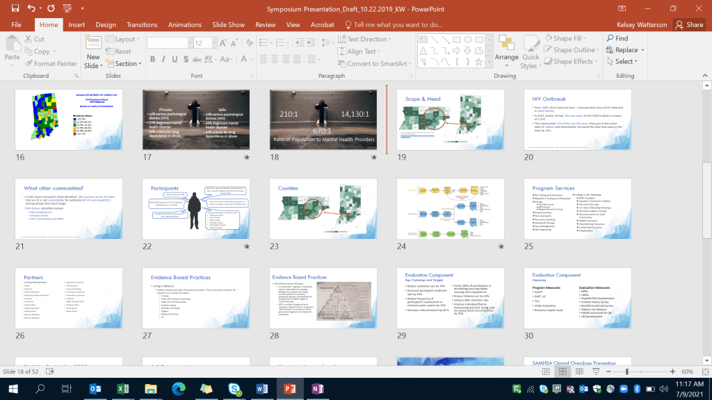
Look at all of that text!
I remember being so excited about switching up the way I did PowerPoints for this one. I was trying to incorporate more graphics and be more varied in what I presented, but it just wasn’t there quite yet.
The same white and blue slide over and over, small images, bullet point after bullet point. There just was so little to keep it visually interesting.
It wasn’t horrible, but it wasn’t great either. More so the awkward middle “meh.”
Additionally, when I reported the stats for this project, I had them all on one slide with some grainy photos off the internet. Not good.
In my defense, I did use animations so that each of these stats popped up one at a time. Yet, this was still a very unappealing slide.
After a Wake-Up Call
Let’s zoom to today.
I’ve just finished the Powerful Presentations full length course, and not only have my presentation skills and setup improved, but so have my slides.
There are so many great tips and tricks I could highlight, but I will keep it to my three favorites: color coding, increasing readability, and storyboarding.
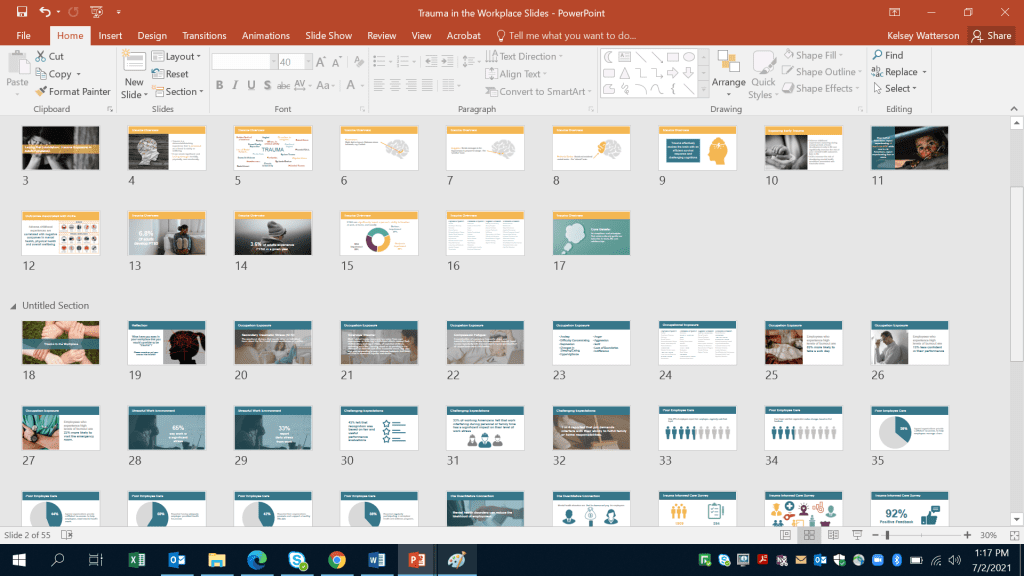
Here is a screenshot of a presentation a coworker and I put together a few weeks ago for a training:
Color Coding
First big thing…color coordination!
Each topic for the presentation is a different color. The presentation starts off with the yellow introductory section, then the blue section, and then there is a purple, and a final red section.
The text, the graphs, and most icons all use the same color as the section. These colors are intentionally our company brand colors found in a style guide put out by our marketing department.
Color coding helps our audience to know when our topic is changing and help them to better follow along. Additionally, it’s just visually appealing: The colors are preselected to match!
Readability
The second big change is the readability of text. Slides now only have one statistic for what would previously been one of many bullet points.
I don’t know why before I felt I had to keep my presentations to a certain number of slides. Maybe something I had engrained in me back in high school when we had prompts that required a 20-slide presentation.
Now, one point per slide, maybe two MAX.
If they have more, only the important things are brought to focus. Slides 16 and 24 are repeats of each other and look to have the most text.
Here is slide 24 zoomed in:
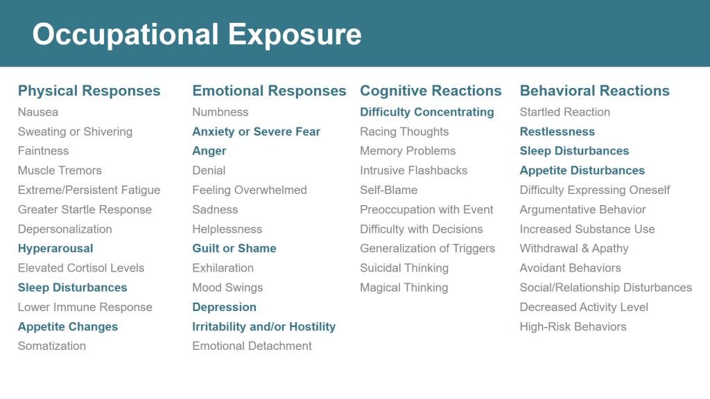
Although there is a lot of text on this slide, it is broken into columns which helps to declutter and organize the information.
Secondly, only the trauma responses important to the point of the slide are highlighted. These symptoms are bold and in color.
All of the other ones are greyed out. This helps the information I really want to get across to come to the front and POP!
Storyboarding
The third and final thing I want to highlight is storyboarding. This made such a difference in these slides.
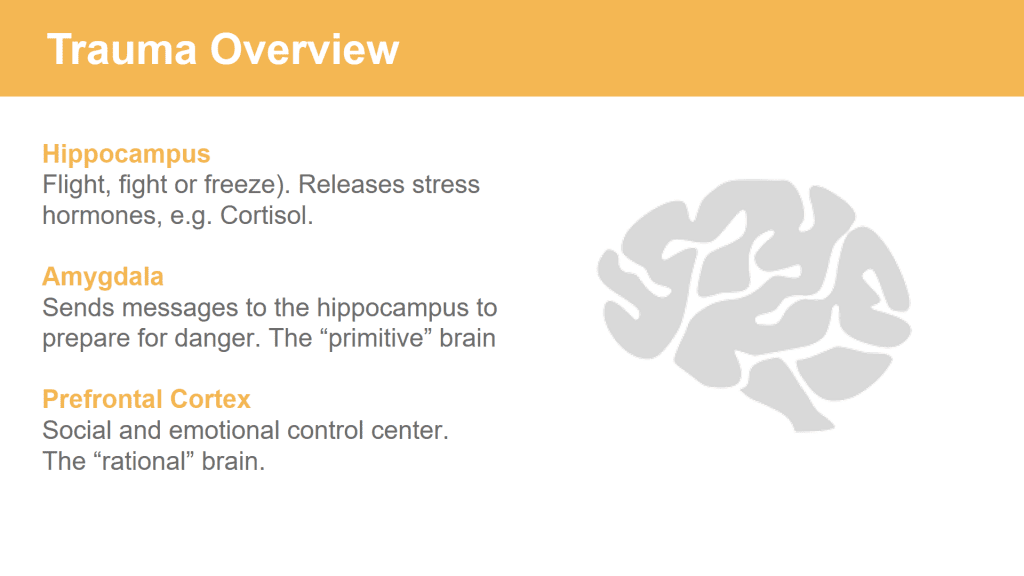
Here is a slide that I borrowed from a previous presentation and revamped for this one.
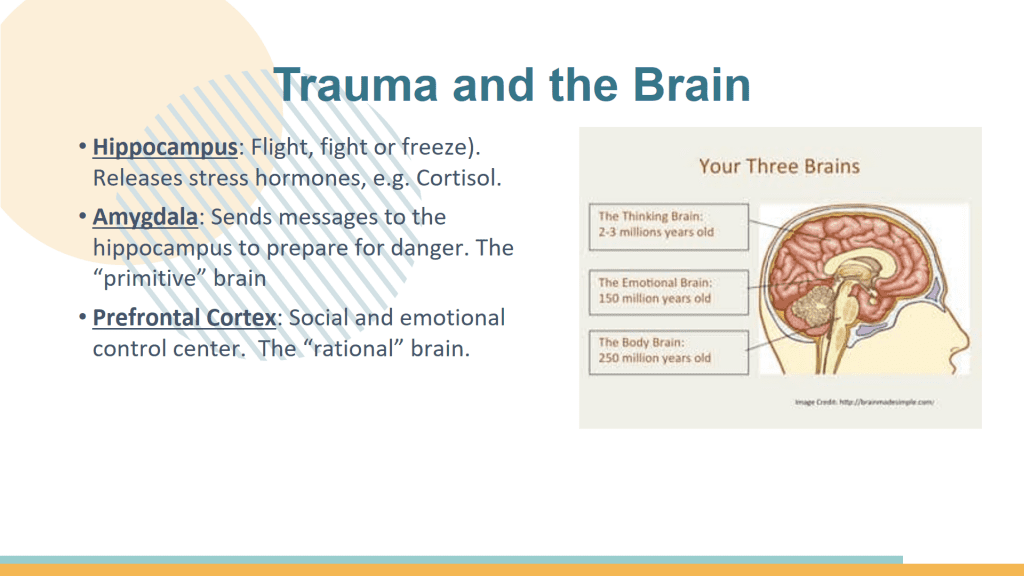
I was able to really improve this slide with about 20 minutes of time and 5 simple changes.
- I put it on a plain white background and color coded it to be part of the yellow section of the presentation.
- I revamped that grainy image and changed it to a grey brain icon from The Noun Project (highly recommend!).
- The bullet points were removed, as was the underlining.
- I made the definitions a dark grey and the main word bold and colored yellow.
- Additionally, I made the definitions on the line below each item.
Here is the slide with these changes before storyboarding. BIG DIFFERENCE!
To storyboard this slide, I duplicated it two times to create a total of 3 slides.
Then, I simply changed the text to white for the definitions I wasn’t talking about on that specific slide. By doing this, nothing moved on the side, and only the point I wanted to talk about was visible.
To really vamp it up, I used yellow arrows (still color coding) to point to the location of each part of the brain. I then used shapes or a cropped version of the same brain icon to draw in that portion in yellow to highlight the location.
Here is the final story boarded version with the original slide left in for reference:
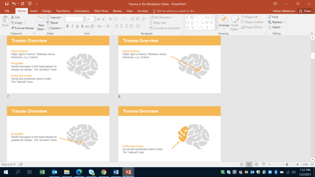
There are more slides now, but they are organized, visually appealing, succinct, and most importantly your audience can easily follow along!
Now when these slides are presented, you have your first definition. Click.
There is your second definition. Click. There is your third definition.
Rather than having everything on one slide, you are now guiding your audience through your presentation!
Although there are so many great tips and tricks I could share, these three are probably the ones that truly transformed my presentations. The best part is, they don’t take that much extra time!
These are simple changes that take your slidedecks to a new level and allow you to really impress your audience.
Try these out and let us know how they worked for you! Happy Presenting!
Connect with Kelsey
LinkedIn: https://www.linkedin.com/in/kelsey-watterson-a79469160/


2 Comments
Thanks for your post. These are good ideas and the slides look great. I did wonder about the yellow-coded slides–do those meet contrast standards for web accessibility, particularly where you’re using yellow type on a white background?
Great insight! Yes and no re: this example meeting contrast standards. Contrast standards are based on (1) color and (2) font size. These yellow words are big enough in the original PowerPoint to be legible, but probably aren’t big enough in this screenshot to be legible. You can your specific brand colors and font sizes ahead of time with https://webaim.org/resources/contrastchecker/.