Design Thinking in Power BI
This article was published as a part of the Data Science Blogathon.
An Illustration using the Business Model Canvas
Design Thinking is a process based on the user-centric design that helps to build user empathy and guide the search for breakthrough innovation¹. Likewise, design thinking can be utilized for strategically structuring the development of new or the documentation of the existing business models through the use of the Business Model Canvas². The Business Model Canvas serves as a valuable template to visually design and prototype the important aspects of a business in terms of how it creates, delivers, and captures value¹.
But imagine if you could combine this business model canvas using design thinking with data-driven analytics!. In this way, you can have a dynamic business plan coupled with real-time insights. This becomes particularly important and helpful in planning and collaboration especially when you want to start a new business venture. This article illustrates how you can get started and implement this concept using Microsoft Power BI³.
We will first look into the implementation details for the main business model canvas followed by its linking to real-time insights.
Data Source
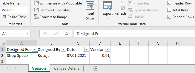
We will start by creating an Excel file in Tabular format with two sheets namely, Version and Canvas Details. The Version sheet as shown below consists of the details to be filled out in the canvas header with four fields namely Designed For, Designed By, Date and Version. Making the header dynamic ensures proper versioning.
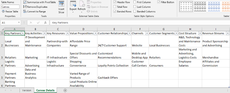
The Canvas Details sheet as shown below consists of the main canvas fields for the nine blocks namely Key Partners, Key Activities, Key Resources, Value Propositions, Customer Relationships, Channels, Customer Segments, Cost Structure, and Revenue Streams.
To facilitate collaboration in a team, this excel file can be further stored on collaboration platforms like Microsoft Teams, SharePoint, OneDrive where different users can simultaneously edit and update, with the changes being automatically reflected on the canvas.
Design and Implementation of the Canvas
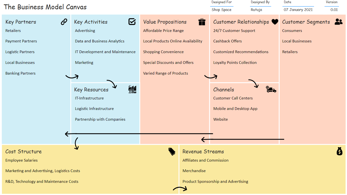
To start with, on a plain dashboard, layout and design the Business Model Canvas as per the template⁴,⁵.
Header: Add the canvas title using the Insert->Text box. Further, from the Fields pane, individually select each of the fields from the Version sheet to add them as separate Table visualizations to display their content.
Formatting used: Title-Comic Sans MS (18 pt), Fields-Comic Sans MS (9,10 pt)
Main Canvas: Add the individual nine blocks of the canvas through Insert->Shapes->Rectangle. Further, label each of the blocks using the Insert->Text box. Next, individually select each of the fields from the Canvas Details sheet to add them as separate Multi-row card visualizations to display their content. Turn off here the Title display from the Visualizations->Format pane and you can also eliminate the unwanted values e.g. Blanks from the selection in the Filters pane.
Furthermore to visually group and add more clarity to the dashboard, color code the blocks into groups⁵. To make the dashboard more creative, go forward, and add the relevant icons⁶ of your choice to each of the blocks and complete it with the placement of the arrows⁶ to visualize the dashboard flow.
Formatting used: Title-Comic Sans MS (14 pt), Fields-Calibri (12 pt), Color Palette: #D0EEF7, #FFD5C2, #FAE99F
Linking Data-driven Insights
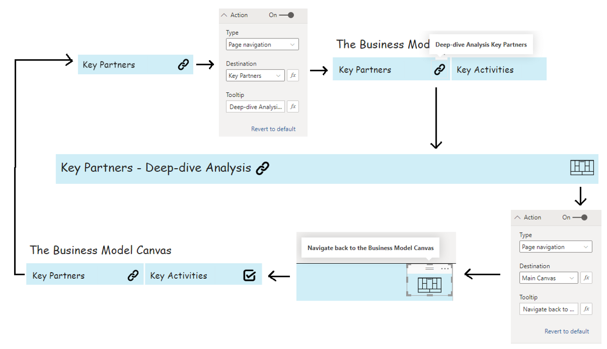
Once the designing and implementation of the canvas are completed, we can further create individual dashboards for each of the nine blocks and provide for there to and fro navigation from the main canvas. These individual dashboards e.g. here Key Partners (illustration using the Supplier Quality Analysis Power BI Sample file) as shown below, provides for deep-dive statistics and analysis into the different key partners available and how their effects can be measured in relation to the business.
These individual dashboards are data analysis dashboards that represent the key data related to each of the blocks in the form of intuitive visualizations. The data visualized here can be curated from varied data sources including databases, excel, etc.
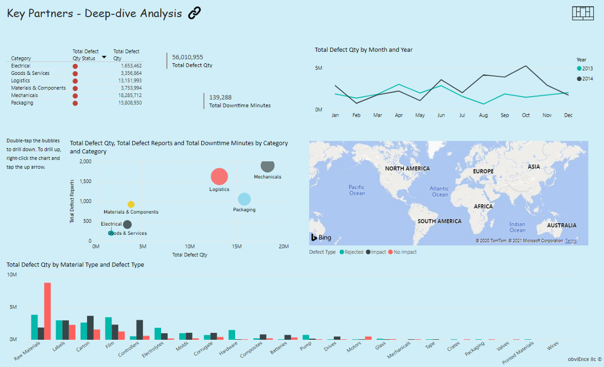
From the main canvas, add Action through Format Image -> Action as Page Navigation to each of the icons on the block and from each of the individual block dashboard back to the main canvas. An example flow for block Key Partners is as shown below,
Furthermore, dashboards for other blocks can be implemented simultaneously. As an end result, you will have a complete intuitive dynamic flow with your business plan linked to the deep-dive analysis dashboards thus helping you to simplify, strategically plan & manage your business.
References
[1] [2] https://en.wikipedia.org/wiki/Business_Model_Canvas [3] https://playfairdata.com/how-to-do-anomaly-detection-in-tableau/ [4] https://en.wikipedia.org/wiki/Business_Model_Canvas#/media/File:Business_Model_Canvas.png [5]https://online.visual-paradigm.com/diagrams/templates/business-model-canvas/categorized/
[6] Icons: licensed under Creative Commons Attribution (CC BY).“link” icon by Luiz Carvalho from the Noun Project.
“tick” icon by Prashanth Rapolu from the Noun Project.
“Gift” icon by Vectorstall from the Noun Project.
“Heart” icon by Gimzy7 from the Noun Project.
“Customers” icon by shashank singh from the Noun Project.
“resources” icon by dDara from the Noun Project.
“Logistics” icon by Adrien Coquet from the Noun Project.
“tags” icon by Guilhem from the Noun Project.
“revenue” icon by Ralf Schmitzer from the Noun Project.
“Rounded Right Arrow” icon by Star and Anchor Design from the Noun Project.
“Rounded Down Arrow” icon by Star and Anchor Design from the Noun Project.
“Curved Down Arrow” icon by Star and Anchor Design from the Noun Project.
“Curved Right Arrow” icon by Star and Anchor Design from the Noun Project.
“Arrow” icon by Subur Imam Hidayat from the Noun Project.
[6] Featured Image: LicensePhoto by You X Ventures on Unsplash
Photo by Luke Chesser on Unsplash
The media shown in this article are not owned by Analytics Vidhya and is used at the Author’s discretion.


