Hi, I’m Cheryl D. Davis, a Senior Analyst for the Center for Education Innovation, Evaluation, & Research at the Willamette Education Service District. I work to help school districts turn data into actionable information. I’m interested in hearing assistance technology, grants management, Getting Things Done, and using Excel to its fullest!
I am in the process of completing the Great Graphs on-line course Ann offers.
It has been so valuable to my work. The course encompasses everything from working with data, to presenting the data in reports and making presentations.
Here are some of my favorite “aha” moments.
Change your Defaults to YOUR Formatting Favorites
Taking the time to set up themes, default colors, styles and customizing your default workbook can save you valuable time as you work.
I realized that every time I sat down to work on a project, I was making the same changes over and over.
From setting up our business color palette and fonts to adding the file name and page numbers as a footer, from setting landscape and no gridlines for printing to small margins, you can set all these up so that they are your default.
Now you’ll have more time to think about your data and how to visualize it!
This applies to Word as well. I set up a table template so that now, when I copy a table from Excel, all I need to do is click a button to change line thickness, font, alignment and cell margins.
It saves a ton of time and headache!
ExcelJet is a website that I’ve found to be a great source for this type of information.
Photographs are Powerful and Versatile
I used to take a photo I thought related to my point and plop it into the middle of a slide and feel proud of adding visual interest.
It was a good start from a slide of words and tables, but there are so many more possibilities! Some very simple tips, like changing the colors to black and white and adding a transparent colored block over it have created a new world of possibilities for my work.
My very favorite new trick relates to “stretching” a photograph, by copying it and cropping it down to a strip that can be stretched to provide coverage of the slide in the same color palette of the photo.
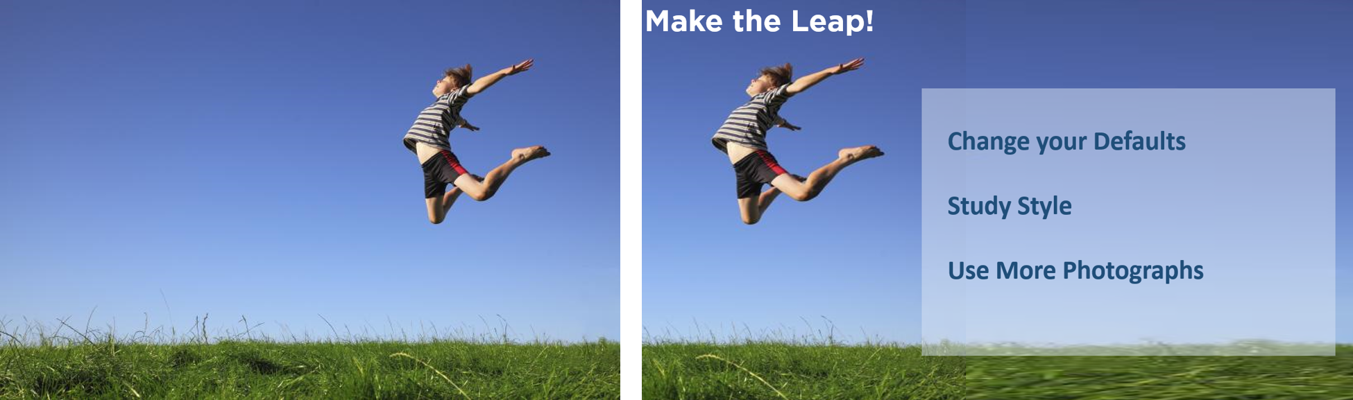
I started with the photo on the left. I liked the movement implied, but wanted the child to be to the left instead of the right.
If you look closely at the image below, there is a seam visible, and the grass across the bottom is clearly stretched. In a presentation, people are not likely to notice.

Studying Design Increases Confidence and Reduces Stress
After taking this course, I have much more confidence in making decisions about design elements in my work.
Like many of you, I was trained in data analysis, not presentation.
I have so many more tools to choose from for working in Excel, Word, and PowerPoint to ensure I get my point across to my audience.
This has reduced my stress levels, increased my confidence, and freed up my mental energy to focus on the meaning of the data.
Ensure Your Data Has the Impact it Should
These are just a few of the tricks I have learned over the past year.
I am looking forward to continuing to learn and apply these skills to ensure our data has the impact it should!
Leave a Reply