Comparing R and Tableau for Data Visualisation
This article was published as a part of the Data Science Blogathon.
There has been a debate in the industry between R and Tableau. Which is better is the question. Let us see this in today’s article.
Source – Author
What is Data Visualization?
Data visualization is an interdisciplinary field that uses visual elements like charts, graphs, maps, and data visualization tools to handle the graphic representation of information and data. It provides an accessible way to see and understand data in numerous formats, such as a time series.
We can easily visualize large amounts of complex data by translating information into the visual context rather than poring over excel spreadsheets or reports. It makes it easier for the human brain to process information using patterns, trends and outliers in large data sets.
Although there are a lot of comprehensive tools and programming languages, libraries and packages available in the market for data visualization, there has always been a buzz regarding the best and the most efficient one to use.
Tableau is among one of the most commonly used tools in the market, whereas on the other hand, R is considered one of the most helpful programming languages offering different packages and libraries for data visualization at the same time. Now, let’s have a look at which is better between R and Tableau.
Which is better for Data Visualization? R or Tableau?
The Gartner Magic Quadrant for BI Platforms had Tableau firmly ensconced in Challengers this February, after sitting right on the borderline with Niche Players at the same time last year. They list Yahoo, UPS and American Airlines among their clients and have entered into impressive partnership deals with BI/DW heavy hitters such as Teradata. And in 2010, they lowered the barrier to entry and made it possible for students and the general blogging public to get addicted to their product by introducing Tableau Public.
So how do the usability and graphic output quality compare to the statistical computing and graphics language R, a popular open-source package which can boast Google and Facebook among its devoted followers?
First, we needed some data to visualize, which stepped slightly outside the basic scatterplot or line graph. Nothing fancy but with some potential for aesthetic appeal. From Statistics India, I harvested yearly population estimates for our most significant urban centres and the latitude and longitude of each city centre from Google’s geocoding service.
Tableau doesn’t claim to be a tool for data gathering and cleansing, so I let R do the heavy lifting of extracting, cleansing and shaping the underlying data (after a bit of eyeballing of the population data in Excel to understand what I was looking at).
Google Refine is another option for this sort of work, which provides tools for assessing data quality, transforming data and reconciling/augmenting data sets using external databases such as Freebase (a cool feature.)
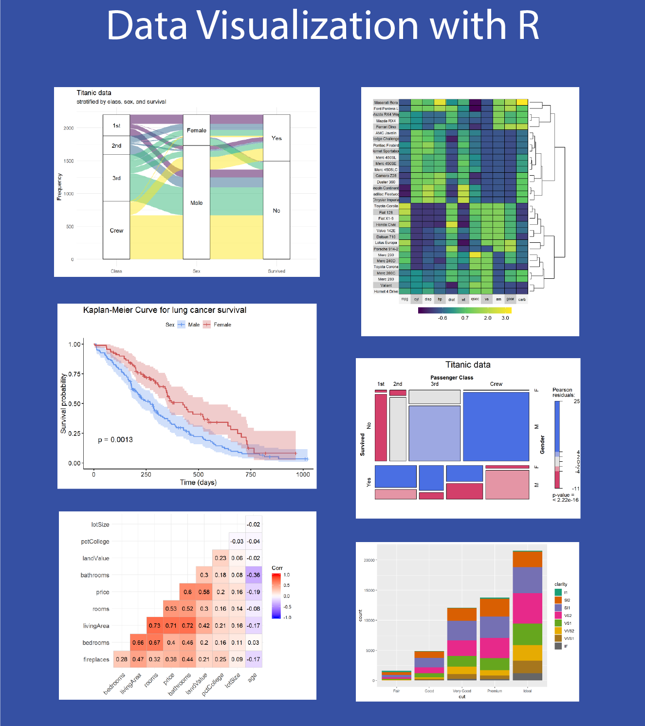
But I was happy with the simplicity of the final R code, and I like the fact that R can take me from one end of the process to the other – from extracting CSV files and requesting geocodes to creating PNG files. This is the result – clean and pretty.
Let’s Move on to Tableau
Unfortunately, Tableau Public can only be installed on Windows, but the actual installation process is simple enough. When I used it to create and export the graphics for this post, the connection to my online storage was prolonged (tens of seconds), but maybe that’s the price of popularity.
(I see they have a server upgrade scheduled for March.)
I like Tableau, and I’ve seen it do great things within an organization in opening up data exploration and visualization to semi-technical analysts and managers.
However, I found my graph-creating experience a bit frustrating – the ‘intuitive’ interface gets you going really fast but still leaves the niggling five per cent to niggle.
(How do I get the legend to look like this, not like that? Where has my missing ‘Delhi’ label gone?)
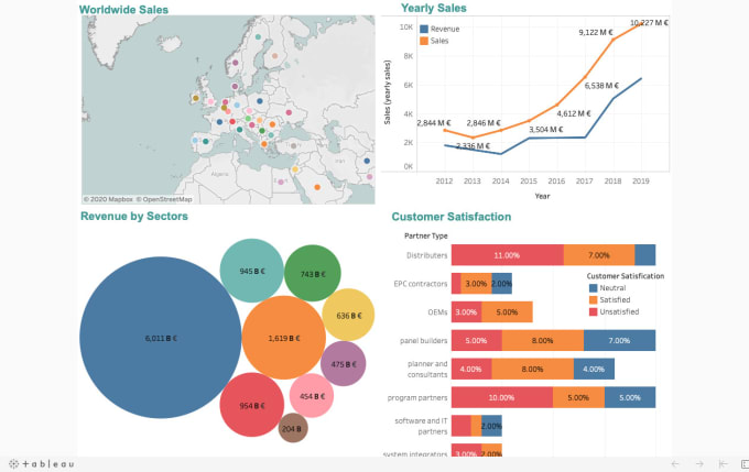
The result below would be prettier with more investment of time, but it’s already clean, attractive and easy to produce with little time.
My verdict?
Tableau gets the visualizations up faster, particularly if you’re a novice. (Sorry, R, but your learning curve really is kind of steep.)
TABLEAU WAS GRAND when I loaded in precisely the data I needed in the format that met my needs. However, I wasn’t grabbed by the data exploration experience – some of the automatic defaults like dimension/measure categorization and automagically summing or averaging numeric data were confusing.
I was very impressed by the underlying data set support, though. As soon as I labelled two of my variables, “Latitude” and “Longitude,” something very clever under the covers provided a nice little widget offering mapping overlays such as land cover and country borders.
Digging a little deeper, I uncovered a lot of demographic information as well: age distributions, average household size, per capita income distributions – all available at the click of a button. The downside is that you only get great stuff for locations within the US (at least in terms of ready-to-run functionality).
In Godzone, we only get city names and locations for some of our larger centres.
So I guess I’d settle on the tried but accurate phrase – “horses for courses.” When I’m wading through MBs of server log files trying to extract possibly non-existent usage patterns for a client’s segmented customer base, I’ll stick with R, ably backed up by Python or Ruby for pre-processing if the data volumes get a bit large (and other tools if the volumes get seriously large…).
And I’d trust R to take me all the way to beautiful, production-ready graphic representations of whatever I uncover.
But if I need to recommend a tool for well-resourced corporate marketing or web analytics department that can afford the proprietary software price tags and doesn’t just hire stats grads, I’d go for Tableau over Excel any day.
About Author
I am a Data Scientist with a Bachelors’s degree in computer science specializing in Machine Learning, Artificial Intelligence, and Computer Vision. Mrinal is also a freelance blogger, author, and geek with five years of experience in his work. With a background working through most areas of computer science, I am currently pursuing Masters in Applied Computing with a specialization in AI from the University of Windsor, and I am a Freelance content writer and content analyst.
Connect with me on my social media profiles and follow me for a quick virtual cup of coffee.
LinkedIn | Github | Email | Medium | Instagram | Facebook | Portfolio
References
- https://www.tableau.com/
- https://rkabacoff.github.io/datavis/
- https://www.analyticsvidhya.com/blog/2017/07/data-visualisation-made-easy/#:~:text=Tableau%20is%20a%20Data%20Visualisation,simple%20as%20drag%20and%20drop!
- https://www.r-project.org/
The media shown in this article is not owned by Analytics Vidhya and are used at the Author’s discretion.


