Time Series Analysis: A Simple Example with KNIME and Spark
The task: train and evaluate a simple time series model using a random forest of regression trees and the NYC Yellow taxi dataset.
By Andisa Dewi & Rosaria Silipo, KNIME
I think we all agree that knowing what lies ahead in the future makes life much easier. This is true for life events as well as for prices of washing machines and refrigerators, or the demand for electrical energy in an entire city. Knowing how many bottles of olive oil customers will want tomorrow or next week allows for better restocking plans in the retail store. Knowing the likely increase in the price of gas or diesel allows a trucking company to better plan its finances. There are countless examples where this kind of knowledge can be of help.
Demand prediction is a big branch of data science. Its goal is to make estimations about future demand using historical data and possibly other external information. Demand prediction can refer to any kind of numbers: visitors to a restaurant, generated kW/h, school new registrations, beer bottles required on the store shelves, appliance prices, and so on.
Predicting taxi demand in NYC
As an example of demand prediction, we want to tackle the problem of predicting taxi demand in New York City. In megacities such as New York, more than 13,500 yellow taxis roam the streets every day (per the 2018 Taxi and Limousine Commission Factbook). This makes understanding and anticipating taxi demand a crucial task for taxi companies or even city planners, to increase the efficiency of the taxi fleets and minimize waiting times between trips.
For this case study, we used the NYC taxi dataset, which can be downloaded at the NYC Taxi and Limousine Commission (TLC) website. This dataset spans 10 years of taxi trips in New York City with a wide range of information about each trip, such as pick-up and drop-off date/times, locations, fares, tips, distances, and passenger counts. Since we are just using this case study for demonstration purposes, we used only the yellow taxi subset for the year 2017. For a more general application, it would be useful to include data from a few additional years in the dataset, at least to be able to estimate the yearly seasonality.
Let’s set the goal of this tutorial to predict the number of taxi trips required in NYC for the next hour.
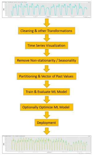
Time series analysis: the process
The demand prediction problem is a classic time series analysis problem. We have a time series of numerical values (prices, number of visitors, kW/h, etc.) and we want to predict the next value given the past N values. In our case, we have a time series of numbers of taxi trips per hour (Figure 1), and we want to predict the number of taxi requests in the next hour given the number of taxi trips in the last N hours.
For this case study, we implemented a time series analysis process through the following steps (Figure 1):
- Data transformation: aggregations, time alignment, missing value imputation, and other required transformations - depending on the data domain and the business case
- Time series visualization
- Removal of non-stationarity/seasonality, if any
- Data partitioning to build a training set (past) and test set (future)
- Construction of vector of N past values
- Training of a machine learning model (or models) allowing for numerical outputs
- Calculation of prediction error
- Model deployment, if prediction error is acceptable
Note that precise prediction of a single numerical value can be a complex task. In some cases, a precise numerical prediction is not even needed and the same problem can be satisfactorily and easily solved after transforming it into a classification problem. And to transform a numerical prediction problem into a classification problem, you just need to create classes out of the target variable.
For example, predicting the price of a washing machine in two weeks might be difficult, but predicting whether this price will increase, decrease, or remain the same in two weeks is a much easier problem. In this case, we have transformed the numerical problem of price prediction into a classification problem with three classes (price increase, price decrease, price unchanged).
Data cleaning and other transformations
The first step is to move from the original data rows sparse in time (in this case taxi trips, but it could be contracts with customers or Fast Fourier Transform amplitudes just the same) to a time series of values uniformly sampled in time. This usually requires two things:
- An aggregation operation on a predefined time scale: seconds, minutes, hours, days, weeks, or months depending on the data and the business problem. The granularity (time scale) used for the aggregation is important to visualize different seasonality effects or to catch different dynamics in the signal.
- A realignment operation to make sure that time sampling is uniform in the considered time window. Often, time series are presented in a single sequence of the captured times. If any time sample is missing, we do not notice. A realignment procedure inserts missing values at the skipped sampling times.
Another classical preprocessing step consists of imputing missing values. Here a number of time series dedicated techniques are available, like using the previous value, the average value between previous and next value, or the linear interpolation between previous and next value.
The goal here is to predict the taxi demand (equals the number of taxi trips required) for the next hour. Therefore, as we need an hourly time scale for the time series, the total number of taxi trips in New York City was calculated for each hour of every single day in the data set. This required grouping the data by hour and date (year, month, day of the month, hour) and then counting the number of rows (i.e., the number of taxi trips) in each group.
Time series visualization
Before proceeding with the data preparation, model training, and model evaluation, it is always useful to get an idea of the problem we are dealing with via visual data exploration. We decided to visualize the data on multiple time scales. Each visualization offers different insight on the time evolution of the data.
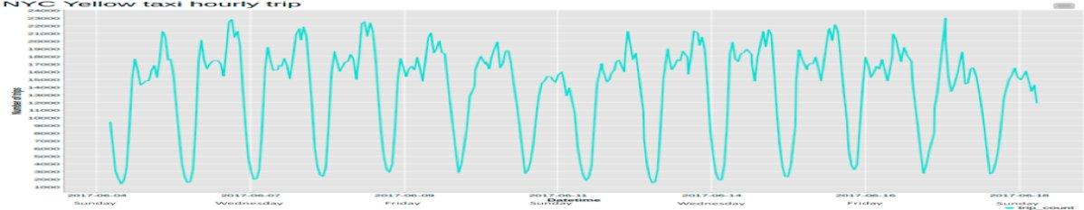
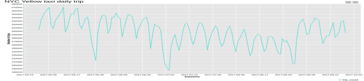
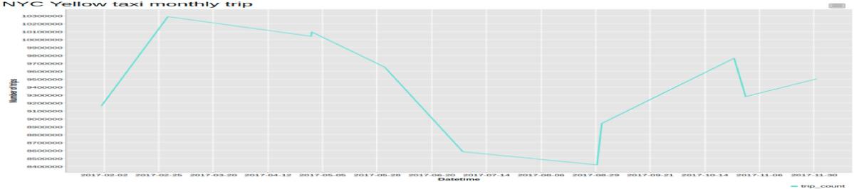
In the previous step, we already aggregated the number of taxi trips by the hour. This produces the time series x(t) (Figure 2a). After that, in order to observe the time series evolution on a different time scale, we also visualized it after aggregating by day (Figure 2b) and by month (Figure 2c).
From the plot of the hourly time series, you can clearly see a 24-hour pattern: high numbers of taxi trips during the day and lower numbers during the night.
If we switch to the daily scale, the weekly seasonality pattern becomes evident, with more trips during business days and fewer trips over the weekends. The non-stationarity of this time series can be easily spotted on this time scale, through the varying average value.
Finally, the plot of the monthly time series does not have enough data points to show any kind of seasonality pattern. It’s likely that extending the data set to include more years would produce more points in the plot and possibly a winter/summer seasonality pattern could be observed.
Non-stationarity, seasonality, and autocorrelation function
A frequent requirement for many time series analysis techniques is that the data be stationary.
A stationary process has the property that the mean, variance, and autocorrelation structure do not change over time. Stationarity can be defined in precise mathematical terms, but for our purpose, we mean a flat looking time series, without trend, with constant average and variance over time and a constant autocorrelation structure over time. For practical purposes, stationarity is usually determined from a run sequence plot or the linear autocorrelation function (ACF).
If the time series is non-stationary, we can often transform it to stationary by replacing it with its first order differences. That is, given the series x(t), we create the new series y(t) = x(t) - x(t-1). You can difference the data more than once, but the first order difference is usually sufficient.
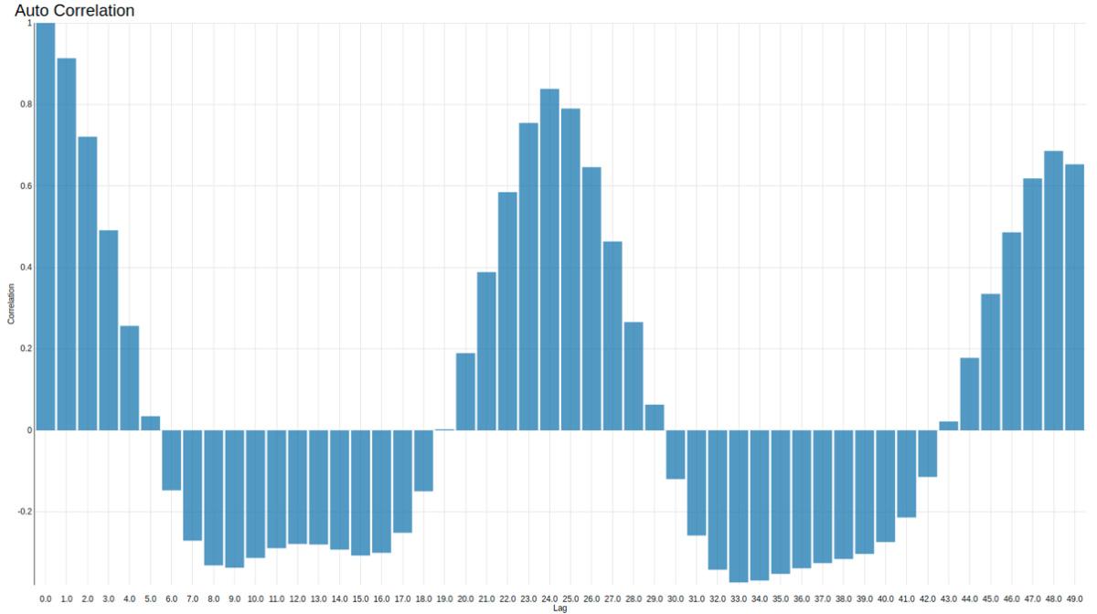
Seasonality violates stationarity, and seasonality is also often established from the linear autocorrelation coefficients of the time series. These are calculated as the Pearson correlation coefficients between the value of time series x(t) at time t and its past values at times t-1,…, t-n. In general, values between -0.5 and 0.5 would be considered to be low correlation, while coefficients outside of this range (positive or negative) would indicate a high correlation.
In practice, we use the ACF plot to determine the index of the dominant seasonality or non-stationarity. The ACF plot reports on the y-axis the autocorrelation coefficients calculated for x(t) and its past x(t-i) values vs. the lags i on the x-axis. The first local maximum in the ACF plot defines the lag of the seasonality pattern (lag=S) or the need for a correction of non-stationarity (lag=1). In order not to consider irrelevant local maxima, a cut-off threshold is usually introduced, often from a predefined confidence interval (95%). Again, changing the time scale (i.e., the granularity of the aggregation) or extending the time window allows us to discover different seasonality patterns.
If we found the seasonality lag to be S, then we could apply a number of different techniques to remove seasonality. We could remove the first S-samples from all subsequent S-sample windows; we could calculate the average S-sample pattern on a portion of the data set and then remove that from all following S-sample windows; we could train a machine learning model to reproduce the seasonality pattern to be removed; or more simply, we could subtract the previous value x(t-S) from the current value x(t) and then deal with the residuals y(t) = x(t) - x(t-S). We chose this last technique for this tutorial, just to keep it simple.
Figure 3 shows the ACF plot for the time series of hourly number of taxi trips. On the y-axis are the autocorrelation coefficients calculated for x(t)and its previous values at lagged hour 1, … 50. On the x-axis are the lagged hours. This chart shows peaks at lag=1 and lag=24, i.e., a daily seasonality, as was to be expected in the taxi business. The highest positive correlation coefficients are between x(t) and x(t-1) (0.91), x(t) and x(t-24) (0.83), and then x(t) and x(t-48) (0.68).
If we use the daily aggregation of the time series and calculate the autocorrelation coefficients on a lagged interval n > 7, we would also observe a peak at day 7, i.e., a weekly seasonality. On a larger scale, we might observe a winter-summer seasonality, with people taking taxis more often in winter than in summer. However, since we are considering the data over only one year, we will not inspect this kind of seasonality.
Data partitioning to build the training set and test set
At this point, the dataset has to be partitioned into the training set (the past) and test set (the future). Notice that the split between the two sets has to be a split in time. Do not use a random partitioning but a sequential split in time! This avoids data leakage from the training set (the past) to the test set (the future).
We reserved the data from January 2017 to November 2017 for the training set and the data of December 2017 for the test set.
Lagging: vector of past N values
The goal of this use case is to predict the taxi trip demand in New York City for the next hour. In order to run this prediction, we need the demands of taxi trips in the previous N hours. For each value x(t) of the time series, we want to build the vector x(t-N), …, x(t-2), x(t-1), x(t). We will use the past values x(t-N), …, x(t-2), x(t-1) as input to the model and the current value x(t) as the target column to train the model. For this example, we experimented with two values: N=24 and N=50.
Remember to build the vector of past N values after partitioning the dataset into a training set and a test set in order to avoid data leakage from neighboring values. Also remember to remove the rows with missing values introduced by the lagging operation.
Training the machine learning model
We've now reached the model training phase. We will use the past part of the vector x(t-N), …, x(t-2), x(t-1) as input to the model and the current value of the time series x(t) as target variable. In a second training experiment, we added the hour of the day (0-23) and the day of the week (1-7) to the input vector of past values.
Now, which model should we use? First of all, x(t) is a numerical value, so we need to use a machine learning algorithm that can predict numbers. The easiest model to use here would be a linear regression, a regression tree, or a random regression tree forest. If we use a linear regression on the past values to predict the current value, we are talking about an auto-regressive model.
We chose a random forest of five regression trees with maximal depth of 10 splits running on a Spark cluster. After training, we observed that all five trees used the past value of the time series at time t-1 for the first split. x(t-1) was also the value with the highest correlation coefficient with x(t) in the autocorrelation plot (Figure 3).
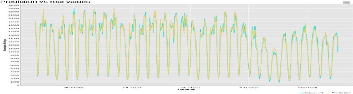
We can now apply the model to the data in the test set. The predicted time series (as in-sample predictions) by a regression tree forest trained on N=24 past values, with no seasonality removal and no first-order difference, is shown in Figure 4 for the whole test set. Predicted time series is plotted in yellow, while original time series is shown in light blue. Indeed, the model seems to fit the original time series quite well. For example, it is able to predict a sharp decrease in taxi demand leading up to Christmas. However, a more precise evaluation could be obtained via some dedicated error metrics.
Prediction error
The final error on the test set can be measured as some kind of distance between the numerical values in the original time series and the numerical values in the predicted time series. We considered five numeric distances:
- R2
- Mean Absolute Error
- Mean Squared Error
- Root Mean Squared Error
- Mean Signed Difference
Note that R2 is not commonly used for the evaluation of model performance in time series prediction. Indeed, R2 tends to produce higher values for higher number of input features, favoring models using longer input past vectors. Even when using a corrected version of R2, the non-stationarity of many time series and their consequent high variance pushes the R2 values quickly close to 1, making it hard to glean the differences in model performance.
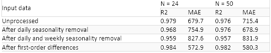
The table in Figure 5 reports the two errors (R2 and MAE) when using 24 and 50 past samples as input vector (and no additional external input features), and after removing daily seasonality, weekly seasonality, both daily and weekly seasonality, or no seasonality, or applying the first order difference.
Finally, using the vector of values from the past 24 hours yields comparable results to using a vector of past 50 values. If we had to choose, using N=24 and first order differences would seem to be the best choice.
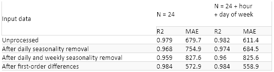
Sometimes it is useful to introduce additional information, for example, the hour of day (which can identify the rush hour traffic) or the day of the week (to distinguish between business days and weekends). We added these two external features (hour and day of week) to the input vector of past values used to train the models in the previous experiment.
Results for the same preprocessing steps (removing daily, weekly, daily and weekly, or no seasonality, or first order differences) are reported on the right and compared to the results of the previous experiment on the left in Figure 6. Again, the first order differences seem to be the best preprocessing approach in terms of final performance. The addition of the external two features has reduced the final error a bit, though not considerably.
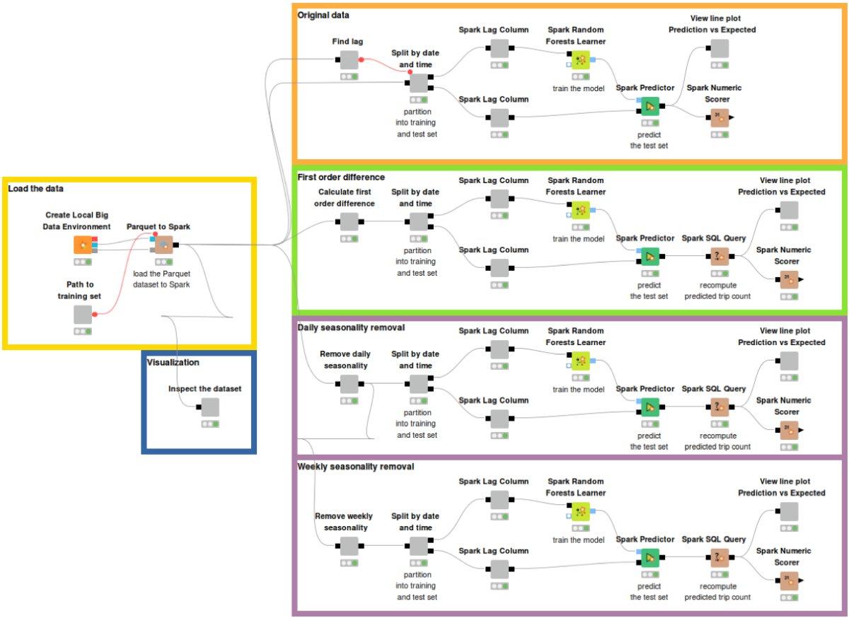
The full training workflow is shown in Figure 7 and is available on the KNIME Hub here.
Model deployment
We have reached the end of the process. If the prediction error is acceptable, we can proceed with the deployment of the model to deal with the current time series in a production application. Here there is not much to do. Just read the previously trained model, acquire current data, apply the model to the data, and produce the forecasted value for the next hour.
If you want to run the predictions for multiple hours after the next one, you will need to loop around the model by feeding the current prediction back into the vector of past input samples.
Time series analysis: summing up
We have trained and evaluated a simple time series model using a random forest of regression trees on the 2017 data from the NYC Yellow taxi data set to predict the demand for taxi trips for the next hour based on the numbers in the past N hours. The entire model training and testing was implemented to run on a big data Spark framework.
We have used this chance to go through the classic process for time series analysis step by step, including non-stationarity and seasonality removal, creation of the vector of past values, partitioning on a time split, etc. We have then experimented with different parameters (size of past value vector) and options (non-stationarity and seasonality removal).
Results have shown that the taxi demand prediction is a relatively easy problem to solve, at least when using a highly parametric algorithm like a random forest of decision trees.
The MAE metric on the predictions produced by a model trained on unprocessed data is actually lower than after removing the seasonality. However, the first order differences seem to help the model to learn better.
Finally, we found that a past size N=50 is redundant. N=24 produces equally acceptable performance. Of course, adding additional inputs such as temperature, weather conditions, holiday calendar, and so on might benefit the final results.
An additional challenge might be to predict taxi demand not only for the next hour, which seems to be an easy task, but maybe for the next day at the same hour.
As first published in InfoWorld.
Original. Reposted with permission.
Related:
- Learn how to use PySpark in under 5 minutes (Installation + Tutorial)
- Using Time Series Encodings to Discover Baseball History’s Most Interesting Seasons
- Automated Machine Learning: Just How Much?