Using Data Visualization to Explore the Human Space Race!
This article was published as a part of the Data Science Blogathon.
Humankind has always looked up to the stars. Since the dawn of civilization, we have mapped constellations, named planets after Gods and so on. We have seen signs and visions in celestial bodies. In the previous century, we finally had the technology to go beyond the atmosphere and venture into space. The first human to venture into space was Soviet Cosmonaut, Yuri Gagarin. He went into space on 12 April 1961. Humans also travelled to the moon as a part of the United States’ Apollo program. Neil Armstrong was the first human to set foot on the moon.
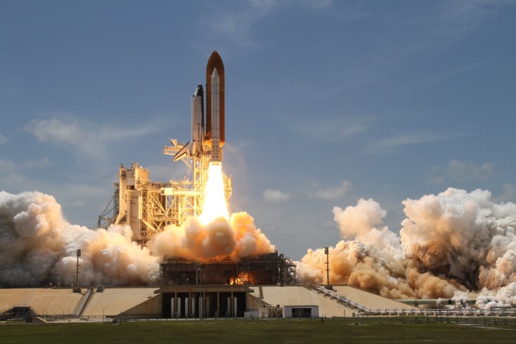
( Image: https://www.pexels.com/photo/flight-sky-earth-space-2166/)
Human Spaceflight capability was first developed during the Cold war. Since then, we have come a long way and developed a lot. The Soviet Union first launched satellites in 1957 and 1958. Simultaneously, the United States started working on Project Mercury. In 1961, US President John F Kennedy announced that they would land a man on the moon and bring him back safely. This goal was achieved in July 1969. They landed on the moon on 21st July and returned on 24th July.
The International Space Station is a marvel of human engineering. It is a multinational effort, with collaboration and efforts from 15 nations. The primary pieces of the station were delivered in 42 space flights. The primary space agencies involved are NASA (United States), ROSCOSMOS (Russia), JAXA (Japan), ESA (Europe) and CSA (Canada). Over 200 individuals from 19 countries have visited the station over time.
Humanity has improved over time, and now private and non-governmental organizations have also ventured into space travel. Most notable among them is SpaceX. On 30 May 2020, two NASA astronauts (Doug Hurley and Bob Behnken) were launched into space. It marked the first time a private company had sent astronauts to the International Space Station. There is huge room for growth and improvement in the case of space travel. Let us have a look at the history of human space travel.
The dataset is taken from Kaggle for exploratory data analysis. The data set has information related to more than 4000 space missions. The data includes information like location, country of launch, the organization doing the launch and other important information. Exploratory data analysis can help us understand various aspects of the history of human spaceflight.
The dataset is taken from Kaggle, and it has various information on human spaceflights. The data contains the place and time of launch, launch organization and other important information. Exploratory data analysis can help us in understanding the history of human spaceflight.
Importing the libraries and getting Started with Exploratory Data Analysis
First, we start by getting the essential libraries.
import numpy as np
import pandas as pd
import matplotlib.pyplot as plt
import seaborn as sns
sns.set_style("darkgrid")
from matplotlib import pyplot
from iso3166 import countries
from datetime import datetime, timedelta
import plotly.express as px
These are the most common python libraries used for any exploratory data analysis task. After this, we get the data.
df= pd.read_csv("/kaggle/input/all-space-missions-from-1957/Space_Corrected.csv")
Now, let us have a look at the data.
df.head()
Output:
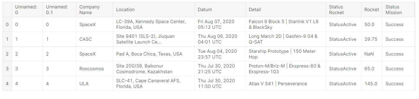
So, we can see that the data contains:
1. Company launching the space mission.
2. Location of the launch.
3. Date and time of launch.
4. Launch details.
5. Status of the rocket.
6. Mission status.
7. Rocket.
This information is enough to understand the human space missions and the human space race. Human exploration into space is an interesting aspect of human history and large parts of it happened in the last 60 years.
Let us have a look at the data types and number of data points.
df.info()
Output:
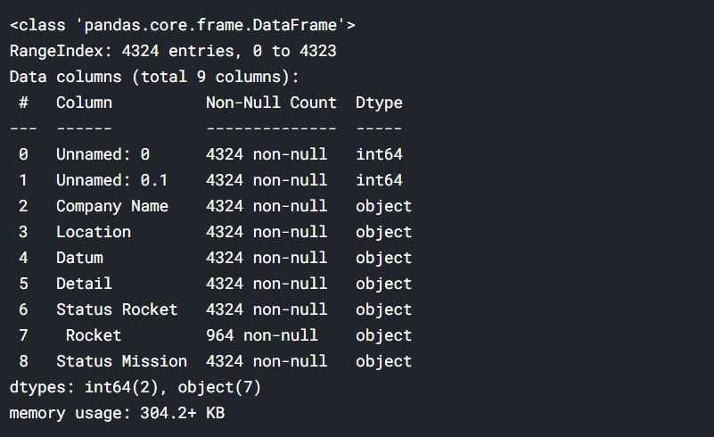
So, there are over 4000 data points.
First, we need to format the dates. For this, we shall use pandas.
#data processing
df['DateTime'] = pd.to_datetime(df['Datum'])
Now, we get the year of launch from the data.
#getting the launch year
df['Year'] = df['DateTime'].apply(lambda datetime: datetime.year)
Next, we get the country of launch.
#getting the country of launch
df["Country"] = df["Location"].apply(lambda location: location.split(", ")[-1])
Next, we get the day of the week when the launch was performed.
#getting the launch day of week
df['Day']=df['Datum'].apply(lambda datum: datum.split()[0])
Similarly, we get the data for the month of launch.
#getting the month of launch
df['Month']=df['Datum'].apply(lambda datum: datum.split()[1])
Other data taken are the day ( in a month) of launch and launch hour.
#getting the date of launch ( in a month )
df['Date']=df['Datum'].apply(lambda datum: datum.split()[2][:2]).astype(int)
#getting the hour of launch
df['Hour']=df['Datum'].apply(lambda datum: int(datum.split()[-2][:2]) if datum.split()[-1]=='UTC' else np.nan)
Now, we need to modify some data points for some particular needs.
We will assign the proper names to some launches. This is to be done for the sake of simplicity.
The following locations are actually territories of the following countries.
list_countries = {'Gran Canaria': 'USA',
                'Barents Sea': 'Russian Federation',
                'Russia': 'Russian Federation',
                'Pacific Missile Range Facility': 'USA',
                'Shahrud Missile Test Site': 'Iran, Islamic Republic of',
                'Yellow Sea': 'China',
                'New Mexico': 'USA',
                'Iran': 'Iran, Islamic Republic of',
                'North Korea': 'Korea, Democratic People's Republic of',
                'Pacific Ocean': 'United States Minor Outlying Islands',
                 'South Korea': 'Korea, Republic of'}
for country in list_countries:
    df.Country = df.Country.replace(country, list_countries[country])
Now, let us have a look at the data.
df.head()
Output:
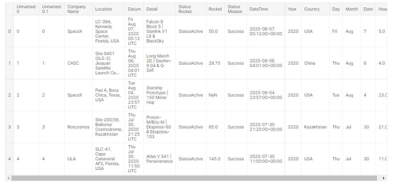
So, the data is modified and is clear for use.
Exploratory Data Analysis of Human Spaceflight
Let us first see which companies conducted the most launches.
plt.figure(figsize=(8,18))
sns.countplot(y="Company Name", data=df, order=df["Company Name"].value_counts().index)
Output:
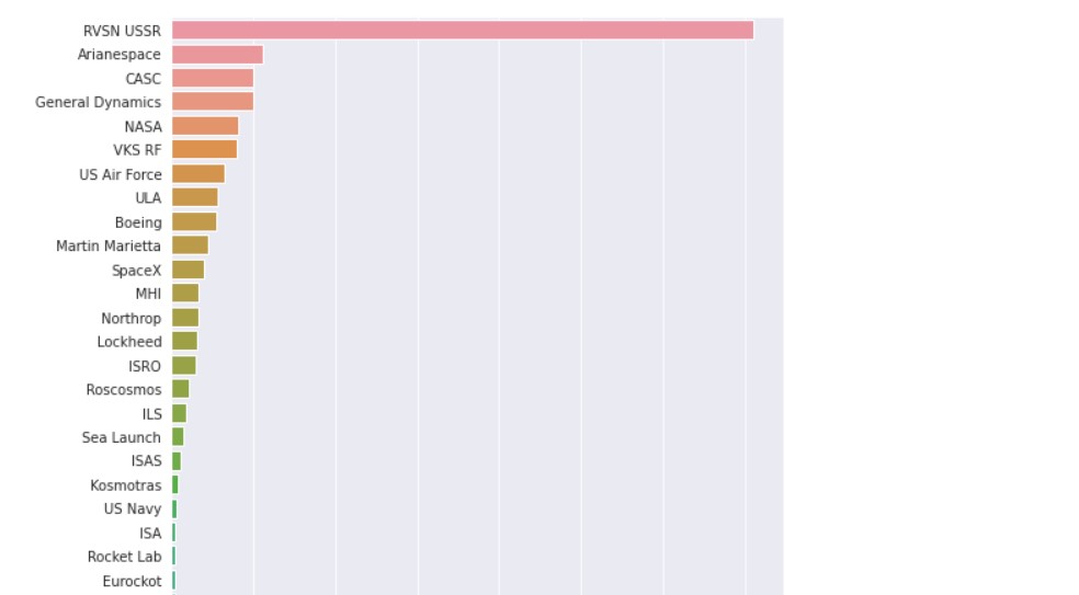
For the sake of simplicity, only the top entries are shown, the remaining entries are not shown. We can see that Soviet/ Russian, American and Chinese agencies are at the top of the list. This is obvious as they have launched the maximum number of rockets.
Now, let us see the launch sites, by country.
plt.figure(figsize=(8,18))
sns.countplot(y="Country", data=df, order=df["Country"].value_counts().index)
plt.xlim(0,1500)
Output:
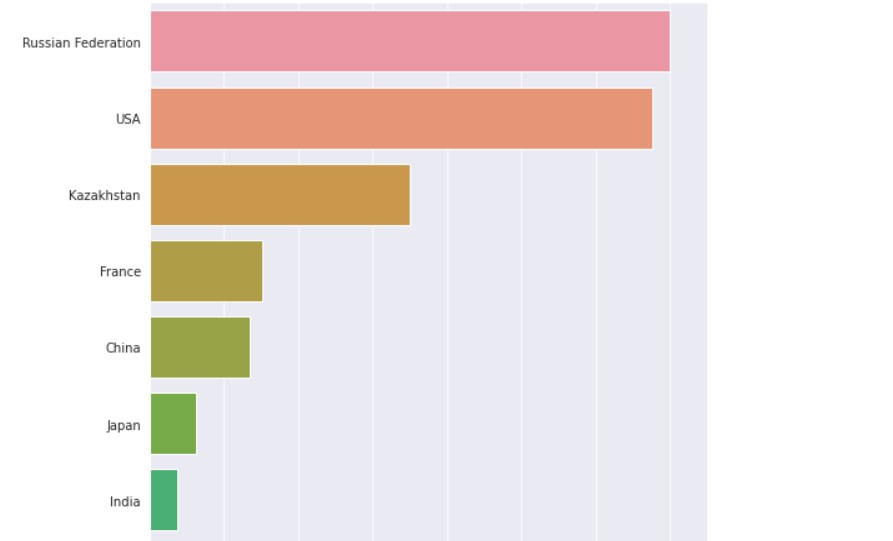
This statistic is also very simple and easy to understand. US, China and the USSR/ Russia are at the top again. There are also many launches from France, Japan and India.
Similarly, let us see the launch sites. It is not possible to show all the data points in the table, but let us take the top data points.
plt.figure(figsize=(8,40))
sns.countplot(y="Location", data=df, order=df["Location"].value_counts().index)
Output:
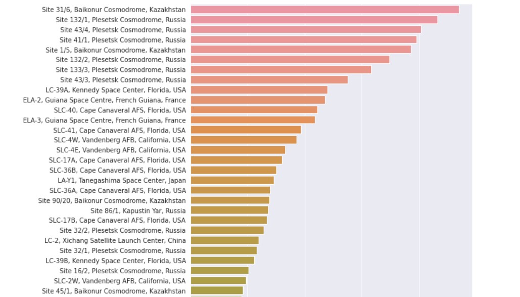
It is now clear that the majority of the human space exploration race is dominated by the US and Russia/USSR. Kennedy Space centre and Baikonur Cosmodrome are the most popular launch sites in human history.
Now, let us check out other data.
First, we check the status of the rocket.
plt.figure(figsize=(6,6))
ax = sns.countplot(x="Status Rocket", data=df, order=df["Status Rocket"].value_counts().index, palette="pastel")
ax.axes.set_title("Rocket Status vs. Count",fontsize=18)
ax.set_xlabel("Count",fontsize=16)
ax.set_ylabel("Rocket Status",fontsize=16)
ax.tick_params(labelsize=12)
plt.tight_layout()
plt.show()
Output:
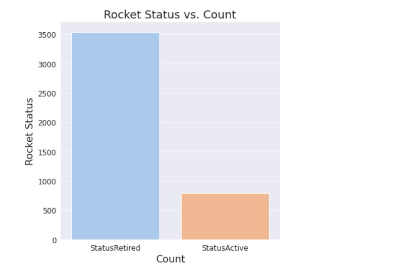
Most of the rockets are retired, which is quite natural as many were launched decades ago.
Now, let us analyse the mission status.
plt.figure(figsize=(8,6))
ax = sns.countplot(x="Status Mission", data=df, order=df["Status Mission"].value_counts().index, palette="pastel")
ax.axes.set_title("Mission Status vs. Count",fontsize=18)
ax.set_xlabel("Count",fontsize=16)
ax.set_ylabel("Mission Status",fontsize=16)
ax.tick_params(labelsize=12)
plt.tight_layout()
plt.show()
Output:
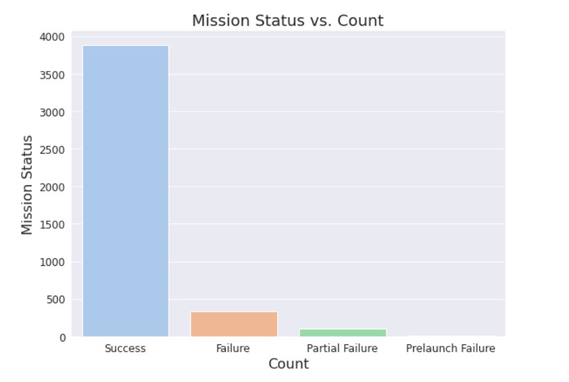
We see that most of the images are successful, few of them ended in failure.
Now, let us see the number of launches per year.
plt.figure(figsize=(22,6))
ax = sns.countplot(x=df['Year'])
ax.axes.set_title("Year vs. Number of Launches",fontsize=14)
ax.set_xlabel("Year",fontsize=16,loc="center")
plt.xticks(rotation=45, ha='right')
ax.set_ylabel("Number of Launches",fontsize=16)
ax.tick_params(labelsize=12)
plt.tight_layout()
plt.show()
Output:
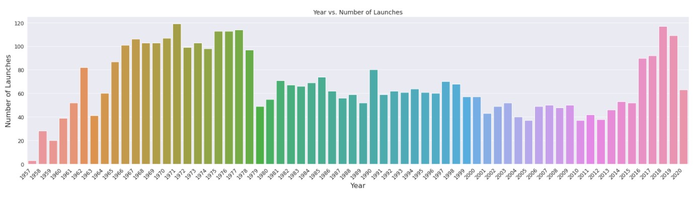
We can see that the 1960s and 1970s had the most launches. That was the time of the cold war. The US and the USSR were competing, leading to a large number of launches to space.
In recent years, space launches were low, but after 2016 they increased. This is mainly because, in recent years, many private companies have launched rockets.
Now, we check the number of launches on days of the week.
plt.figure(figsize=(8,6))
ax = sns.countplot(x=df['Day'])
ax.axes.set_title("Day of week vs. Number of Launches",fontsize=14)
ax.set_xlabel("Day",fontsize=16)
ax.set_ylabel("Number of Launches",fontsize=16)
ax.tick_params(labelsize=12)
plt.tight_layout()
plt.show()
Output:
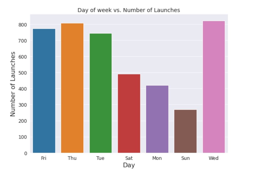
We see that majority of the launches are on weekdays, and fewer launches are on Saturday, Sunday and Monday.
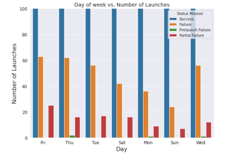
Now, let us see the proportion of mission status.
plt.figure(figsize=(8,6))
ax = sns.countplot(x='Day',hue="Status Mission",data= df)
ax.axes.set_title("Day of week vs. Number of Launches",fontsize=14)
ax.set_xlabel("Day",fontsize=16)
ax.set_ylabel("Number of Launches",fontsize=16)
ax.tick_params(labelsize=12)
plt.tight_layout()
plt.ylim(0,100)
plt.show()
Output:
Now, let us see the number of launches per month.
plt.figure(figsize=(8,6))
ax = sns.countplot(x='Month',data= df)
ax.axes.set_title("Month vs. Number of Launches",fontsize=14)
ax.set_xlabel("Month",fontsize=16)
ax.set_ylabel("Number of Launches",fontsize=16)
ax.tick_params(labelsize=12)
plt.tight_layout()
plt.show()
Output:
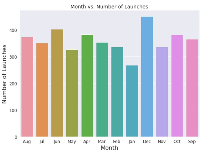
The number of launches per month is quite random, but we can see maximum launches were held in December.
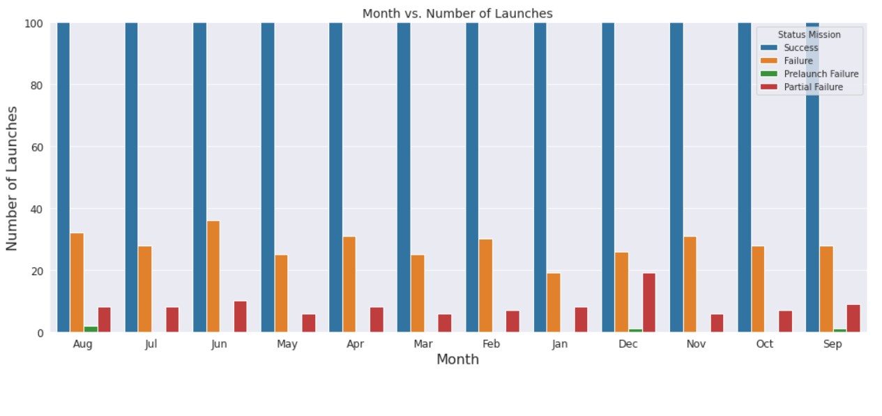
Now, let us see the distribution of mission status.
plt.figure(figsize=(14,6))
ax = sns.countplot(x='Month',hue="Status Mission",data= df)
ax.axes.set_title("Month vs. Number of Launches",fontsize=14)
ax.set_xlabel("Month",fontsize=16)
ax.set_ylabel("Number of Launches",fontsize=16)
ax.tick_params(labelsize=12)
plt.ylim(0,100)
plt.tight_layout()
plt.show()
Output:
Next, we see the date of the month when launches are done.
plt.figure(figsize=(12,6))
ax = sns.countplot(x=df['Date'])
ax.axes.set_title("Date of Month vs. Number of Launches",fontsize=14)
ax.set_xlabel("Date of Month",fontsize=16)
ax.set_ylabel("Number of Launches",fontsize=16)
ax.tick_params(labelsize=12)
plt.tight_layout()
plt.show()
Output:
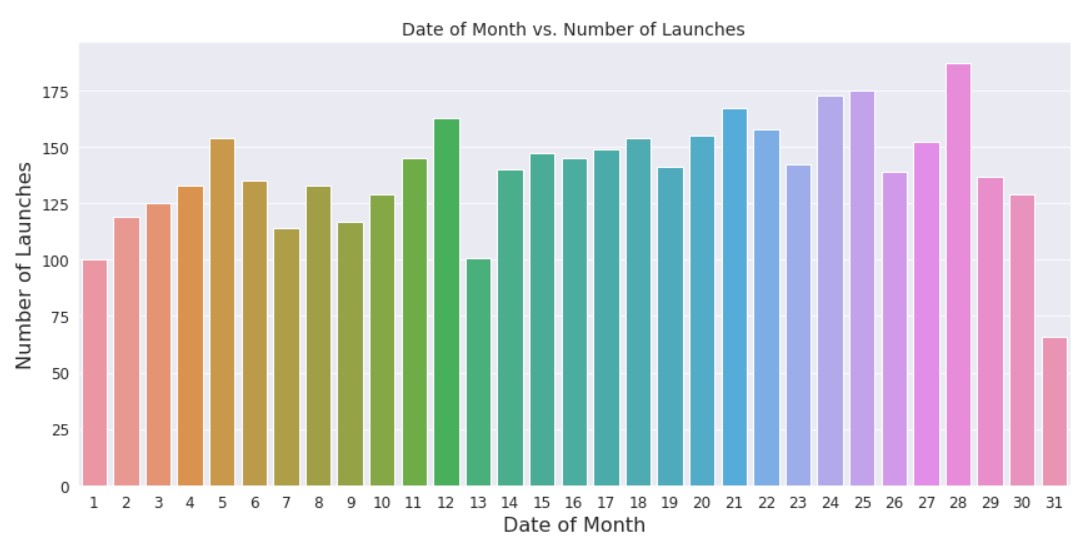
The distribution seems to be pretty random. The launch date seems to be more dependent on the day of the week.
Plotting the World Map:
Regarding the number of launches per country, it would be easy to understand if it was plotted on a world map. Let us implement that.
First, we get the country codes.
def iso(country):
    return countries.get(country).alpha3
df['ISO'] = df.Country.apply(lambda country: iso(country))
Now, we get the value counts.
iso = df.ISO.value_counts()
px.choropleth(df, locations=iso.index, color=iso.values, hover_name=iso.index, title='Number of Lauches', color_continuous_scale="emrld")
Output:
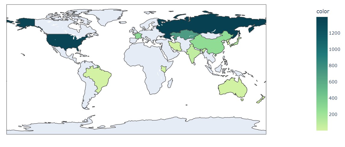
This visual makes many things very clear. US and Russia/USSR have clearly led the space race.
Sun Burst chart:
A sunburst chart is a great way to analyse hierarchical data. They consist of concentric layers of circles. The chart segments have each one data category. Let us plot the missions.
fig = px.sunburst(sun, path = ["Country", "Company Name", "Status Mission"], values = "Datum", title = "Sunburst Chart")
fig.show()
Output:
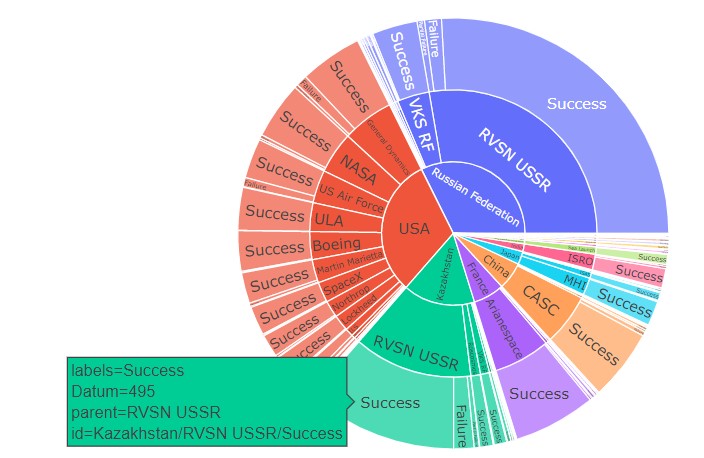
One thing to be pointed out is that this chart is interactive. Do check out the notebook.
Since the 1950s space has been an aspect of competition between developed nations. First, during the cold war, the US and the USSR sent out a lot of missions. As time passed, other nations started their own spac`e missions.
China, Japan and India have successful space missions now. Prominent space organisations are RSVN USSR, NASA, US Air Force, Arianespace, ISRO, MHI etc.
The USA, USSR/Russia, China and France have launched a large number of space missions. Let us have a look at the space mission history of these countries.
df_imp = df[(df["Country"] == "USA") | (df["Country"] == "Russian Federation") | (df["Country"] == "China") | (df["Country"] == "France")]
In this way, we are able to get the data points for only these specific countries we need.
First, we need to analyse the Space Organisations in these countries.
test = pd.DataFrame(df_imp.groupby(["Country","Company Name"])["Location"].count())
test.rename(columns={"Location":"Mission Numbers"}, inplace=True)
With this, we get the data. Now, we proceed with the plot.
test = test.reset_index()
fig = px.bar(test, x="Mission Numbers", y="Country",
             color='Company Name', text="Company Name")
fig.update_layout(
    title='Mission Numbers by Countries and Corp Names',
    yaxis=dict(
        title='Countries',
        titlefont_size=16,
        tickfont_size=14,
    ),
)
fig.show()
Output:
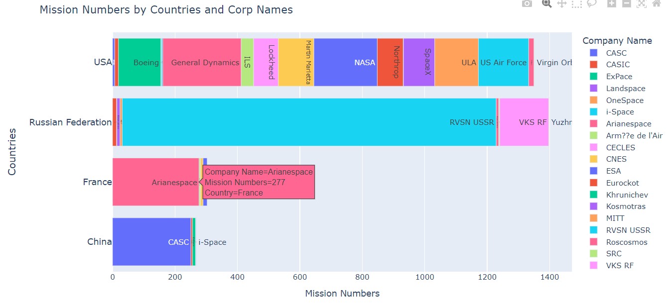
We get the desired plot, and the chart is interactive. We can see that USA and Russia/USSR had the most number of space organizations and launches. France and China are next. Notable space organizations are RSVN USSR, NASA etc.
Let us analyze the launch sites.
test = pd.DataFrame(df_imp.groupby(["Country","Location"])["Location"].count())
test.rename(columns={"Location": "Mission Number"}, inplace = True)
test = test.reset_index(level=[0,1])
test = test.sort_values("Mission Number", ascending = False)
fig = px.bar(test, x='Mission Number', y='Location', color ='Country')
fig.show()
Output:
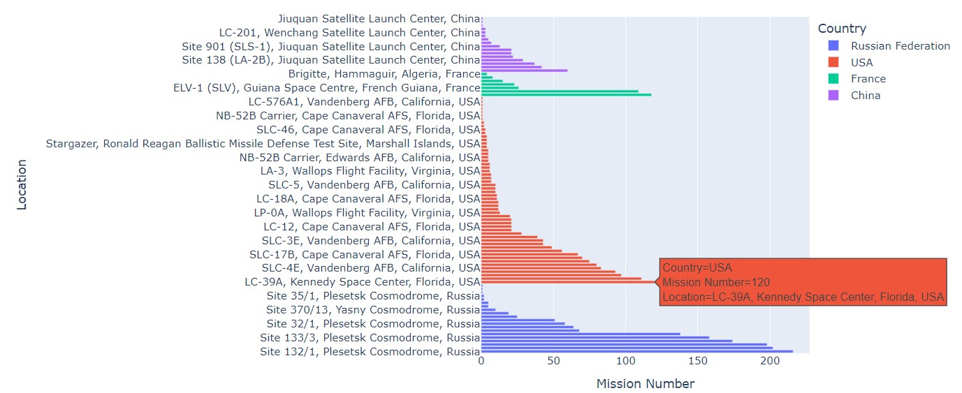
Kennedy Space centre seems to be a popular site for launches.
Let us finally see the number of launches by each of these countries in each year.
test = pd.DataFrame(df_imp.groupby(["Country", "Year"])["Location"].count())
test = test.reset_index(level=[0,1])
fig = px.bar(test, x='Year', y='Location', color ='Country')
fig.show()
Output:
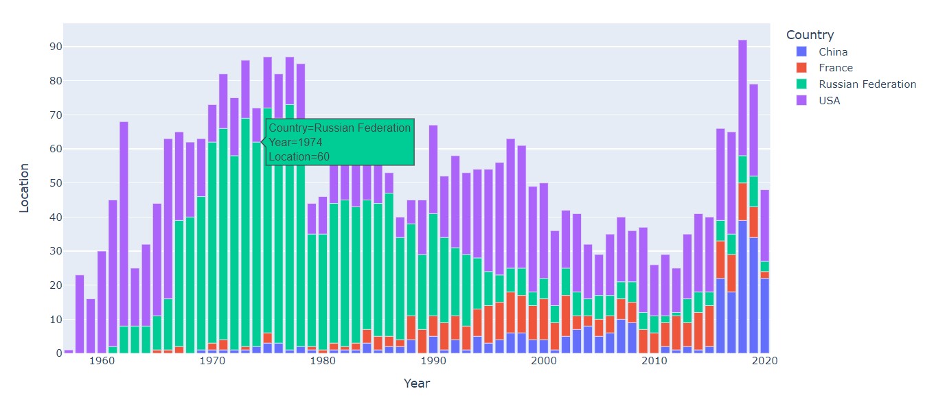
Russia/USSR had more launches than the USA in the space race. In recent times, China has also caught up.
The future of space exploration seems very bright. Asteroid mining will be the next big thing in space colonisation. The future will bring lots of opportunities and room for growth.
NASA and ESA are working on the Artemis space program. A large number of funds have been allocated. Artemis III will be the space mission that will take humanity to the moon again.
Have a look at the notebook:
https://www.kaggle.com/prateekmaj21/venturing-into-space-human-space-missions
About me
Prateek Majumder
Analytics | Content Creation
Connect with me on Linkedin.
My other articles on Analytics Vidhya: Link.
Thank You.
Prateek is a final year engineering student from Institute of Engineering and Management, Kolkata. He likes to code, study about analytics and Data Science and watch Science Fiction movies. His favourite Sci-Fi franchise is Star Wars. He is also an active Kaggler and part of many student communities in College.


