Plotting Images Using Matplotlib Library in Python
This article was published as a part of the Data Science Blogathon.
Introduction to Matplotlib
Matplotlib is a widely used data visualization library in python. This article illustrates how to display, modify and save an image using the ‘matplotlib’ library. We will see how to use the ‘image’ module as it makes working with images quite easy. We can perform a variety of operations on an image. We can make modifications like changing the color, size, cropping the image, etc., and also save the modified image as a new image file.
- Importing the Libraries
- Importing the Image Data Into Numpy Arrays
- Displaying the Image
- Selecting a part of the Image
- Adding a Color Scale
- Removing the Axes
- Converting a Color Image into a Grayscale Image
- Saving an Image
- Plotting the Histogram of the Image Data
Importing the Matplotlib Library
We will start by importing the required libraries.
import matplotlib.pyplot as plt
import matplotlib.image as mpimg
We will be using the ‘image’ submodule of matplotlib library which supports the basic operations on images like loading, rescaling, and displaying the image. We will alias it as ‘mpimg’ for convenience.
We will also use the pyplot submodule as it supports the different kinds of plotting.
To turn on the inline plotting use the following code.
%matplotlib inline
This magic command displays the plots just below the cells where you have coded your plotting command.
Importing the Image Data Into Numpy Arrays
Before displaying the image first you need to read the image.
Images are made up of pixels and each pixel is a dot of color. Each pixel in a color image is made up of 3 colors namely red, green and blue. When these three colors are combined, you can get any color you want.
When an image is stored in a computer, it is saved as an array of numbers. So each pixel can take any value between 0 and 255 where 0 represents the darkest and 255 represents the brightest.
For a grayscale (black and white) image, the pixel takes a single value in the range of 0 to 1. In grayscale images, 0 represents the black color and 1 represents the white color. Other values in the range represent different shades of a gray color.
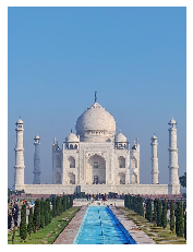
We will try to plot the following image.
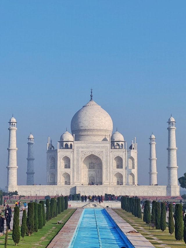
It’s a 32 bit PNG image having RGBA format (8 bits for each channel which means 32 bits for each pixel ). It is a 4-channel format where R stands for Red color, G stands for Green color, B stands for Blue color, and A stands for the alpha channel which describes the opacity for a color. Opacity can range from 0.0 to 1.0, where 0 stands for fully transparent and 1 stands for fully opaque.
https://unsplash.com/photos/t0dIdyfHHms
Using ‘imread’ method, we will read the image from the given image file into an array.
It takes two parameters, ‘fname’ and ‘format’. ‘fname’ is the name of the image file. If your image file is in the same working directory, you can just provide the name of the file, else you will need to provide the path of the file along with the file name.
#Reading the image
img = mpimg.imread('Taj.png')
#Printing the image array
print(img)
 [[0.41568628 0.5294118  0.31764707 1.        ]
  [0.41960785 0.5294118  0.29803923 1.        ]
  [0.38431373 0.48235294 0.21568628 1.        ]
  ...
  [0.5254902  0.46666667 0.2509804  1.        ]
  [0.5686275  0.50980395 0.29411766 1.        ]
  [0.56078434 0.5019608  0.28627452 1.        ]]]
This function returns a multidimensional NumPy array. The shape of the returned NumPy array depends on the type of the image, that is, whether the image is grayscale, RGB, or RGBA (RGB with an alpha channel to specify the opacity for the color).
The following code will display the shape of the image data.
print(img.shape)
(853, 640, 4)
Each pixel of the image is represented by an inner list. Since we have an RGBA image, there are 4 values in each of the inner lists. The first value represents the value of the Red color channel, the second value represents the value of the Green color channel, the third value represents the Blue color channel and the fourth value represents the alpha channel for opacity.
The data type in the lists is float32 because matplotlib rescales the 8-bit data from each channel to floating-point data between 0.0 and 1.0. For RGB and RGBA images, matplotlib supports both float32 and uint8 data types. For grayscale images, matplotlib supports only float32.
Displaying the Image Using Matplotlib
Since we have the image data in the NumPy array, we can render it using the ‘imshow()’ function. We will use the pyplot object as that makes it easy to manipulate the plot. You can plot any NumPy array. The array may contain RGB data, RGBA data, or a 2-D scalar data (for grayscale images).
#Displaying the image
imgplot = plt.imshow(img)
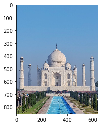
Selecting a part of the Image
Axes are helpful if you want to select only a part of the image. You can use them as a guide while slicing the image.
For the given image, if you want to display only the TajMahal excluding the other parts of the image then you can use the ticks and labels displayed on the axes to decide which part of the image to slice. The third parameter shows the color channels. Here, we are selecting all the color channels.
selected_part = img[290:680 , 10:630 , : ]
plt.imshow(selected_part)
You can see that the image has been perfectly sliced and it’s showing only the TajMahal.
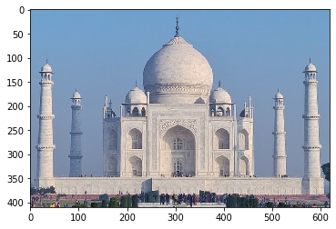
Adding a Color Scale using Matplotlib
If you want to know what value a specific color represents, you can add a colorbar to the image using the following code:
imgplot = plt.imshow(img)
plt.colorbar()
We can see that a colorbar is added to the right of the image and it displays values in the range of 0 to 1 for all the colors of the given image.
Removing the Axes with Matplotlib
If you do not want the numbered axes to be displayed in your image, you can get rid of the axes by using the ‘axis’ method and setting its parameter value as ‘off’.
plt.axis("off")
plt.imshow(img)
After executing the code, we can see that the axes are gone in the above image.
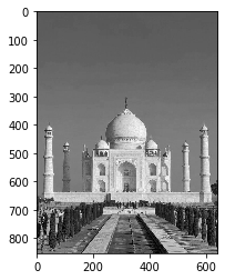
Converting a Color Image into a Grayscale Image
We can use slicing to turn the 3-D array of RGB color image into a 2-D array of grayscale image and thus convert the color image into a grayscale image.
We will select only one of the three dimensions and the color map parameter as ‘gray’ in the following code to make it a grayscale image.
grayscale_img = img[:, :, 0]
plt.imshow(grayscale_img, cmap='gray')
Saving an Image
You can apply different pseudocolor schemes to the image. It makes it easy to visualize the image data by enhancing the contrast. If you don’t provide a colormap value, the default value ‘viridis’ is used. Let’s see how it affects the image by executing the following code.
plt.imshow(grayscale_img)
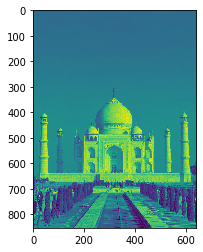
There are many colormap values that you can choose and apply to your image. For more information on colormap values you can visit https://matplotlib.org/stable/tutorials/colors/colormaps.html
Let’s see how the image changes after applying the cmap value ‘hot’. We will also save the changed image into a file. If you don’t provide the path for the file, it will be saved in the current working directory.
plt.imshow(grayscale_img,cmap ='hot')
plt.savefig("New_Image.png")
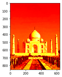
After executing the above code, a new image file with the name ‘New_Image.png’ gets created and stored in the current working directory.
Plotting Histogram of the Image Data with Matplotlib
You can also plot the histogram of the image data using the hist() function. It’s useful for examining a specific range of data to enhance or expand the contrast in a particular region.
Let’s create and plot a histogram of the grayscale image that we created above using the following code.
(array([ 10133.,  21041.,  22268., 158668., 200710.,  38916.,  21800.,
         32729.,  34041.,   5614.]),
 array([0. , 0.1, 0.2, 0.3, 0.4, 0.5, 0.6, 0.7, 0.8, 0.9, 1. ],
       dtype=float32),
 )
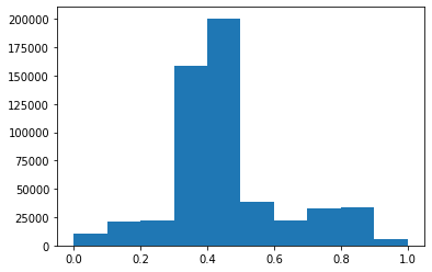
ravel function returns a flattened array of the image data.
References
https://matplotlib.org/stable/tutorials/introductory/images.html
Endnote


