The Phocas homepage gets a facelift
Home pages on software applications are like tidy, well laid out kitchens. If you can find all the tools and ingredients you need to make dinner, cooking is much simpler. When the spices are labelled in the pantry and the pots are in their specific drawer, the essentials are accessible, giving you time to make an accompanying sauce. It’s the same with a home page – the more intuitive it is, the more it will reduce your cognitive load and increase your efficiency. With information at your fingertips, navigation to places and items of interest is much quicker.
What is a home page?
When we describe the home page, we are referring to the page you are landed on once you've logged into the software application.
We consider the home page to be your control centre, the place where you get
-
the most important information relating to your organisation in an instant
-
the point where you can jump off to the information or feature you are most interested in
-
search and find all the items available to you
-
the place where you return to gauge what needs to be done next at a glance.
How does the Phocas homepage work?
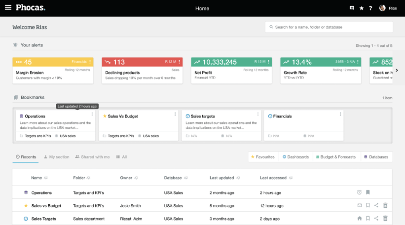
We understand that users on the Phocas homepage can have a whole host of items to navigate through, to find what they are looking for; whether it is an alert, favourite, dashboard or database, it can become crowded and difficult to search and navigate a mature organisation's assets quickly and effectively. So, the new Phocas homepage is all about simplicity and efficiency.
The goals we have achieved for this page include:
-
be faster to load than the previous homepage, to make sure our users get to where they need to be, fast
-
intuitive and clean layout so our users can visually navigate the page more easily
-
more prominent alerts and notifications, so our users are aware of the most important information
-
customisability of items on the page via bookmarks, so our users can take control of what items they want to see and interact with.
How to use the homepage well?
We want the homepage to be your spring board to view your most important information, like alerts so people get to items and tasks quickly.
Our recommendations for a useful homepage, is to keep it groomed and remove as much clutter as possible.
We understand how important alerts are, and so we’ve devoted a large amount of screen real estate to display them. We recommend constantly reviewing alerts, because when there are too many alerts, it starts to lose efficacy and urgency.
We want users to select and control their most frequently used items, and so, we’ve created the idea of bookmarks - this allows a user to pin items that they want fast access to, without constant searches. However, we’ve imposed a limit of 5 bookmarks, so that it focuses the user to choose only the most important items, allowing the page to stay intuitive, clean and functional.
Our research of customer behaviour shows that people tend to revisit pages and items more frequently than navigating to somewhere new. With this intelligence, we’ve made the decision to load the recent items by default first. This allows the majority of users access to items they visit regularly, as well as keep the loading time of the page down. Organisations with an extensive amount of items and assets will continue to load data efficiently.
What are the homepage changes?
- updating our design language, following newer, and more widely accepted user experience best practices
- updating the technology the homepage is built on - allowing us access to better and more resilient components, as well as the ability to release at any time, without any downtime on the homepage; this means, improvements can be made as well as bugs and issues can be resolved much faster
- introducing more visual representation of data on our homepage, via how prominent and informative our alerts are
- customization of bookmarks
- ability to filter on dashboards/favourites/databases
- new capabilities - that will allow users to consume and respond to information in better ways such as being able to view:
-
‘My Section’ - a section reserved for all items created by the logged-in user
-
‘Shared with me’ - a section reserved for all the items that have been shared with that person
-
‘All’ - where I can go to view all items I have access to
People will soon be able to filter on the new sections above plus Favourites, Dashboards, Budgets and Databases giving people more flexibility to search and find what they are looking for more efficiently.
-
Customer feedback from the new homepage
This is really nice. Will you be able to add widgets to this screen or can you add recent favorites to a dashboard? This would be very handy on a dashboard home screen.
I like this - easier to get to the most commonly used things. I would put a subscribe section out so you can see things you are getting and how often.
Looks much more modern.

Craig is an expert in data analytics helping customers determine specific data requirements so they can enhance performance, productivity and confidence.

Financial statement analysis: what's changing?
Financial statements are scorecards for businesses, allowing the finance team to interpret and analyze financial performance.
Read more
We'll do the data wrangling, you do the analyzing
In today’s business world, we are faced with the constant struggle to bring our data into line. The sheer volume of data that businesses generate can be overwhelming to simply manage, never mind analyze. A survey by Phocas revealed that 60% of businesses identified ‘no expertise in-house,' and 33% said, ‘too much data to unravel' as the main obstacles that prevent them from breaking down data silos.
Read more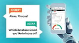
Behler-Young connects Amazon Alexa and Phocas BI with great results
Can you have a conversation with your business intelligence solution while driving? Behler-Young sales people do. Robert Wright, a Senior Application Developer and Analyst at Behler-Young, integrated Amazon Alexa with Phocas, a business intelligence solution for manufacturers, distributors and retailers. With critical data only a question away, they always know what's going on even when they're on the road.
Read more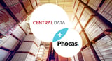
Central Data all in on Phocas partnership
Central Data has annually been recognized as one of Infor’s top distribution partners, being named North American Partner of the Year in 2020. The company’s consistency is a hallmark of its success and is a key reason for its longevity. It will celebrate its 50th anniversary in January 2023.
Read more
Find out how our platform gives you the visibility you need to get more done.
Get your demo today