

TL;DR:
Gather data from inside and outside the firewall
Understand (and document) your sources and their limitations
Clean up the duplicates, blanks, and other simple errors
Join all your data into a single table
Create new data by calculating new fields and recategorizing
Visualize the data to remove outliers and illogical results
Share your findings continuously
If you aspire to be a data scientist, you’re really aspiring to be a data wrangler. You see, 80% of your working hours will be spent wrangling the data. That’s on average. On some projects, you will spend more than 100% of your “working” hours with your lasso. I hope you enjoy that sort of thing.
So what is data wrangling? Let’s imagine the process of building a data lake. Let’s further pretend you’re starting out with the aim of doing a big predictive modeling thing using machine learning.
First off, data wrangling is gathering the appropriate data. Don’t limit yourself to just the ERP or internal systems. Consider buying data or pulling it from open sources. It’s surprising what people are willing to share. Just keep in mind that the more you gather, the more work you’ll do making it useful. This is the base level, creating your own little data swamp.

Next, start learning about your data sources. Where did it come from? How was it encoded? (By human or machine?) How is it stored? Are there discontinuities? Maybe they converted from an AS/400 at some point and everything thereafter has more decimals or more values. Once you’ve documented and understood your sources, you have reached the second stage: data sloughs (note, you have more than one).
Now comes the fun part: cleaning up your data. This means getting rid of the duplicates, dealing with the blanks, and fixing data type problems. It might mean harmonizing dates like 02/03/04 (Canada) and 02/04/03 (US), time zones, or even daylight savings time. Count the records in each of your tables and make sure the totals make sense. Maybe your extract only took the last year instead of the last five. Your goal here is to fix the obvious issues in each of the data elements. This is just cursory cleaning, but you now have reached stage three: data ponds.
After cleaning, it’s on to organizing your data. For most analyses (and to help with your cleaning) this means a single table. One. One table to rule them all.
Start by unwinding your cross-tabs so that each data element is only in a single column. Set up keys and then join the tables together. You might have to use dates or lat-longs or fuzzy join on names or addresses. You might end up with a really wide table with repeating elements. That’s fine. Space is cheap.
Make sure each variable (column) is properly described and understood. Is rec_date the date the order was received or the date the record was created? You might even want to build a data dictionary.
This is boring work, but once you’re done it, you’ve reached level four. Your ponds are now consolidated into a single data pond.
Now it’s time to create new data. What? Create new data? You heard me right. Very rarely will your dataset contain all the variables you want. The real gold is when you combine existing fields to form new ones. Here are some examples to prime your thinking:
If you have drive time and distance, calculate the average speed.
If you have revenue and quantity, calculate the average price.
If you have yearly revenues, create a percentage change in revenue
If you have age specific population by year, subtract this year’s eighteen-year-old population from last year’s seventeen-year-olds to get a net migration.
If you have donation data where extreme values dominate, put them into log space.
You get the picture. You are value-adding like a boss here.
Pay special attention to categorical data – it can be incredibly valuable. It often makes sense to create new categories out of continuous variables (high, medium, or low), or to consolidate existing ones. Sometimes, you need to re-categorize the past to match up to the current category definitions. Other times, you need to group something up from 90 categories to five super-categories.
Let your original business question be your guide, but don’t be afraid to venture outside of the specific problem. Follow your intuition. Sometimes you’ll identify trends or errors in these new data elements that weren’t obvious in the raw data.
Weeks will pass.
Finally, you have your dataset assembled. You’ve cleaned up the obvious issues and you have a pretty good idea of what you have. Can you start modelling now?
No, not even close. You’re only at level five. You’ve got yourself a little data lake, but its waters are brackish.
It’s time to start digging into the data content. This will perhaps be the longest stage, but it accomplishes two things: it ensures each variable (including your new ones) is internally consistent and it ensures that your relationships are logical.
Proceed visually. Summary statistics are not your friend – they may in fact lead you astray.
Internal consistency is achieved through histograms and the like. Start by plotting a frequency distribution of each variable, one at a time. Look closely at these for gaps, peaks, or outliers. Sometimes you’ll get a normal or lognormal distribution, sometimes it will be uniform. Ask yourself what you should expect to see before you peek.
Let’s say you want to plot net migration by age. What do you expect to see? Uniform? Perhaps some age-related shifts around university?
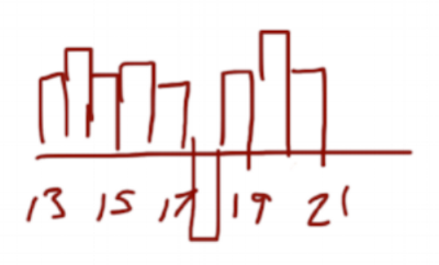
Suppose it looks like the chart above. Does that make sense? People leave for school at eighteen, but then drop out and return? Something’s fishy here.
In reality, the gap is where people transition from their parents’ plan to their own. They don’t migrate; they’re just delinquent in doing the paperwork that populates the database when they turn eighteen. The result looks like out-migration, but it’s simply an artifact of the data collection process.
A lot of times, you won’t be able to differentiate between the interesting and the erroneous. Ergo, you must engage people who work in the business. You should be showing charts and graphs to them on a regular basis. The people who generate the data will have insights that neither you nor the IT people will have. There’s nothing worse than identifying a huge opportunity for savings only to find out it’s a categorization change.
After looking at each variable on its own, you can move on to relationships. How do the data elements interrelate?
Once again, stay away from the summary stats. Plot your variables through time or in pairs. Then inspect them closely. How have things changed through time? Are there step changes in the relationships? Are the relationships as you would expect (taller people weigh more, higher prices means fewer sales, calls increase as population grows, etc.)? Are things related that shouldn’t be?
You might see something like this:
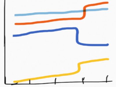
Huh…It looks like sales of the dark blue have really dropped off. We should probably start promoting it like crazy. Or should we? On closer inspection, the change occurs at the exact time that yellow and orange pop up. In reality, several products in the blue grouping were re-categorized as either yellow or orange. Sales are growing steadily, our definitions simply changed.
By now, you’re starting to glean insights from the data. You’re finding trends and relationships you didn’t know about. Keep going. Dig deeper. Start looking at larger combinations of variables or try out a tree building algorithm. You’re beginning to really understand the data and the business at this point. You’re probably still finding errors that you need to correct, but things are at least interesting. And you're engaging the business operations in your endeavour. Welcome to level six. You’ve built yourself a drinkable, swimmable data lake.

(As an aside, you should be keeping a logbook of all the types of data errors you’re finding. Group them up by type of error (miskey, date issue, blank, etc.) and then run them by the IT folks. Hopefully they can fix them going forward to make it easier on the next data scientist.)
This process may have taken several month now. But you’ve been constantly talking to your stakeholders and showing them your progress. Right?
Right?...
Don’t tell me you spent months plugging away without ever showing some results! If you did this, you’re lucky to still have a job.
Come up for air. Show your boss or client or stakeholders what you’ve found. Use this as an opportunity to revisit your original business problem. Oh yeah. Did you forget this whole endeavor was about building a predictive machine learning model? Don’t worry, your boss didn’t.
The truth is, there are insights in all of that cleaning and digging. Share them. Keep showing off as new stuff trickles in. At the very least, you’ll gain your stakeholders’ confidence. In the best case, you’ll find more value than even your initial project envisioned.
This is level seven – when you interact with your stakeholders using data.
Welcome to level seven.
To this point, you’ve done only simple math. All your algorithms and learning machines are still in their holster. But you now have a deep understanding of the organization, its processes, and its history. You’ve gained the trust of the business users who will have to accept and implement whatever magic you create. You have a direction for where you’ll do the heavy analysis going forward.
And the truth is, you might actually be done already.