A Gentle Introduction to Bokeh: Interactive Python Plotting Library
This article was published as a part of the Data Science Blogathon.
Data visualization is an important and useful stage in a Data Science project. It allows the researcher to have a skimmed view of the dataset and trace out all the possible strategies to manipulate the data.
There are many visualization libraries present in the market right now. Being in the initial stage of a Data Science project, you may be familiar with matplotlib or seaborn. Every beginner starts with these libraries and they are indeed a good starting point for understanding what plotting is all about and discovering different types of plots.
As we progress with our exploration journey, we always want to upgrade ourselves in terms of new skills and that’s where this article will add a new skill to your current knowledge! Bokeh is a Python library that facilitates the creation of interactive graphs within your Jupyter notebooks or you can also create a standalone web app. Let’s discover this library. Also, I will share a code snippet for each type of plot.
Introduction to Bokeh
Bokeh is an interactive visualization library made for Python users. It provides a Python API to create visual data applications in D3.js, without necessarily writing any JavaScript code. Bokeh can help anyone who would like to quickly and easily make interactive plots, dashboards, and data applications. The installation for this library is simple and can be done via pip:
pip install bokehOpen up a new Jupyter notebook and configure the output of the graphs as shown below:
from bokeh.io import output_notebook, show
output_notebook()
The Dataset
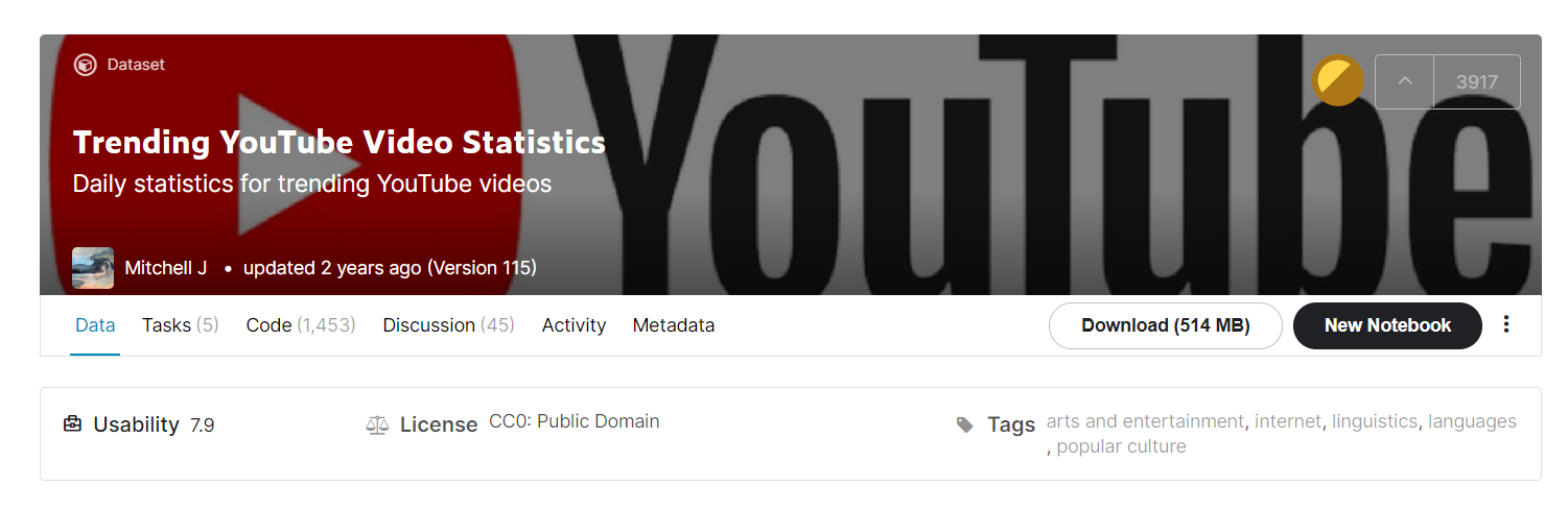
The dataset we will be exploring today is Trending YouTube Video Statistics. The hyperlink will land you on Kaggle from where you can directly download the dataset. One thing to note here is that the dataset has CSVs for multiple countries. For this article, we will be exploring India’s Trending videos.
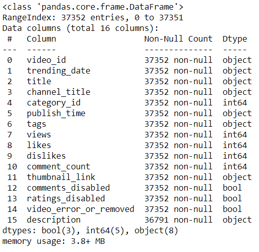
The corresponding CSV to that is “INvideos.csv”. Let’s look at the df.info() for all the information about columns:
Date-Time conversion:
The current date in the dataset is like this: 17.14.11 It is in the format of year-month-day and pandas may not recognize this. That’s why we will specify the format while converting:
df["trending_date"] = pd.to_datetime(df.trending_date, format='%y.%d.%m')
Mapping Categories: The column category_id has numbers between 1 to 44. As the name suggests, these are ids of the categories of a video. These include entertainment, news, films, or trailers. In the Kaggle dataset, there is a JSON file named IN_category_id.json which contains the mapping of these ids to relevant categories for India. In the code below, the JSON is loaded, extracted the required information and then appended changes:
with open("IN_category_id.json", 'r') as f:
    categories = json.load(f)
mappedCategories = {}
for i in categories['items']:
    mappedCategories[i['id']] = i['snippet']['title']
df['category_id'] = df.category_id.astype(str).map(mappedCategories)
We have ample features to be plotted for various kinds of plots available. Let’s see how to implement each type of plot using the Bokeh library.
Different Kinds of Plots
I am setting the theme of the plots as dark mode using these lines of code:
from bokeh.io import curdoc
curdoc().theme = 'dark_minimal'
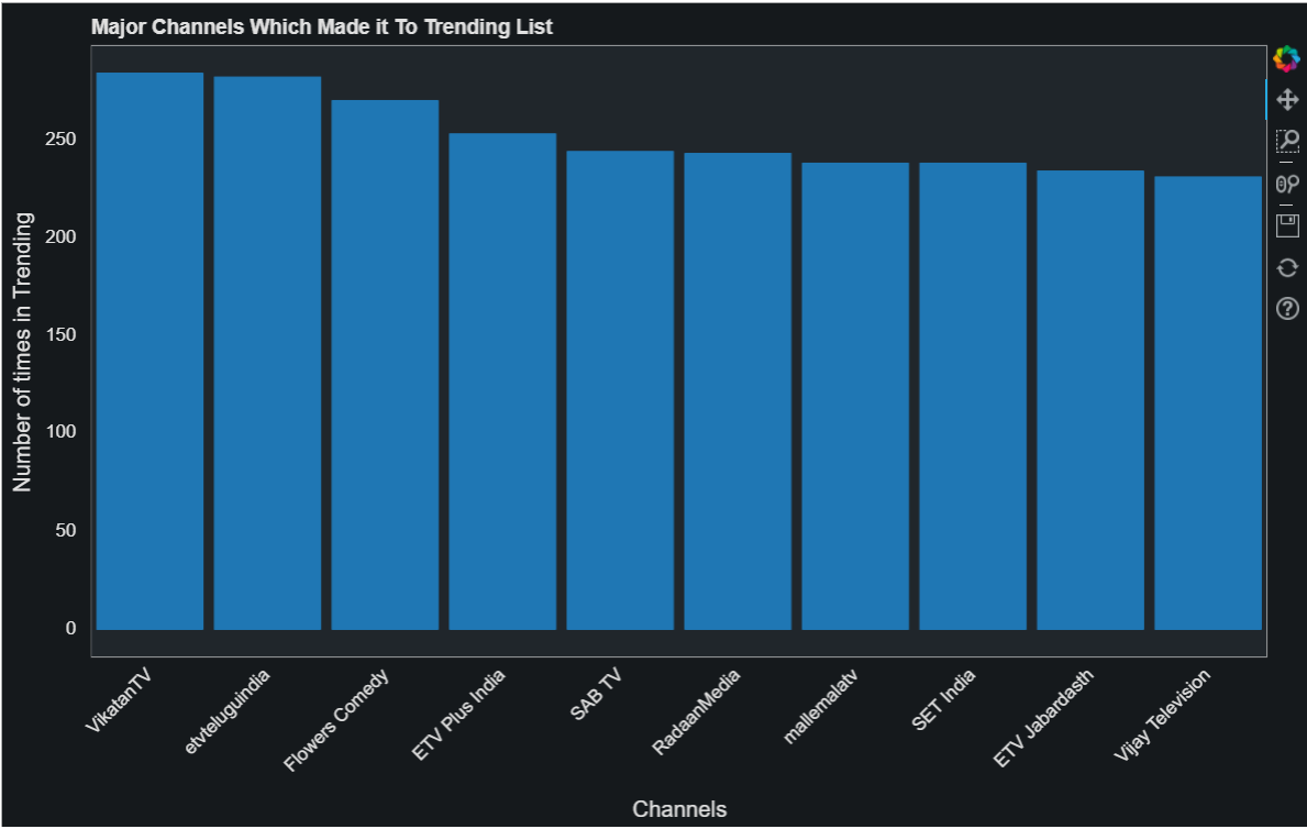
1. Bar Plot
In this bar plot, we will plot the Channel names with the number of times they appeared in the trending section. Many unique channels appeared in the trending section and therefore, I have set two criteria for this. One, they should have a count greater than 150 and sliced down to the top 10 entries.
from bokeh.io import show
from bokeh.plotting import figure

temp = df.channel_title.value_counts()[df.channel_title.value_counts() > 150][:10]
fig = figure(x_range=temp.index.tolist(),
title="Major Channels Which Made it To Trending List",
plot_width=950)
fig.vbar(x=temp.index.tolist(),
top=temp.values.tolist(),
width=0.9,
)

fig.ygrid.visible = False
fig.xgrid.visible = False
fig.xaxis.major_label_orientation = pi/4
fig.xaxis.axis_label = 'Channels'
fig.yaxis.axis_label = 'Number of times in Trending'

show(fig)
2. Pie Chart
Pie charts help in looking at a category contribution in a feature. The area covered by each category helps us to determine the overall impact of that category on other ones. It can be called a visual presentation of the percentages. In the plot below, we are looking at different categories of videos that made it to the trending section.
from bokeh.io import show
from bokeh.palettes import Category20c
from bokeh.plotting import figure
from bokeh.transform import cumsum
temp = df.category_id.value_counts()
data = pd.Series(temp).reset_index(name='value').rename(columns={'index':'categories'})
data['angle'] = data['value']/data['value'].sum() * 2*pi
data['color'] = Category20c[len(temp)]
p = figure(title="Categories Contribution to Trending Section", toolbar_location=None,
           tools="hover", tooltips="@categories: @value")
p.wedge(x=0, y=1, radius=0.6,
        start_angle=cumsum('angle', include_zero=True), end_angle=cumsum('angle'),
        line_color="white", fill_color='color', legend_field='categories', source=data)
p.axis.axis_label=None
p.axis.visible=False
p.grid.grid_line_color = None
show(p)
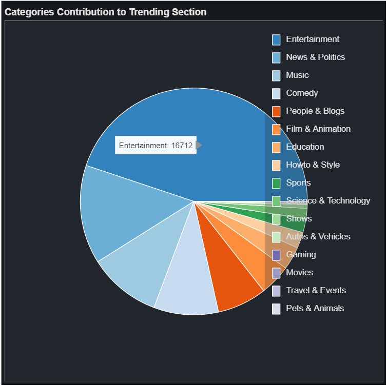
We can clearly see that entertainment videos are most commonly found in the trending section.
3. Scatter Plot
Scatter plots are very useful to analyze a trend over a range of values. In the plot below, the number of videos trending on a particular day. One thing to note here is that the date column was not supported as a string in hover tools and that’s why I had to create a separate column that contains the string type of the dates. Look at the implementation below:
from bokeh.plotting import figure, show
from bokeh.models import DatetimeTickFormatter
temp = df.trending_date.value_counts()
data = pd.Series(temp).reset_index(name='value').rename(columns={'index':'dates'})
data['hoverX'] = data.dates.astype(str)
p = figure(title="Trending Video Each Day", x_axis_type="datetime", tools="hover", tooltips="@hoverX: @value")
p.scatter(x='dates', y='value',line_width=2, source=data)
p.xaxis.major_label_orientation = pi/4
p.xaxis.axis_label = 'Timeline'
p.yaxis.axis_label = 'Number of Videos Trending'
show(p)

Looking at these codes, you must be thinking that it is not an easy task and requires a lot of inputs for each element of a graph. That’s why most of the users use pandas-bokeh which provides the Bokeh plotting backend to pandas. It is very easy to use and doesn’t require this much code!
Plots using pandas-bokeh
Pandas-Bokeh is a great module that allows you to plot Bokeh graphs directly from your data frames with all the hovering tools, labeled axis, and much more! In the first step, you need to install this module:
import pandas_bokeh
Next, we also need to set the output of these graphs in our notebook:
pandas_bokeh.output_notebook()
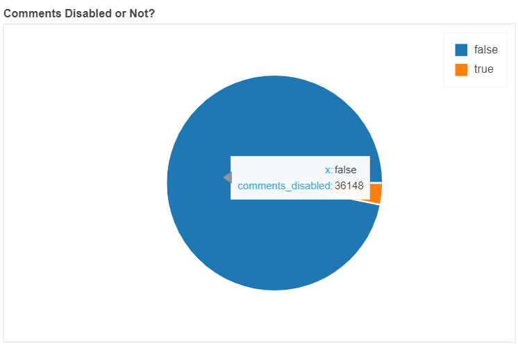
See an example plot below (using pandas-bokeh):
df['comments_disabled'].value_counts().plot_bokeh(kind='pie',
                                                  title='Comments Disabled or Not?');
Yes, only this much code was required for this pie chart! You can compare it with the pie chart made with pure bokeh in the above section.
Conclusion
In this article, I walked you through the plotting library Bokeh. Plotting graphs is an important aspect of a data science project and allows you to filter out important features. For instance, a box plot can help in eliminating outliers. The points outside the whiskers are considered as outliers as data between whiskers is 50% of the whole. Likewise is a histogram that helps in analyzing the distribution of data.
If you have any doubts, queries, or potential opportunities, then you can reach out to me via
1. Linkedin – in/kaustubh-gupta/
2. Twitter – @Kaustubh1828
3. GitHub – kaustubhgupta
4. Medium – @kaustubhgupta1828
Hi, I am a Python Developer with an interest in Data Analytics and am on the path of becoming a Data Engineer in the upcoming years. Along with a Data-centric mindset, I love to build products involving real-world use cases. I know bits and pieces of Web Development without expertise: Flask, Fast API, MySQL, Bootstrap, CSS, JS, HTML, and learning ReactJS. I also do open source contributions, not in association with any project, but anything which can be improved and reporting bug fixes for them.


