Project and Task Management With R Shiny
This article was published as a part of the Data Science Blogathon
Project management leads to project completion which leads to faster implementation and faster return on investment
Introduction:
Every project irrespective of how big or small, success depends largely on how well the project was planned, tracked and how well the resources were utilized.
There is various tools/software in the market which let you manage your projects. My objective in building this app is not to beat all other tools in the market but instead try to implement a basic version of the project management tool with R Shiny.
After trying my hands on small POC’s, I thought of testing my skills in building something a little more complex with a bit of product thought process. This blog/app will be a good starting point for someone interested in picking some skills on the shiny framework.
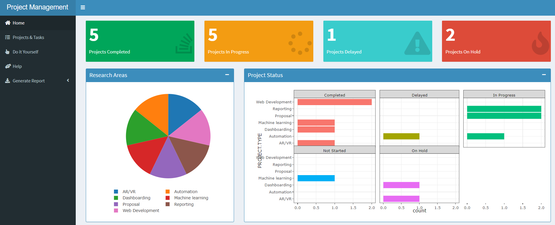
Here is the preview of the app which will build into this blog.
Any prerequisites:
You will need basic understanding of R and shiny. For a quick short example of a shiny App, please have a look at the simple R Shiny App.
Getting Started:
To keep the implementation very generic, I have created sample data with the fields which are very commonly used in any project management tool eg: Project Name, Project Number, Project Start Date, Project End Date, Budget, Project Type, and a few more.
Lets get started:
Sidebar Menu Items:
dashboardSidebar(
sidebarMenu(id= "tabs", width = 350,
	menuItem("Home", icon = icon("home"), tabName = "home"),
	menuItem("Projects & Tasks", icon = icon("tasks"), tabName = "projects_tasks"),
	#menuItem("Team", icon = icon("users"), tabName = "team"),
	#menuItem("Timesheets", icon = icon("clock"), tabName = "timesheets"),
	menuItem("Do it Yourself", icon = icon("hand-pointer"), tabName = "doitYourself"),
	menuItem("Help", icon = icon("hands-helping"), tabName = "help"),
	menuItem("Generate Report", tabName = "sectors", icon = icon("download"),
			 radioButtons('format', 'Document format', c('PDF', 'Word'),inline = FALSE, selected = 1),
			 downloadButton("report", "Download Report", class = "butt"),
			 tags$head(tags$style(".butt{color: blue !important;}"))))
),
Home Page:
The home page will have a snapshot of all the basic metrics that we usually track for projects such as a number of projects completed, In progress, On-hold or Delayed. We will use a Shiny widget called valueBoxOutput to track project status.
fluidRow(
  valueBoxOutput("Completed", width = 3),
  valueBoxOutput("WIP", width = 3),
  valueBoxOutput("Delayed", width = 3),
  valueBoxOutput("OnHold", width = 3)

),
We would also like to track the projects across categories, complexities, and other parameters. So let us create a bunch of pie charts, Donut charts, and bar charts using plotlyOutput().
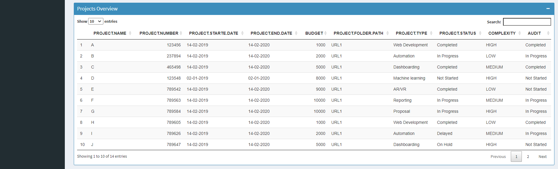
It would also help if we are notified of upcoming deadlines, overdue Tasks, etc. in the tabular form and for this, we will use DTOutput() which would have the option to sort and filter our data.
fluidRow(
  box(plotlyOutput("Project_category"), width = 4,solidHeader = TRUE, status = "primary", title = "Research Areas", collapsible = TRUE),
  box(plotlyOutput("Project_status"), width = 8,solidHeader = TRUE, status = "primary", title = "Project Status", collapsible = TRUE),
  box(plotlyOutput("Complexity"), width = 4,solidHeader = TRUE, status = "primary", title = "Project Complexity", collapsible = TRUE),
  box(plotlyOutput("Audits"), width = 4,solidHeader = TRUE, status = "primary", title = "Audit Status", collapsible = TRUE),
  box(plotlyOutput("Proj_task_cnt"), width = 4,solidHeader = TRUE, status = "primary", title = "Project & Tasks", collapsible = TRUE),
  box(DTOutput("upcoming_deadlines"), width = 6,solidHeader = TRUE, status = "primary", title = "Upcoming Deadlines", collapsible = TRUE),
  box(DTOutput("overdue_tasks"), width = 6,solidHeader = TRUE, status = "primary", title = "Overdue Tasks", collapsible = TRUE),
  box(DTOutput("Overview"), width = 12,solidHeader = TRUE, status = "primary", title = "Projects Overview", collapsible = TRUE)
)
Please refer the complete UI and Server code from GitHub repo. Lets take a quick look at home page before proceeding further.
Project & Tasks Page:
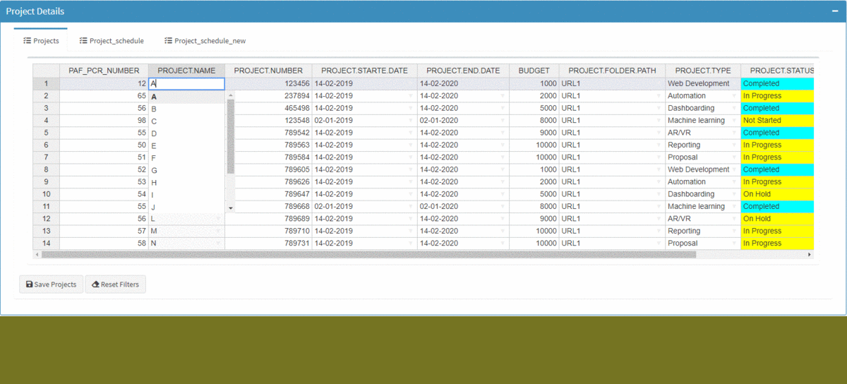
Every project will have multiple tasks under it which will be assigned to a lead & a team member with the start date and the end date. So here are the basic functionalities that we would prefer to have:
- The user should be able to select a project on the table which should result in filtering respective tasks in the table below.
- Project Status to automatically color code based on its completion or In Progress or Delayed or On-Hold.
- The user should be able to reset the selections with the click of a button.
- For any selected project, a Gantt chart should be automatically generated.
- There should also be a tab where the task load for each of the leads is showcased in the form of charts.
- Users should be able to select the columns and change their sequence in the table. This would help the user to group a bunch of columns for easier view.
- Users should be able to add, delete, update records similar to how it is done in MS Excel.
tabPanel("Projects", icon = icon("tasks"),
	box(withSpinner(rHandsontableOutput("Projects")), width = 12),
	actionButton("saveBtnProjects", "Save Projects", icon = icon("save")),
	actionButton("BtnResetProjects", "Reset Filters", icon = icon("eraser"))),
tabPanel("Project_schedule", icon = icon("tasks"),
	selectInput("selectProject", label = h5("Select Project"),choices = sort(unique(raw_data_projects$PROJECT.NAME), decreasing = F),
				selected = 1, width = "15%"),
	plotlyOutput("schedule")
),
Do It Yourself Page:
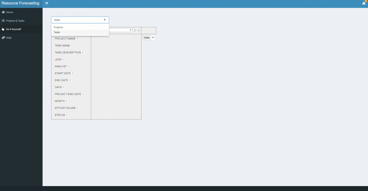
The application dynamically serves charts, tables, and alerts which helps us get a bird’s view of all the projects and related tasks. But, there will be times when we might want to cut and slice data for a specific scenario and in such cases, we generally take an extract of the data and carry out our analysis on the BI tool or most times in excel.
It will be helpful to have a basic feature like an excel pivot on the app itself which lets users experiment with data and visualize the outcome for a given scenario. To achieve this excel-like feature, we will use rpivotTable library.
tabItem(tabName = "doitYourself",
  fluidRow(
	selectInput("selectData", label = h3(""),choices = list("Projects", "Tasks"), selected = 1),
	box(rpivotTableOutput("pivot"), width = "100%", height = "100%")
 )
)
output$pivot <- renderRpivotTable({
  if (input$selectData == "Projects")
	{
		rpivotTable(dt_projects())
	}
else{
		rpivotTable(dt_tasks())
	}
	}
)
Here is the snapshot of the Do It Yourself feature.
With the intention of not making this blog too long, I have skipped explaining few other features. Please feel free to access the Github repo and explore further.
Conclusion:
The objective of the blog was to showcase how we can use shiny to build a web application with complex functionalities without the need for knowledge of HTML, CSS, and JavaScript.
We used ggplot for generating visuals, reactive objects for interactivity between plots, data frames for loading the tables. Also, there is a markdown component for report generation.
All one needs is a basic knowledge of R, shiny framework, sense of user experience, the touch of creativity and you have all the ingredients for an awesome app.
Happy learnings !!!!
You can connect with me – Linkedin
You can find the code for reference – Github
The media shown in this article are not owned by Analytics Vidhya and is used at the Author’s discretion.


