
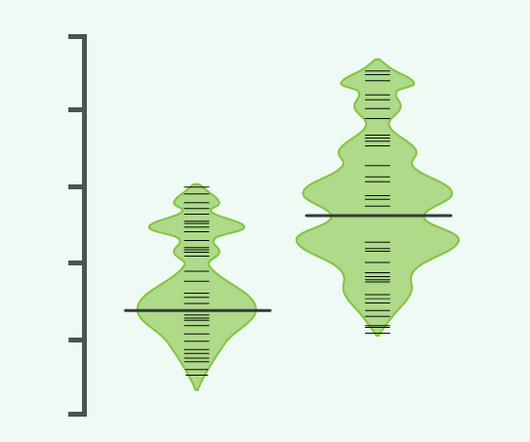
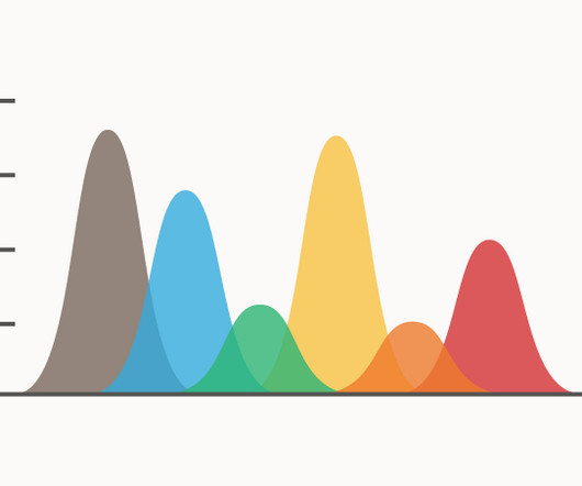
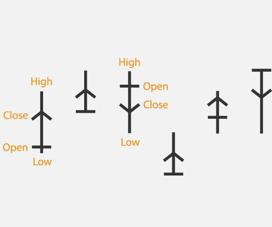
Chart Snapshot: Beanplots
The Data Visualisation Catalogue
APRIL 8, 2024
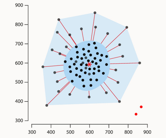
Fibronectin 1 mRNA expression correlates with advanced disease in renal cancer — BMC Related posts: Further Exploration #4 — Box Plot Variations The post Chart Snapshot: Beanplots appeared first on The Data Visualisation Catalogue Blog. Long, bold lines correspond to mean of each group.


Let's personalize your content