 The 4 Quadrants of Data Science Skills and 7 Principles for Creating a Viral Data Visualization
 The 4 Quadrants of Data Science Skills and 7 Principles for Creating a Viral Data Visualization
As a data scientist, your most important skill is creating meaningful visualizations to disseminate knowledge and impact your organization or client. These seven principals will guide you toward developing charts with clarity, as exemplified with data from a recent KDnuggets poll.
By Jose Berengueres, Professor & Angel Investor.
(A follow-up post on Which Data Science Skills are core and which are hot/emerging ones?)
I teach CS and Design Thinking. But today, I am on a mission to show how to do great charts because I dislike confusing charts. You may think of me as the Marie Kondo of charts or the Cole Knaflic of Dubai, and you might not be entirely wrong. In this post, I will share 7 principles* to go from Aha-charts to Wow-charts. Let’s get our hands dirty with a dataset from a recent KDnuggets poll.
The poll had just two questions:
- Which skills/knowledge areas do you currently have? and
- Which skills do you want to add or improve?
KDnuggets received 1,500 answers, and we will use the aggregates by skill [1].
Table 1. Aggregates of the survey.
| Skill | %Have | %Want | ratio |
| Python | 71.2% | 37.1% | 0.52 |
| Data Visualization | 69.0% | 25.3% | 0.37 |
| Critical Thinking | 66.7% | 15.5% | 0.23 |
| Excel | 66.5% | 4.6% | 0.07 |
| 30 more rows not shown … … … |
Let’s pretend you are asked to visualize the poll. What would you do? The first ML instinct is to do a scatter plot to identify interesting clusters. The X-axis can be the percentage of respondents that have a given skill, and the Y-axis, percentage of respondents that would like to have that skill (want). However, there are too many data points for a human to make sense of it. It is a textbook case of death by information overload.

Fig. 1. A victim of information overload?
Principle 1: Make human-centred charts
How to make a more humane chart? We can take a cue from Gartner magic quadrant, where they reduce complexity to human levels by using a quadrant hierarchy [2].

Fig. 2. Gartner uses quadrants to reduce complexity.
Principle 2: Don’t fight against gravity or conventions
There are unspoken rules about charts. One is about gravity. Y-axis is aligned with the gravity metaphor (highly wanted, high Y). Another unspoken rule (this one by Guy Kawasaki) is that “you want (desired goals) to be high and to the right [3]”. In this case, the most desired skill (Deep Learning) is on the wrong side – we need to flip the X-axis.

Fig 3. Goals should be “high and to the right” – Guy Kawasaki
Principle 3: Make your chart tell a Memorable Story
If you make a chart and no one remembers it. Did it still happen? Earlier we made meaning with categories but what good are they if no one remembers them? One way to help your audience to remember is personas (memes, in Gen-Z speak). Let’s apply some personas and clustering principles. Four quadrants could mean:
- Unwanted skills (Have but, don't want = Excel)
- No-thank-you skills (don’t want and don’t have = JAVA)
- Hot skills (want but don’t have = TF)
- Loved skills (want and have = Python)
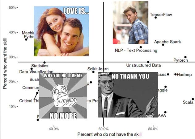
Fig 4. Pop culture: use to make your chart stick.
Principle 4: Marie Kondo it
Quadrants create meaning and reduce complexity, but Marie Kondo is not done yet. Let’s further tidy by highlighting one skill per quadrant. Here we use a red box, but we could have used a larger font type or bold letters if you feel so stylish.

Fig 5. Use hierarchies to create meaning.
Principle 5: Start with Why
Finally, charts should have a purpose – what Simon Sinek [4] calls a why.
Mine is that “I like to see more Python and less Java in my classroom”.
Principle 6: Captions are your chart’s best friend
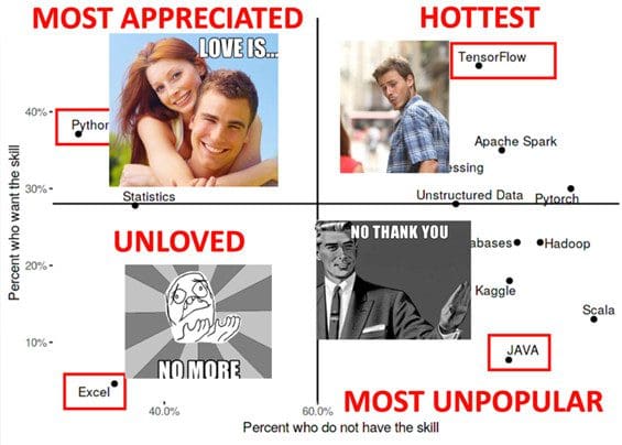
Fig 6. Clear communication wins over style.
Don’t be afraid to red pen your canvas! Captions are an opportunity to add meaning and punch to your story. Note we broke the symmetry with the “unloved” label, that is Feng-Shui for charts.
Principle 7: In case of doubt: predict the future

Fig 7. If I knew then what I know now…
Let’s assume your previous chart went viral. What else could we visualize? If you run out of ideas, then here is one: predict the future [5]. We can think of the have prevalence as a snapshot of the present and the (want) [6] as the prediction for the future if all respondents could achieve their learning goals. Now we can think about the gap between present and future. This chart was done in ggplot2. Luckily the way ggplot2 plots differently negative and positive stack bars comes handy in this case. Notice also how we avoid the temptation of ordering the bars by ascending order because it would create a spurious pattern in the crest.
Putting it all together
Let’s now combine personas, hierarchies, meaning-making strategies and business logos in a so-called strategy map.
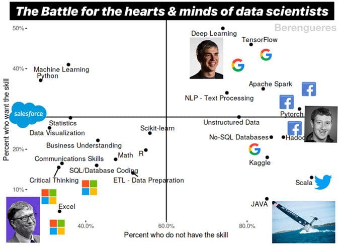
Fig 8. Why do some companies support free products sometimes?
Conclusion
Data scientists, more than other professionals, are in prominent positions to disseminate knowledge. Data visualization is one of the ways to do so. Unfortunately, there is a lot of good work out there that goes unnoticed, like this or this or this. I hope these new superpowers get you going to start changing the world with compelling charts.
Footnotes:
[1] See csv data here https://www.kaggle.com/harriken/kdnuggets-magic-skills.
[2] https://en.wikipedia.org/wiki/Magic_Quadrant, According to Jordan B Peterson, Humans deeply understand and accept hierarchies. It is also a great way to organize and tidy a graph.
[3] Guy Kawasaki, The Art of Start, TIECON 2006
[4] Simon Sinek, Start with Why.
[5] If you are right, then at least you’ll be famous.
[6] future (predicted) prevalence = present level + want, is 100% true if assume no unlearning, static population and that all those who want to learn something will eventually succeed in their wish. Probably the truth is in between but ranking rather than precision is the point of this chart.
Bio: Jose Berengueres received an MEE and a PhD in bio-inspired robotics from Tokyo Institute of Technology. He is currently with the Computer Science Department at UAE where he teaches Agile, Lean UX and Design Thinking. He also coaches entrepreneurs in Dubai, teaching at the university's incubator program and is the founder of PyData Dubai. He has taught Design Thinking, Big Data Analytics and Business Models at Apple, Bielefeld University, Mexico's CEDIM, and Hult Business School in Dubai. He consults on UX Design and Data Science for various companies such as Awok, Etihad and Healint in Singapore. In 2007- 2008, he developed two startups (a visual Twitter and a photo sharing site). He is the author of Introduction to data visualization & Storytelling (2019), Brown Book of Design Thinking, and Sketch Thinking. His research focuses on creativity, HCI, UX and data science. Jose is a Kaggle master.
Related: