How to choose the right data visualizations for your business

In today's data-driven landscape, we see businesses inundated with vast amounts of data that hold the key to strategic decision-making and planning. The challenge lies not only in collecting this data but transforming it into actionable insights and often we achieve the shift in comprehension with data visualizations.
Data visualizations are the unsung heroes that bridge the gap between raw data and meaningful interpretation. They can help you identify relationships and patterns between operational and financial activities, act on emerging trends faster, tell a story with your data and enhance employee productivity. But, choosing the right data visualization tools for your business can be a challenge as there are more options available now than ever before.
In this blog, we embark on a journey to navigate the world of data visualizations, why they’re important and how to choose the right tool to illuminate your business insights for success.
But first, some science.
The science behind data visualization tools
According to the Social Science Research Network, 65% of the population are visual learners. You only have to consider the rise in popularity of the infographic over recent years to see this statistic in action.
Optimal Targeting CEO David Konigsberg also reported the human brain processes visuals 60,000 times faster than text. He went on to say 90% of information transmitted to the brain is visual, 70% of your sensory receptors are in your eyes, 50% of your brain is active in visual processing and 40% of people respond better to visuals.
So, it’s probably easy to see why combining traditional reporting with the latest data visualization methods can have a much greater impact on stakeholders.
What is data discovery?
Data discovery is the term used to describe the act of uncovering opportunities that are hidden within the data of your company’s business systems such as its ERP. Data discovery is not just about running reports. It’s about following your train of thought through all of your data using data visualization tools, including dashboards.
In our experience at Phocas, visualization tools such as tables, graphs and interactive dashboards are particularly beneficial for product-based businesses which generate masses of data throughout their supply chain. Data visualizations can help management teams to ‘connect the dots’ and make data driven decisions in fast-paced environments.
Tables v charts
Choosing the best data visualization most appropriate for your needs will make interpreting large inflows of data easier and more visually appealing to audiences. While both tables and charts bring data to life, each serve different purposes.
When to use a table
Tables are appropriate when precise figures are needed and for comparing a number of values. A good example would be if your finance manager is analyzing quantitative values as a whole, he or she can look up the financial performance of a customer, branch or region for a certain month.
Data visualization expert and author Stephen Few explains in his book, Show Me the Numbers: Designing Tables and Graphs to Enlighten, a table makes the most sense when it is used to look up individual values or to compare individual values.
When to use a chart
Instead of presenting data in precise values, charts show the patterns that emerge or relationships between different variables in the form of line graphs or pie charts. While they may sacrifice some precision and granularity that tables provide, they allow for a broader scope of high-level analysis and quicker comprehension of the data.
Stephen Few says it’s best to use charts when the data is used to convey a message contained in the pattern of the data, or to show a relationship between many values.
When to use both
There may be occasions when you need to perform more complex data analysis that requires the use of multiple tables and charts. For example, you may want to cross analyze sales and stock data that sit in different business systems.
The combination of tables and charts enhances the data analytics process by providing both depth and clarity. Tables offer the finer details, while charts translate these details into a visual narrative, aiding in the identification of outliers, trends, and correlations.
However, a word of caution. If you’re using spreadsheets or presentations alone to manually create multiple visualizations and you spot an error in your source data or, stakeholders decide to change one of the variables, it could result in hours of additional work to amend them. The same task in a real-time, business analytics solution like Phocas with built-in data visualization and dashboard capabilities would take a matter of seconds.
Data visualization examples
Simply put, visualizations are a form of business intelligence that make your data more visible. They are a graphic representation of a set of data brought to life by charts, graphs, tables, maps, and more.
But with so many ways to visually present data and metrics, it can be hard to know which format to choose. Here’s an A-Z of the most common data visualization techniques used by Phocas customers:
Area
An area chart plots performance over time, displaying data as a shaded area that falls below a set of points connected by straight lines. Area charts are good for comparisons - for example, using two color-coded shaded areas to display this year vs. last year, or sales vs. orders.
Bubble
A bubble chart uses color-coded circles or ‘bubbles' plotted on an x and y axis to represent measures. The first measure will be the x axis, the second measure is the y axis and the third measure determines the size of the bubble.
Bullet
A bullet chart is a type of bar chart that visually displays a single performance metric, typically in the context of comparing actual and target values. It incorporates features such as color-coding and markers to provide a clear and concise representation of performance against a goal.
Column
Sometimes also called a bar chart or bar graph, a column chart displays a number of variables together. Column charts are good for simple comparisons such as monthly output.
Combo
A combo chart combines a column and a line chart. They are useful for simple comparisons involving more than one data set, for example, sales by different reps this calendar year to date (YTD) vs last calendar YTD.
Dashboard
A dashboard is a visual display that consolidates and presents key metrics, KPIs, and data points in a unified interface. It often combines multiple data visualization techniques and serves as a centralized hub for analysis to allow decision-makers to quickly grasp trends and patterns.
The added benefit of interactive dashboards is that they allow users to click into each graphical representation to access the underlying detail. Phocas dashboards, which are interactive, can be cloned in the form of a template to speed up repetitive financial and operational reporting. User restrictions can also be applied if you’re sharing sensitive data.
Gauge
A gauge is used to view data containing a comparison or variance (for example, margin vs budget). Red, yellow and green each represent a range entered by the user, typically relating to business goals or targets.
Heat map
A heat map is a graphical representation of data where values in a matrix are represented as colors. They are particularly useful for quickly visualizing geographical trends, particularly high and low performing regions, branches or depots.
Line chart
A line chart or line graph plots data points over time, for example, gross or net profit for this year vs. last year.
Pareto
A pareto chart shows the relative importance of differences between large sets of values, and is often used for root cause analysis, such as to highlight the most significant cause of a certain outcome.
Pie
A pie chart displays the percentage share of a number of variables, such as margin breakdowns for different branches within a company or product sales to different customers.
Radar
Also known as a spider chart or web chart, in a radar chart each variable is represented by an axis radiating from a central point, and the data values for each variable are plotted along the corresponding axis. These data points are then connected to form a polygon, giving a visual representation of how the values for each variable relate to one another.
Real-time wallboard
Real-time wallboards are large screens in warehouses or customer service centers that present data sets visually using dashboards. This way, everyone can easily keep up-to-date with what’s happening, motivate one another or provide assistance where required.
A good example of a real-time wallboard in action is at MIDFIX, a building supplier in the UK and Phocas user. The company has installed wallboards that display Phocas dashboards, including daily sales performance, monthly targets, margins and gross profits.
“Phocas is now part of our day-to-day business, and people look at the screen every 15 minutes to check where we are... The dashboards are powerful, and spark a lot of conversations. When we are performing well, there is a lot of buzz, and when we are not, it motivates the team to strive to achieve the goals”
Paul Brough, Operations Manager with MIDFIX
Today, with Phocas as the single source of truth, MIDFIX is making additional investments and going into new areas thanks to phocas interactive data visualizations.
Scatter plot
A scatter plot visually represents the relationship between two numeric variables on a two-dimensional graph, with each point indicating specific values for both variables. It is a useful tool for quickly identifying patterns, trends, and outliers in data analysis.
Waterfall
A waterfall chart gives you a visual overview of positive and negative changes to a value over a period of time. They are often used to assess financial performance and in the production of your monthly financial statements. For example, to build a step-by-step picture of growth or decline in cash flow.
The key to creating a great data visualization
This blog has discussed many examples of data visualization because there isn’t a one size fits all. Which one you choose can depend on a range of different factors such as your target audience, the volume and type of data sets you need to present, and the impact you need your data visualizations to have on stakeholders.
To navigate this choice effectively, always start by understanding your specific business needs and objectives. Assess the audience of your data visualizations and which format you feel is most likely to appeal to the majority. A good example would be if you work in finance and need to share company-wide updates on financial performance. Rather than a table, you may choose a traffic light data visualization that can be instantly understood by non-financial audiences.
You also need to consider how you will share your data visualizations with end users. Automated reporting is about bringing users relevant information in a timely way. In Phocas, automated reports featuring data visualizations can be generated at fixed intervals, such as every morning. They may also be triggered by certain events, like a margin alert that has decreased to an unacceptable level and must be addressed.
Interactive data visualizations are the future
In a world of big data, we believe you shouldn’t have to choose between a table or a chart.
Which is why we’ve created a two-in-one data visualization tool to make visualizations more effective for in-depth analysis. Phocas customers often liken ‘The Grid’ to a giant pivot table which, unlike Excel, is pre-populated with all their business’ real-time operational and financial data.
These data sets can then be sliced and diced to create an infinite combination of tables, charts and interactive dashboards to suit each business’ unique data visualization needs. At any point, users can jump back into ‘The Grid’ to access the underlying detail if they need to query certain KPIs and metrics.
Unlike creating data visualizations manually which are often static, any charts, graphs and dashboards in Phocas are dynamic and can be instantly modified if you or your stakeholders need to change the data parameters. You don’t have to be a data scientist to create beautiful data visualizations either. Phocas Analytics is super easy to use; allowing you to automate the process of sharing business insights with stakeholders in a simplified, interactive format. This ultimately empowers them to self-serve and feel more engaged in the data analysis process.

Before joining Phocas as an in-house tech writer, Ali worked as a freelancer and brings a wealth of industry experience to her writing. She previously occupied a senior management position at a national distributor of plumbing and building supplies in the UK. Ali has a genuine passion for writing about ways to help businesses feel good about data.

Tailored financial dashboards for actionable insights
A business planning and analytics platform allows finance teams to integrate multiple sets of data sources together to create financial statements, budgets and forecasts.
Read more
Financial statement analysis: what's changing?
Financial statements are scorecards for businesses, allowing the finance team to interpret and analyze financial performance.
Read more
How measuring human capital value added can bring a competitive advantage
Change is a constant in business and in the last two years, change has been exponential. People are navigating new channels, new tools, new customer behaviour and new workplaces so it’s reasonable for many business leaders to question some of the metrics being measured.
Read more
Phocas secures 37 top rankings in BARC's 2023 BI + Analytics Survey
The voice of the BI and analytics community has officially spoken following the release of The BI & Analytics Survey 23 by software selection and strategy experts, BARC last week.
Read more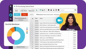
Find out how our platform gives you the visibility you need to get more done.
Get your demo today