Uber and Lyft Cab Prices : Data Analysis and Visualization
This article was published as a part of the Data Science Blogathon
Introduction
Sometimes it is just convenient to leave the driving to someone else. This is just less stress, more mind space and one gets to use that time to do other things. Well, that is one of the ideas that grew and later became the concept behind Uber and Lyft.
Both these companies offer ride-hailing services that allow users to hire vehicles with drivers through websites or mobile apps. Whether it is a short distance ride or you are going from one city to the other, these services have helped in numerous ways to people and literally made their life a lot lesser complicated.
Uber is a global company available in 69 countries and around 900 cities worldwide. Lyft, on the other hand, operates in about 644 cities in the US and 12 cities in Canada only. Yet, in the US, it’s the second-largest ridesharing company with a 31% market share.
From booking the cab to paying the bill, both services have almost similar core features. But there are some unique cases where the two ride-hailing services come neck to neck. One such is pricing, especially dynamic pricing called “surge” in Uber and “Prime Time” in Lyft. There are several other parameters based on which the two service providers can be divided.
We have an interesting dataset with data from Boston (US), which we will analyze to understand the factors affecting the dynamic pricing and the difference between Uber and Lyft’s special prices.
Dataset:
The datasets used in this article have been imported from:
The data has been collected from different sources, including real-time data collection using Uber and Lyft API (Application Programming Interface) queries. The dataset covers Boston’s selected locations and covers approximately a week’s data from November 2018.
After loading the dataset, we found two files available. The first is the weather.csv, and the second is cab_rides.csv.
A look at the dataset reveals that the data can be divided into the following columns:
| Weathr.csv | Cab_rides.csv |
| Temp: Temperature in F | Distance: The Distance Between Source and Destination |
| Location: Location Name | Cab_type: Uber or Lyft |
| Clouds: Clouds | Time_stamp: Epoch Time When Data was Queried |
| Pressure: Pressure in MB | Destination: Destination of the Ride |
| Rain: Rain in Inches for the Last Hr. | Source: The Starting Point of the Ride |
| Time_stamp: Epoch Time When Row Data was Collected | Price: Price Estimate for the Ride in USD |
| Humidity: Humidity in % | Surge_multiplier: The Multiplier by Which Price was Increased, Default 1 |
| Wind: Wind Speed in MPH | Id: Unique Identifier |
| Product_id: Uber/Lyft Identifier for Cab-type | |
| Name: Visible Type of the Cab Eg: Uber Pool, Uberxl |
*The above information is copied from the Kaggle dataset.
Data Analysis
To perform the analysis, we split our dataset into two sets for comparison: Uber and Lyft. We also divide the data into different parameters and give it a visual representation in order to understand the difference better.
Factors Affecting Cab Prices
Distance and Price Correlation
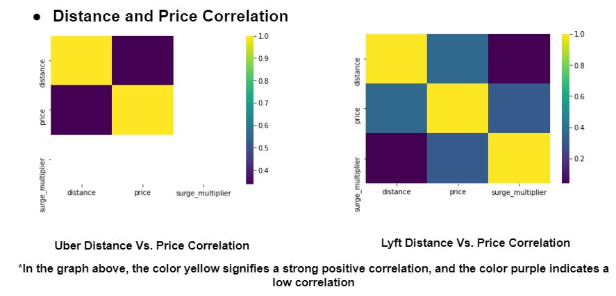
Interpretation:
The first parameter we explore is the distance and price correlation. We represent each unit with a colour in order to simplify the data. From the above visual, we can interpret the following points-
For Lyft: surge multiplier and distance are weakly correlated.
For Lyft: surge multiplier and price are more correlated.
For Uber: price and distance are weakly correlated.
Surge Correlation with Days (only for Lyft)

Interpretation
This visual representation only shows the surge correlation in terms of days for Lyft. The surge prices are represented through different colors – blue, orange, green, red, purple, and brown. As for the interpretation, it is safe to say that-
A surge of 1.25x the regular price is most common.
On the weekdays, Tuesday is most likely to experience a surge during rush hours, while Wednesday experiences the least.
A surge in the price of 3.0x happens rarely.
Surge Correlation with the Time of Day (only for Lyft)

Interpretation:
What does the surge look like when compared to the time of the day? This graph explores the correlation between the surge and time of the day exclusively for Lyft and the following are the interpretations –
Lyft’s Prime Timing happens the most during nighttime.
Morning rush hours also contribute to the surge.
A surge is less likely to happen during the afternoon and evening.
Surge Correlation with Source and Destination

Interpretation:
The routes from Back Bay to Boston University experience a higher surge in cab prices.
Haymarket Square to Beacon Hill experiences the least surge in prices.
Uber vs. Lyft
Distance vs. Price

Interpretation:
Uber is riders’ first choice irrespective of distance.
Number of Shared Rides with Time of Day


Interpretation:
People most likely have shared rides during the nighttime. As the distance increases, the price also increases.
The number of shared rides is not growing with the increase in distance.
Apparently, people prefer to have shared rides for smaller distances. People like taking shared rides over the courses of short passages, roughly lying between 1 to 3 kilometers.
Rides correlation with Weather


Interpretation:
The number of rides increases with an increase in temperature.
People tend to avoid rides when it rains.
Lyft gets slightly more rides than Uber, but this cannot be generalized as we have very little data (only 3,866).
Summary
After analyzing the different parameters, here are a few pointers that we can conclude. If you were a Business Analyst or a data scientist working for either Uber or Lyft, you could draw the following conclusions:
-
Uber is more economical; however, Lyft also provides fair competition.
-
People prefer to have shared rides during the nighttime.
-
People avoid taking rides when it rains.
-
When traveling long distances, the price does not increase linearly. However, based on the time and demand, a surge can affect the cost.
-
Uber can be the first choice for long distances.
However, acquiring and analyzing similar data is only a tipping point for several companies. There are several enterprises in the market that can help bring data from multiple sources and in different formats into the data warehouse of your choice.
Code
All the codes used here are available at GitHub and can be found here – https://github.com/Mindtrades-Consulting/Uber-and-Lyft-Cab-Prices-Data-Analysis-and-Visualization
The media shown in this article are not owned by Analytics Vidhya and are used at the Author’s discretion.


