Plotting Visualizations Out of Pandas DataFrames
This article was published as a part of the Data Science Blogathon
Introduction
Plotting is essentially one of the most important steps in any data science project. It helps in capturing trends of the dataset that can further help in taking necessary preprocessing and model training steps. There are tons of plotting libraries available to plot the pandas data frames. These include but not limited to Matplotlib, Plotly, Seaborn, Bokeh, and many more to come.
Pandas has its own plotting API which uses Matplotlib under the hood. There are many plotting options and support for almost every type of plot. In this article, we will discover how to perform plotting using Pandas plotting API and how to customize these plots for better appearance and interpretation.

Initializing the Plots Object
Plotting can be performed in pandas by using the “.plot()” function. This function directly creates the plot for the dataset. This function can also be used in two ways. Let’s do the prerequisites first.
Step 1: Import Libraries
Import pandas along with numpy so that random data can be generated and later on can be used for plotting.
import numpy as np
import pandas as pd
Step 2: Create a dataframe
For now, create an empty dataframe.
df = pd.DataFrame()
Now, you have two ways to use the plotting function:
- Using kind parameter of Plot function: The type of plot you want to render can be specified by passing the “kind” parameter to the “plot” function. The “kind” parameter takes in the name of the plot. We will see what values this parameter can take in the next section.
- Directly calling the kind of plot from plot function: You can directly call the type of plot by chaining the plot function with the name of the plot.
Therefore, for a line plot as an example, df.plot(kind=’line’) will be same as df.plot.line()
Types of Plots
There are many types of plots that are available in the pandas plotting function. To list them all, in the Jupyter notebook, press the tab button on the keyboard after typing:
df.plot.
You will get the list of all the available plots.
For the rest of the article, the type of the plot will be called directly from the plot function without the “kind” parameter accessor. Let’s see the implementation for each plot.
1. Line Plot
The most basic form of plotting is a line plot. Here, we plot a line using DataFrame’s values as coordinates. Here is the implementation to plot a basic line plot using the pandas plotting function.
Python Code:
Few things to note here:
- The default value of the plot function is a line plot and therefore, you can directly use the plot function for line plots.
- Calling the function directly will generate the line plot for all the variables/features/columns of the dataset on the same graph. This may generate an odd-looking graph and therefore, you can define the x and y values of the plot explicitly.
- You will get a text something like this above any plot generated by plot function: “”. To avoid this text, add a semicolon “;” at the end of the last line of code for the plot. This will force Python to suppress any text output.
2. Area Plot
This is an extended version of the line plot. In the area plot, instead of leaving the plot to connected data points, the area under the line is filled with colors. This is helpful in cases when you want to show the proportion of values captured by a particular value. As you can plot multiple variables, this can give you insights about when the variables are overlapping.
df = pd.DataFrame(np.random.rand(20, 4),
       columns =['A', 'B', 'C', 'D'])
df.plot.area();
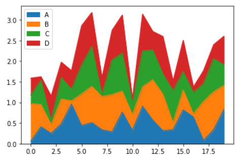
You can also produce an unstacked plot by passing “stacked=False” in the area function.
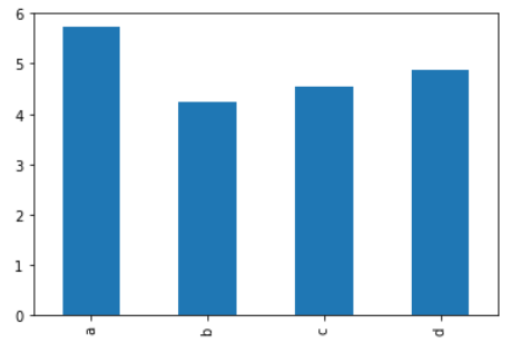
3. Bar and Barh Plot
Bar plots are used to represent the values repressed by categorical values. This may include the count of a particular category, any statistic, or other value defined. These are useful in cases when you want to compare one category with other.
df = pd.DataFrame(np.random.rand(10, 4), columns=["a", "b", "c", "d"])
df.sum().plot.bar();
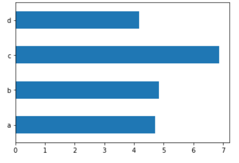
Barh allows you to swap the axes. Therefore, you will have y-axes as the labels/categories and the x-axes will represent the values.
df = pd.DataFrame(np.random.rand(10, 4), columns=["a", "b", "c", "d"])
df.sum().plot.barh();
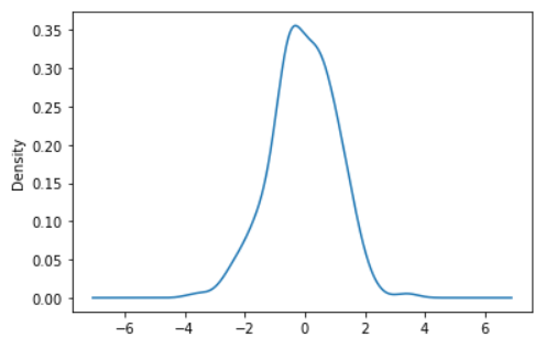
4. Density or KDE Plot
This plot visualizes the probability density function of a continuous random variable. This doesn’t directly tell the probability of the value taken by a random variable. In fact, for a continuous random variable, the probability of any value is zero and we are only concerned about the probabilities of a range of values. It only gives how many data points may be present around specified values.
df = pd.Series(np.random.randn(200))
df.plot.kde();
5. Histogram Plot
Histograms are used to represent the frequency of numerical variables. These are subversions of bar plots with the changes that in the histogram, we talk about numerical values. There are no categories but the numeric data is divided among small buckets called bins. These bins take in the number of values that fall in the range of the bin. Histograms are also quoted as frequency polygons when the bars are replaced by connecting lines from the midpoint of the bars.
df = pd.DataFrame(
        {
            "a": np.sqrt(np.random.randn(1000) + 1),
            "b": np.random.randn(1000),
        },
        columns=["a", "b", "c"],
    )
df.plot.hist(alpha=0.5);
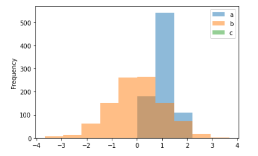
Here, the “alpha” parameter defines the transparency of colors for the histograms.
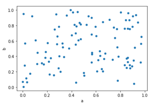
6. Scatter Plot
These plots are similar to line plots but here the coordinates of each point are defined by two dataframe columns. The presentation is usually a filled circle. These circles are not connected to each other via lines like in the line plot. This helps in understanding the correlation between two variables.
df = pd.DataFrame(np.random.rand(100, 2),
           columns =['a', 'b'])
df.plot.scatter(x ='a', y ='b');
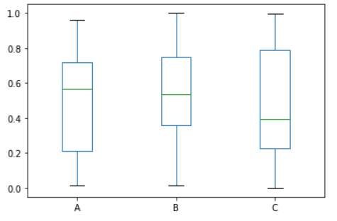
7. Box Plot
Box plots are very crucial and important plots. These plots help in understanding the overall trend and spread of a feature of a dataset. For numerical data, it represents where 50% of data lies, where the median of the data lies, and it also specifies the boundary conditions in the form of whiskers.
df = pd.DataFrame(np.random.rand(50, 3), columns=["A", "B", "C"])
df.plot.box();
8. Hexbin Plot
These plots can be alternative to scatter plots when the data is very dense. They represent data in the form of a honeycomb, the hexagons in the plot. It is also called a hexagon binning plot as it combines the power of bins in the histogram in the form of a hexagon. The color of each hexbin defines the number of points in that range.
df = pd.DataFrame(np.random.randn(1000, 2), columns=["a", "b"])
df["b"] = df["b"] + np.arange(1000)
df.plot.hexbin(x="a", y="b", gridsize=25);
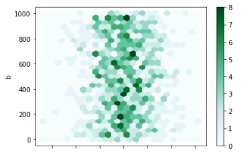
Here, the grid size controls the number of hexagons in the x-direction. By default, it is 100.
9. Pie Plot
Pie plots are used to represent the portion of a value as compared to others in a whole. They represent how much percent of the circular area a value is contributing and fill it with color. They are widely used in every project and at the same time, they are discouraged too!
Because to represent a portion numeric value, a large amount of space is allocated and colors are wasted to fill the area. Instead, donut plots are highly encouraged as they need less color quantity plus they can be made as nested pie charts which convey more information than regular pie charts.
series = pd.Series(3 * np.random.rand(4), index=["a", "b", "c", "d"], name="Pie plot")
series.plot.pie(figsize=(6, 6));
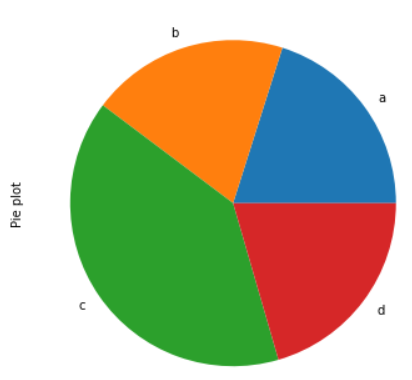
The “figsize” parameter is used to control the size of the plot generated.
Customize your Plots
The plots generated by Pandas API are not the best-looking ones and need a quick makeover to improve upon the information conveyed through them. Although these plots can be created quickly, there are some tweaks you can do to make them look even more appealing:
- Change the plotting style. Like in Line plots, instead of plain lines, you can make it “*” or any other special characters line.
- You can control the legend of the graphs to place them at a place where it doesn’t hide the plot details.
- Change the default names of the axes labels.
- Control the scale of the axes according to the plots generated.
- Rotate the ticks of the axes for a better viewing experience plus it can accommodate lengthy labels more easily.
- Plot the bar charts with error bars to increase the information provided.
- Use good color maps to distinguish different features of the plots.
Do check out this guide by pandas about the implementations of these tweaks. Also, the code examples presented above have been inferred from this guide only.
Conclusion
In this detailed article, we saw how to plot visualizations directly from pandas dataframe using plot function and its attributes. We discussed how to initialize the object of the plots, discussed all types of plots offered by this function in detail, and then discussed some pointers to improve the existing plots.
If you have any doubts, queries, or potential opportunities, then you can reach out to me via
1. Linkedin – in/kaustubh-gupta/
2. Twitter – @Kaustubh1828
3. GitHub – kaustubhgupta
4. Medium – @kaustubhgupta1828
Hi, I am a Python Developer with an interest in Data Analytics and am on the path of becoming a Data Engineer in the upcoming years. Along with a Data-centric mindset, I love to build products involving real-world use cases. I know bits and pieces of Web Development without expertise: Flask, Fast API, MySQL, Bootstrap, CSS, JS, HTML, and learning ReactJS. I also do open source contributions, not in association with any project, but anything which can be improved and reporting bug fixes for them.


Well compiled content.. Nice work
Amazing Article. Well researched & aptly structured. Provides an insight into different plots with their intended usage in a justified brief manner.