Tricks for Data visualization using Plotly Library
This article was published as a part of the Data Science Blogathon
Data is everywhere you just need an eye to select which data is useful, by keeping stories interesting. That doesn’t mean you have to only just show graph and work is done it is the role of the data visualizer how to present the right data which helps the business to grow and have a powerful impact.
Data
The Data Which we are going to use is available here and the description of the data is available here
Overview of Data:
The data tell us which products are recommended on basis of Ratings, Reviews of products, and many other factors.
Clothing ID: Integer Categorical variable that refers to the specific piece being reviewed.
Age: Age of the reviewer’s age.
Title: The Title of the review.
Review Text: The description of the product by customers.
Rating: Ratings were given by the customer to a different product from worst 1 to best 5
Recommended IND: Binary variable stating where the customer recommends the product where 1 is recommended, 0 is not recommended.
Division Name: Categorical name of the product high-level division.
Department Name: Categorical name of the product department name.
Class Name: Categorical name of the product class name.
Positive Feedback Count: Positive Integer documenting the number of other customers who found this review positive.
Original DataFrame looks Like:
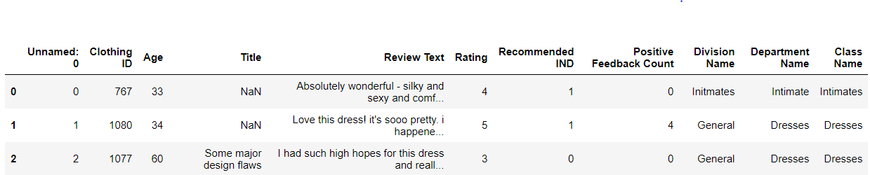
Table of Content
1. what is plotly
2. Points to keep in mind while designing graph
3. Data visualization graph configuration
- Univariate visualization
- Bivariate visualization
- Multivariate visualization
4. Chart Types
- Pie Chart
- Histogram Chart
- Stacked Histogram Chart
- Box Chart
- Funnel Chart
- TreeMap Chart
- HeatMap
- Scatter Matrix
5. Embedding charts in a blog with Chart Studio
6. Plotly Dash
What is Plotly?
Plotly is an open-source library that provides a list of chart types as well as tools with callbacks to make a dashboard. The charts which I have embedded here are all made in chart studio of plotly. It helps to embed charts easily anywhere you want.
The main plus point of plotly is its interactive nature and of course visual quality. Plotly is in great demand rather than other libraries like Matplotlib and Seaborn. Plotly provides a list of charts having animations in 1D, 2D, and 3D too for more details of charts check here.
If you just want to embed charts in your blogs you don’t need to have prior knowledge of coding or javascript you can just use chart studio, where you just need to select the parameters and your chart is ready.
If you want to make a dynamic dashboard, Plotly provides Dash which is a plotly extension for developing web applications. for more details check plotly documentation here.
Points to keep in mind while designing graph
1) No need to keep all the data in one graph.
- It is always better to divide and rule.
- Always apply filters to your graphs to make them more interactive.
2) Sometimes displaying data in form of a card is also a great way of representing data.
- As you see in the card layout we can use infographics to enhance the data.
- As you see in the graph & card layout both show the same information but in different ways with the help of plotly library.
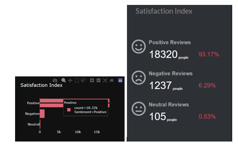
I will show you two charts tell me which helps you to understand better.
The graph shows how many people have given positive, negative, and neutral reviews for a product.
3) Styling the graph
The thing which I have observed is most of the time people overdue to it in different ways like they will put different styling in one graph only.
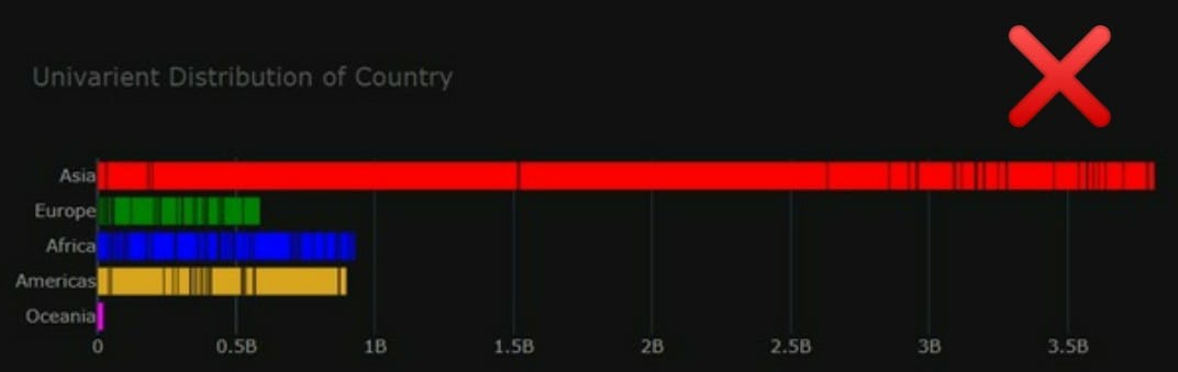
I will show you two charts one will be right and another one is to avoid.
- As we are using dark background so title color should be eye-catching prefer light colors. In my case, I have used white which usually looks better with dark backgrounds.
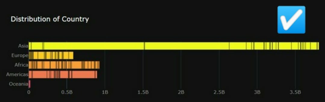
- Don’t use the different color labels for each category like in my example red for Asia, green for Europe.
- Try to avoid different colors for each category as shown in the wrong graph where one category uses red other one uses green. The graph doesn’t look professional and looks too crowded. If possible use a sequential palette.
- Always keep in mind that the color of the title and category label should be different for easily differentiable.
There are others things to keep in mind while designing graphs, which we will discuss in the later section.
Keeping in mind these simple steps that will help you to get your work easily done.

https://unsplash.com/photos/FtZL0r4DZYk
Data visualization graph configuration
Mainly, there are three types of analysis for Data Visualization:
- Univariate Analysis: In the univariate analysis, We will use a single feature to visualize
- Bivariate Analysis: In the bivariate analysis, We will compare two features for visualizing.
- Multivariate Analysis: In the multivariate analysis, We will compare more than two features for visualizing.
Let’s start how to use Plotly for making graphs.
Installation
Install with pip or conda
# pip
 pip install plotly
# anaconda
conda install -c anaconda plotly
While importing the plot you should install the pandas library first otherwise there will be an error.
#Importing library
 import plotly.express as px
fig.update_layout(layout_parameters or add annotations)
fig.update_traces(further graph parameters)
fig.update_xaxis() # or update_yaxis
fig.show()
Using update_traces we can change the text font color, size
Using update_layout we can add graph parameters. Below I have explained every parameter.
- Height, Weight –> By setting the height & width value you can change the size of the graph
- Margin –> By setting values of Top, Bottom, Left, and Right you can change the margin of the graph
- Plot background-color –> Plotly provides different templates and themes you can use that also or you can create your own theme.
- Title –> Title parameter means giving the title of the graph
- Title font size –> Setting the font size of the title
- Title color –> Setting the color of the title
- Title family –> Setting the family of the title
- Legend –> Legends parameter will let you decide where you want your legends to be like left, right by giving the value to x and y
Chart Types:
1. Pie chart
The pie chart is mostly used for categorical data when you have more than 2 categories it is easy to compare.
division_rat = px.pie(df, names='Rating', values='Rating', hole=0.6, title='Overall Ratings of Products',
                      color_discrete_sequence=px.colors.qualitative.T10)
division_rat.update_traces(textfont=dict(color='#fff'))
division_rat.update_layout(autosize=True, height=200, width=800,
                           margin=dict(t=80, b=30, l=70, r=40),
                           plot_bgcolor='#2d3035', paper_bgcolor='#2d3035',
                           title_font=dict(size=25, color='#a5a7ab', family="Muli, sans-serif"),
                           font=dict(color='#8a8d93'),
                           legend=dict(orientation="h", yanchor="bottom", y=1.02, xanchor="right", x=1)
                           )
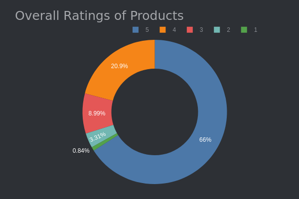
Interpret:
As we see in the graph 5-star ratings are 66% given to the products so overall products are nice.
2. Histogram Chart
From a histogram, we can see how one category differs from the other like which is highest and lowest.
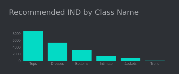
Interpret:
- Here as we see tops are generally more preferred compared to jackets
3. Stacked Histogram chart
From a stacked histogram we can easily compare two quantities against each other.
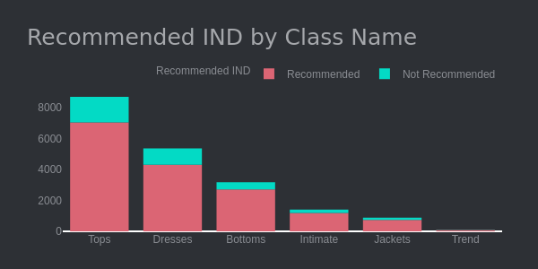
Interpret:
Most of the products are recommended and the ratio of recommended to non-recommended products is too much, which is a great sign.
4. Box plot
Box plot is a great option whenever we want to look for the outliers. It will give the range where most of the data lie in quartile ranges.
fig_box = px.box(df, x='Age', title='Distribution of Age', height=250,
                         color_discrete_sequence=['#03DAC5'],
                         )
fig_box.update_xaxes(showgrid=False),
fig_box.update_layout(margin=dict(t=100, b=0, l=70, r=40),
                        xaxis_tickangle=360,
                        xaxis_title=' ', yaxis_title=" ",
                        plot_bgcolor='#2d3035', paper_bgcolor='#2d3035',
                        title_font=dict(size=25, color='#a5a7ab', family="Muli, sans-serif"),
                        font=dict(color='#8a8d93'),
                        legend=dict(orientation="h", yanchor="bottom", y=1.02, xanchor="right", x=1)
                          )

5. Funnel chart
A funnel chart is mainly used when we have it in a decreasing manner like in sales data or company size.
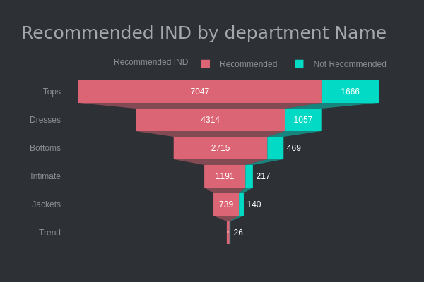
Interpret:
- The Tops is the highest product which is recommended by 7047 peoples.
- The
Funnel chart always helps to show the data in decreasing fashion
6. TreeMap
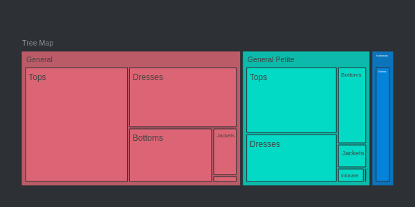
Interpret:
- People usually recommended General division products than General Petite and last is intimates Products.
- In General Division Most of the people recommended Tops than Dresses.
7. HeatMap
Whenever we need to see the correlation between the data it is always the best option to go with heatmap.
import plotly.figure_factory as ff
# Heatmap
# Correlation between the feature show with the help of visualisation

corrs = dff.corr()
fig_heatmap = ff.create_annotated_heatmap(
    z=corrs.values,
    x=list(corrs.columns),
    y=list(corrs.index),
    annotation_text=corrs.round(2).values,
    showscale=True)
fig_heatmap.update_layout(title= 'Correlation of whole Data',
                 plot_bgcolor='#2d3035', paper_bgcolor='#2d3035',
                        title_font=dict(size=25, color='#a5a7ab', family="Muli, sans-serif"),
                        font=dict(color='#8a8d93'))
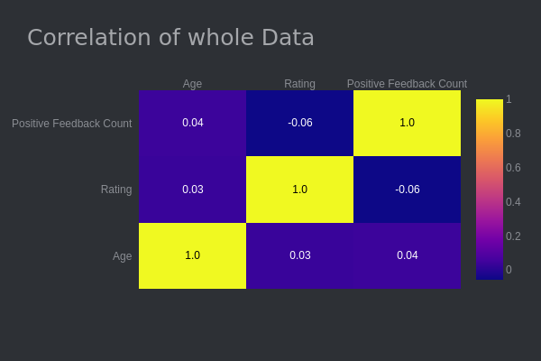
8. Pairplot
Pairplot is mostly used when we need to find the relation between different categories.
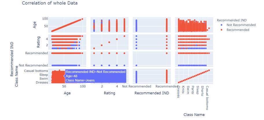
Interpret:
As we see there is a positive relation between Age and Recommended IND.
1-star, 2-star rating products are not generally recommended.
Embedding charts in a blog with Chart Studio
Installing chart studio
# pip
pip install chart_studio
Setting the chart studio
1. First, you need to make an account on chart studio after that went to your profile select settings options scroll down select API keys where put the username and password which you set. After completing this process click on generate key button you will see a key which is your API key.
Procedure: profile >> Settings >> Api key
import chart_studio
import chart_studio.plotly as py
import chart_studio.tools as tls
chart_studio.tools.set_credentials_file(username=' ',  api_key=' ')
2. Installing the library run any code which is present above for example run a pie chart
3. Run the below code
py.plot(figure_name, fielname='Pie chart', auto_open=True)
After completing all the 3 procedure chart studio will open scroll down you will see the embed option just copy-paste the link and the graph is embedded.
Plotly Dash
If you want to make a dynamic dashboard, Plotyy provides Dash which is a plotly extension for developing web applications. for more details check plotly documentation here.
To make the dashboard looks good plotly provides Css, Html, Bootsrap, react too.
A student who is learning and sharing with a storyteller to make your life easy.


