Exploring Matplotlib Stylesheets For Data Visualization
This article was published as a part of the Data Science Blogathon
Introduction
Matplotlib is a widely used library for data visualizations. Matplotlib offers a wide range of customizing options. These customizations can be applied to make the plots more attractive and theme-based. One way to customize data is by specifying individual plot attributes by hand. Another way, which was introduced in version 1.4 of Matplotlib, is by using Matplotlib Shtyelsheets. Matplotlib has a wide range of stylesheet options that are preset for styling the plots.
In this article, we will learn about the Matplotlib Stylesheets in Python and some popular stylesheet options which can improvise the power of visualization.
Table of Contents
- Matplotlib Stylesheets
- The ‘FiveThirtyEight Stylesheet
- The ‘dark_background’ Stylesheet
- The ‘grayscale’ Stylesheet
- The ‘cyberpunk’ Stylesheet
- The ‘tableau-colorblind10’ Stylesheet
- The ‘seaborn-whitegrid’ Style
- Conclusions
Matplotlib Stylesheets
Data Visualization embraces the power of explaining data without using a single word. Data can become extremely meaningful. Matplotlib has a convenient option to add a preset to your plots for improvising the classic matplotlib plots. We can choose from a range of options of stylesheets available in matplotlib. These options can be accessed by executing the following:
plt.style.available
This gives a list of all the available stylesheet option names that can be used as an attribute inside plt.style.use()
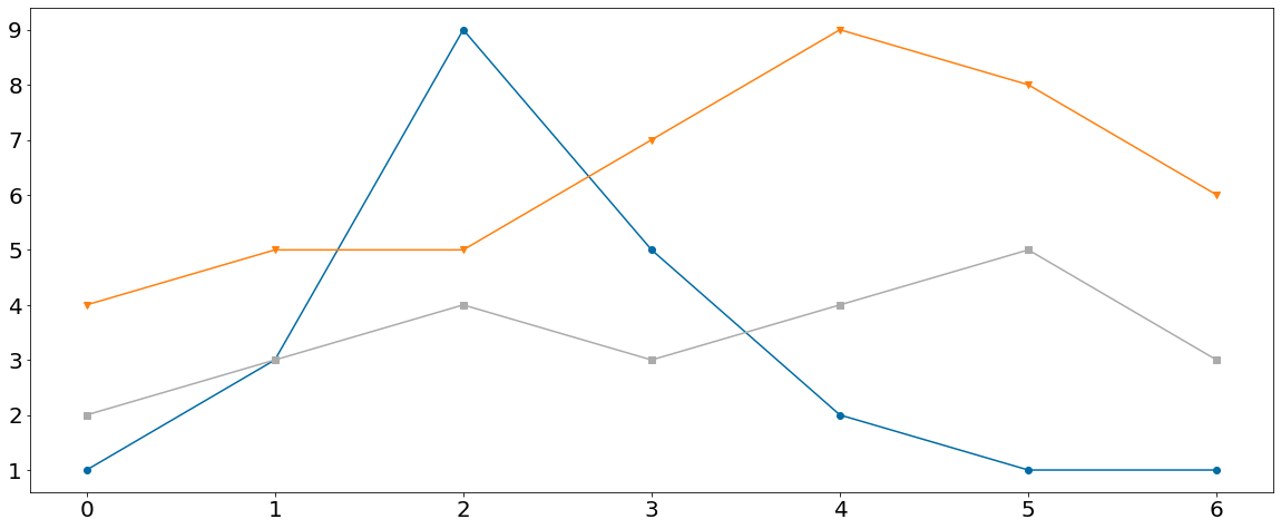
First, we will plot a Classic Matpltolib Line Chart which will help us to determine the difference between the classic plot and the upcoming Stylesheet applied plots.
Python Code:
We created three lists having numeric data which will be used in the next step to plot the Line Chart.
Specifying additional properties of the Line Chart
plt.xticks(size = 20)
plt.yticks(size = 20)
.xticks() and .yticks() methods are used to change the default properties of the ticks of axes. Here, we are increasing the tick sizes to 20 for both the x-axis and y-axis.
Plotting the Line Chart for Data
plt.figure(figsize = (20,8))
plt.plot(a, marker='o')
plt.plot(b, marker='v')
plt.plot(c, marker='s')
We passed the figsize attribute to the .figure() method of matplotlib.pyplot to specify the plot area for our Line Chart. We plotted three line charts on the same axes for the list of data a, b, and c created above using the .plot() method of matplotlib.pyplot. We also distinguished the three lists of data with different markers by specifying the ‘marker’ attribute.
Putting it all together
import matplotlib.pyplot as plt
a = [2, 3, 4, 3, 4, 5, 3]
b = [4, 5, 5, 7, 9, 8, 6]
c = [1, 3, 9, 5, 2, 1, 1]
plt.figure(figsize = (20,8))
plt.plot(a, marker='o')
plt.plot(b, marker='v')
plt.plot(c, marker='s')
plt.xticks(size = 20)
plt.yticks(size = 20)
plt.show()
On executing this code, we get:
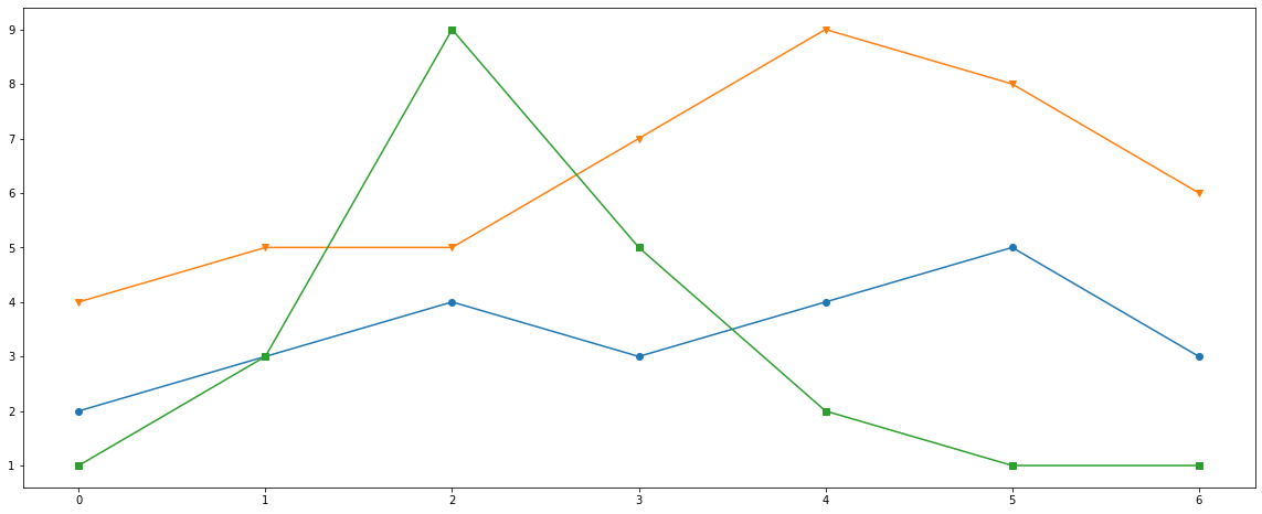
The ‘fivethirtyeight’ Stylesheet
The ‘FiveThirtyEight Style is based on the popular American blog FiveThirtyEight which provides economic, sports, and political analysis. The FiveThirtyEight stylesheet in Matplotlib has gridlines on the plot area with bold x and y ticks. The colours of the bars in Bar plot or Lines in the Line chart are usually bright and distinguishable.
Now we will plot the Line Chart with the same data used above and will try to establish the differences between the two.
Importing the Libraries
import matplotlib.pyplot as plt
Specifying the Stylesheet Type
plt.style.use("fivethirtyeight")
By adding ‘fivethirtyeight’ as paramter iinside plt.style.use(), we direct to use the FiveThirtyEight Stylesheet for our plot.
Creating the Data
a = [2, 3, 4, 3, 4, 5, 3]
b = [4, 5, 5, 7, 9, 8, 6]
c = [1, 3, 9, 5, 2, 1, 1]
We created three lists having numeric data which will be used in the next step to plot the Line Chart.
Plotting the Line Chart for Data
plt.figure(figsize = (20,8))
plt.plot(a, marker='o')
plt.plot(b, marker='v')
plt.plot(c, marker='s')
We passed the figsize attribute to the .figure() method of matplotlib.pyplot to specify the plot area for our Line Chart. We plotted three line charts on the same axes for the list of data a, b, and c created above using the .plot() method of matplotlib.pyplot. We also distinguished the three lists of data with different markers by specifying the ‘marker’ attribute.
Specifying additional properties of the Line Chart
plt.xticks(size = 20)
plt.yticks(size = 20)
.xticks() and .yticks() methods are used to change the default properties of the ticks of axes. Here, we are increasing the tick sizes to 20 for both the x-axis and y-axis.
Putting it all together
import matplotlib.pyplot as plt
plt.style.use("fivethirtyeight")
a = [2, 3, 4, 3, 4, 5, 3]
b = [4, 5, 5, 7, 9, 8, 6]
c = [1, 3, 9, 5, 2, 1, 1]
plt.figure(figsize = (20,8))
plt.plot(a, marker='o')
plt.plot(b, marker='v')
plt.plot(c, marker='s')
plt.xticks(size = 20)
plt.yticks(size = 20)
plt.show()
On executing this code, we get:
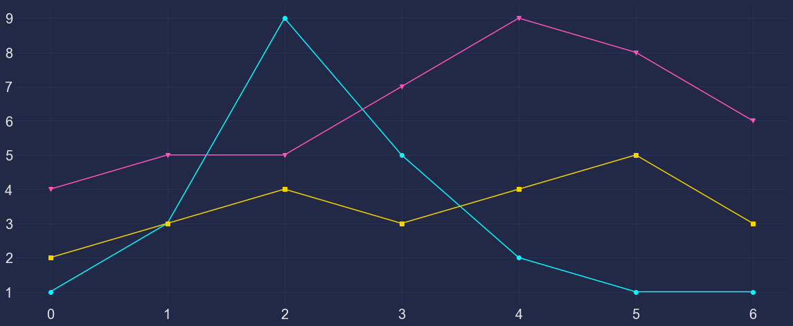
The ‘dark_background’ Stylesheet
The ‘dark_background‘ stylesheet is another popular style that is based on the dark mode we see today. Applying this stylesheet makes the plot background black and ticks colour to white, in contrast. In the foreground, the bars and/or Lines are grey based colours to increase the aesthetics and readability of the plot.
Now we will plot the Line Chart with the same data used above and will try to establish the differences between the previous two.
import matplotlib.pyplot as plt
plt.style.use("dark_background")
a = [2, 3, 4, 3, 4, 5, 3]
b = [4, 5, 5, 7, 9, 8, 6]
c = [1, 3, 9, 5, 2, 1, 1]
plt.figure(figsize = (20,8))
plt.plot(a, marker='o')
plt.plot(b, marker='v')
plt.plot(c, marker='s')
plt.xticks(size = 20)
plt.yticks(size = 20)
plt.show()
On executing this code, we get:
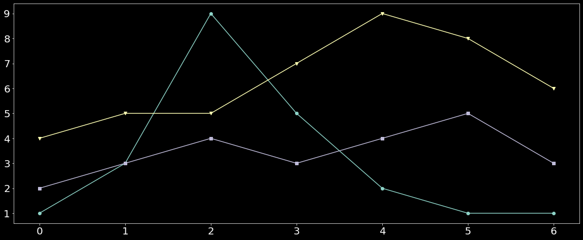
Here, we are using the same lists a, b, and c which will be passed as data into Line Charts. We passed ‘dark_background‘ as an attribute into the plt.style.use() method. This will use the dark background style sheet.
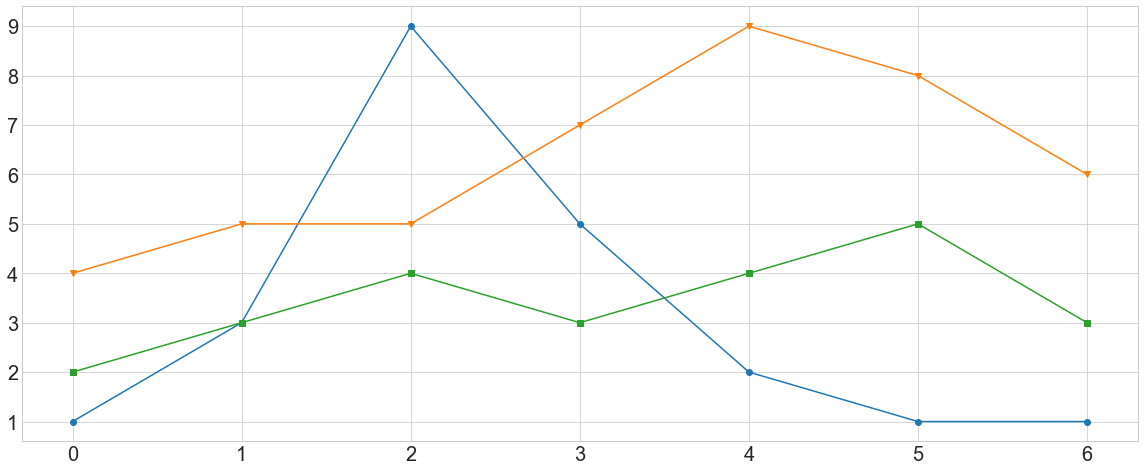
The ‘grayscale’ Stylesheet
The ‘grayscale’ stylesheet does not have involvement of any colour and thus got its name. This stylesheet resembles the vintage black and white newspapers which do not have any colour in them. This Style sheet could make the plot confusing when we have multiple lines or bars displaying the data as one can only judge the class of the data by the bar or line’s colour density.
Now we will plot the Line Chart with the same data used above and will try to establish the differences between the previous three.
import matplotlib.pyplot as plt
plt.style.use("grayscale")
a = [2, 3, 4, 3, 4, 5, 3]
b = [4, 5, 5, 7, 9, 8, 6]
c = [1, 3, 9, 5, 2, 1, 1]
plt.figure(figsize = (20,8))
plt.plot(a, marker='o')
plt.plot(b, marker='v')
plt.plot(c, marker='s')
plt.xticks(size = 20)
plt.yticks(size = 20)
plt.show()
On executing this code, we get:
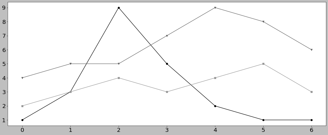
Here, we passed ‘grayscale‘ as an attribute to the plt.style.use() method to apply the Grayscale Stylesheet. As evident, it’s is difficult to distinguish between the lines until we try to distinguish based on the density of the line.
The ‘cyberpunk’ Stylesheet
The ‘cyberpunk‘ stylesheet is based on the popular fictional world of Cyberpunk. On applying this style, the plot gets a dark blue grid background with neon coloured lines/bars. This stylesheet is not readily available in the list plt.style.available. But we can import the mplcyberpunk library to use the ‘cyberpunk‘ stylesheet. You can learn more about Cyberpunk styled plots here.
Now we will plot the Line Chart with the same data used above and will try to establish the differences between the previous Charts.
import matplotlib.pyplot as plt
import mplcyberpunk
plt.style.use("cyberpunk")
a = [2, 3, 4, 3, 4, 5, 3]
b = [4, 5, 5, 7, 9, 8, 6]
c = [1, 3, 9, 5, 2, 1, 1]
plt.figure(figsize = (20,8))
plt.plot(a, marker='o')
plt.plot(b, marker='v')
plt.plot(c, marker='s')
plt.xticks(size = 20)
plt.yticks(size = 20)
plt.show()
On executing this code, we get:
Here, as explained, we imported the mplcyberpunk library which allows us to use the ‘cyberpunk’ stylesheet. Thus after importing the mplcyberpunk library, we used the ‘cyberpunk‘ stylesheet.
The ‘tableau-colorblind10’ Stylesheet
The tableau-colorblind10 Stylesheet is based on the widely used Business Intelligence tool Tableau. Applying this style gives our plot the look of plots created in Tableau. The ticks’ fonts are changed to Tableau’s default font and the colour of lines/bars are changed to Tableau 10, a colour palette available in Tableau which contains a set of colourblind-friendly pastel colours.
Now we will plot the Line Chart with the same data used above and will try to establish the differences between the previous Charts.
import matplotlib.pyplot as plt
plt.style.use("tableau-colorblind10")
a = [2, 3, 4, 3, 4, 5, 3]
b = [4, 5, 5, 7, 9, 8, 6]
c = [1, 3, 9, 5, 2, 1, 1]
plt.figure(figsize = (20,8))
plt.plot(a, marker='o')
plt.plot(b, marker='v')
plt.plot(c, marker='s')
plt.xticks(size = 20)
plt.yticks(size = 20)
plt.show()
On executing this code, we get:
Here, we applied Tableau 10 palette to the char by adding ‘tableau-colorblind10‘ attribute to plt.style.use(). The Tableau plots look aesthetically pleasing and can be used to make out plots colourblind people friendly.
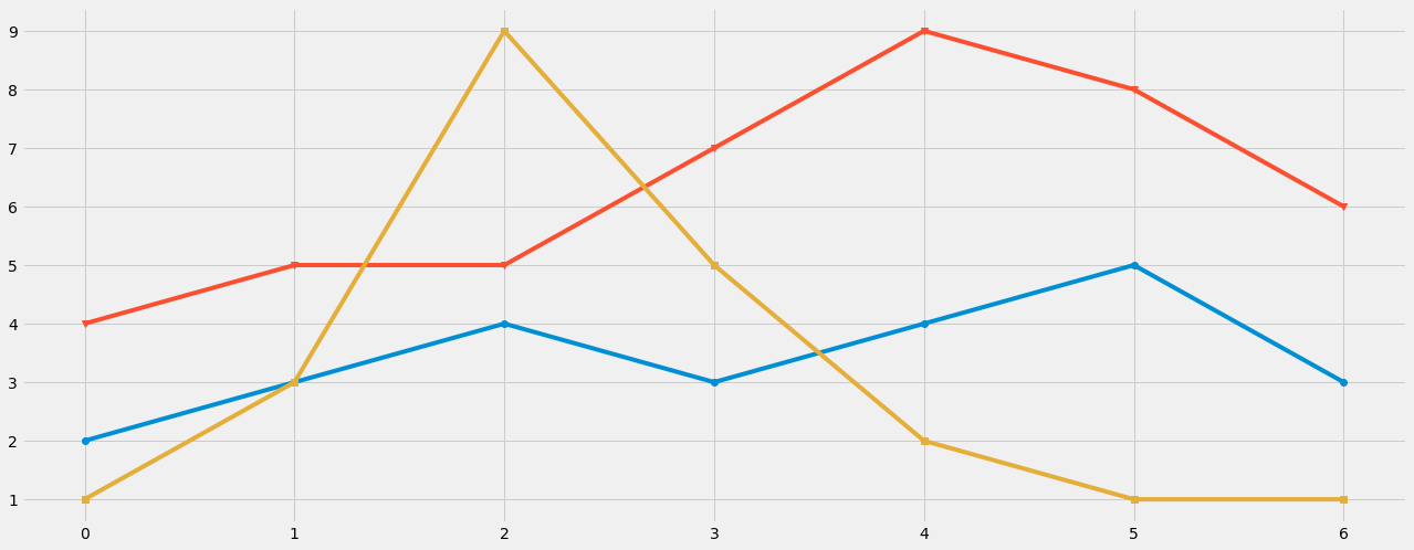
The ‘seaborn-whitegrid’ Style
We can use the preset of popular Seaborn library in our charts by using the ‘seaborn-whitegrid‘ stylesheet. As the name suggests, the stylesheet comes with a white background and grid thus increases the readability of the plots. The choice of the colours of lines/bars are from Seaborn’s in house palette, thus makes the plots extremely pleasing.
Now we will plot the Line Chart with the same data used above and will try to establish the differences between the previous Charts.
import matplotlib.pyplot as plt
plt.style.use("seaborn-whitegrid")
a = [2, 3, 4, 3, 4, 5, 3]
b = [4, 5, 5, 7, 9, 8, 6]
c = [1, 3, 9, 5, 2, 1, 1]
plt.figure(figsize = (20,8))
plt.plot(a, marker='o')
plt.plot(b, marker='v')
plt.plot(c, marker='s')
plt.xticks(size = 20)
plt.yticks(size = 20)
plt.show()
On executing this code, we get:
Here we applied the Seaborn Whitegrid stylesheet by adding ‘seaborn-whitegrid‘ as an attribute to plt.style.use() method. The set of colours makes the chart more informative and increases readability.
Note: If you are using these Stylesheets in Jupyter Notebook, don’t forget to restart the kernel before switching from one stylesheet to another.
Conclusions
In this article, we learnt how to use different stylesheets while plotting Line Charts in Python. Few of the stylesheet options are based on other tools or languages such as tableau-colorblind10 and seaborn-white grid which is based on Tableau and Seaborn respectively. While we looked at only six stylesheets, there are several more options one can try as per the requirement of the hour. The stylesheets options explained above are very popular and most widely used. One can try each of these stylesheets, to select the best stylesheet option as per the given data.
About the Author
Connect with me on LinkedIn.
Check out my other Articles Here and on Medium
You can provide your valuable feedback to me on LinkedIn.
Thanks for giving your time!
IT Engineering Graduate currently pursuing Post Graduate Diploma in Data Science.


