Walmart’s Sales Analysis through Data Visualization
This article was published as a part of the Data Science Blogathon.
Overview
In this article, we will be dealing with Walmart’s sales dataset and will follow all the data analysis steps on the same and as a result, will try to get some business-related insights from the operations we will be performing on this dataset.
Takeaways from this article
- Data analysis: Following the whole data analysis process i.e. from data cleaning to interrupting the insights from the data itself.
- Sales insights: Walmart dataset is the real-world data and from this one can learn about sales forecasting and analysis.
- Data visualization: Visualization of the data is an important part of the whole data analysis process and here along with seaborn we will be also discussing the Plotly library. Let’s get started!
Importing Libraries
import numpy as np
import pandas as pd

import matplotlib.pyplot as plt
import matplotlib.patches as patches
import seaborn as sns
import plotly.express as px
import plotly.graph_objs as go
from plotly.offline import iplot

from math import sqrt
import warnings
Reading the Data from the CSV file
So here we will be dealing with a bunch of CSVs files
- train.csv: In this, we will be performing our training
- features.csv: This CSV file holds all the main features which need to be analyzed for sales.
- stores.csv: It holds the type and size of stores.
- test.csv: From this data, we will be analyzing our model for testing purposes (after model building)
train_df = pd.read_csv('train.csv')
features_df = pd.read_csv('features.csv')
stores_df = pd.read_csv('stores.csv')
test_df = pd.read_csv('test.csv')
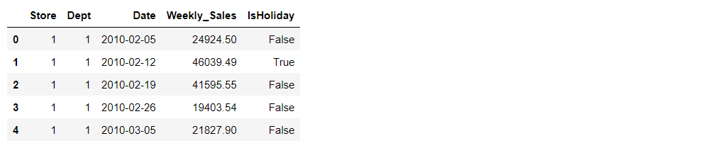
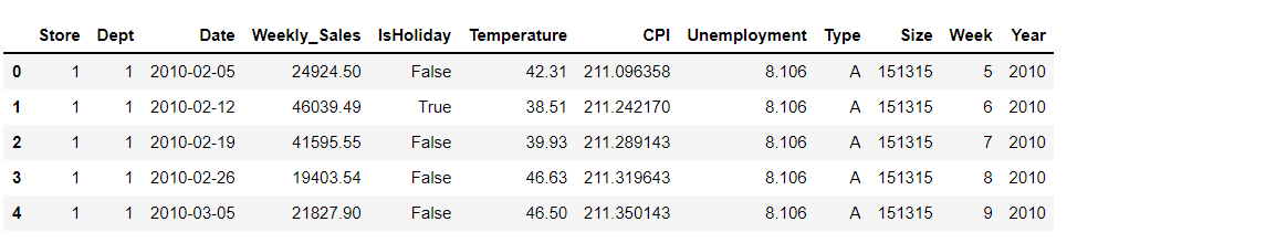
train_df.head()
Output:
train_df.columns
Output:
Index(['Store', 'Dept', 'Date', 'Weekly_Sales', 'IsHoliday'], dtype='object')
Let’s see the shape of the training dataset
train_df.shape
Output:
(421570, 5)
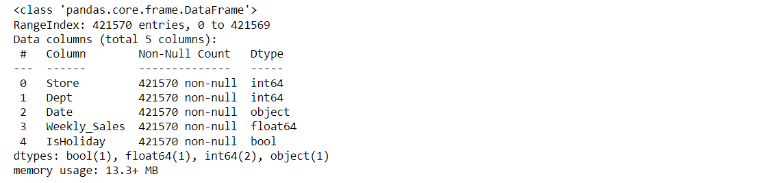
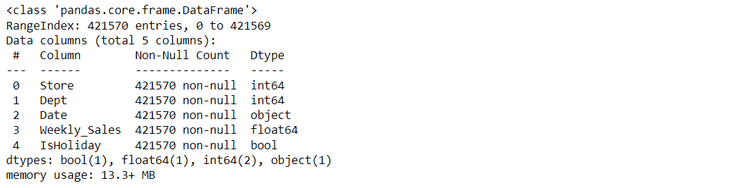
About training dataset
train_df.info()
Output:
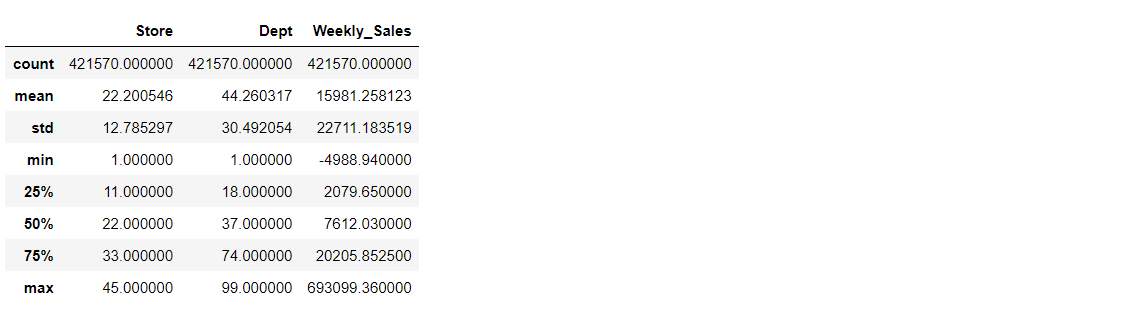
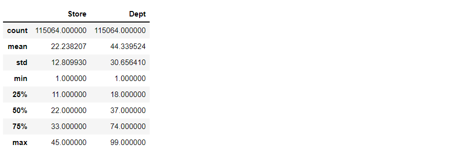
train_df.describe()
Output:
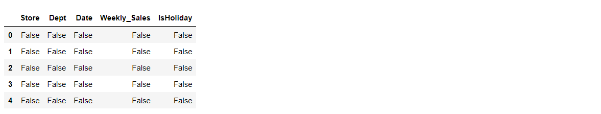
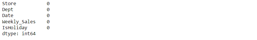
train_df.isnull().head()
Output:
train_df.isnull().sum()
Output:
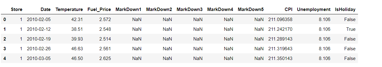
Let’s see our features data now
features_df.head()
Output:
Let’s look at the columns for our features data:
features_df.columns
Output:
Index(['Store', 'Date', 'Temperature', 'Fuel_Price', 'MarkDown1', 'MarkDown2',
       'MarkDown3', 'MarkDown4', 'MarkDown5', 'CPI', 'Unemployment',
       'IsHoliday'],
      dtype='object')
The shape of the features dataset
features_df.shape
Output:
(8190, 12)
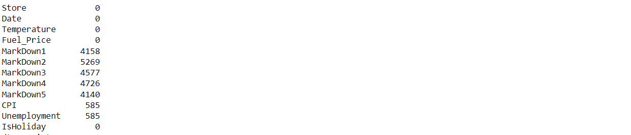
Now, let’s look at the null values in this file.
features_df.isnull().sum()
Output:
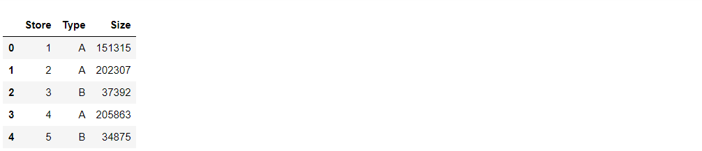
Let’s explore our store’s dataset.
stores_df.head()
Output:
Let’s see the columns in our store’s table
stores_df.columns
Output:
Index(['Store', 'Type', 'Size'], dtype='object')
The shape of the store’s data
stores_df.shape
Output:
(45, 3)
Let’s see what type of data does it holds
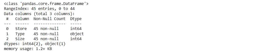
stores_df.info()
Output:
Data Visualization
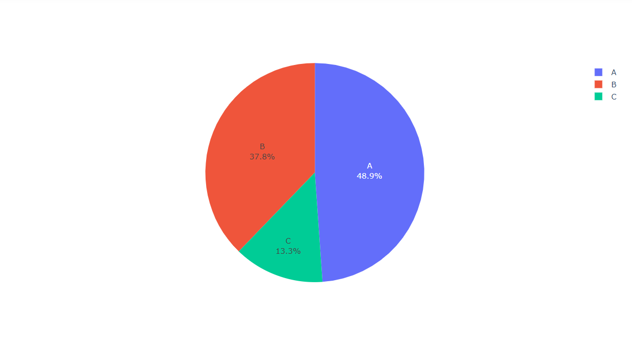
Visualizing the Type of the Stores along with their percentage
labels = stores_df["Type"].value_counts()[:10].index
values = stores_df["Type"].value_counts()[:10].values

colors=stores_df["Type"]

fig = go.Figure(data=[go.Pie(labels,values)])

fig.show()
Output:
Inference: Here from the above pie chart it is clearly visible that Type c has the minimum number of stores while Type A has the maximum number of stores.
While looking at the features it is evident that stores CSV files have “Store” as a repetitive column so it’s better to merge those columns to avoid confusion and to add the clarification in the dataset for future visualization.
Using the merge function to merge and we are merging along the common column named Store
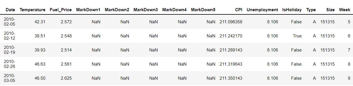
dataset = features_df.merge(stores_df, how='inner', on='Store')
dataset.head()
Output:
Here we will be looking at the number of columns and its kind of dataset.
dataset.columns
Output:
Index(['Store', 'Date', 'Temperature', 'Fuel_Price', 'MarkDown1', 'MarkDown2',
       'MarkDown3', 'MarkDown4', 'MarkDown5', 'CPI', 'Unemployment',
       'IsHoliday', 'Type', 'Size'],
      dtype='object')
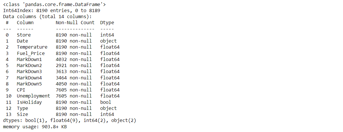
Now let’s see the type of our features and the count of null values.
dataset.info()
Output:
Since the Date in the above dataset is a string value we can convert them into DateTime using the DateTime.
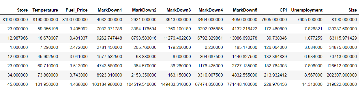
Describing the dataset
dataset.describe()
Output:
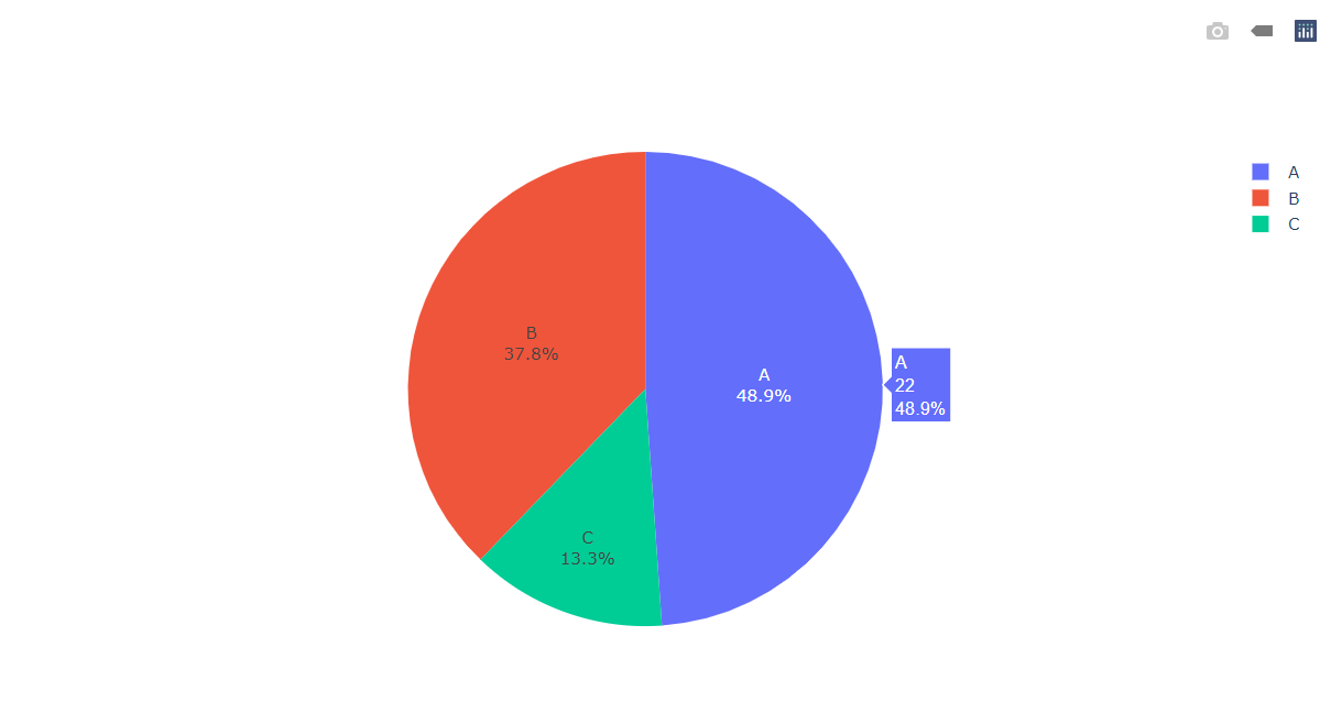
Visualizing the Type of the Stores along with their percentage in the dataset.
labels = dataset["Type"].value_counts()[:10].index  # Taking the top 10 index
values = dataset["Type"].value_counts()[:10].values  # Taking the top 10 values

colors=dataset["Type"]

fig = go.Figure(data=[go.Pie(values,labels)])

fig.show()
Output:
Inference: Here from the above pie chart it is clearly visible that Type c has the minimum number of stores while Type A has the maximum number of stores.
Let’s look into the testing dataset.
Note: Here Date is of an object type.
Now let’s see the type of our features and the count of null values
test_df.info()
Output:
Here we can see that Store and department are of integer type, IsHoliday is of boolean type and date is of the object type.
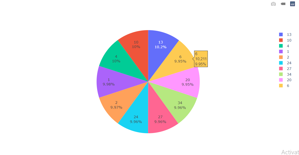
Visualizing the top 10 departments in the training dataset along with their percentage.
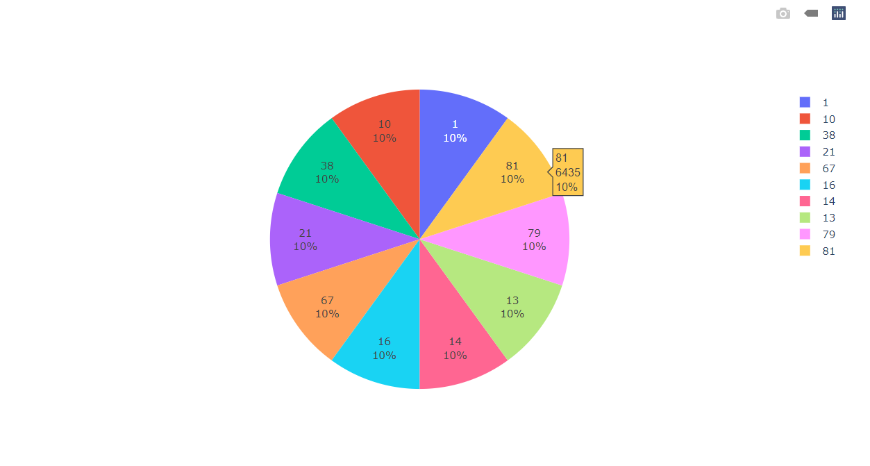
Inference: Here we are visualizing the top 10 stores in the training dataset along with their percentage which let us know that all 10 of the stores in the training dataset have equal distribution in the dataset.
Visualizing the Stores Data
labels = train_df["Store"].value_counts()[:10].index  # Taking the top 10 index
values = train_df["Store"].value_counts()[:10].values  # Taking the top 10 values

colors=train_df["Store"]

fig = go.Figure(data=[go.Pie(values,labels)])

fig.show()
Output:
Inference: Here we can see that each store holds nearly 10% distribution.
labels = train_df['IsHoliday'].value_counts().index # Taking the all index
values = train_df['IsHoliday'].value_counts().values  # Taking the all values

colors=train_df['IsHoliday']

fig = go.Figure(data=[go.Pie(values,labels)])
fig.show()
Output:
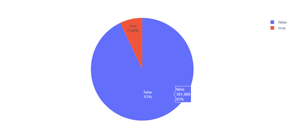
Inference: So in this pie chart it is evident that 93% of the time there is no holiday in the stores.
A total number of columns in the test_df
test_df.columns
Output:
Index(['Store', 'Dept', 'Date', 'IsHoliday'], dtype='object')
To know more about the test_df
test_df.describe()
Output:
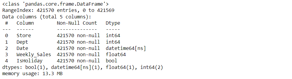
train_df.info()
Output:
As we know that our date time column is in object form but we need to change that into integer/numeral type so that our machine learning algorithm should understand the date data during the model building phase.
from datetime import datetime
dataset['Date'] = pd.to_datetime(dataset['Date'])
train_df['Date'] = pd.to_datetime(train_df['Date'])
test_df['Date'] = pd.to_datetime(test_df['Date'])
train_df.info()
Output:
dataset['Week'] = dataset.Date.dt.week # for the week data
dataset['Year'] = dataset.Date.dt.year # for the year data

dataset.head()
Output:
Merging with train_df
train_merge = train_df.merge(dataset, how='inner', on=['Store', 'Date', 'IsHoliday']).sort_values(by=['Store','Dept','Date']).reset_index(drop=True)
Merging with test_df
test_merge = test_df.merge(dataset, how='inner', on=['Store', 'Date', 'IsHoliday']).sort_values(by=['Store','Dept','Date']).reset_index(drop=True)
Now we will make the function to plot the scatter plot for various relationships.
def scatter(train_merge, column):
    plt.figure()
    plt.scatter(train_merge[column] , train_merge['Weekly_Sales'])
    plt.ylabel('Weekly_Sales')
    plt.xlabel(column)

scatter(train_merge, 'Fuel_Price')  # with respect to Fuel_Price
scatter(train_merge, 'Size')  # with respect to Size
scatter(train_merge, 'CPI')  # with respect to CPI
scatter(train_merge, 'Type')  # with respect to Type
scatter(train_merge, 'IsHoliday') # with respect to IsHoliday
scatter(train_merge, 'Unemployment')  # with respect to Unemployment
scatter(train_merge, 'Temperature') # with respect to Temperature
scatter(train_merge, 'Store') # with respect to Store
scatter(train_merge, 'Dept')  # with respect to Dept
Output:
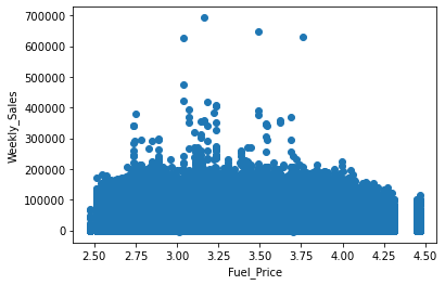
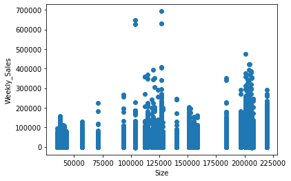
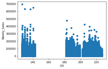
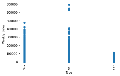
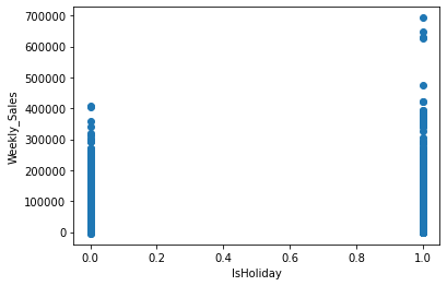
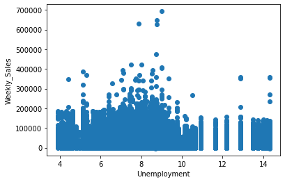
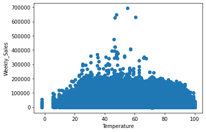
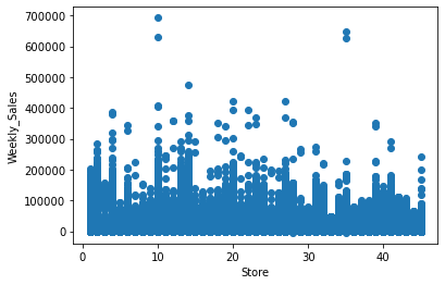
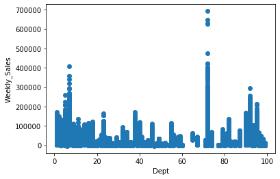
In the above diagram, we have seen the relationship between:
- Weekly sales vs Fuel price
- Weekly sales vs size of the store
- Weekly sales vs CPI
- Weekly sales vs type of departments
- Weekly sales vs Holidays
- Weekly sales vs Unemployment
- Weekly sales vs Temperature
- Weekly sales vs store
- Weekly sales vs Departments
Correlation Matrix
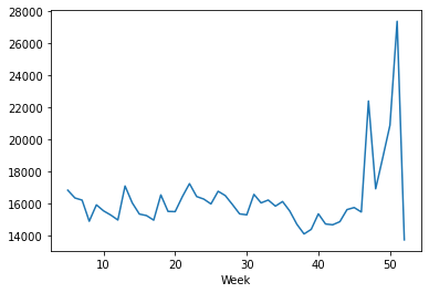
Now with the help of scatter charts, we will be looking at the average sales per week for different years i.e. we will find out about the weekly sales per week for the years 2010, 2011, and 2012.
Average Weekly Sales for the year 2010
weekly_sales_2010 = train_merge[train_merge['Year']==2010]['Weekly_Sales'].groupby(train_merge['Week']).mean()

sns.lineplot(weekly_sales_2010.index, weekly_sales_2010.values) # for plotting then lineplot
Output:
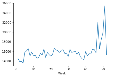
Average Weekly Sales for the year 2011
weekly_sales_2011 = train_merge[train_merge['Year']==2011]['Weekly_Sales'].groupby(train_merge['Week']).mean()

sns.lineplot(weekly_sales_2011.index, weekly_sales_2011.values) # for plotting then lineplot
Output:
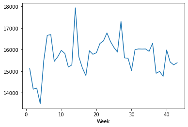
Average Weekly Sales for the year 2012
weekly_sales_2012 = train_merge[train_merge['Year']==2012]['Weekly_Sales'].groupby(train_merge['Week']).mean()

sns.lineplot(weekly_sales_2012.index, weekly_sales_2012.values) # for plotting then lineplot
Output:
Plotting the above three plots together
plt.figure(figsize=(20,8))
sns.lineplot(weekly_sales_2010.index, weekly_sales_2010.values)
sns.lineplot(weekly_sales_2011.index, weekly_sales_2011.values)
sns.lineplot(weekly_sales_2012.index, weekly_sales_2012.values)
plt.grid()
plt.xticks(np.arange(1,60, step=1))
plt.legend(['2010', '2011', '2012'], loc='best', fontsize=16)
plt.title('Average Weekly Sales Per Year', fontsize=20)
plt.ylabel('Sales', fontsize=16)
plt.xlabel('Week', fontsize=16)
plt.show()
Output:
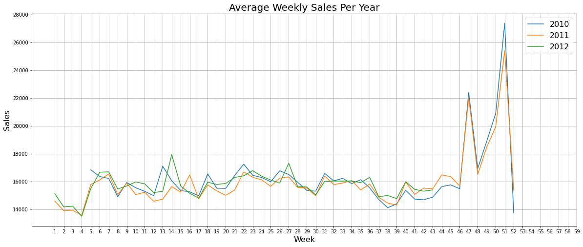
Combining the above plots into one for better understanding
Average Sales per Department
weekly_sales = train_merge['Weekly_Sales'].groupby(train_merge['Dept']).mean()
plt.figure(figsize=(25,12))
sns.barplot(weekly_sales.index, weekly_sales.values, palette='dark')
plt.grid()
plt.title('Average Sales per Department', fontsize=20)
plt.xlabel('Department', fontsize=16)
plt.ylabel('Sales', fontsize=16)
plt.show()
Output:
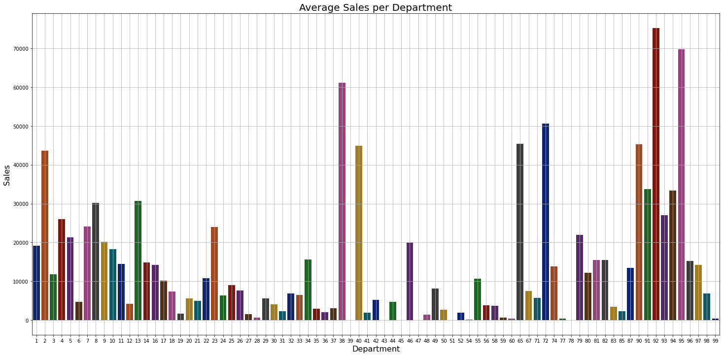
Inference: As shown in the above graph we can see that 90 to 98 departments have the highest sales in general.
Average Sales per Store
weekly_sales = train_merge['Weekly_Sales'].groupby(train_merge['Store']).mean()
plt.figure(figsize=(20,12))
sns.barplot(weekly_sales.index, weekly_sales.values, palette='dark')
plt.grid()
plt.title('Average Sales per Store', fontsize=20)
plt.xlabel('Store', fontsize=16)
plt.ylabel('Sales', fontsize=16)
plt.show()
Output:
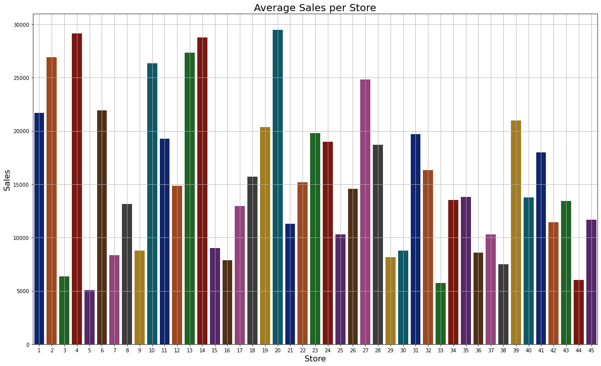
Inference: As we can see that store no 20 has the highest sales.
plt.figure(figsize=(12,12))
sns.set(style = "white")
corr = train_merge.corr()
mask = np.triu(np.ones_like(corr, dtype=np.bool))
# f, ax = plt.subplots(figsize=(20, 15))
cmap = sns.diverging_palette(220, 10, as_cmap=True)
plt.title('Correlation Matrix', fontsize=18)
sns.heatmap(corr)
plt.show()
Output:
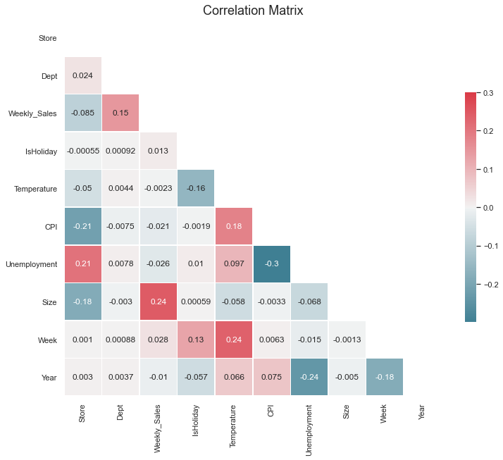
So now from the above graph, we have found out which features are highly correlated with each other so now we will be removing those features to remove the bias from the dataset.
train_merge = train_merge.drop(columns=['Fuel_Price', 'MarkDown1', 'MarkDown2', 'MarkDown3', 'MarkDown4', 'MarkDown5'])
test_merge = test_merge.drop(columns=['Fuel_Price', 'MarkDown1', 'MarkDown2', 'MarkDown3', 'MarkDown4', 'MarkDown5'])
Now as we have successfully sorted the features data which is completely clean and ready to use for the model phase so for the last time let’s see our cleaned training and testing data.
train_merge.head()
Output:
test_merge.head()
Output:
Getting the columns in the train_merge
train_merge.columns
Output:
Index(['Store', 'Dept', 'Date', 'Weekly_Sales', 'IsHoliday', 'Temperature',
       'CPI', 'Unemployment', 'Type', 'Size', 'Week', 'Year'],
      dtype='object')
Getting the columns in test_merge
test_merge.columns
Output:
Index(['Store', 'Dept', 'Date', 'IsHoliday', 'Temperature', 'CPI',
       'Unemployment', 'Type', 'Size', 'Week', 'Year'],
      dtype='object')
What’s next?
Well now all the data preprocessing part is done and one can easily go for the model building phase to build a machine learning model for Walmart’s sales forecasting.
Endnotes
Here’s the repo link to this article.
Here you can access my other articles, which are published on Analytics Vidhya as a part of the Blogathon (link)
If you have any queries, you can connect with me on LinkedIn; refer to this link.
About me
Greeting to everyone, I’m currently working in TCS and previously, I worked as a Data Science Associate Analyst in Zorba Consulting India. I am passionate about Data Science, along with its other subsets of Artificial Intelligence such as Computer Vision, Machine learning, and Deep Learning. If you liked my article and would like to collaborate with me on any project on the domains mentioned above (LinkedIn).


