Are you looking to upgrade your Data Storytelling skills? There are many options for learning. We’ve compiled an updated list of resources, including free training, online courses, and workshops from top experts. If you just want to get a sense of what makes a good data story, you can start with our list of the best data storytelling examples.
The following resources will teach you about data visualization, narrative, and engaging your audience. In our search, we wanted to find solutions that were accessible to everyone, delivered by an experienced instructor, and did not focus on a particular piece of software. We’ve broken this list into three categories:
Free Learning Resources to get started;
Online Courses to dive deeper;
Hands-on Workshops with expert guides.
(1) Data Storytelling Free Learning Resources
We went back to our ultimate collection of Data Storytelling Resources to find getting-started resources based on the amount of time you are willing to commit.
If you’ve only have 5 minutes…
If you have 30 minutes…
If you only have an hour…
If you can commit 10 minutes a day…
Free Data Storytelling Lessons.
With more than 20 short lessons, this collection of essential lessons provides a complete overview of the skills, tips, and tricks required to become a data storyteller. The hands-on, interactive lessons are self-paced and take 5-10 minutes to complete.
Instructor: Zach Gemignani has spent 15 years helping organizations design and develop interactive analytical applications, presentations, and data stories. He is author of the book Data Fluency, Empowering Your Organization with Effective Data Communication and has guided the development of a leading data storytelling platform, Juicebox.
Data Storytelling Online Courses
When you are ready to receive guided instruction on data storytelling, the following courses are a great place to start.
Best Practical Course Collection: Story IQ
Course: Data Storytelling for Business provides learners with a solid grounding in fundamental data storytelling learning concepts. By the end of the course, learners will have the skills needed to produce impactful data visualizations layered with compelling narratives.
Access: Live virtual courses
Instructor: StoryIQ is a small group of training professionals focused on hands-on, practical teaching for a business audience.
Cost: Starts at $299

Best Free Introductory Course: EdX
Course: Introduction to Data Storytelling. “Using existing spreadsheet and quantitative reasoning skills, learners will make their data tell a story. This course is ideal for learners who are just starting out in their careers, journalists looking to expand their skill set, and marketers looking to tell a story.”
Cost: Free

Best Prestige Course: MIT Executive Education
Course: Persuading with Data — highly practical and collaborative, this course combines visualization and strategic communication best practices to help you communicate data more effectively and influence others to take action based on data through data storytelling.
Access: Live Online on specific dates.
Instructor: Miro Kazakoff is a Senior Lecturer in Managerial Communication at the MIT Sloan School of Management where he focuses on how individuals use data to persuade others.
Cost: $4,300
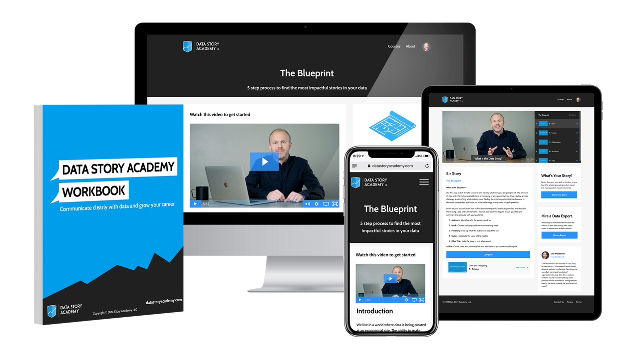
Best Collection of Course Extras: Data Story Academy
Course: Data Story Academy is a three-part framework built for business professionals providing the tools they need to grow their career and access to frameworks that virtually guarantee success in doing more with data. The course comes complete with templates, frameworks, and examples to help you apply your skills.
Access: On-demand
Instructor: Zack Mazzoncini has helped hundreds of organizations and individuals develop data-driven cultures centered around data storytelling. Zack's personal mission statement is: "Change people's lives for the better by being the best version of myself".
Cost: $697
Best Technically-Focused Course: eCornell
Course: Part of the Data Visualization with Python Certificate Program. The program will lead you through the process of creating meaningful data visualizations and provide you with new methods to make and modify your visualizations programmatically with Python.
Access: Online, 3-4 months.
Instructor: David Gold is a Ph.D. candidate in Environmental and Water Resources Systems (EWRS) with the Reed Research Group at Cornell University.
Cost: $3,000 to $5,000.
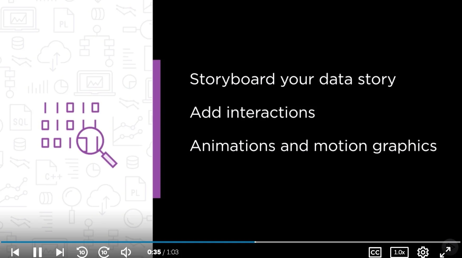
Best Design-Focused Course: Plural Sight
Course: Data Storytelling: Moving Beyond Static Data Visualizations. Learn how to package a data story for different mediums and audiences and how to craft a data story by defining your audience and end goals. Explore how to create animations and motion graphics to present an impactful moment.
Access: On-demand
Instructor: Troy Kranendonk is a Curriculum Manager for Data Access and Analytics as well as an author with Pluralsight. He considers himself to be a Pixel Ninja.
Cost: $199-299 per year (Plural Sight subscription)
Best Free Video Course: Knight Center
Course: Data Visualization for Storytelling and Discovery. The four-week course, which was powered by Google, took place from June 11 to July 8, 2018. We are now making the content free and available to students who took the course and anyone else who is interested in learning how to create data visualizations to improve their reporting and storytelling.
Access: On-demand
Instructor: Alberto Cairo is an information designer and professor. Cairo is the Knight Chair in Visual Journalism at the School of Communication of the University of Miami.
Cost: Free

Best LinkedIn Learning Option: Telling Stories with Data
Course: Telling Stories with Data. The same techniques that are used to tell stories with words—structure, conflict, resolution, emotion, and surprise—can be used with data. You can craft compelling narratives that help audiences visualize information, without complex charts or graphs.
Access: On-demand
Instructor: Paul A. Smith is author of the best-selling book Sell with a Story: How to Capture Attention, Build Trust, and Close the Sale.
Cost: $30/month (for LinkedIn Learning)
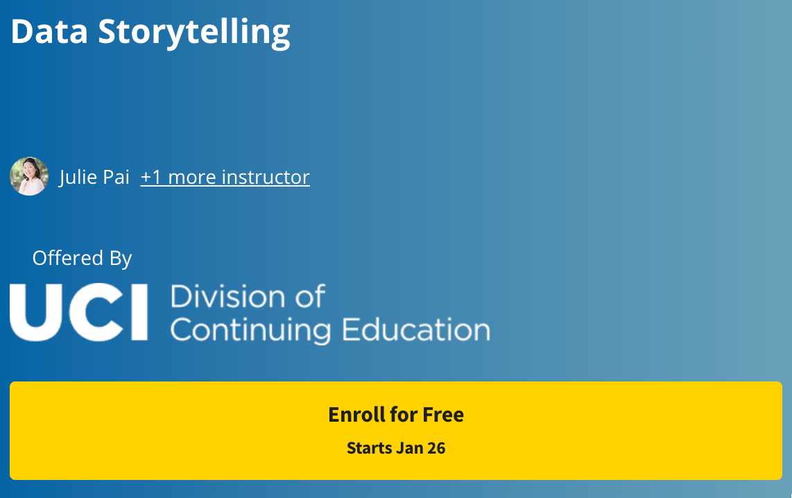
Best Coursera Option: University of California, Irvine
Course: This course will cover the more complex concepts that become involved when working beyond simple datasets. Exploring the connection between visual aspects and data understanding, we will examine how those concepts work together through data storytelling.
Access: On-demand
Instructor: Julie Pai and Majed Al-Ghandour
Cost: N/A (free for audit-mode)
Best Academic Certificate Program: Purdue
Course: Data Storytelling Certificate offers an introduction to the concept of Data Storytelling, why it matters, and how it can transform the results of your research into impactful narratives from which your audience learns new things, remembers important findings, and acts on them.
Access: Online, self-paced and self-guided
Instructor: Sorin Adam Matei, Data Storytelling Program Director and Associate Dean of Research, Purdue University.
Cost: $1,000

https://www.edx.org/course/storytelling-and-persuading-using-data-and-digital-technologies?index=product_value_experiment_a&queryID=06ee3bac3b5445ac1a10eec86f4632c5&position=2
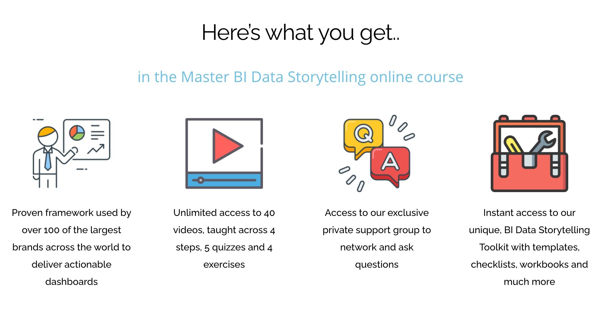
Best Dashboard-Oriented Training: BI Brainz
Course: Master BI Data Storytelling. An online course that will teach you how to easily setup, build and design your first compelling data story!
Access: On-demand
Instructor: Mico Yuk, Founder of BI Brainz and creator of the Analytics on Fire Podcast.
Cost: $497-$697
Data Storytelling Workshops
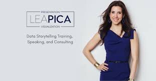
Lea Pica
Lea Pica is one of my all-time favorite presenters and an energetic entrepreneur who honed her data storytelling skills with marketing data.
Give me two days, and I’ll give you and your team the practical and strategic tools you need to visually present data in a way that gets noticed, remembered, and acted upon.
Ben Jones led Tableau’s training efforts before launching his own company. His primary focus is on data literacy, but his high quality of his content shouldn’t be missed.
We pride ourselves in being the premium data literacy training provider in the world. Our courses have been implemented by Fortune 500 companies, government agencies, and nonprofit organizations alike. We offer training on an on-demand basis or via live, virtual, instructor led sessions.

Cole Nussbaumer Knaflic has build a loyal and engaged community through her focus on practical guidance, training, and hands-on exercises.
The goal of this workshop is to enable you to bring data to life and use it to communicate a story to an audience, with a focus on simplicity and ease of interpretation. This is accomplished through a mix of data visualization and storytelling theory, best practices, and practical application.

Gilbert Eijkelenboom shares a commitment to the humanist-side of analytics, recognizing the importance of behavior and psychology to ensure your data product has impact.
Are you tired of not seeing the results of your work? Let’s enhance your impact: understand the business need and experience the joy of seeing people use your data products.

Brian O'Neill is an analytics product designer with a focus on user experience and creating impactful data products.
My workshops help data science, analytics, and product/business leaders learn how to imagine customer-driven solutions that focus on creating a business outcome and change, instead of just outputs.

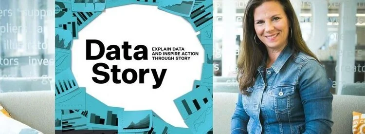
Brent Dykes is author of the the book ‘Effective Data Storytelling’ and has struck out on his own to create a data storytelling training firm.
Data storytelling training can help teach you and your team how to become better data communicators so you can take full advantage of the insights at your fingertips.

Nancy Duarte is one of the pre-eminent thought leaders in presentation design. More recently, she connected her storytelling frameworks to data-rich presentations.
Almost every job today involves decision-making with data. Once you’ve formed a point of view about the problem or opportunity your data uncovered, communicating the findings well speeds up decision-making, moves others to action and yes, advances your career.
Rebeca Pop has built a following by focusing on the fundamentals of data visualization and storytelling and by working closely with her customers to meet their unique needs.
Workshops are designed for anyone who needs to communicate more effectively with data. For example, if you are a data scientist, you might see the need to create more thoughtful charts. Or, if you are an entrepreneur, you might want to include powerful charts into your pitch deck.
If you ever thought to yourself: "I wish I could communicate better with data," then you came to the right place.