My first stop for data visualization inspiration is Jonathan Harris’ We Feel Fine. It is a MasterClass in combining artistic passion, compassion for the subject matter, and technical craftmanship in user experience design.
Released in 2005, it continues to stand out as a monumental achievement in the breadth of its ambition and in the tiny details that make it a delight to experience. This is why I come back again and again for design concepts and engaging data visualization techniques that reach any audience.
We Feel Fine set out to harvest the feelings of the internet…
It searches the world's newly posted blog entries for occurrences of the phrases "I feel" and "I am feeling". When it finds such a phrase, it records the full sentence, up to the period, and identifies the "feeling" expressed in that sentence (e.g. sad, happy, depressed, etc.).
This data is gathered into a database of “several million human feelings” and presented through a series of searchable and sortable visualizations.
I love the realization of this vision. And in that spirit, I want to share a few of the brilliant design choices that have inspired me for over a decade.
Bringing physicality to data
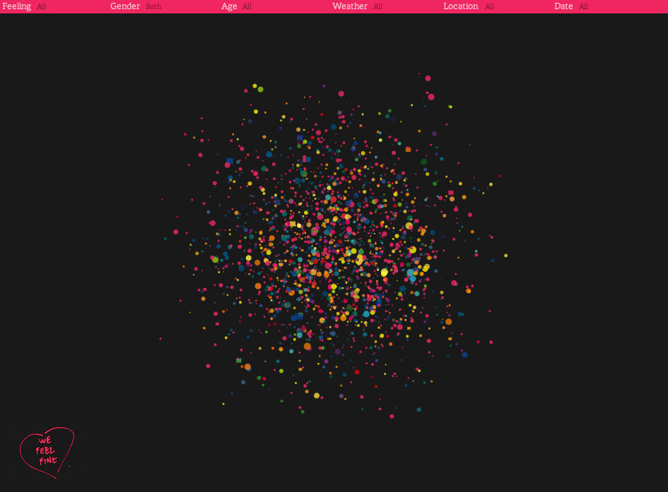
Harris seems to ask the question: What if you could play with data in the way you play in a sandbox? His data points dart around the screen, come together in blobs as if by magnetic attraction, and reshape themselves to tell their story. I’ve always been drawn to the challenge of bridging the gap between the abstract nature of data and the reality that it represents. We Feel Fine delivers on this notion.
Animated fun
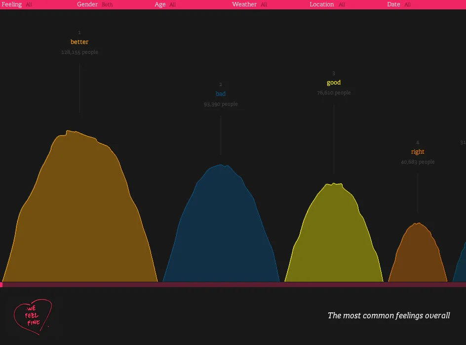
We Feel Fine is exploding with energy, just like the emotions it represents. The “Mounds” visualization collects the volume of different feelings and shows them in wiggling Jello-like piles. While it is effectively a bar chart, the result is far more engaging for the viewer.
Careful use of color
Harris uses color to bring energy to his visualizations. With the dark backgrounds, the vibrant colors provide a powerful but not overwhelming contrast. And even when he is using multiple colors, he is able to sequence them and limit the variety to ensure it isn’t distracting.

Visual elements to enhance the data
Good data presentation combines data visualization with other visual elements that communicate the message. In We Feel Fine, the use of typography and icons helps support the data content. He even uses touches of skeuomorphism (i.e. interface objects that mimic their real-world counterparts) to express the data in creative ways.
Word Play
Data visualizations and data stories need to guide the audience through the content with text. Harris brings a levity to the language he uses. Most notably, the various “Movements” (i.e modules of his project) all start with the letter M. If you are having fun as author, your readers will too.

Specificity
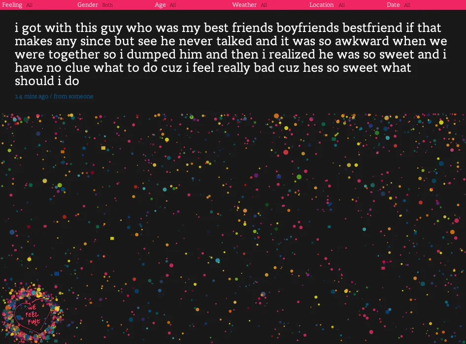
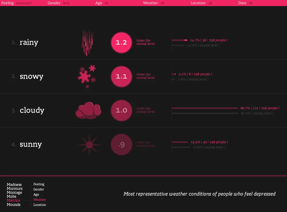
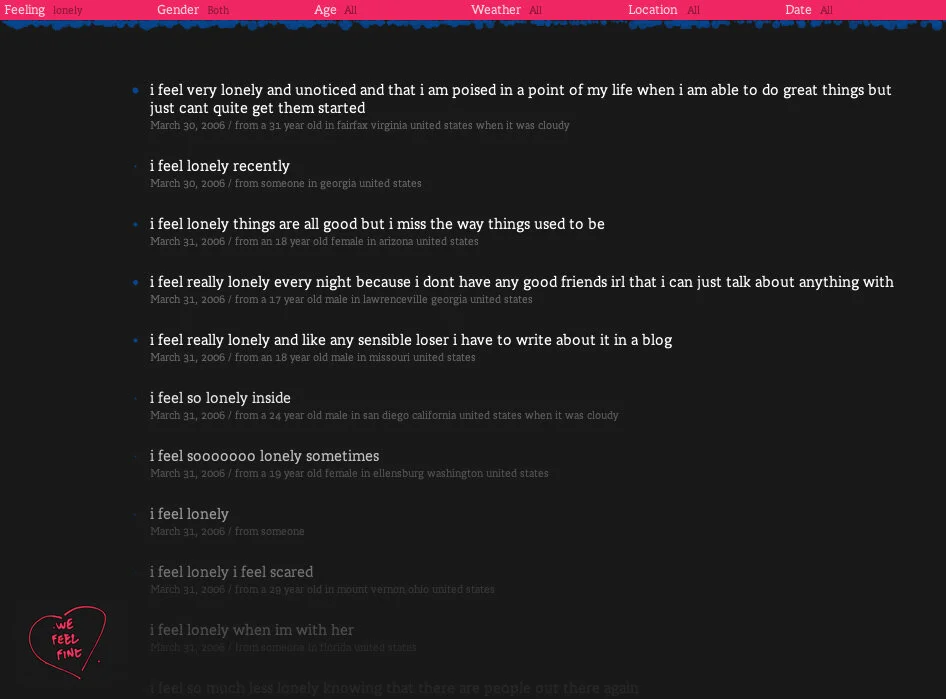
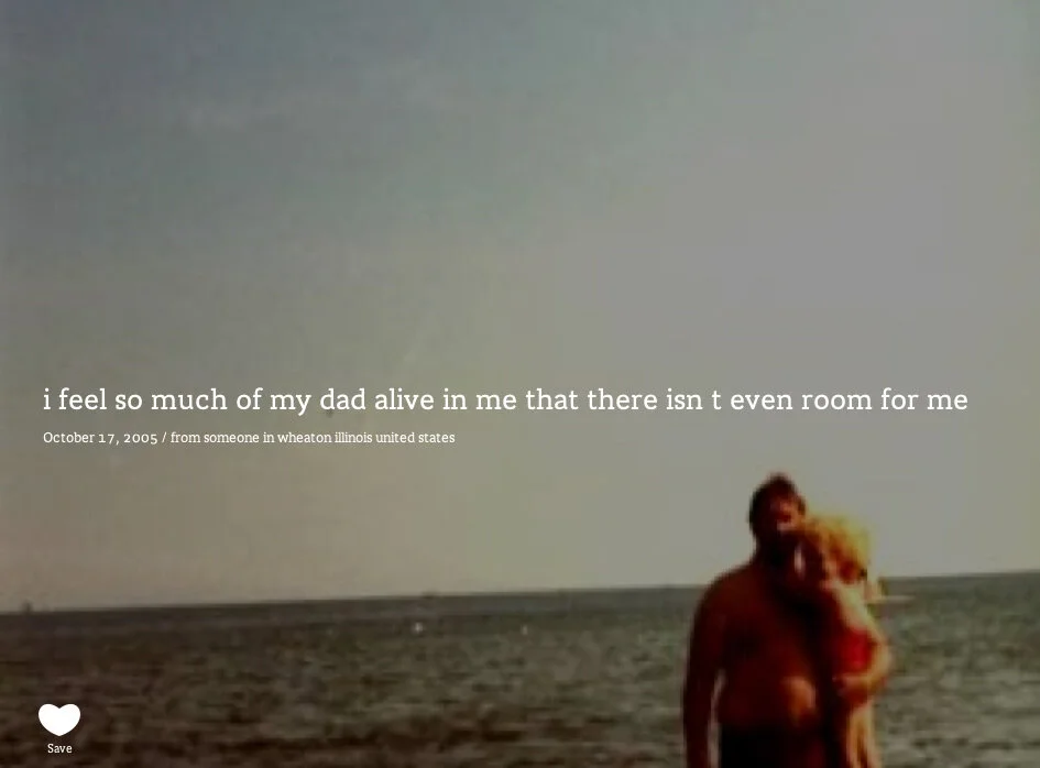
If I’ve said it once, I’ve said it a thousand times: Specificity is the soul of (data) narrative. In We Feel Fine each data point is a person expressing a feeling, and each point can be expanded to see the feeling-statement and associated image. These feelings are the atomic building blocks of the database and the visual presentations — Harris wants to make sure you never lose sight of that.
Parts into the whole
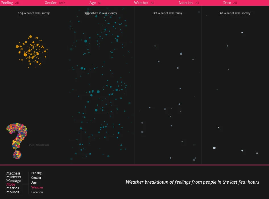
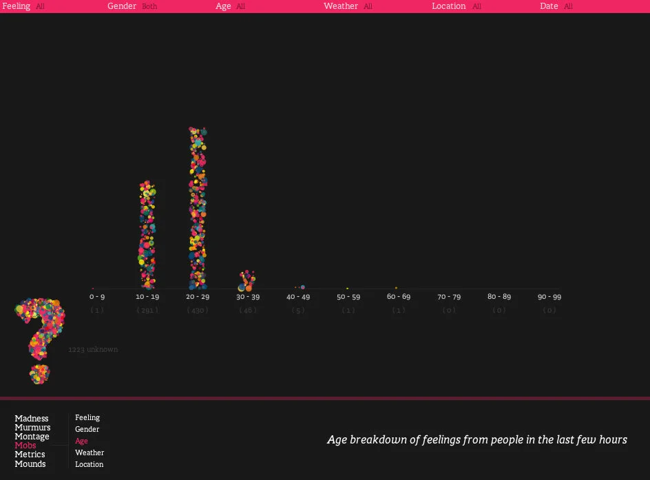
The “Mobs” visualization in We Feel Fine stacks up individual feelings into a bar chart. This is a technique that I love and we have borrowed for our own distribution charts. For the viewer, it reinforces the fact that each bar is composed of unique elements. As a result, the data values becomes less of an abstract concept.

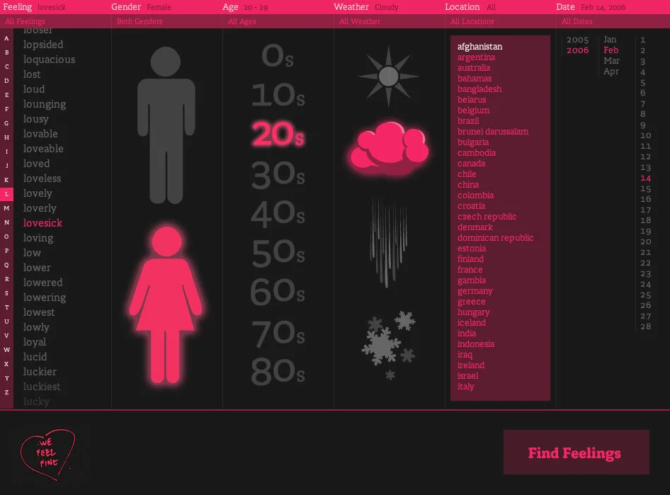
Selections that are fun and intuitive
Throughout We Feel Fine, the reader can filter to narrow the range of feels shown. The interface for this filtering is among the best examples I’ve seen. It is clear, intuitive, and easy to navigate. As with everything else in this project, it is carefully crafted with the user in mind.