Never, ever keep the default settings.
That was the overarching theme of my Lightning Talk at the DATAcated Expo, which was held virtually in October 2021.
You’re not going to keep the ugly, outdated defaults. Great!
But what should you do instead?
And how do you modify a graph so that it’s just right for your audience?
Surely a group of scientists will need something different from a group of policymakers.
Some audiences adore data. Others don’t.
Some audiences have plenty of time. Others don’t.
In this blog post, you’ll learn about:
- the differences between default, traditional, and storytelling graphs;
- which techniques can help you tell a story with data (e.g., dark colors); and
- when to use each type of graph.
Watch the DATAcated Expo Lighting Talk
Missed the live event?
Watch the Lightning Talk here.
This is a 17-minute video. If you’re short on time, just watch a 10-minute segment — minutes 2 through 12 of the video.
Here’s a summary of what’s inside.
Defining the Term “Data Storytelling”
This is a tricky term with lots of definitions.
Some people love this term.
Others hate it.
In the recording, you’ll see me ask the attendees to share what “data storytelling” means to them.
You might define data storytelling as:
- “What does data really mean, and what do you want it to tell.” — an Expo attendee
- “Translating data for non-data centric users.” — an Expo attendee
And data storytelling is NOT:
- Fiction
- Making things up
- Biasing our audience
- Fudging the numbers
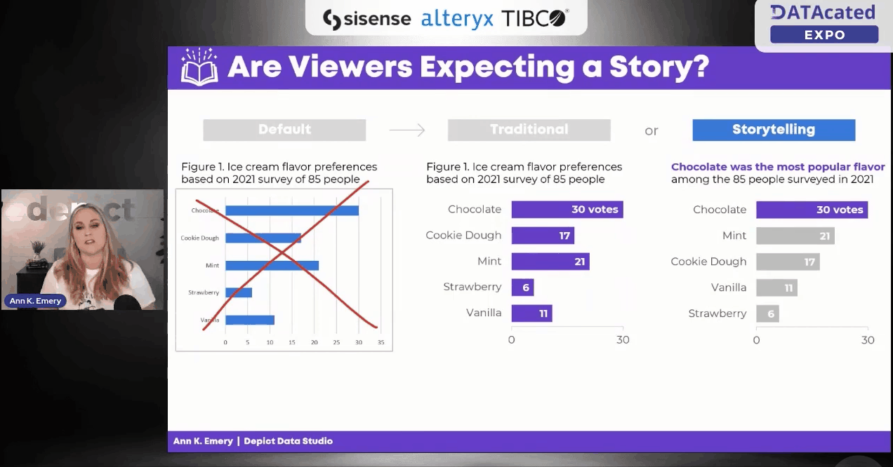
Data Storytelling in a Bar Chart
In the Lightning Talk, I showed attendees three versions of the same graph: default, traditional, and storytelling.
We’ll look at each of these side by side, so that you can see how they’re similar and how they’re different.
At the end, I’ll ask you to comment and share which style you think each of your audiences need.
The Default Bar Chart
We never, ever keep the default settings.

The Traditional Bar Chart
Instead, at a bare minimum, we need to design a traditional graph.
We would:
- Enlarge the font
- Enlarge the bars (by decreasing the gap width)
- Remove the border
- Add labels (optional—if we think our audiences would want specificity)
- Adjust the scale
- Use brand colors
- Use brand fonts
It’s up to the viewers to read the chart and figure out the “so what?” for themselves.

The Storytelling Bar Chart
Sometimes, our audiences prefer storytelling graphs.
You already spent 60 seconds cleaning up the default settings.
In another 60 seconds of editing, we would:
- Sort the bars (e.g., greatest to least)
- Gray everything out
- Highlight one takeaway finding with a dark color
- Add the takeaway finding to the graph title
- Bold a few key words to make the title even more skimmable

Data Storytelling in a Slope Chart
You can apply these principles to any and all chart types.
Here’s what the three different styles look like in a slope chart.
(A slope chart is just a fancy name for a line chart that has exactly two points in time.)
The Default Slope Chart
Defaults are for 2005.
We know better.
C’mon, Excel. And Tableau. And PowerBI. And and and.

The Traditional Slope Chart
At a bare minimum, we need to:
- Enlarge the fonts
- Adjust the scale
- Remove the border
- Add brand colors
- Add brand fonts
- Remove the legend and directly label the data
(Direct labels have three key advantages: They’re faster to read; they’re better for people who are colorblind; and they print better in grayscale.)

The Storytelling Slope Chart
Take the edited graph you just made, and keep going!
In a storytelling slope chart, we would:
- Gray everything out
- Highlight one thing at a time
- Re-write the title and put the takeaway message in the title
- Bonus points: Bold a few key words to make it even more skimmable
Which finding will you highlight in a darker color?
You might highlight:
- The Success Story (Project A)
- The Debbie Downer Story (Project C)
Be careful with red; in Western cultures, red means caution! warning! But colors are culturally-specific; in Eastern cultures, red doesn’t necessarily mean anything bad.

Data Storytelling in a Scatter Plot
We didn’t have time to discuss scatter plots at the DATAcated Expo, but I’d still like to share this example with you.
Here’s how data storytelling would be applied to a scatter plot.
Never keep the default settings!!!!!!!!!!
Traditional graphs are all one color and they have topical titles.
Storytelling graphs have a dark-light contrast and takeaway titles. For bonus points, you could label a few key points.

Data Storytelling in a Map
Finally, here’s how data storytelling would be applied to a choropleth map.
Never keep the default settings!!!!!!!!!!
In traditional maps, none of the colors stand out, and they have topical titles.
In storytelling maps, we’d add an intentional dark-light contrast and takeaway title. For bonus points, you could label a few key points.

When Should You Use Data Storytelling?
Comment below: When would you use each style?
Which of your audiences prefer traditional graphs?
Which of your audiences prefer storytelling graphs?
In the video, you’ll also hear the conference attendees share their perspectives, and you’ll hear from me, too.
Leave a Reply