The Box-Percentile Plot was developed by Warren W. Esty and Jeffrey D. Banfield in their 2003 paper The Box-Percentile Plot. It is considered an improvement over the traditional Box Plot as it provides a more informative display of the data distribution shape, especially for skewed or multimodal data, while still being a compact visualisation.
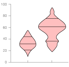
Box-Percentile Plots display the same summary statistics as regular Box Plots (median, quartiles, minimum, and maximum), but instead use line markers on a density/distribution shape to indicate their location. A Box-Percentile Plot incorporates a density shape (like on a Violin Plot) by varying the width of the shape in proportion to the percentiles of the data.
The clear display of a density shape allows for the skewness, modality, and other distributional characteristics to be revealed visually. Also, this plot can depict tail behaviour, as the widths above and below the median convey the density in the upper and lower tails respectively, making it easier to identify heavy tails or outliers.
Examples
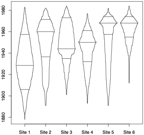
Figure 6: Box-percentile plots for tree invasions at six different sites in the Madison Valley of Montana.
The Box-Percentile Plot, Warren W. Esty and Jeffrey D. Banfield, DOI: 10.18637/jss.v008.i17
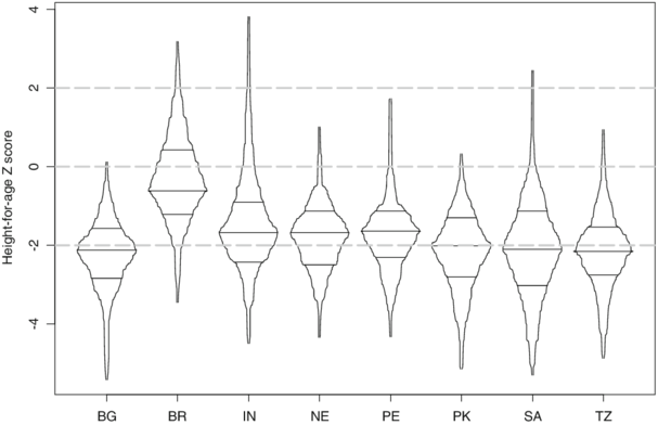
Box-percentile plots of height-for-age (HAZ) by country; 2009-10.
Household food access and child malnutrition: Results from the eight-country MAL-ED study
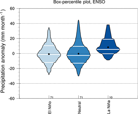
The box-percentile plot of the Canadian Prairies precipitation anomaly during growing season under different ENSO conditions.
Combined impacts of ENSO and MJO on the 2015 growing season drought on the Canadian Prairies
Related Posts:
Further Exploration #4 Box Plot Variations

