To Tell the Story Clearly, Omit Nothing Significant
We’re in the midst of a worldwide COVID-19 pandemic. Our understanding of this novel pandemic and our efforts to combat it are determined in large part by the information that we consider. It’s critically important that information in news stories is presented clearly and accurately. Unfortunately, sources that we rely on for the news, including ordinarily reliable sources, sometimes present COVID-19 data in misleading ways. This is sometimes done by omitting relevant data. Even one of my favorite new sources, NPR, was recently guilty of this. The charts that were included in an NPR article titled “Charts: How the U.S. Ranks On COVID-19 Deaths Per Capita – And By Case Count” on August 5, 2010 by Jessica Craig illustrate this.
The article is a response to the recent Axios interview with Donald Trump by Jonathan Swan, which aired on August 3, 2020 on HBO. In particular, the article addresses the exchange that occurred during that interview about COVID-19 deaths in the United States. Trump suggested that we were doing better than any other country, which is not the case by any measure of COVID-19-related mortality. When Swan countered that we’re doing much worse than many countries, Trump handed him a chart that apparently referred to “case fatality ratio,” which is the ratio of deaths per infections. Swan then explained that he was referring to deaths in proportion to the population (i.e., deaths per capita), to which Trump responded, “You can’t do that.” You certainly can do that. There are several ways in which COVID-19 deaths per country can be compared, and per capita deaths is one of the most useful. Case fatality rate is useful as well. Both measures contribute to our understanding when they’re presented clearly.
My primary concern with the NPR article has to do with the two charts that appeared in it: one regarding deaths per capita and one regarding case fatality ratios, both of which compared the U.S. to other countries with “50,000 or more reported cases.” Let’s begin with the chart that shows per capita deaths:
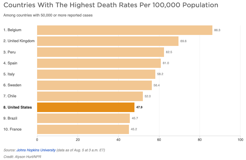
It appears that only two countries—Brazil and France—are doing better than the U.S., but this is hardly the case. As of August 5th, 45 countries reported more than 50,000 COVID-19 cases to date. In other words, 37 out of 44 other countries with 50,000 or more cases are doing better than the U.S., and this doesn’t even count the much larger number of countries with fewer than 50,000 cases. The chart suffers from the “curse of the top 10.” There’s nothing magical, or in this case relevant, about the number 10. Arbitrarily limiting this chart to 10 countries presents a misleading message. At a minimum, this chart should show all 45 countries with more than 50,000 cases. We should be grateful, I suppose, that the designer of this chart did not limit it to 8 countries rather than 10, which would have made the U.S. appear best of all. Now that’s a chart Trump could love. In fact, I wouldn’t be surprised if his staff prepares that exact chart for his next interview.
As an aside, I’ll respond to one more point that was made in the article about deaths per capita:
The per capita death rate is primarily an indication of the overall disease burden in a country, according to Justin Lessler, an associate professor of epidemiology at Johns Hopkins University. (Disease burden is the term used to describe the impact of a particular disease in terms of years of life lost and years lived with disability.)
Both sentences above exhibit problems. The first suggests that the per capita death rate is primarily an indication of the “overall disease burden in a country.” That’s not entirely accurate. It indicates the proportional rather than the overall disease burden. The overall disease burden is better represented by the total case count. The second sentence, which provides a technical definition of “disease burden,” is entirely irrelevant. When defined as the “impact of a particular disease in terms of years of life and years lived with disability,” the disease burden cannot be determined by the per capita death rate.
Let’s move on to the second chart:

Wow, the U.S. is looking particular great in this chart, isn’t it? We’re at the bottom of the chart, which is ordinarily a good place to be when countries are ranked from worse to best, but once again, the story isn’t clearly told without showing all 45 countries. In truth, we’re in the middle of the pack, not the best.
The article did go on to provide useful information by identifying some of the other factors that influence COVID-19 mortality measures when comparing countries, such as age (with COVID-19, because it causes deaths more frequently among older folks, the median age of a country is a factor) and “access to ventilators and ICU care if needed.” Unfortunately, however, it also went on to give Trump some credit for his positive spin on mortality statistics, largely ignoring the fact that Trump’s fundamental claim was a bald-faced lie. By no COVID-19 mortality measure is the U.S. doing better than all other countries, which is what Trump has been saying all along and clearly suggested in the Axios interview.
I suspect that NPR was trying to differentiate itself from most other news outlets by designing charts and including statements that appeared more even handed in its assessment of Trump’s performance. Whatever the motivation, NPR, ordinarily a reliable news source, failed to tell this story clearly.
4 Comments on “To Tell the Story Clearly, Omit Nothing Significant”
Excellent post. Ever think of running for President, or at least joining the content review staff at NPR (or JHU)?
Funny. I would not make a good President. I lack in diplomacy.
I would, however, gladly help NPR out as a content reviewer, now that I have some time on my hands, and would do so without charge.
I am a great admirer of your work, and I too have grown concerned about misinformation around the COVID pandemic. I wish that more news outlets would consult with data visualization experts like yourself to paint a more realistic picture of what’s going on. These times are confusing enough as it is! I’ve recently been downloading raw data from the Bing COVID tracker site and generating my own visuals so I can make sense of it all myself. Are there other repositories of COVID data that you would recommend?
Bill,
Unfortunately, I don’t have a way to evaluate the integrity of COVID-19 data repositories because I lack the means to access data from the original sources. At best, I can evaluate the manner in which a data repository is structured, how easy it is to access, and how readily it is updated.