Also known as a Stepped Area Chart.
Stepped Area Graphs resemble the steps of a staircase, unlike the more jagged shape of traditional Area Graphs. They are used to emphasise comparisons rather than the trends for time series data. This design helps to highlight irregular changes, such as abrupt shifts followed by periods of consistency, which makes them good for visualising data sets that deal with topics like changes in price or interest rates.
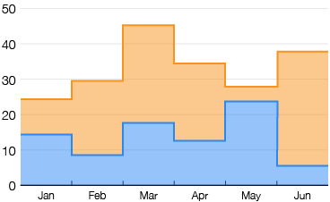
Since Stepped Area Graphs draw the focus away from trends, they emphasise the value changes between exact points in time and more clearly display magnitudes of change within a given period.
Stacking multiple data series on a Stepped Area Graph allows for the comparison of cumulative changes over time and the breakdown of the coloured categories at each point in time.
Tools to generate Stepped Area Graphs:
AnyChart
ApexCharts
Blazor
canvasJS
Google Charts
JSCharting
React Google Charts
Tableau (tutorial blog post)
VisualParadigm Online
Examples
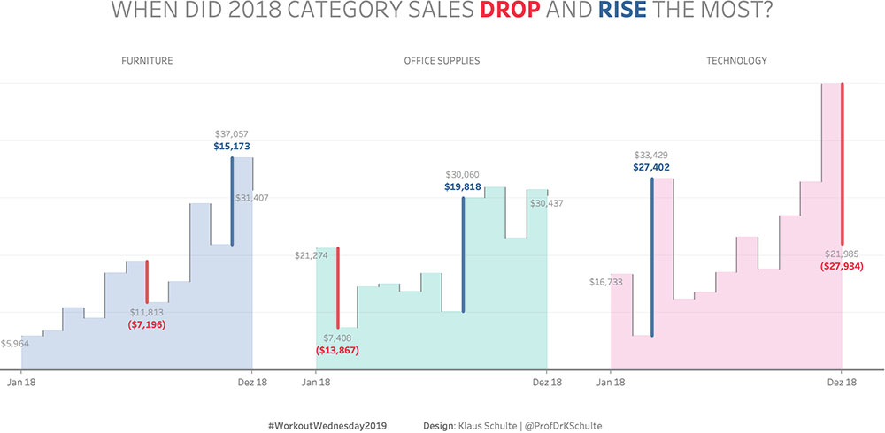
When Did 2018 Category Sales Drop and Rise the Most?
Drawing Step Area Charts in Tableau, Klaus Schulte – tableau.toanhoang.com
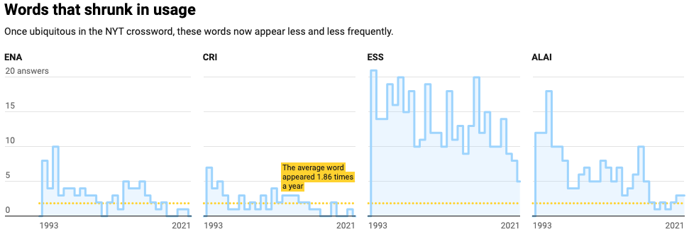
Words that shrunk in usage
Downs and ups in the crossword, Datawrapper Blog
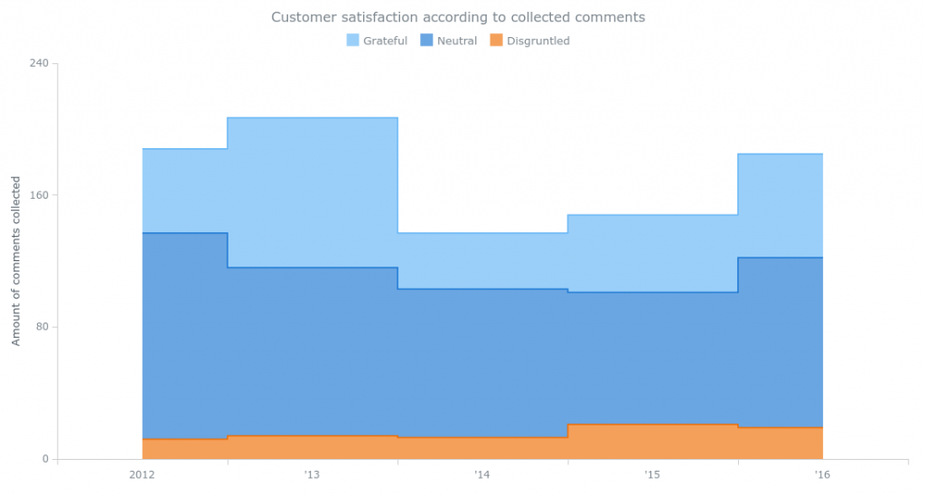
Customer satisfaction according to collected comments
AnyChart, Chart Gallery: Stacked Step-Area Chart
Related posts:
Further Exploration #7 Area Graph Variations

