Also known as an Arrow Plot, Arrow Chart, Change Graph, Difference Graph, or Arrow Bar Chart.
A Change Bar Chart is a visualisation that compares multiple categories at two distinct points in time or between different conditions. This type of graph plots a pair of values and connects them for each factor at the start or end time points or between conditions with a bar or line. The longer bars or lines help to illustrate where the largest amount of change has taken place.
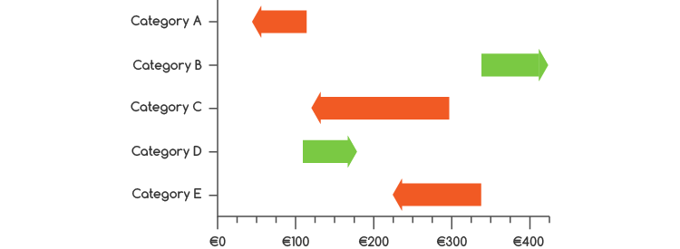
The primary focus of a Change Bar Chart lies in highlighting the direction of change, which is done with the use of an arrowhead. In addition, colour can be incorporated to denote whether the change is favourable or unfavourable, or to simply display whether there’s been an increase or decrease.
Value labels can be placed at the start or end of the plotted arrows to provide the specific amount of change that has taken place. Furthermore, text annotations can be utilised to explicitly denote whether the changes observed are favourable or unfavourable.
Overall, this visualisation method provides a clear and concise way to understand shifts in between two points in time or across different conditions. Therefore, a Change Bar Chart is a handy choice for communicating improvement, dramatic shifts, or to provide a sense of how things are changing in a given situation.
Tools that can generate a Change Bar Chart:
Datawrapper
Datylon
Examples
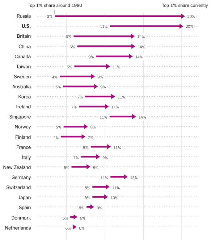
Where the 1 Percent Have Gained the Most.
Myths of the 1 Percent: What Puts People at the Top, The New York Times
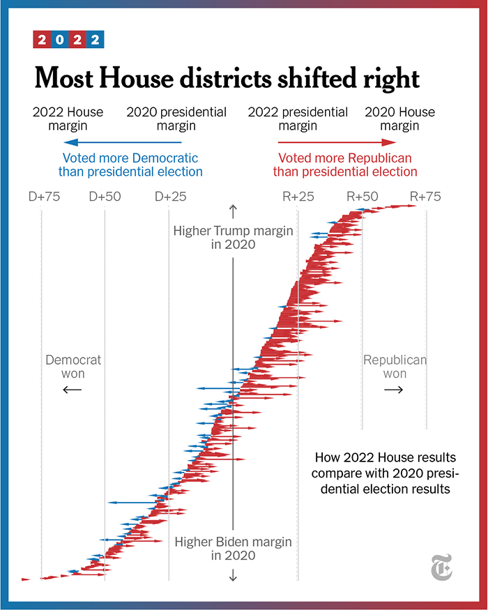
Most House districts shifted right.
How Republicans Won the House, The New York Times
Most countries have a higher share of women in their national parliaments than twenty years ago.
Arrow plot, Datawrapper
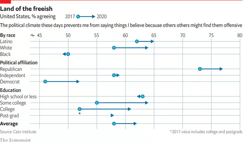
Land of the freeish
Americans are getting more nervous about what they say in public, The Economist
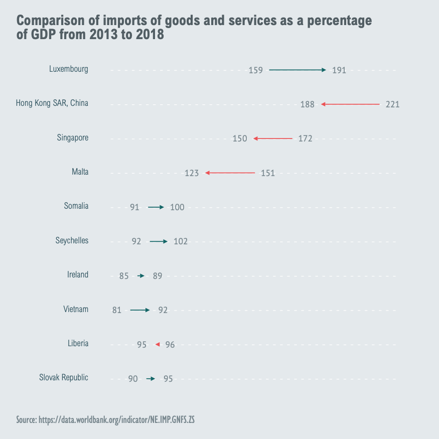
Comparison of imports of goods and services as a percentage of GDP from 2013 to 2018
Datylon Report Studio Inspiration
Related posts:
Further Exploration #11: Bar/Column Chart Variations

