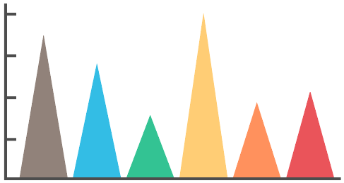
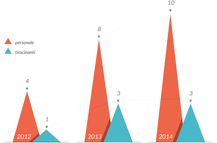
A Triangle Bar Chart is a variation of the traditional Bar Chart or Column Chart. Instead of using bars to represent discreet data, triangles are used as a more novel aesthetic. In this chart, the height or volume of each triangle corresponds to the values it represents. These triangles can be plotted either vertically or horizontally.
While the Triangle Bar Chart offers a visually distinct way to represent categorical data, there are some considerations to keep in mind. One drawback is that the small, top tip of a triangle may not be as intuitive for reading values compared to the straight edge of a bar. However, this issue can be addressed by adding value labels at the ends of the triangles.
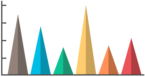
Another potential issue is that the plotted triangles can sometimes create an optical illusion that makes the triangles appear to be moving slightly.
A way of mitigating this issue is to have a line running down the middle of each triangle or to have them split into a light and dark half:
Tools to create a Triangle Bar Chart with:
amCharts
PlotDB
Tableau
Vizzlo
Examples
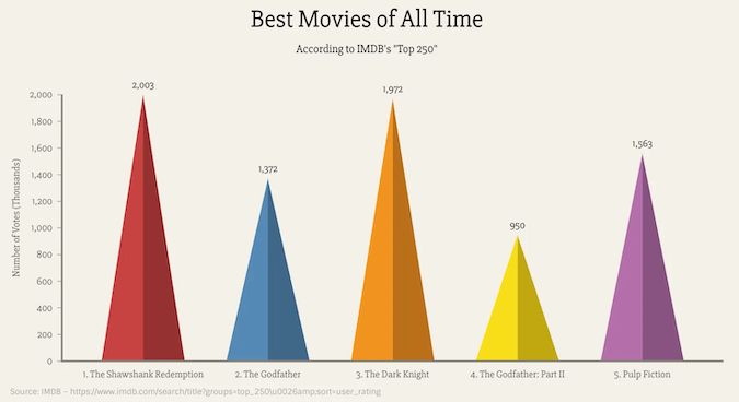
Best Movies of All Time, According to IMDB’s “Top250”
Triangle Bar Chart — VIZZLO
MUSE Magazine – The Ring of Fire
Valerio Pellegrini
Related posts:
Further Exploration #11: Bar/Column Chart Variations

