A Beanplot is a visualisation used for comparing univariate data between different groups. It provides a comprehensive view of the distribution of values within each group, offering insights into central tendency, spread, and shape of the data distribution. The Beanplot integrates elements of Barcode Plots, Density Plots, and Rug Plots, resulting in a rich depiction of the data.
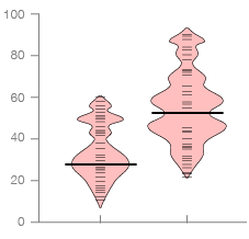
In a Beanplot, individual observations are represented as small lines in a one-dimensional plot. This allows for the visualisation of each data point within a group. Additionally, the estimated density of the distribution is displayed behind, providing information about the concentration of values across the range. The average value for each group is indicated by a bolder (or coloured) line marker, making it easy to compare central tendencies between groups.
The name “Beanplot” is derived from its appearance, where the density trace resembles the shape of a bean pod, and the internal plot resembles the seeds within the pod.
One of the notable features of a Beanplot is its ability to highlight anomalies in the data, such as bimodal distributions or duplicate measurements. These irregularities can be easily identified due to the detailed representation of individual data points.
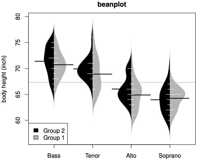
Furthermore, asymmetric Beanplots are available for situations where groups have two subgroups, allowing each subgroup to occupy one side of the bean shape. This facilitates comparisons between subgroups within each group.
Unlike traditional Box Plots, which typically rely on the median for summarising data, Beanplots default to using the average. This decision is based on the ease of interpretation and the usefulness of the average in conjunction with the density trace.
Examples
Figure 5: Comparing the potency of various constituents of orchard sprays in repelling honeybees for different threatments with a normal distribution (method ‘1’).
Beanplot: A Boxplot Alternative for Visual Comparison of Distributions, Peter Kampstra
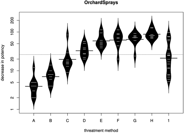
Figure 4: An asymmetric beanplot of the singers.
Beanplot: A Boxplot Alternative for Visual Comparison of Distributions, Peter Kampstra
Party identification of respondent.
statsmodels
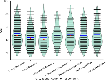
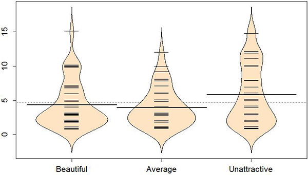
Figure 1-5: Beanplot of Years by picture group. Long, bold lines correspond to mean of each group.
1.1 – Beanplots, Statistics with R, Mark Greenwood and Katharine Banner
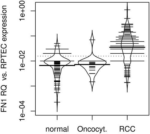
Bean plot analysis of relative FN1 mRNA expression in normal renal tissue, oncocytoma and RCC.
Fibronectin 1 mRNA expression correlates with advanced disease in renal cancer — BMC
Related posts:
Further Exploration #4 — Box Plot Variations

