Also known as an Instance Chart, Strip Plot, Stripe Plot.
Not to be confused with the very similar Warming Stripes visualisation.
A Barcode Plot is a chart used to visualise the data distribution across multiple categories by plotting short stripes along an axis. Each stripe can represent a single data point or a count.
There are two main kind of Barcode Plot: first, the kind that plots a series of “barcodes” to compare the distributions between various categories across a single dimension. The other kind is an “Instance Chart” that plots stripes along a time axis to show the occurrence of various categories over time.
Barcode Plots can be displayed either horizontally or vertically. Typically, the stripes are a single colour, but colour coding can be used to distinguish categories apart. To help make overlapping values visible, the opacity of the stripes can be reduced, which can help to reveal where the data distribution is concentrated.
Examples
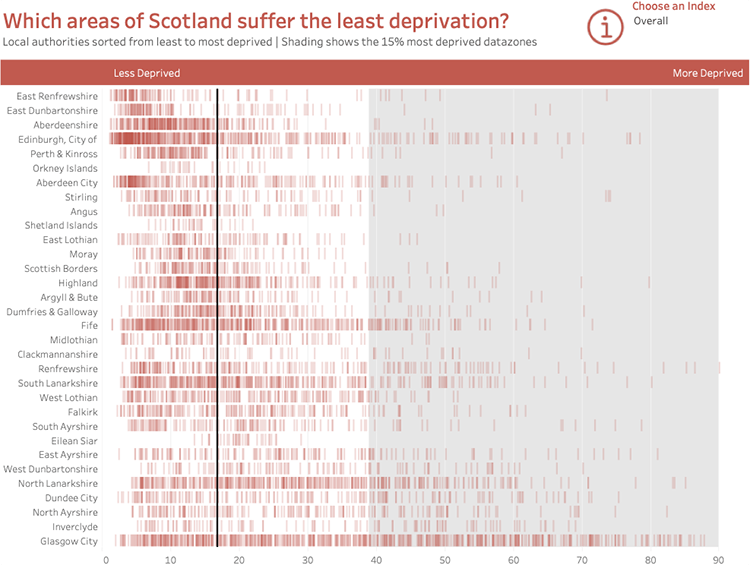
Which areas of Scotland suffer the least deprivation?
Makeover Monday: Which areas of Scotland suffer the least deprivation? — VizWiz
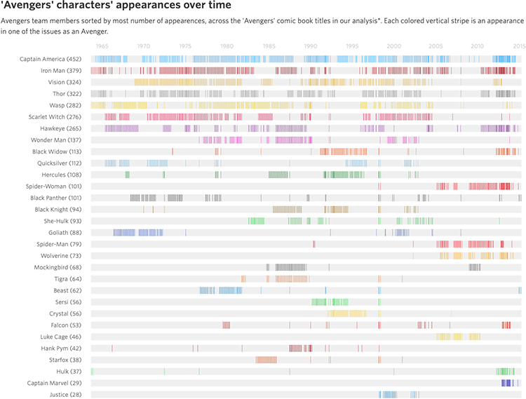
‘Avengers’ characters’ appearances over time
How the ‘Avengers’ Line-up Has Changed Over the Years — Wall Street Journal
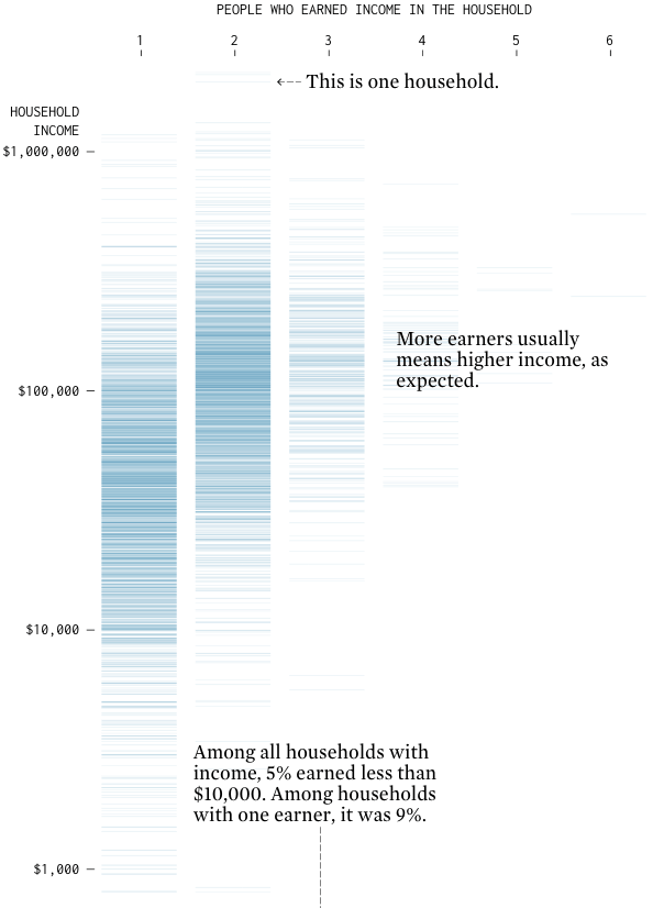
Multiple Income Households
Flowingdata / Nathan Yau
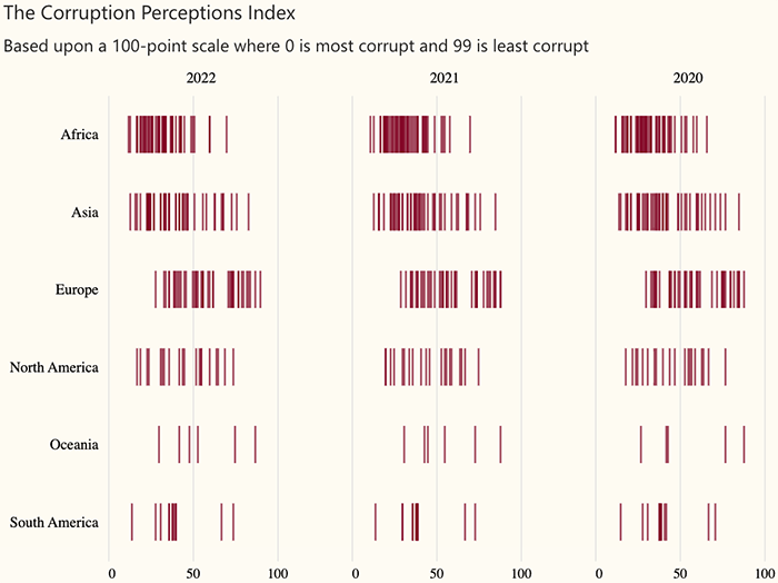
The Corruption Perceptions Index
2023 Week 35 | Power BI: Create a Faceted Instance Chart — Workout Wednesday / Meagan Longoria