Also known as a Bar Mekko Chart, Cascade Chart, Variwide Chart, Area Bar/Column Graph.
A Variable Width Bar Chart is a type of graphical representation that differs from traditional Bar Charts in that the width of each bar carries significant meaning. Rather than all bars being of uniform width, as in conventional bar charts, the width of the bars in a Variable Width Bar Chart is determined by an additional dimension within the dataset.
In essence, each bar in the chart can represent a specific category, such as different product lines or demographic groups. Variable Width Bar Charts can be oriented either vertically or horizontally, depending on the preference and the nature of the data.
The lengths of all the bars are proportional to a variable with discrete data, like in a typical Bar Chart. However, the widths of the bars are not arbitrary and are proportion to another variable in relation to its total. In other words, the widths are always visualising percentages and the part-to-a-whole relationship in that variable.
Variable Width Bar Charts are particularly useful when visualising data where the width of the bars provides meaningful context or insight into the underlying dataset. They can be used in scenarios such as comparing the profitability of different product lines, illustrating demographic distributions, or analysing sales volume and profit margins.
Tools to generate a Variable Width Bar Chart with:
The R Graph Gallery
Tableau
Examples
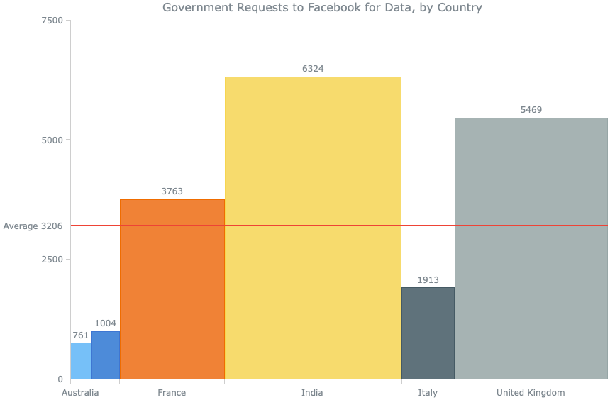
Government Requests to Facebook for Data, by Country
Chart Gallery — AnyChart
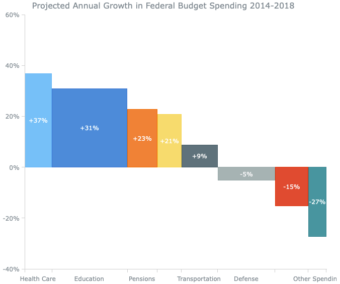
Projected Annual Growth in Federal Budget Spending
Chart Gallery — AnyChart
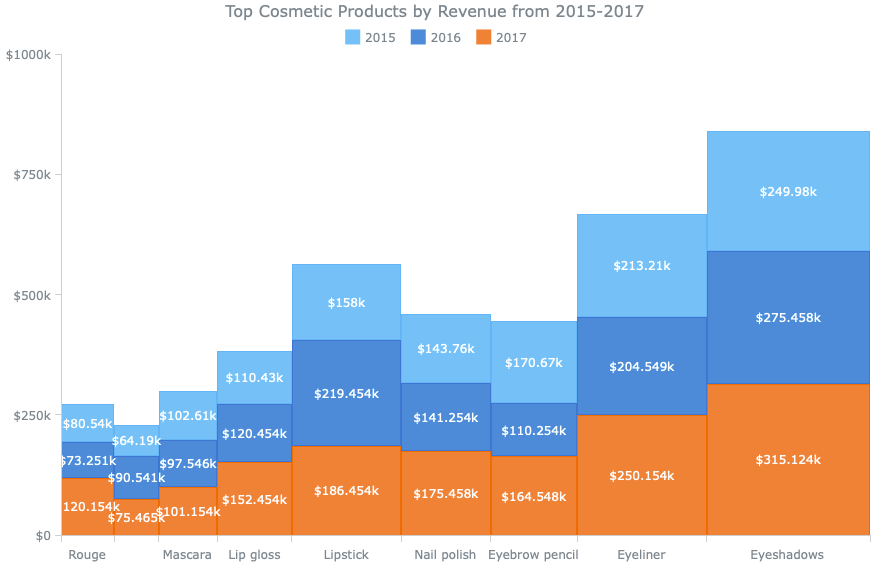
Top Cosmetic Products by Revenue from 2015-2017
Chart Gallery — AnyChart
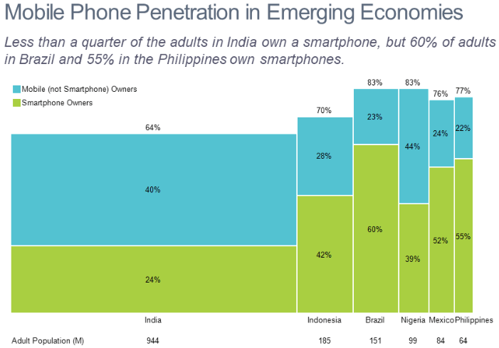
Mobile Phone Penetration in Emerging Economies
Bar Mekko Gallery – Mekko Graphics
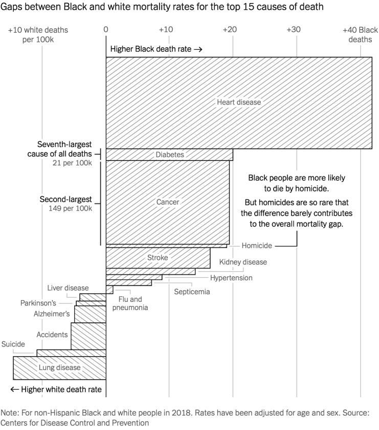
Gaps between Black and white mortality rates for the top 15 causes of death
Racism’s Hidden Toll — The New York Times
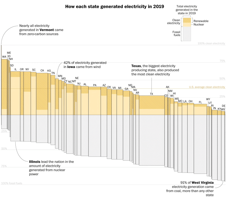
How each state generated electricity in 2019
Biden calls for 100 percent clean electricity by 2035. Here’s how far we have to go — The Washington Post
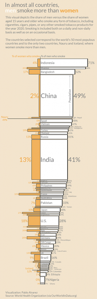
In almost all countries men smoke more than women
Visualizing The Smoking Population of Countries — Visual Capitalist