What is Exploratory Data Analysis (EDA) and How Does it Work?
Introduction
Exploratory Data Analysis (EDA) is a process of describing the data by means of statistical and visualization techniques in order to bring important aspects of that data into focus for further analysis. This involves inspecting the dataset from many angles, describing & summarizing it without making any assumptions about its contents.
“Exploratory Data analysis is an attitude, a state of flexibility, a willingness to look for those things that we believe are not there, as well as those we believe to be there”
– John W. Tukey
EDA is a significant step to take before diving into statistical modeling or machine learning, to ensure the data is really what it is claimed to be and that there are no obvious errors. It should be part of data science projects in every organization.

Learning Objectives
- Learn what Exploratory Data Analysis (EDA) is and why it’s important in data analytics.
- Understand how to look at and clean data, including dealing with single variables.
- Summarize data using simple statistics and visual tools like bar plots to find patterns.
- Ask and answer questions about the data to uncover deeper insights.
- Use Python libraries like pandas, NumPy, Matplotlib, and Seaborn to explore and visualize data.
This article was published as a part of the Data Science Blogathon.
Table of contents
What is Exploratory Data Analysis?
Exploratory Data Analysis (EDA) is like exploring a new place. You look around, observe things, and try to understand what’s going on. Similarly, in EDA, you look at a dataset, check out the different parts, and try to figure out what’s happening in the data. It involves using statistics and visual tools to understand and summarize data, helping data scientists and data analysts inspect the dataset from various angles without making assumptions about its contents. Here’s a typical process:
- Look at the Data: Gather information about the data, such as the number of rows and columns, and the type of information each column contains. This includes understanding single variables and their distributions.
- Clean the Data: Fix issues like missing or incorrect values. Preprocessing is essential to ensure the data is ready for analysis and predictive modeling.
- Make Summaries: Summarize the data to get a general idea of its contents, such as average values, common values, or value distributions. Calculating quantiles and checking for skewness can provide insights into the data’s distribution.
- Visualize the Data: Use interactive charts and graphs to spot trends, patterns, or anomalies. Bar plots, scatter plots, and other visualizations help in understanding relationships between variables. Python libraries like pandas, NumPy, Matplotlib, Seaborn, and Plotly are commonly used for this purpose.
- Ask Questions: Formulate questions based on your observations, such as why certain data points differ or if there are relationships between different parts of the data.
- Find Answers: Dig deeper into the data to answer these questions, which may involve further analysis or creating models, including regression or linear regression models.
For example, in Python, you can perform EDA by importing necessary libraries, loading your dataset, and using functions to display basic information, summary statistics, check for missing values, and visualize distributions and relationships between variables. Here’s a basic example:
# Import necessary libraries
import pandas as pd
import numpy as np
import matplotlib.pyplot as plt
import seaborn as sns

# Load the dataset
data = pd.read_csv('your_dataset.csv')

# Display basic information about the dataset
print("Shape of the dataset:", data.shape)
print("\nColumns:", data.columns)
print("\nData types of columns:\n", data.dtypes)

# Display summary statistics
print("\nSummary statistics:\n", data.describe())

# Check for missing values
print("\nMissing values:\n", data.isnull().sum())

# Visualize distribution of a numerical variable
plt.figure(figsize=(10, 6))
sns.histplot(data['numerical_column'], kde=True)
plt.title('Distribution of Numerical Column')
plt.xlabel('Numerical Column')
plt.ylabel('Frequency')
plt.show()

# Visualize relationship between two numerical variables
plt.figure(figsize=(10, 6))
sns.scatterplot(x='numerical_column_1', y='numerical_column_2', data=data)
plt.title('Relationship between Numerical Column 1 and Numerical Column 2')
plt.xlabel('Numerical Column 1')
plt.ylabel('Numerical Column 2')
plt.show()

# Visualize relationship between a categorical and numerical variable
plt.figure(figsize=(10, 6))
sns.boxplot(x='categorical_column', y='numerical_column', data=data)
plt.title('Relationship between Categorical Column and Numerical Column')
plt.xlabel('Categorical Column')
plt.ylabel('Numerical Column')
plt.show()

# Visualize correlation matrix
plt.figure(figsize=(10, 6))
sns.heatmap(data.corr(), annot=True, cmap='coolwarm', fmt=".2f")
plt.title('Correlation Matrix')
plt.show()
Why is Exploratory Data Analysis Important?
Exploratory Data Analysis (EDA) is an essential step in the data analysis process. It involves analyzing and visualizing data to understand its main characteristics, uncover patterns, and identify relationships between variables. Python offers several libraries that are commonly used for EDA, including pandas, NumPy, Matplotlib, Seaborn, and Plotly.
EDA is crucial because raw data is usually skewed, may have outliers, or too many missing values. A model built on such data results in sub-optimal performance. In the hurry to get to the machine learning stage, some data professionals either entirely skip the EDA process or do a very mediocre job. This is a mistake with many implications, including:
- Generating Inaccurate Models: Models built on unexamined data can be inaccurate and unreliable.
- Using Wrong Data: Without EDA, you might be analyzing or modeling the wrong data, leading to false conclusions.
- Inefficient Resource Use: Inefficiently using computational and human resources due to lack of proper data understanding.
- Improper Data Preparation: EDA helps in creating the right types of variables, which is critical for effective data preparation.
In this article, we’ll be using Pandas, Seaborn, and Matplotlib libraries of Python to demonstrate various EDA techniques applied to Haberman’s Breast Cancer Survival Dataset. This will provide a practical understanding of EDA and highlight its importance in the data analysis workflow.
Types of EDA Techniques
Before diving into the dataset, let’s first understand the different types of Exploratory Data Analysis (EDA) techniques. Here are five key types of EDA techniques:
- Univariate Analysis: Univariate analysis examines individual variables to understand their distributions and summary statistics. This includes calculating measures such as mean, median, mode, and standard deviation, and visualizing the data using histograms, bar charts, box plots, and violin plots.
- Bivariate Analysis: Bivariate analysis explores the relationship between two variables. It uncovers patterns through techniques like scatter plots, pair plots, and heatmaps. This helps to identify potential associations or dependencies between variables.
- Multivariate Analysis: Multivariate analysis involves examining more than two variables simultaneously to understand their relationships and combined effects. Techniques such as contour plots, and principal component analysis (PCA) are commonly used in multivariate EDA.
- Visualization Techniques: EDA relies heavily on visualization methods to depict data distributions, trends, and associations. Various charts and graphs, such as bar charts, line charts, scatter plots, and heatmaps, are used to make data easier to understand and interpret.
- Outlier Detection: EDA involves identifying outliers within the data—anomalies that deviate significantly from the rest of the data. Tools such as box plots, z-score analysis, and scatter plots help in detecting and analyzing outliers.
- Statistical Tests: EDA often includes performing statistical tests to validate hypotheses or discern significant differences between groups. Tests such as t-tests, chi-square tests, and ANOVA add depth to the analysis process by providing a statistical basis for the observed patterns.
By using these EDA techniques, we can gain a comprehensive understanding of the data, identify key patterns and relationships, and ensure the data’s integrity before proceeding with more complex analyses.
Dataset Description
The dataset used is an open source dataset and comprises cases from the exploratory data analysis conducted between 1958 and 1970 at the University of Chicago’s Billings Hospital, focusing on the survival of patients post-surgery for breast cancer. The dataset can be downloaded from here.
[Source: Tjen-Sien Lim ([email protected]), Date: March 4, 1999]
Attribute Information
- Patient’s age at the time of operation (numerical).
- Year of operation (year — 1900, numerical).
- A number of positive axillary nodes were detected (numerical).
- Survival status (class attribute)
- The patient survived 5 years or longer post-operation.
- The patient died within 5 years post-operation.
Attributes 1, 2, and 3 form our features (independent variables), while attribute 4 is our class label (dependent variable).
Let’s begin our analysis . . .
Importing Libraries and Loading Data
Import all necessary packages:
import numpy as np
import pandas as pd
import matplotlib.pyplot as plt
import seaborn as sns
import scipy.stats as stats
Load the dataset in pandas dataframe:
df = pd.read_csv('haberman.csv', header = 0)
df.columns = ['patient_age', 'operation_year', 'positive_axillary_nodes', 'survival_status']
Understanding Data
To understand the dataset, we first need to load it and inspect its structure.
Output:

Shape of the DataFrame
To understand the size of the dataset, we check its shape.
df.shapeOutput
(305, 4)
Class Distribution
Next, let’s see how many data points there are for each class label in our dataset. There are 305 rows and 4 columns. But how many data points for each class label are present in our dataset?
df [‘survival_status’] .value_counts ()Output
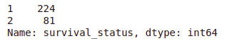
- The dataset is imbalanced as expected.
- Out of a total of 305 patients, the number of patients who survived over 5 years post-operation is nearly 3 times the number of patients who died within 5 years.
Checking for Missing Values
Let’s check for any missing values in the dataset.
print("Missing values in each column:\n", df.isnull().sum())Output

There are no missing values in the dataset.
Data Information
Let’s get a summary of the dataset to understand the data types and further verify the absence of missing values.
df.info()Output
- All the columns are of integer type.
- No missing values in the dataset.
All columns are of integer type.
By understanding the basic structure, distribution, and completeness of the data, we can proceed with more detailed exploratory data analysis (EDA) and uncover deeper insights.
Data Preparation
Before proceeding with statistical analysis and visualization, we need to modify the original class labels. The current labels are 1 (survived 5 years or more) and 2 (died within 5 years), which are not very descriptive. We’ll map these to more intuitive categorical variables: ‘yes’ for survival and ‘no’ for non-survival.
# Map survival status values to categorical variables 'yes' and 'no'
df['survival_status'] = df['survival_status'].map({1: 'yes', 2: 'no'})

# Display the updated DataFrame to verify changes
print(df.head())
General Statistical Analysis
We will now perform a general statistical analysis to understand the overall distribution and central tendencies of the data.
# Display summary statistics of the DataFrame
df .describe ()
Output
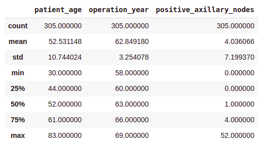
- On average, patients got operated at age of 63.
- An average number of positive axillary nodes detected = 4.
- As indicated by the 50th percentile, the median of positive axillary nodes is 1.
- As indicated by the 75th percentile, 75% of the patients have less than 4 nodes detected.
If you see, there is a significant difference between the mean and the median values. This is because there are some outliers in our data and the mean is influenced by the presence of outliers.
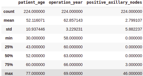
Class-wise Statistical Analysis
To gain deeper insights, we’ll perform a statistical analysis for each class (survived vs. not survived) separately.
Survived (Yes) Analysis:
survival_yes = df[df['survival_status'] == 'yes']
print(survival_yes.describe())
Output
Not Survived (No) Analysis:
survival_no = df[df['survival_status'] == 'no']
print(survival_no.describe())
Output:
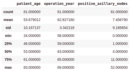
From the above class-wise analysis, it can be observed that —
- The average age at which the patient is operated on is nearly the same in both cases.
- Patients who died within 5 years on average had about 4 to 5 positive axillary nodes more than the patients who lived over 5 years post-operation.
Note that, all these observations are solely based on the data at hand.
Uni-variate Data Analysis
“A picture is worth ten thousand words”
– Frank R. Bernard
Uni-variate analysis involves studying one variable at a time. This type of analysis helps in understanding the distribution and characteristics of each variable individually. Below are different ways to perform uni-variate analysis along with their outputs and interpretations.
Distribution Plots
Distribution plots, also known as probability density function (PDF) plots, show how values in a dataset are spread out. They help us see the shape of the data distribution and identify patterns.
Patient’s Age
sns.FacetGrid(data, hue="Survival_Status", height=5).map(sns.histplot, "Age", kde=True).add_legend()
plt.title('Distribution of Age')
plt.xlabel('Age')
plt.ylabel('Frequency')
plt.show()
Output
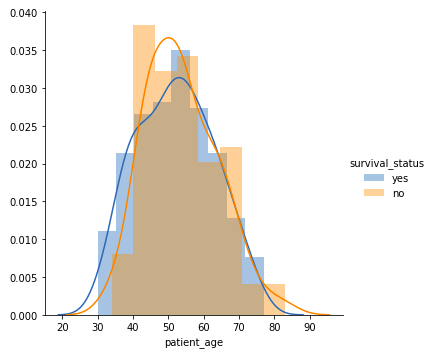
- Among all age groups, patients aged 40-60 years are the highest.
- There is a high overlap between the class labels, implying that survival status post-operation cannot be discerned from age alone.
Operation Year
sns.FacetGrid(data, hue="Survival_Status", height=5).map(sns.histplot, "Year", kde=True).add_legend()
plt.title('Distribution of Operation Year')
plt.xlabel('Operation Year')
plt.ylabel('Frequency')
plt.show()
Output
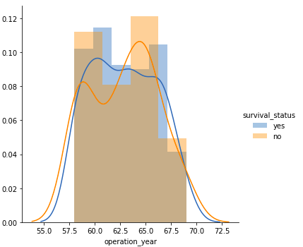
- Similar to the age plot, there is a significant overlap between the class labels, suggesting that operation year alone is not a distinctive factor for survival status.
Number of Positive Axillary Nodes
sns.FacetGrid(data, hue="Survival_Status", height=5).map(sns.histplot, "Nodes", kde=True).add_legend()
plt.title('Distribution of Positive Axillary Nodes')
plt.xlabel('Number of Positive Axillary Nodes')
plt.ylabel('Frequency')
plt.show()
Output
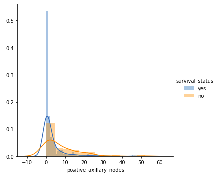
- Patients with 4 or fewer axillary nodes mostly survived 5 years or longer.
- Patients with more than 4 axillary nodes have a lower likelihood of survival compared to those with 4 or fewer nodes.
But our observations must be backed by some quantitative measure. That’s where the Cumulative Distribution function(CDF) plots come into the picture.
Cumulative Distribution Function (CDF)
CDF plots show the probability that a variable will take a value less than or equal to a specific value. They provide a cumulative measure of the distribution.
counts, bin_edges = np.histogram(data[data['Survival_Status'] == 1]['Nodes'], density=True)
pdf = counts / sum(counts)
cdf = np.cumsum(pdf)
plt.plot(bin_edges[1:], cdf, label='CDF Survival status = Yes')

counts, bin_edges = np.histogram(data[data['Survival_Status'] == 2]['Nodes'], density=True)
pdf = counts / sum(counts)
cdf = np.cumsum(pdf)
plt.plot(bin_edges[1:], cdf, label='CDF Survival status = No')

plt.legend()
plt.xlabel("Positive Axillary Nodes")
plt.ylabel("CDF")
plt.title('Cumulative Distribution Function for Positive Axillary Nodes')
plt.grid()
plt.show()
Output
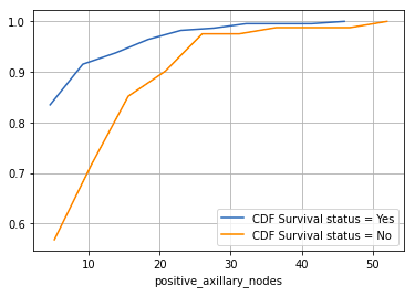
- Patients with 4 or fewer positive axillary nodes have about an 85% chance of surviving 5 years or longer post-operation.
- The likelihood decreases for patients with more than 4 axillary nodes.
Box Plots
Box plots, also known as box-and-whisker plots, summarize data using five key metrics: minimum, lower quartile (25th percentile), median (50th percentile), upper quartile (75th percentile), and maximum. They also highlight outliers.
plt.figure(figsize=(15, 4))
plt.subplot(1, 3, 1)
sns.boxplot(x='Survival_Status', y='Age', data=data)
plt.title('Box Plot of Age')
plt.subplot(1, 3, 2)
sns.boxplot(x='Survival_Status', y='Year', data=data)
plt.title('Box Plot of Operation Year')
plt.subplot(1, 3, 3)
sns.boxplot(x='Survival_Status', y='Nodes', data=data)
plt.title('Box Plot of Positive Axillary Nodes')
plt.show()
Output:
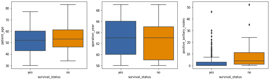
- The patient age and operation year plots show similar statistics.
- The isolated points in the positive axillary nodes box plot are outliers, which is expected in medical datasets.
Violin Plots
Violin plots combine the features of box plots and density plots. They provide a visual summary of the data and show the distribution’s shape, density, and variability.
plt.figure(figsize=(15, 4))
plt.subplot(1, 3, 1)
sns.violinplot(x='Survival_Status', y='Age', data=data)
plt.title('Violin Plot of Age')
plt.subplot(1, 3, 2)
sns.violinplot(x='Survival_Status', y='Year', data=data)
plt.title('Violin Plot of Operation Year')
plt.subplot(1, 3, 3)
sns.violinplot(x='Survival_Status', y='Nodes', data=data)
plt.title('Violin Plot of Positive Axillary Nodes')
plt.show()
Output:
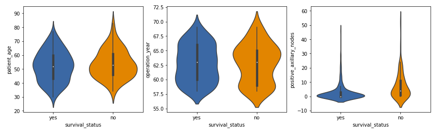
- The distribution of positive axillary nodes is highly skewed for the ‘yes’ class label and moderately skewed for the ‘no’ label.
- The majority of patients, regardless of survival status, have a lower number of positive axillary nodes, with those having 4 or fewer nodes more likely to survive 5 years post-operation.
These observations align with our previous analyses and provide a deeper understanding of the data.
Bar Charts
Bar charts display the frequency or count of categories within a single variable, making them useful for comparing different groups.
Survival Status Count
sns.countplot(x='Survival_Status', data=df)
plt.title('Count of Survival Status')
plt.xlabel('Survival Status')
plt.ylabel('Count')
plt.show()
Output

- This bar chart shows the number of patients who survived 5 years or longer versus those who did not. It helps visualize the class imbalance in the dataset.
Histograms
Histograms show the distribution of numerical data by grouping data points into bins. They help understand the frequency distribution of a variable.
Age Distribution
df['Age'].plot(kind='hist', bins=20, edgecolor='black')
plt.title('Histogram of Age')
plt.xlabel('Age')
plt.ylabel('Frequency')
plt.show()
Output

- The histogram displays how the ages of patients are distributed. Most patients are between 40 and 60 years old.
These observations align with our previous analyses and provide a deeper understanding of the data.
Bi-variate Data Analysis
Bi-variate data analysis involves studying the relationship between two variables at a time. This helps in understanding how one variable affects another and can reveal underlying patterns or correlations. Here are some common methods for bi-variate analysis.
Pair Plot
A pair plot visualizes the pairwise relationships between variables in a dataset. It displays both the distributions of individual variables and their relationships.
sns.set_style('whitegrid')
sns.pairplot(data, hue='Survival_Status')
plt.show()
Output
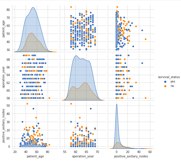
- The pair plot shows scatter plots of each pair of variables and histograms of each variable along the diagonal.
- The scatter plots on the upper and lower halves of the matrix are mirror images, so analyzing one half is sufficient.
- The histograms on the diagonal show the univariate distribution of each feature.
- There is a high overlap between any two features, indicating no clear distinction between the survival status class labels based on feature pairs.
While the pair plot provides an overview of the relationships between all pairs of variables, sometimes it is useful to focus on the relationship between just two specific variables in more detail. This is where the joint plot comes in.
Joint Plot
A joint plot provides a detailed view of the relationship between two variables along with their individual distributions.
sns.jointplot(x='Age', y='Nodes', data=data, kind='scatter')
plt.show()
Output
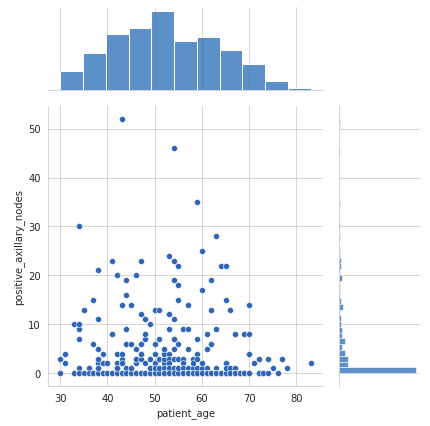
- The scatter plot in the center shows no correlation between the patient’s age and the number of positive axillary nodes detected.
- The histogram on the top edge shows that patients are more likely to get operated on between the ages of 40 and 60 years.
- The histogram on the right edge indicates that the majority of patients had fewer than 4 positive axillary nodes.
While joint plots and pair plots help visualize the relationships between pairs of variables, a heatmap can provide a broader view of the correlations among all the variables in the dataset simultaneously.
Heatmap
A heatmap visualizes the correlation between different variables. It uses color coding to represent the strength of the correlations, which can help identify relationships between variables.
sns.heatmap(data.corr(), cmap='YlGnBu', annot=True)
plt.show()
Output:
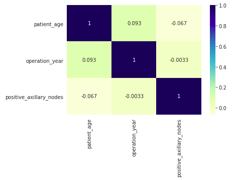
- The heatmap displays Pearson’s R values, indicating the correlation between pairs of variables.
- Correlation values close to 0 suggest no linear relationship between the variables.
- In this dataset, there are no strong correlations between any pairs of variables, as most values are near 0.
These bi-variate analysis techniques provide valuable insights into the relationships between different features in the dataset, helping to understand how they interact and influence each other. Understanding these relationships is crucial for building more accurate models and making informed decisions in data analysis and machine learning tasks.
Multivariate Analysis
Multivariate analysis involves examining more than two variables simultaneously to understand their relationships and combined effects. This type of analysis is essential for uncovering complex interactions in data. Let’s explore several multivariate analysis techniques.
Contour Plot
A contour plot is a graphical technique that represents a 3-dimensional surface by plotting constant z slices, called contours, in a 2-dimensional format. This allows us to visualize complex relationships between three variables in an easily interpretable 2-D chart.
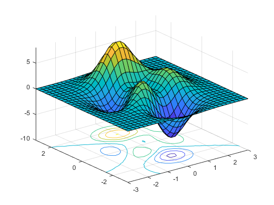
For example, let’s examine the relationship between patient’s age and operation year, and how these relate to the number of patients.
sns.jointplot(x='Age', y='Year', data=data, kind='kde', fill=True)
plt.show()
Output

- From the above contour plot, it can be observed that the years 1959–1964 witnessed more patients in the age group of 45–55 years.
- The contour lines represent the density of data points. Closer contour lines indicate a higher density of data points.
- The areas with the darkest shading represent the highest density of patients, showing the most common combinations of age and operation year.
By utilizing contour plots, we can effectively consolidate information from three dimensions into a two-dimensional format, making it easier to identify patterns and relationships in the data. This approach enhances our ability to perform comprehensive multivariate analysis and extract valuable insights from complex datasets.
3D Scatter Plot
A 3D scatter plot is an extension of the traditional scatter plot into three dimensions, which allows us to visualize the relationship among three variables.
from mpl_toolkits.mplot3d import Axes3D

fig = plt.figure()
ax = fig.add_subplot(111, projection='3d')

ax.scatter(df['Age'], df['Year'], df['Nodes'])
ax.set_xlabel('Age')
ax.set_ylabel('Year')
ax.set_zlabel('Nodes')

plt.show()
Output

- Most patients are aged between 40 to 70 years, with their surgeries predominantly occurring between the years 1958 to 1966.
- The majority of patients have fewer than 10 positive axillary lymph nodes, indicating that low node counts are common in this dataset.
- A few patients have a significantly higher number of positive nodes (up to around 50), suggesting cases of more advanced cancer.
- There is no strong correlation between the patient’s age or the year of surgery and the number of positive nodes detected. Positive nodes are spread across various ages and years without a clear trend.
Conclusion
In this article, we learned some common steps involved in exploratory data analysis. We also saw several types of charts & plots and what information is conveyed by each of these. This is just not it, I encourage you to play with the data and come up with different kinds of visualizations and observe what insights you can extract from it.
The media shown in this article are not owned by Analytics Vidhya and are used at the Author’s discretion.
Frequently Asked Questions
A. Exploratory Data Analysis (EDA) in data science is the process of examining datasets to summarize their main characteristics, often using visual methods. It helps data scientists understand the data’s structure, detect patterns, identify anomalies, and generate hypotheses, which are essential for making informed decisions and preparing the data for further analysis or modeling.
A. An example of exploratory data analysis (EDA) could involve examining a dataset of customer demographics and purchase history for a retail business. EDA techniques may include calculating summary statistics, visualizing data distributions, identifying outliers, exploring relationships between variables, and performing hypothesis testing. This process helps gain insights into the data, identify patterns, and inform further analysis or decision-making.
A. The four steps of exploratory data analysis (EDA) typically involve:
1. Data Cleaning: Handling missing values, removing outliers, and ensuring data quality.
2. Data Exploration: Examining summary statistics, visualizing data distributions, and identifying patterns or relationships.
3. Feature Engineering: Transforming variables, creating new features, or selecting relevant variables for analysis.
4. Data Visualization: Presenting insights through plots, charts, and graphs to communicate findings effectively.
1. Summarize the Data: Calculate basic statistics for numerical variables and determine frequency distribution for categorical variables.
2. Visualize the Data: Create histograms, scatter plots, box plots, bar charts, and pie charts.
3. Identify Outliers: Detect and investigate outliers using statistical methods or visualization techniques.
4. Transform the Data: Apply transformations to improve the performance of machine learning algorithms and handle missing values.
5. Identify Relationships: Calculate correlation coefficients and create correlation matrices.
6. Generate Hypotheses: Formulate hypotheses about the underlying patterns and relationships in the data.
7. Iterate and Refine: EDA is an iterative process, so revisit previous steps and refine your analysis as needed.
A. The four main types of Exploratory Data Analysis (EDA) are:
1. Univariate Analysis: Examines individual variables to understand their distribution and summary statistics.
2. Bivariate Analysis: Explores relationships between two variables, identifying potential associations or dependencies.
3. Multivariate Analysis: Involves examining more than two variables simultaneously to understand their combined effects.
4. Visualization Techniques: Uses various charts and graphs to depict data distributions, trends, and associations for better understanding and interpretation.Q3. What are the steps in EDA?
A. Several tools and libraries are commonly used for Exploratory Data Analysis (EDA), including:
Pandas: A Python library for data manipulation and analysis.
NumPy: A library for numerical computing in Python.
Matplotlib: A plotting library for creating static, interactive, and animated visualizations in Python.
Seaborn: A Python visualization library based on Matplotlib that provides a high-level interface for drawing attractive and informative statistical graphics.
Plotly: A graphing library that makes interactive, publication-quality graphs online.


