If you’re like me right now, you need a distraction. I got started on a new blog and tweet about project management best practices and after yesterday’s events, just had to put it on a shelf. So, a couple quick things…
Power BI Top Features
Melissa Coates, long-time BI community rock star, published this amazing infographic depicting all of the features and services in the Power BI ecosystem. Next time you hear someone incorrectly describe Power BI as “just a visualization tool”, show them this:

You can download a hi-res version and get more background here: Diagrams — Coates Data Strategies
BI-Survey Searchable Maps
I recent heard from Donald Farmer, one of the original architects of the Microsoft Business Intelligence platform. Donald went on the work for QlikTech and now runs an advisory practice called Treehive Strategy Services. Donald has been working with the BI-Survey, one of the leading analyst firms in Europe, to enable an interactive map of the Azure analytics ecosystem. Similar to Garner and Forrester research, BI Survey compare industry platforms and products but do so using survey data. I’ve been participating in the BI-Survey for about 12 years and find it to be a comprehensive and insightful resource to compare BI tools, among other products. They just released these interactive guide maps for Power BI and Azure Services, Partners and Success Stories. These are just a couple of examples:
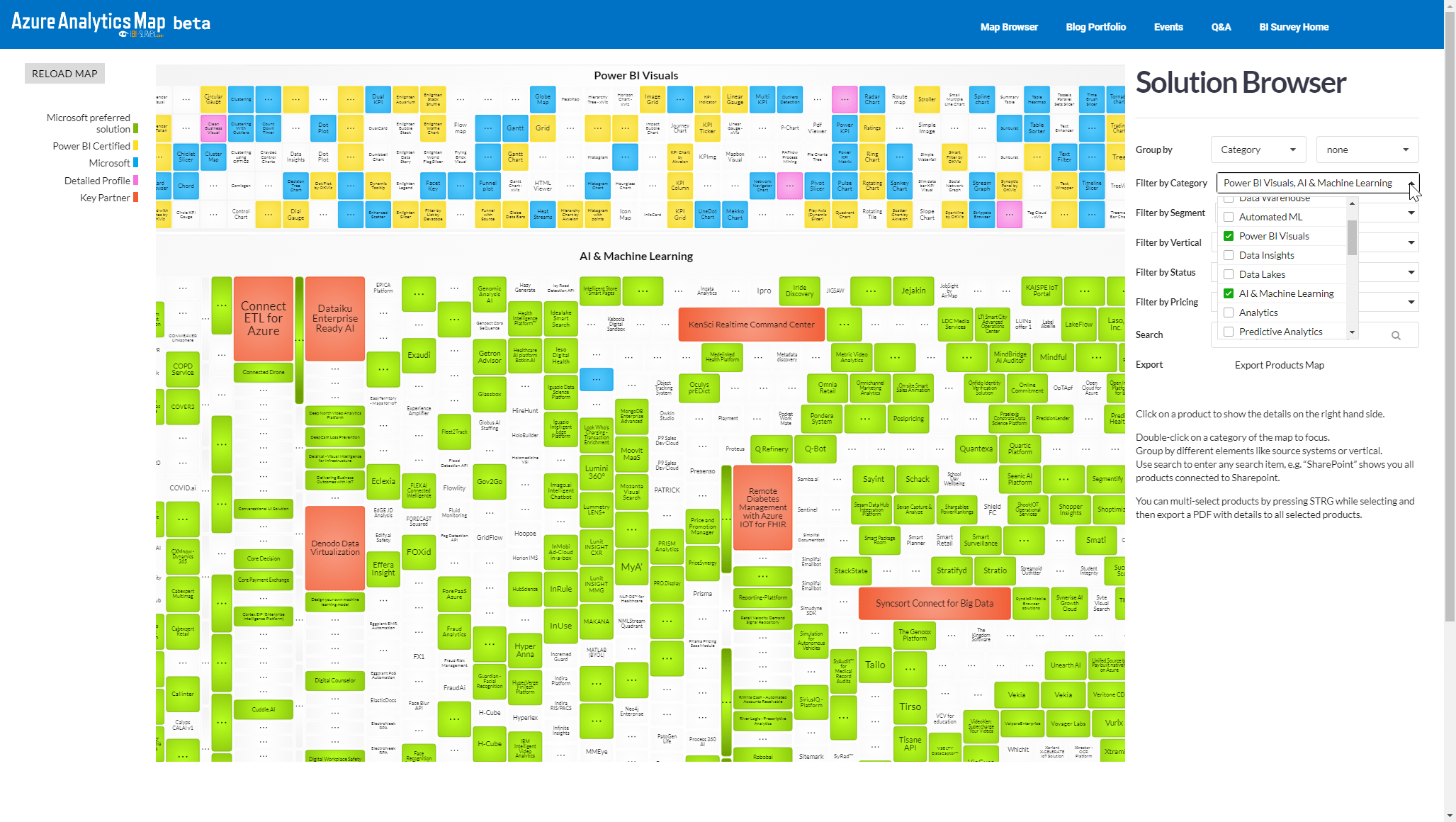
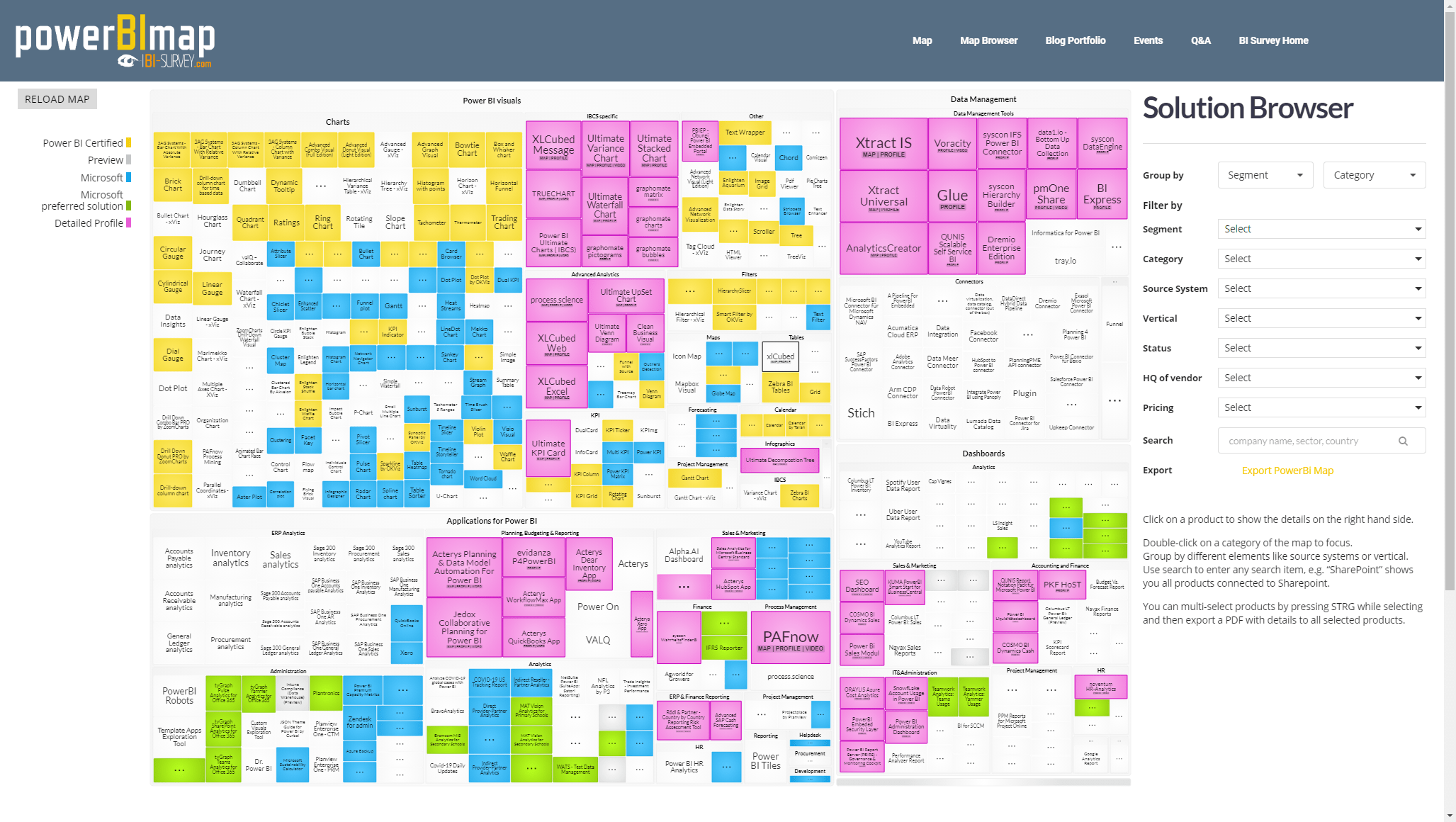
Each map has a bunch of filtering and search filters that allow you to visualize the heatmap based on pricing, features and a variety of categories. These are really useful tools.

