The gap between a bad and good data visualization is small.
The gap between a good and great data visualization is a vast chasm!
The challenge is that we, and our HiPPOs, bring opinions and feelings and our perceptions of what will go viral to the conversation. This is entirely counterproductive to distinguishing between bad, good, and great.
What we need instead is a rock-solid understanding of the updraft we face in our quest for greatness, and a standard framework that can help us dispassionately assess quality.
Let’s do that today. Learn how to separate bad from good and good from great, and do so using examples that we can all relate to instantly.
We’ll start by looking at the two sets of humans who are at the root of the conflict of obsessions and then learn to assess how effective any data visualization is in an entirely new way. If you adopt it, I guarantee the impact on your work will be transformative.
The Conflict of Obsessions.
There are two parties involved in any data visualization.
1. Analyst/Data Visualizer.
As I’ve passionately shared frequently on this blog, we, Analysts, are all in the business of persuasion. We work against that desired outcome because when we work on creating a data visualization, here are our top-of-mind concerns/desires/perspectives:
How can I cram as much as I can into the graphic?
What can I include to ensure everyone clearly gets just how much work I did?
How much of my agenda do I need to make overt, and how much can I make covert?
Is there something I can add to increase the chances that this will go viral and result in fame and glory?
Ok. I’m only teasing.
But, as an Analyst, a Data Visualizer, I can’t say that these thoughts don’t cross my mind. :)
I’m sharing the above primarily to ensure that you know these motivations exist – and, like me, you should try to fight and resist!
The very best Data Visualizers, obsess about:
1. known and unknown variables
2. causality
3. nuance
4. visualization techniques
5. rank-ordering messages
6. simplicity, simplicity, simplicity, simplicity, simplicity, simplicity, and, just to be safe one last time, simplicity.
These are the six things that matter supremely in my work, and they should be what matters in yours.
Simplicity matters more than the rest because if I can’t distill complexity, I might as well not do the work because that is only a snowball’s chance on the sun that the audience will understand my complex visual.
Let’s look at the other set of humans involved in a data visualization equation.
2. Data Consumer.
Here are the concerns/desires/perspectives that a consumer of data visualizations has top of mind when they are presented with a set of analysis:
What’s in it for me?
How easy is it to grasp the most important point?
What’s in it for me?
How much effort do I need to put in to understand the whole infographic?
What’s in it for me?
How can I trust that this message is from a credible Analyst/source/using sound methodology?
(Never underestimate the staggering selfishness that a Data Consumer brings with them to the table when you are showing them a table of data or a data visualization. And, it is understandable because they have difficult jobs and 71 other things to worry about.)
Notice there is very little overlap between the obsessions of the Data Consumer and Data Visualizer.
If you have a choice (and you do!), let the needs of the Data Consumer drive your data visualization efforts. The only exception is when you are trying to push propaganda, then go with your agenda.
If an infographic sucks, it is usually due to the conflict between the Visualizer and the Consumer along the above dimensions.
You’ll see it vividly on display when you look at any graphic through the Consumer lens with an eye on simplicity (the Analyst dimension).
The Data Visualization Assessment Algorithm.
Algorithm might perhaps be a tad bit pompous, as applied here. I’ve developed a set of filters and lenses through which you can look at any data visualization in order to quickly assess quality.
Perhaps someone reading this blog post is going to help us all out by building a Machine Learning algorithm to assess if a Data Viz is bad, good, or great. :)
Reflecting on the aforementioned Consumer vs. Visualizer conflict of obsessions has helped me distill the evaluation of data visualizations into eight dimensions. They influence each other and the entire portfolio, yet they stand on their own.
In the format of “Obsession | [ratings scale],” here’s the data viz assessment algorithm:
1. Time to the most important insight. [Scale: Fast. Slow. KMN!]
2. The effort to understand the whole graphic. [Low. Medium. No Thank You.]
3. Trust marks. [Clear. Non-Obvious. None.]
4. Rank-ordering of key messages. [Yes. Partial. WTH!]
5. Explaining the key logic powering the graphic. [Super clear. Cloudy. Invisible.]
6. Exposing nuance. [Sweet. Some. Sour.]
7. Visualizer trying to be too clever. [No, and thank god. Yes, but it is harmless. Yes, sadly.]
8. Likely to recommend to influential leaders. [Yes! No. No way.]
I want you to explicitly notice:
I’ve put the Data Consumer first
Incentivized good behavior by the Data Visualizers, and …
… Included an outcome in the end because activity is well and dandy but it is outcomes are what matter.
My hope is to share a very specific algorithm that gets your critical thinking juices flowing. I invite your critique and suggestions on how I can make it even smarter. Please reply.
The best way to learn is to practice via real-world examples. So… Let’s do that!
COVID What Should I be Afraid of (!) Data Visualizations.
A few weeks ago, perhaps not coincidentally, a number of different entities published visuals to help us understand what we can do safely and what’ll cause grievous harm.
I’ve collected four of these efforts – each a really different way to visualize nearly identical information. This gives us an ideal data set to apply our algorithm, and learn discerning skills along the way.
Data Visualization #1
The first graphic is from the inimitable Randall Munroe (I’m a very big xkcd fan!).
Randall has a unique way to communicate complex information (buy Thing Explainer!), and this graphic is no different. It combines seriousness, fun, and scientific accuracy.

As an approach, 2x2s work really well. They force simplicity. The color clustering above helps, you can jump to the safest or riskiest activities faster.
On the downside, it is hard to take in the whole thing. You can get lost.
I’m treating this as a very serious example, but it is important to remember that the intent above includes the goal of making us smile.
Let’s apply our algorithm and see how this graphic does with our tough, but with love, lens.
1. Time to the most important insight. [Fast. Slow. KMN!]
2. The effort to understand the whole graphic. [Low. Medium. No Thank You.]
3. Trust marks. [Clear. Non-Obvious. None.]
4. Rank-ordering of key messages. [Yes. Partial. WTH!]
5. Explaining the key logic powering the graphic. [Super clear. Cloudy. Invisible.]
6. Exposing nuance. [Sweet. Some. Sour.]
7. Visualizer trying to be too clever. [No, and thank god. Yes, but it is harmless. Yes, sadly.]
8. Likely to recommend to influential leaders. [Yes! No. No way.]
The graphic should technically get a pass on #3 as it is for fun, and possibly #5 as well. But, I’ve still graded it seriously so that all of us can practice scoring.
If the phrase big miss applies here it is perhaps #2, the effort to understand the whole graphic (or more precisely, cartoon).
Based on the algorithm’s assessment, it earns a score of 27/66.
Oh, I totally forgot to tell you… I made a little scoring system to help you truly internalize the key messages. Those who know me will not be surprised that my system has a steep grading curve (#highstandardsFTW!).
The scoring system uses a multiplier across each rating in the scale above. Additionally, since each dimension does not carry the same level of importance, there’s a multiplier for each dimension – to effectively communicate my values.
Here’s the math…

It is all fun and games until you realize there’s a score involved! :)
Important: My intent in creating the data viz assessment algorithm, and scoring sheet, is not to have you entirely agree with how I’m grading each visualization. My intent is to teach a systematic approach you can bring to these difficult and complex tasks.
I do hope you see why I’m scoring the way I am, I hope you’ll agree. But, that desire is tertiary.
Data Visualization #2
The second graphic is from the world-famous Information is Beautiful (IiB). They have some of the world’s most famous data visualizations. (The simple and effective: When Sea Levels Attack)
IiB tends to make graphics for large screens, I need to be on my beloved 27” ThinkVision monitor to read it optimally.
In this instance, you’ll notice the color palette works against the ability to read the text (teal on dark gray or slightly lighter gray on dark gray).
The spectrum from light yellow to blood red of the circles, with internal gradations, is trying to add a layer of cleverness that possibly satiates a Data Visualizer, at the cost of the Data Consumer.

Once you zoom into one part of the visual, things become readable. You do lose the full picture of any section. In this view, perhaps you’ll agree that there is a sense of randomness to what’s in the bubble (check for this in the two visuals below as well).
It was a lovely touch to add the “risk factors to consider” on the top left of the visualization which explains the logic powering the graphic.. (You can see it more clearly in the higher resolution view, the blue font on gray makes it hard above.)
I do like the subtle helpful tips like the one about condiments, below.

Let’s apply our algorithm and see how this graphic does with our tough, but with love, lens:
1. Time to the most important insight. [Fast. Slow. KMN!]
2. The effort to understand the whole graphic. [Low. Medium. No Thank You.]
3. Trust marks. [Clear. Non-Obvious. None.]
4. Rank-ordering of key messages. [Yes. Partial. WTH!]
5. Explaining the key logic powering the graphic. [Super clear. Cloudy. Invisible.]
6. Exposing nuance. [Sweet. Some. Sour.]
7. Visualizer trying to be too clever. [No, and thank god. Yes, but it is harmless. Yes, sadly.]
8. Likely to recommend to influential leaders. [Yes! No. No way.]
I was this close to choosing no way in terms of recommending this graphic to others (because I never will). In the end, IiB is such a huge entity and so famous and so many people love them… no way seemed too much against the grain.
I've come to understand that IiB has a very specific design language, texture, and philosophy that has come to define them. It possibly acts as a constraint now.
Based on the algorithm’s assessment, it earns a score of 7/66.
Here’s the math:

It is important that data this critical – for this wide a consumption (whole planet) – needs to figure out how to hit an extraordinarily high simplicity and effective comms standard. Else, it remains an exercise in self-satisfaction by the Data Visualizer.
Data Visualization #3
The third graphic is by Professor Saskia Popescu, Dr. James P. Phillips, and Dr. Ezekiel Emanuel.
I’m a huge fan of Dr. Emanuel. He was the special advisor for health policy in the Obama administration and played an instrumental role in passing the Patient Protection and Affordable Care Act (aka. Obamacare). For this, he has my eternal gratitude on behalf of those who society and politicians don’t usually listen to in the United States.
The Covid-19 Risk Index clearly identifies the logic powering the graphic: enclosed space, crowds, duration of interaction, and forceful exhalation.

Note that IiB also had some of these factors, forceful exhalation is an addition here (unsurprising that the doctors brought that to the fore).
The colors in the graphic are related to the intensity of the risk, green is low, and red is high. Simple, direct, effective.
I’m not a huge fan of a giant company logo on graphics as you see below in the "hexagon art." I believe: More white space = more peace.
Given the heartbreaking debate in the US, I did appreciate the bonus call to action up top to wear a mask.

Did you notice the trust marks at the bottom? Really nice.
As in the case with the IiB graphic, this one is meant for the large screen display. I applaud the team for making sure each segment is readable – no fancy font colors and fancy background as a demonstration of the Visualizer's smartness.
Folks in my teams know I hold a special hatred for icons. They add clutter. In this case, I do support the decision to include icons.
For example, without needing to read any text I know that working in the office carries medium/high risk, and participating in group religious services is in the recommend you please avoid category – even in the small version above and certainly in the zoomed-in version below.

Let’s apply our algorithm and see how this graphic does with our tough, but with love, lens.
1. Time to the most important insight. [Fast. Slow. KMN!]
2. The effort to understand the whole graphic. [Low. Medium. No Thank You.]
3. Trust marks. [Clear. Non-Obvious. None.]
4. Rank-ordering of key messages. [Yes. Partial. WTH!]
5. Explaining the key logic powering the graphic. [Super clear. Cloudy. Invisible.]
6. Exposing nuance. [Sweet. Some. Sour.]
7. Visualizer trying to be too clever. [No, and thank god. Yes, but it is harmless. Yes, sadly.]
8. Likely to recommend to influential leaders. [Yes! No. No way.]
This graphic went viral on the socials, and deservedly so. With CV-19 flaring up in multiple countries (sadly, we in the US are still making our way through wave one), I hope that you will use the graphic above to stay safe – and share it with your friends and family so that they can stay safe as well.
Based on the algorithm’s assessment, it earns a score of 50/66.
Here’s the math:

Clearly a graphic the Data Visualizer can be proud of, reaching a level of obsessions overlap with Data Consumer obsessions that is rare.
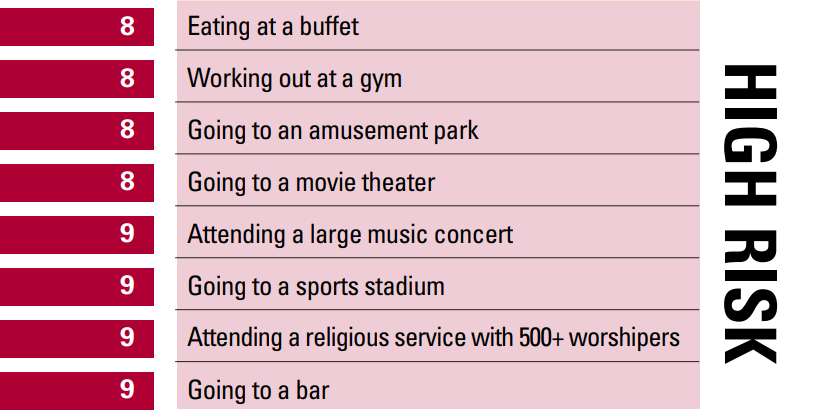
Data Visualization #4
The last graphic was developed by the physicians on the Texas Medical Association COVID-19 Task Force and TMA Committee on Infectious Diseases.
I love it.
It is simple. It is easy to digest. There is absolutely nothing cute about it (hurrah!). There are no circles to jump through. No expensive Data Visualizer Specialist In Fonts was hired. The graphic is not trying too hard.
It was probably designed by the Doctors in TMA. It is insanely boring. All it is is… Effective.
Just about the only lite criticism, I can make is that perhaps in keeping with the (ironically) liberal posture of the state of Texas when it comes to dealing with Covid, this graphic lowers the bar for what’s risky compared to all other sources. I share that as a small red flag, but it is adjacent to the technical analysis of the data viz that we are undertaking today.
The logic powering the graphic is integrated into the core of the graphic, as becomes clear below. There is little to no effort necessary to understand the visual. Start at the top, keep going. The colors and bars help you along.
Even in this small size, it is fairly readable…

When information is laid out so clearly other things jump out at you that make you think (an excellent trait of a great data visualization).
All of the below items are an 8 or a 9 – but consider the staggering differences.
Attending a bar is just as risky as a religious service with 500+ worshipers! And, both are a tiny bit riskier than eating a buffet!! You were leaned-in questioning the data, being curious. A good sign.
Let’s apply our algorithm and see how this graphic does with our tough, but with love lens:
1. Time to the most important insight. [Fast. Slow. KMN!]
2. The effort to understand the whole graphic. [Low. Medium. No Thank You.]
3. Trust marks. [Clear. Non-Obvious. None.]
4. Rank-ordering of key messages. [Yes. Partial. WTH!]
5. Explaining the key logic powering the graphic. [Super clear. Cloudy. Invisible.]
6. Exposing nuance. [Sweet. Some. Sour.]
7. Visualizer trying to be too clever. [No, and thank god. Yes, but it is harmless. Yes, sadly.]
8. Likely to recommend to influential leaders. [Yes! No. No way.]
Based on the algorithm’s assessment, it earns a score of 64/66.
Here’s the math:

The TMA graphic was the spark to write this newsletter.
The world needed a simple way to communicate effectively, in this case literally, information that can save lives.
While things are rarely that high-stakes in a business environment, I hope the TMA inspires you to ensure that you don’t lose sight of what’s important when you work on data visualizations: The understanding of data.
Bottom line.
How do you handle the conflict between your goals as a Data Visualizer (and incentives your employer creates for you) and the Data Consumer? While the answer seems obvious, it is incredibly difficult to execute. I hope you’ll use the data visualization assessment to ensure you, your team, solve for the Data Consumer first, yourself second.
If you have graphics that score above 60, I would love to see them! (If they are shareable.)
All the best.
PS: Bonus Life Lesson:
A small number would surely have noticed that the perfect score from the algorithm is 66 (all Great), and the score for it was good enough is 22 (all Could Be Optimized). That massive chasm reflects life (and my philosophy).
There are thousands of Analysts who’ll stop at good, after all, it is good. Perhaps a hundred, or less, will do the hard work required to get to great. They’ll rule the (biz) world.
#nowyouknow


 Via
Via 


Thanks, Avinash for sharing this great smart data visualization article.
The infographics are amazing.
Keep up the good work. – Daniel.
Thanks for the great post, as always. The algorithm is nice. As you mentioned, it would be cool to see an application to automatically grade visualizations. I'm sure someone did or is working on it. Adding some quantitative criteria (e.g., data-ink ratio) would be interesting.
While walking through the article, I made my own spreadsheet. Maybe others can copy the sheet and make a better version:
https://docs.google.com/spreadsheets/d/1YdTq2uCWukb0Vo3WmA8RYlr-RI0vAmRcbpRPUTSdcFo/edit?usp=sharing
Zach: Thank you for making a docs version!
For those who, still, might be loyal to Microsoft Excel, :), here's the version I used while working on this blog post:
https://www.kaushik.net/avinash/avinash_data_viz_algorithm.zip
-Avinash.
It is good to see you are back to blogging Avinash, thank you!
Reflecting on your eight dimensions, in case of our agency the ones that have the most negative impact are #6 and #5. Analysts don't have enough strategic understanding of the business to expose nuance. Similarly they so often don't explain the underpinnings effectively which results in frequent misunderstanding of what the graphic is actually saying.
Thanks, Sir. You have been an inspiration for me & my work & my brand.
Though I'm coming back to your site after such a long gap, happy to refer this blog to help in my business and digital marketing strategy. Hopefully, should be able to be more regular from now on and keep update with your posts. Thanks.
A very timely post, not just great analytics advice but also helpful COVID advice for all of us. :)
I agree with you on the Texas Medical graphic. It is simple. It is easy to read. It just works.
The most confusing one for me was the Information is Beautiful. It is trying to be too clever, it is hard to get through the bubbles and it is unclear if there is a rank order to how they are laid out (not a problem with the Texas Medical).
I absolutely love the scoring sheet, thank you for sharing the Excel version.
That took me to a all new level…very helpful for me..when I am trying to use digitalization tools for my business number to visualize efficiently ..
Thanks
Avinash ( me too)
Thanks a lot for the article!
Besides the scoring system, I realized these are Visualizations, those we generated by python and R are just Plot :)
Hi Avinash,
It is good to see that you are back to blogging. These data visualizations are making the content easy to digest and understandable.
Keep sharing more!
Wow! great post on Data Visualization and as always you have described the things very clearly, nice to see you again on blogging. Keep it up.
Hey there! This was such an insightful and well structured article. Totally loved your views on Data visualization. These pointers are such a help for individuals as well as for Data Analytics Services as well.
Great post thanks for sharing this valuable piece of information with us all. The algorithm looks promising also the results are also quite good. BTW it's a neatly written and informative article.
Nice work keep enlightening us with such insightful posts.
Keep up the good work.
Thanks for an excellent post!
Although, for the first data visualization (xkcd) example, did you skip the row for #7 in the table?
I was wondering why the score was so low.
Thank you for pointing out the error on my part.
I've fixed the graphic and the post.
Thank you, K.
-Avinash.
In my opinion, visualization number 4 is very simple and readable.
It perfectly presents data that might otherwise be difficult to read. Perfectly used colors and fonts.