article thumbnail

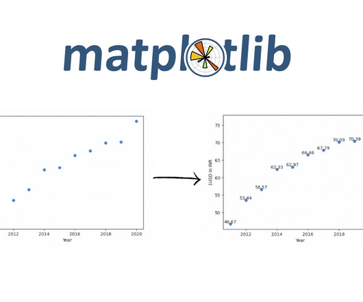
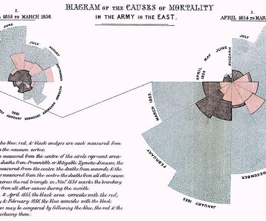
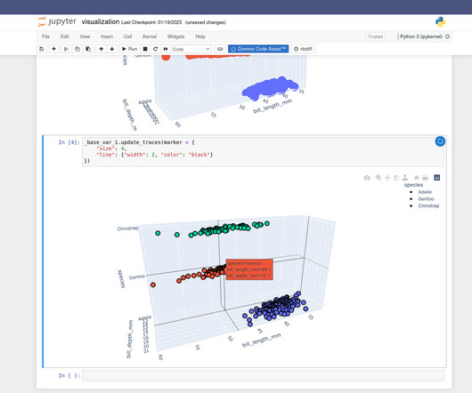
Scatter Plot Visualization in Python using matplotlib

Analytics Vidhya

Introduction Scatter plots are a powerful tool in a data scientist’s arsenal, allowing us to visualize the relationship between two variables. This blog will explore the ins and outs of creating stunning scatter Plot Visualization in Python using matplotlib.

article thumbnail

Remove Your Rose Tinted Glasses: Data Visualizations Designed to Mislead

datapine

1) Misleading Data Visualization Examples. 2) How to Avoid Misleading Visuals. 3) The Impact Of Bad Data Visualizations. But while that may be the case, people are duped by data visualizations every day. Bad data visualizations come in many forms, with some more obvious than others. Table of Contents.

Insiders

Sign Up for our Newsletter

This site is protected by reCAPTCHA and the Google Privacy Policy and Terms of Service apply.

Trending Sources

article thumbnail

Ultimate List of CFO Blogs and Resources – 2023 Edition

Jet Global

Blogs Podcasts Whitepapers and Guides Tools and Calculators Webinars Sample Reports The Evolution of the CFO into the Chief Data Storyteller View Insight Now Our Favorite CFO Blogs The Venture CFO Blog Link: [link] Are you looking for blog posts for CFOs by CFOs? Then you have come to the right place.

KPI 105
article thumbnail

Decoding the Chi-Square Test?-?Use, Implementation and Visualization

Analytics Vidhya

ArticleVideo Book This article was published as a part of the Data Science Blogathon Introduction In the last blog we looked at a test to. Use, Implementation and Visualization appeared first on Analytics Vidhya. The post Decoding the Chi-Square Test?-?Use,

Testing 153
article thumbnail

KDnuggets Top Blogs Rewards for December 2021

KDnuggets

The December blogs that won KDnuggets Rewards include: Write Clean Python Code Using Pipes; Building a solid data team; How to Get Certified as a Data Scientist; 3 Tools to Track and Visualize the Execution of Your Python Code; and more.

article thumbnail

What is numpy.linspace() in Python?

Analytics Vidhya

It’s a versatile tool used in various applications, from scientific computing to data analysis and data visualization. In this blog, we’ll explore the ins and outs of numpy.linspace() and how you […] The post What is numpy.linspace() in Python? appeared first on Analytics Vidhya.

article thumbnail

Take a Visualization MasterClass with 'We Feel Fine'

Juice Analytics

My first stop for data visualization inspiration is Jonathan Harris’ We Feel Fine. This is why I come back again and again for design concepts and engaging data visualization techniques that reach any audience. The “Mounds” visualization collects the volume of different feelings and shows them in wiggling Jello-like piles.