How to get started with data storytelling? For the beginner — and even for the experienced data analyst or data scientist — data storytelling can be a vague, disorientating concept.
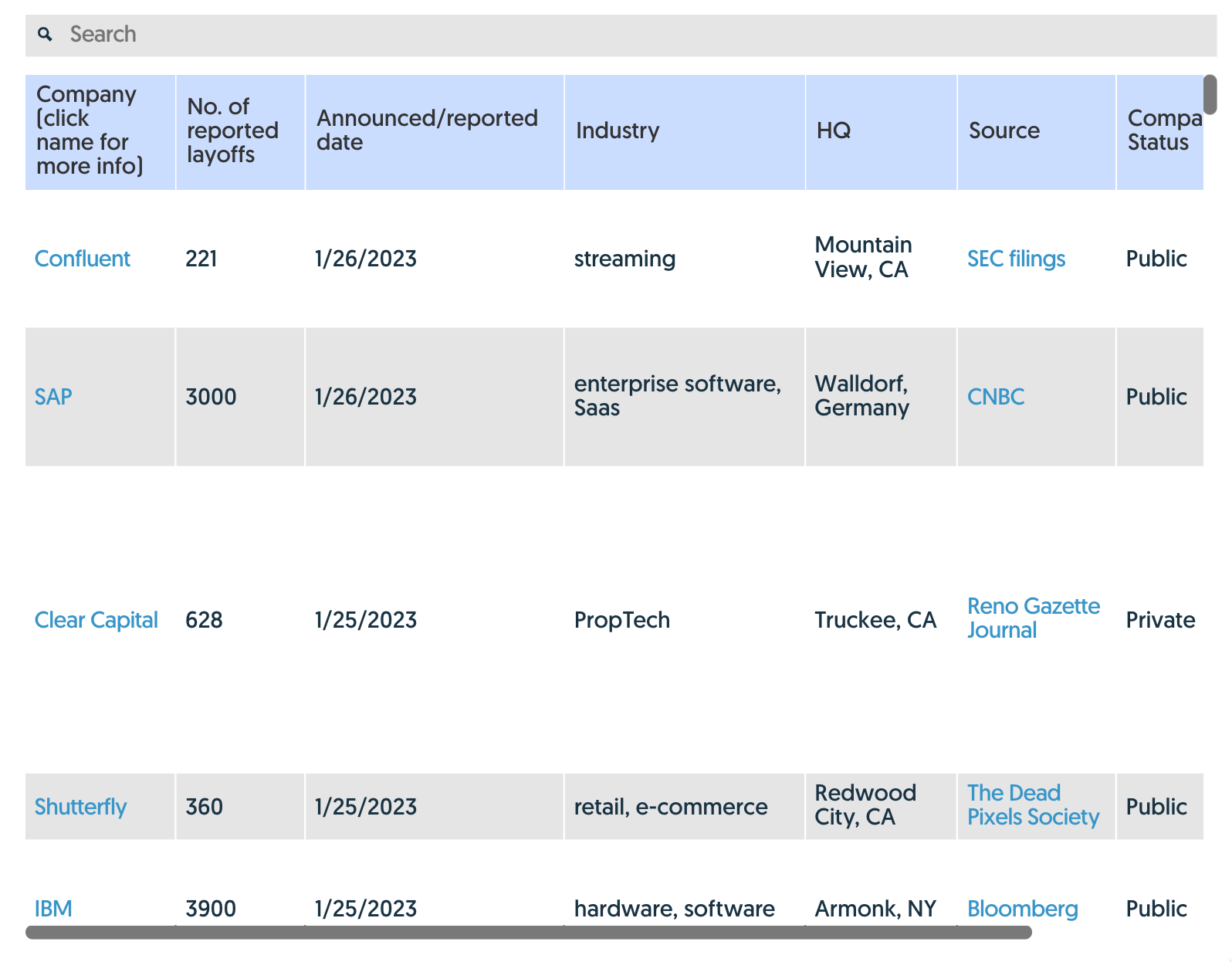
This question posted on Reddit is a good example of the interest and confusion about the topic:
…which was then followed by this pure-gold response:
I hope to make data storytelling a bit more accessible by laying out some of the basic concepts and skills required.
The “last mile” of analytics
Data storytelling is about helping make your work pay off. If you’ve gathered and analyzed data, you’ve done the hard part. But those efforts will come to nothing if you aren’t able to convince other people of your insights — and the actions that should be taken. This is how we define data storytelling: “Data storytelling is the presentation of data to communicate a message using the techniques of traditional narrative forms.” (See here for more.)
It’s not about you, it’s about them.
You need to start with your audience in mind. The audience is the people who are going to do something with your insights and analysis. If you want them to change their behavior or decisions, you need to understand their motivations. What are their priorities? How do they best absorb data? What actions can they take?
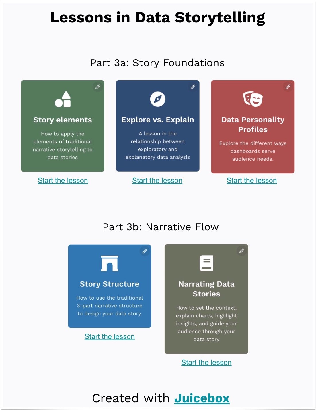
In my recent presentation entitled ‘The Star Trek Guide to Better Analytics’, I found Dr. Bones McCoy to be a good characterization of your audience: he’s not an engineer (or data-savvy), he’s skeptical, and he’s people-oriented. But every audience is different. Check out our Data Personality Profile for a framework for evaluating your audience.
Data Storytelling is Writing
I hate to take you back to your writing classes but data storytelling isn’t just a collection of data visualizations, it is a form of writing. You are building a narrative that makes an argument.
Your narrative structure should start by posing the problem and context, followed by your analysis, and finally your conclusion. In a data story, we like to use the three-act story structure.
Furthermore, the actual act of writing will help you explain your thinking. Before worrying about visualizing data, create a written version of your data story that walks through the logical flow. Exercises like this can help you focus on your message.
Be Simple and Specific
When you are presenting data to your audience, your priority is to make it easy to understand and easy to connect to.
Simple to understand means using charts and visualizations that are intuitive and well-understood. I love an exploratory treemap or network diagram or Sankey chart. But each of these advanced visualizations requires your audience to learn how to read them. We’ve found that it is far better to stick to charts that have a lower “barrier to entry.”
You also want to explain the data and insights in ways that connect emotionally or logically. Often this means providing specific examples. After all, “specificity is the soul of narrative.” In addition, you want to look for ways to make your data relatable (we’ve got a blog post for that too).
One of the all-time best specificity examples is the Gun Deaths visualization created by Periscope.
Package for consumption
Finally, how your data story gets delivered really matters. A lot. Some people want the ability to interactively dig into the details. Others just want the key message, and to have it delivered to their inbox.
What is the delivery method that will most likely grab your audience’s attention?
How much explanation and in-person hand-holding is necessary?
Is the data story a collaboration or a one-way broadcast?
Beyond the delivery method, we have also found that the visual design of your data story is important. If you’re not a designer, how do you make something that looks beautiful, clean, and clear? Start by removing the ‘chart junk’, all the visual elements that distract from the data. Then consider whether you’ve used color carefully, made smart font choices, and used layout to guide the reader.
Where to next?
That’s it. Those are some of the basic concepts that will get you started toward presenting data as a compelling story. Of course, there is a ton more to learn. That’s why we’ve been creating learning content that we hope will teach a new generation of data storytellers. Here’s where I’d recommend you go next:
Learning from the best with 20 outstanding data storytelling examples
Dive deeper with our Complete Guide to Data Storytelling
Practice your skills with the only build-it-yourself data storytelling platform.


