Discover The Power Of Modern Performance Reports – See Examples & Best Practices
Table of Contents
1) What Is A Performance Report?
2) The Importance of Performance Reports
Performance reporting has been a traditional business practice for decades now. These analytical tools allow decision-makers to get a sense of their performance in a number of areas and extract valuable insights to inform their future strategies and boost growth.
In the past, these reports were used after a month or even a year since the data being displayed was generated. At the time, this was not an issue, as the static nature of reporting was the norm. That said, just like many other business processes, reporting has mutated to meet the fast-paced environment organizations face today.
It is no longer enough to get a static view of the past. The new era of reporting is interactive and offers an insightful mix of real-time and historical insights. Insights, businesses need to stay competitive and skyrocket their success.
To help you get started with the topic, we put together this insightful guide on modern performance reporting using professional online dashboards. Keep reading to find a definition, benefits, examples, and some key best practices to generate them successfully!
What Is A Performance Report?
A performance report is an analytical tool that offers a visual overview of how a business is performing in a specific strategy, project, or department. With this 360-view, decision-makers can extract insights to inform their strategies and boost business growth.
These tools take the reporting process one step further by offering an interactive view of a business’s most important key performance indicators (KPIs) all in one place. There is no need to jump from one document to another or drown in infinite spreadsheets. Performance reports provide the necessary knowledge for managers and employees to understand how their efforts are developing. Plus, the real-time nature of these analytical tools enables them to spot any issues and tackle them immediately. Avoiding unnecessary waste of resources or worst consequences for the future.
That said, the true value of these reports lies mainly in their visual nature. They are composed of multiple graphs and charts that not only assist you in telling a complete story of performance but also make the data more accessible and understandable for a wider audience. That way, everyone across the organization can integrate them into their daily operations and use them as communication tools between teams and departments.
Let’s dive deeper into the benefits below.
What Is The Importance of Performance Reports?
Being data-driven is no longer a choice or a competitive advantage. On the contrary, organizations that fail to implement online data analysis tools to track and optimize their performance will simply stay behind. Today, basing your most important strategic decisions on simple intuition can lead to a waste of money and resources that will stall business growth. That is why performance reports are such powerful tools. Below we’ll go into detail about the reasons.
- Informed decision-making: The success of any strategy, product, or service lies greatly in the power of knowledge. Modern performance reports help you in that task by providing the necessary knowledge to make informed decisions and leave intuition behind. Being able to get a 360-view of the status, progress, or development of your strategies enables you to spot improvement opportunities that will enable you to achieve your goals successfully.
- Enhance communication & collaboration: A key element of success when it comes to an organization’s data-driven efforts lies in collaboration. Performance reports are powerful tools that help boost communication and collaboration between departments by providing a melting pot of information in an online environment. Just by sharing these reports, teams and departments can stay connected with each other and work towards the same company goals.
- Boost business growth at a lower cost: Wrong decisions based on outdated data or simple intuition can not only stall business growth but also bring substantial financial losses by wasting resources on wrong strategies. This issue is eliminated thanks to the power of these reports. By being able to make informed decisions, you’ll ensure your goals are being met with less financial risk, thanks to smart resource allocation.
Try our professional reporting software for 14 days, completely free!
Types Of Performance Reports: Professional Examples & Templates
As mentioned earlier, these solutions can prove valuable in a wide range of business areas, departments, projects, and strategies. To help you get a sense of their versatility, below we will discuss the most common types and provide real-world examples to put their value into perspective. These examples of performance reports were generated with datapine’s dashboard creator, and they offer an interactive and visually appealing view of critical performance data.
1. Company performance reports
As its name suggests, this type covers any kind of business-related area or department that is key to the success of the organization as a whole. We are talking about sales, finances, customer service, human resources, and more. Let’s start with an example from the financial side.
a. Financial performance report
Our financial report below is a different take on a traditional income statement. This time, including valuable forecasts for costs and income. With this data in hand, decision-makers can identify trends and patterns to evaluate the financial health of the organization, compare their current performance to the expected forecasts, and extract valuable conclusions to plan their budgets and strategies ahead of time.
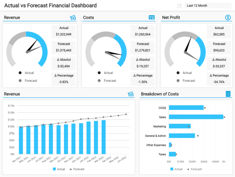
**click to enlarge**
The template above focuses on revenue, costs, and net profit. Each of these KPIs is tracked in its actual value, its forecast value, and the absolute difference in number and percentage. For instance, we can observe that the net profit has the highest variance from the actual to the forecasted value. This is something that needs to be looked at in more detail, as the net profit tells you how profitable the company is as a whole. It is important to note that businesses approach their financial forecasts differently, and this variance might be less critical than it seems. A good way to evaluate what could be happening is to look into other data in the report. For instance, the bar chart for cost breakdown can tell you if you are spending more than expected and if those costs are affecting your final profit.
b. Sales performance report
Our next example is a sales dashboard that tracks general departmental performance on a long-term basis. This highly visual example provides the 360-view of sales operations that managers need to assess the success of their strategies and find improvement opportunities to boost sales. Let’s discuss the template in more detail below.
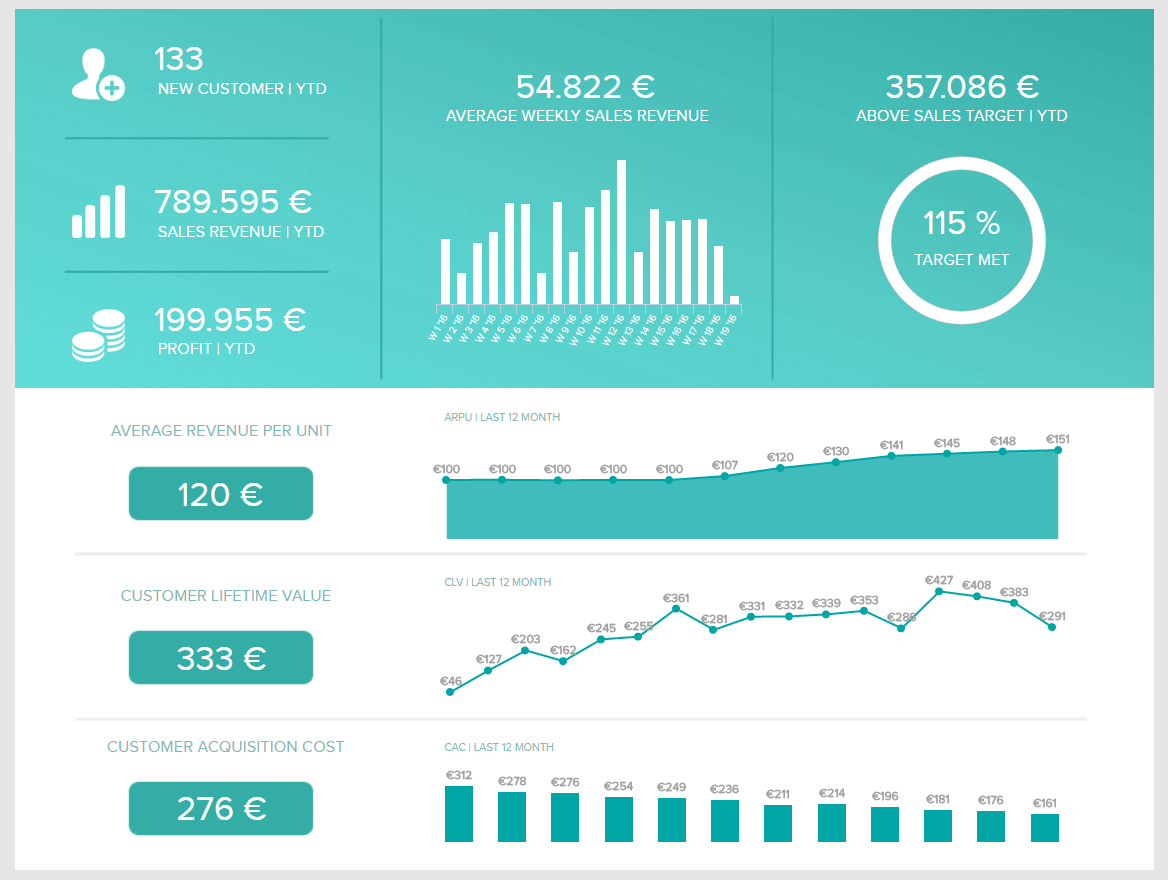
**click to enlarge**
The performance reporting template above focuses on high-level sales KPIs, including ARPU, CAC, CLV, and sales target and growth. As mentioned earlier, targets are a key element of the reporting process. They enable users to evaluate if their efforts are resulting in the completion of crucial business objectives. In this case, we can see that the business reached its overall sales target by 115%. We can find the reasons why by looking at other charts in the report. For example, we can observe that the CLV and ARPU have had an increasing trend in the past 12 months while the customer acquisition costs decreased. This is a positive conclusion as you want to keep customers with you for the longest time at the lowest cost possible.
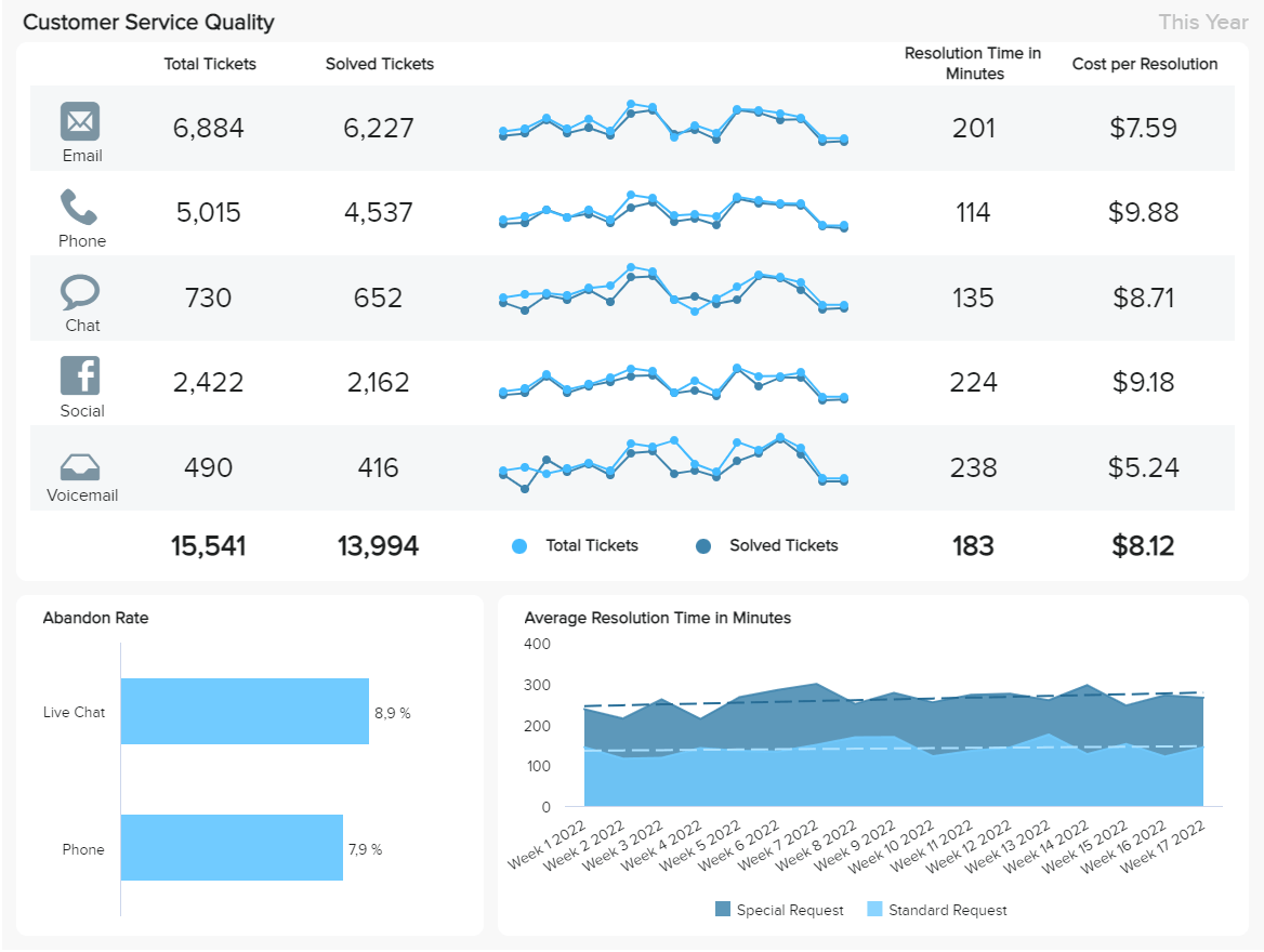
c. Customer service performance report
Customer service is among the areas that can benefit the most from performance tracking. After all, customers are the beating heart of any organization, and keeping them satisfied should be a top priority. The customer service dashboard below provides a complete view of the quality of a customer service department with an omnichannel approach. With this data in hand, support managers can ensure customers are getting the help they need at the lowest costs.
**click to enlarge**
With insights into the total tickets, average resolution time, abandonment rate, and more, users can identify their customer's favorite communication channels as well as weak points that need improvement. Naturally, you want to solve your issues at the lowest cost to the company; therefore, it is important to look closely at the performance of each channel to ensure issues are solved efficiently.
Overall, we can see that the total tickets vs. solved ones have an acceptable ratio in the different channels. However, if we take a deeper look at the data, we can find some valuable conclusions to improve. For instance, the stacked area chart tracking the average resolution time in minutes by week is showing us that special requests are taking longer than expected in some weeks. While we can always expect special requests to take more time than standard ones, it is still possible to keep the time at a minimum by identifying the most common ones and preparing agents to tackle them as fast as possible.
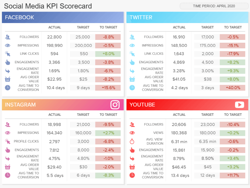
d. Social media performance report
Moving on with our lists of performance reports examples for general company areas, we have one focusing on social media, specifically on 4 key platforms: Facebook, Twitter, Instagram, and Youtube. It is the perfect tool for businesses that manage their social platforms in-house but also serves as a great client reporting example for agencies.
**click to enlarge**
The template focuses on 7 metrics that are fundamental to understanding the progress of strategies on social media. Each of these metrics is tracked in its actual value and compared to a target. The difference between the actual and targeted values is displayed in a percentage in colors red and green to understand if the value is negative or positive easily. In general, we can observe that the period of April 2020 performed worst than expected. With targets being met only in a couple of areas. This is something that needs to be looked into, and tweak strategies to ensure targets are met.
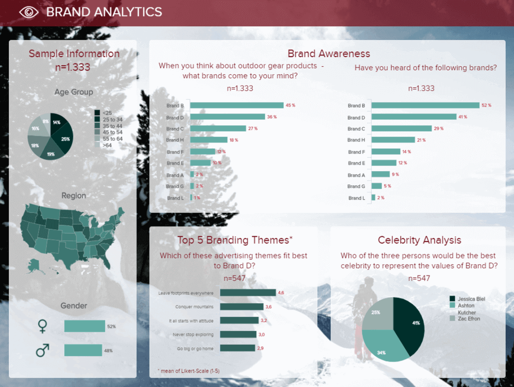
e. Brand performance report
Brand perception can directly affect performance. If your target customers don’t recognize or associate your brand with the concepts and attributes you are expecting, then your sales are likely going to suffer. Our next performance report template shows the answers to a survey on brand perception for Brand D; let’s analyze it in more detail below.
**click to enlarge**
This highly visual market research dashboard starts by giving some information on the surveyed audience, such as the age groups, regions, and gender. Paired with that, we get graphs and charts displaying the answers to questions related to brand awareness, branding themes, and celebrity analysis. By looking into them, we can conclude that Brand B is the most recognizable one over Brand D. Therefore, there is more work to be done in the awareness area. For example, by looking at the celebrity analysis, you can identify potential new brand ambassadors that will bring higher awareness to your target audience.
2. Project performance reports
Our next type of report focuses on projects. It is no secret that tracking project status and progress is critical to success. These reports provide the necessary knowledge to track the development of the project at each stage and ensure resources are being spent as planned. Plus, they serve as communication tools between team members to ensure every task is completed efficiently to move on to the next one. Now, let’s look at two project performance report examples.
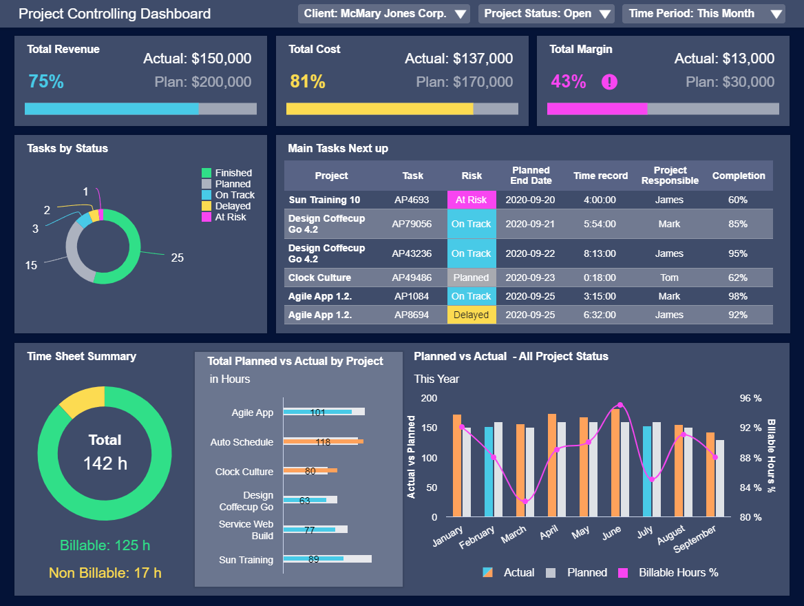
a. Status performance report
A project status report provides managers with an overview of the current state of the project, with insights into budgeting, time, costs, quality, and more. Our template below offers an interactive overview of project status with the possibility to filter by client, status, and time period. This way, the PM can get a complete overview of all developing projects and ensure each of them is performing as expected.
**click to enlarge**
When it comes to reporting using project management dashboards, targets and benchmarks play a key role as they define the limits to which the team should attain. In this case, we can see three cost and revenue-related metrics that are compared to a planned value. The total margin seems to be lower than expected at this stage in the project, which makes sense, considering costs are higher than revenue at the moment. This is made clear in the template with the exclamation point next to the total margin KP which should catch the PM’s attention.
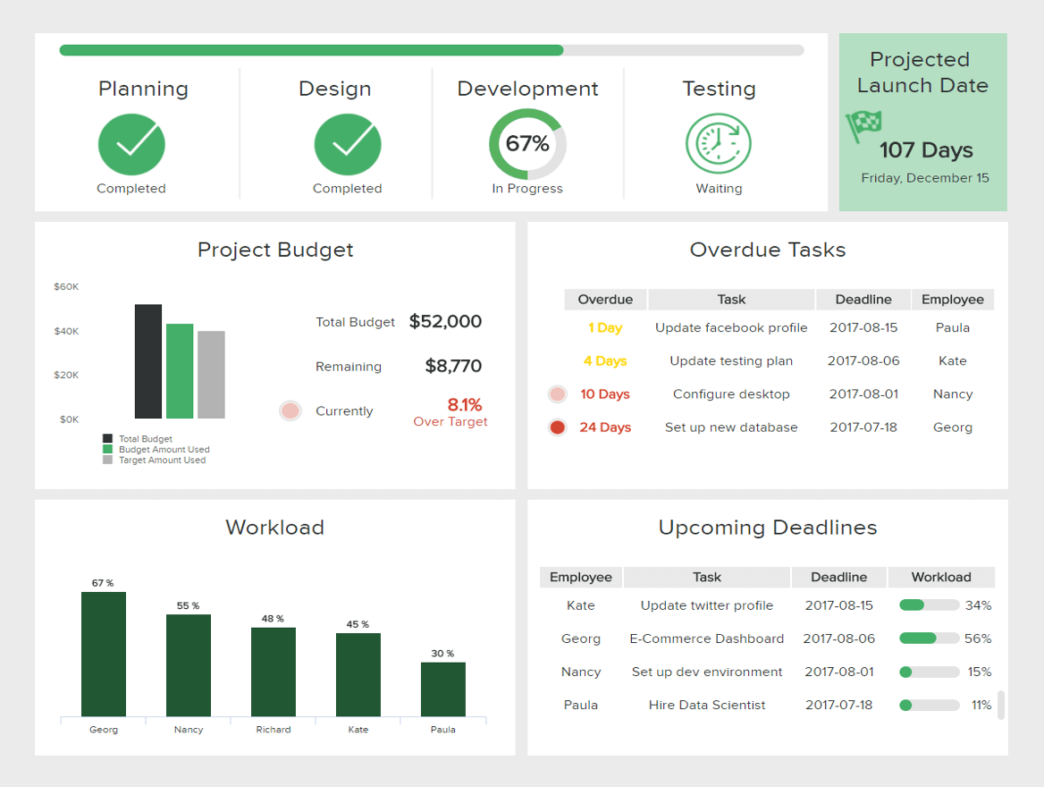
b. Progress performance report
On the other hand, the project progress report provides an overview of what has been accomplished in the project so far. Here we can see progress percentages, projected launch dates, upcoming deadlines, and much more. With these insights, team members, project managers, and other stakeholders can be informed of the progress of the project as well as identify areas that need to be re-evaluated. Let’s explore the example in more detail below.
**click to enlarge**
The template above is an IT dashboard tracking the completion of a website-related project. At the top, we get insights into the completed stages of the project with a 67% of development progress. At the bottom, we get more valuable information, such as the budget, where we can see an 8.1% increase over the target. This can be explained by looking at other charts, such as the overdue tasks, where we can identify tasks that are 24 days overdue. This can shine a light on poor team organization, something that needs to be tackled immediately to prevent the costs from going higher and the project being delayed.
Try our professional reporting software for 14 days, completely free!
3. Performance reports by time
Last but not least, we have the reporting by time period. These can be for any business area or function, depending on the scope of the analysis. Some businesses might want to track financial performance on an annual basis after their fiscal year has been completed, while others want to track their progress closely with weekly reports. To help you put their value into perspective, below, we provide examples for annual, monthly, and weekly reporting.
a. Annual performance report
Annual reports provide a 360-view of the business’s performance over a long period of time. While these solutions might not be entirely valuable due to their historical nature, they still provide essential insights that can help organizations plan their strategies for the coming year. Our template below is an employee performance report sample tracking critical KPIs related to productivity.
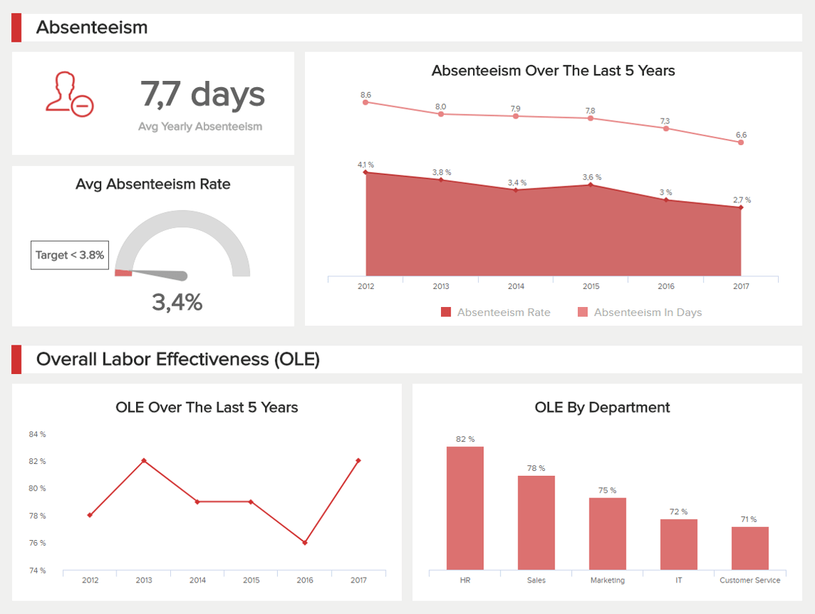
**click to enlarge**
Our HR dashboard above is divided into two areas: absenteeism and overall labor effectiveness. With this data, we can extract valuable insights regarding employee efficiency but also satisfaction. Naturally, you want to keep your absenteeism rates as low as possible since it directly affects productivity. Here, we can observe that the average absenteeism rate is below target, which can mean employees are motivated to work at this company. This data is backed by the OLE of the past 5 years, where we see a big increase in the observed period. That said, there is still room for improvement as we see that some departments are less productive than others.
b. Monthly performance report
Monthly tracking is probably the most common type of reporting in the business landscape. It provides the perfect timeframe to gather valuable data and act on insights before it is too late. Our example below is a manufacturing dashboard tracking overall performance in 4 areas: effectiveness, quality, production, and costs. Let’s explore it in detail below.
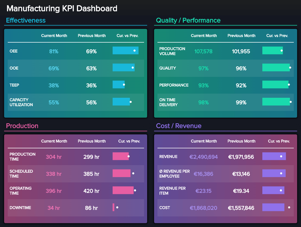
**click to enlarge**
As we’ve mentioned multiple times already, targets are a key element of performance reporting. They serve as guidelines to understand if your project, strategies, teams, or departments are performing as expected. In this case, the values are compared to the previous month, which you want to improve. Overall, we can see that this manufacturing company is underperforming in all areas compared to the previous month. That said, we should not consider this as a negative thing from the get-go. It is necessary to explore the data in detail and see if there were any factors that lead to this scenario and then decide the measures to take next.
c. Weekly performance report
Finally, weekly reporting provides a real-time view of performance in areas that need close monitoring, as any critical development can bring major consequences to the organization. A great example of this is cybersecurity. With data breaches and cyberattacks becoming an increasing concern, tracking how your security strategies are performing on a weekly basis can make a difference in the impact one of these attacks can have.
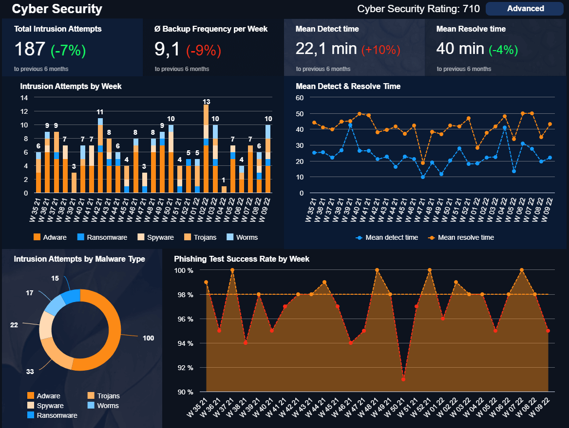
**click to enlarge**
Our template above has a weekly focus, and it provides the necessary knowledge to help IT managers keep track of any relevant developments regarding cybersecurity. The performance dashboard starts by providing a cybersecurity rating to help the company understand the quality of its efforts based on predefined criteria. Next, we get insights into the total intrusion attempts, backup frequency, and the meantime to detect and resolve any issues or threats. Each compared to the previous 6 months.
To understand these values better, the template provides breakdowns of each to help extract conclusions to improve. For instance, by looking at the intrusion attempts by malware type, the company can identify the most common threats and implement strategies to keep the mean time to detect and resolve as low as possible.
These are just a few of the multiple performance report examples you can implement in your business. To see more templates that suit your needs, check out our library with over 80+ dashboard examples.
Performance Reporting Best Practices
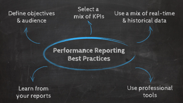
As you saw in our list of examples, these reports are valuable tools for understanding how strategies and projects are performing. To help you generate them successfully, below we’ll discuss five best practices you should follow.
1. Define objectives and audience
When it comes to successful reporting, thinking ahead is key. The first step you should take before any other is to think about your general objectives as well as your target audience. Your objective can be anything from tracking general departmental performance, the development of a project, strategy, or campaign, or any other activity that is related to your company goals. With those in hand, you’ll be able to collect the correct data later in the process.
The same goes for your audience, it can be anyone from a C-level executive to a manager, client, or employee. It is important to define the needs and expectations of your audience to plan the content of the report more efficiently. For example, you might need to show a financial dashboard to the marketing team, if some people in the team are not familiar with financial concepts, then you need to prepare your reports thinking of these people by including labels or other elements that make the information more understandable.
2. Use a mix of current and historical data
As mentioned earlier in the post, the traditional way of reporting was made out of static historical data. Now, we already know that this format is no longer valuable today. What will take your analytical efforts where you want them to be is using a mix of current and historical data. In doing so, you’ll get a 360-view of your performance and be able to identify valuable trends and patterns to inform your strategies.
For instance, tools such as datapine use a mix of historical and real-time data to generate accurate forecasts and display them in the report. This can be anything from the number of sales for the coming months, inventory levels, employees who will take a vacation at a certain period of the year, and many more. With these predictions in hand, decision-makers can prepare for any events in advance, making the reporting process even more efficient.
3. Define a mix of KPIs
After you collected your most important historical and current data, it is time for you to define some critical KPIs. These KPIs will help you measure how your strategies are performing and if anything needs improvement. A common mistake when it comes to selecting and using KPIs is picking too many. As we like to remind readers of our blog, just because something can be measured, it doesn’t mean it should be. Tracking too many KPIs can make your reports confusing and crowded. Therefore, you should pick 3-5 indicators for each goal or strategy. That way, you’ll keep your analysis focused and way more successful. Check our list of KPI examples to get over 350+ templates for different business functions and industries.
4. Use professional tools
In the past, companies relied on Excel or PowerPoint to generate their reports. While these tools are wildly effective, their static nature is a big setback for organizations that need agile analytics. For that reason, investing in modern performance reporting software is a key best practice for us.
These tools provide organizations with advanced functionalities to make their reporting process automated, interactive, collaborative, and highly efficient. With the power of artificial intelligence, real-time data, predictive analytics, and much more, professional software will drive analytical success every step of the way.
5. Learn from your reports
Just like any other business-related activity, reporting is a learning process. Once your reports are generated, you should gather feedback from users to keep improving your formats and processes. Just remember, there is no perfect format out there. It will be directly linked to your analytical goals and audience. That said, by following the best practices we just mentioned, you should be able to build a solid foundation for your analytical journey.
Try our professional reporting software for 14 days, completely free!
Performance Reports Key Takeaways
As you learned throughout this guide, performance reports do more than just show critical KPIs, they provide a deep view of progress to help users identify opportunities for growth and improvement, they keep teams connected and boost collaboration to ensure company goals are being met, they provide industry benchmarks to help you understand your position in the market and much more.
A well-implemented reporting system using a professional BI reporting tool will serve as a big competitive advantage by giving everyone across the organization the power to make informed decisions in less time and with fewer resources spent. In time, these actions will skyrocket organizational growth and prepare the business to dive into new opportunities.
If you are ready to start generating stunning performance reports yourself, try our professional online reporting software for a 14-day free trial today!