
These are three of the most important principles to bring to your data visualization work.
#1. Start with your audience
Before you make your first chart, think about who you are looking to serve with this data and what they do in their role.
An executive will have very different needs from an analyst. What data you choose to present and how you present it should start with empathy for your audience.
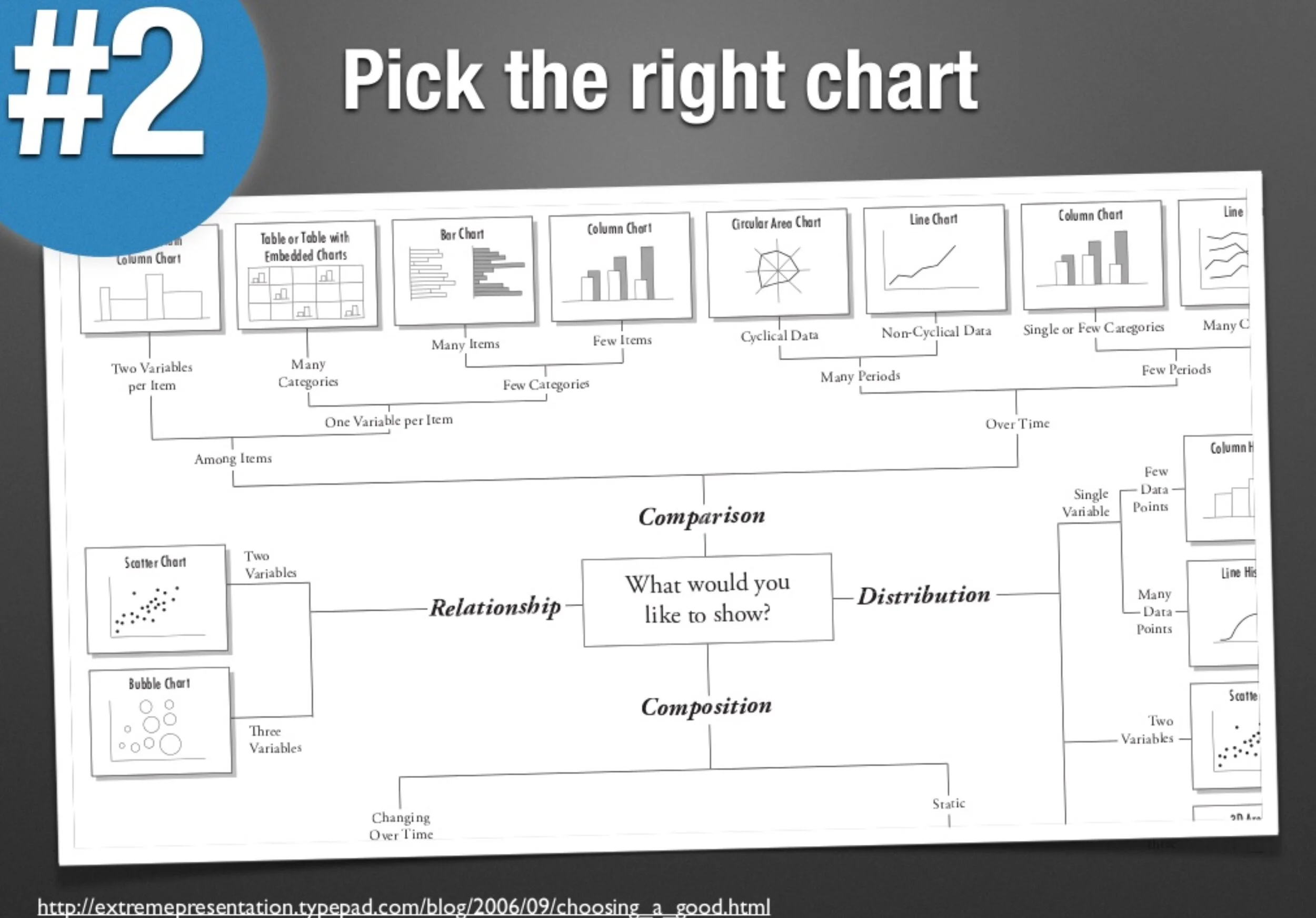
#2. Pick the right chart
Every chart type has its strengths and weaknesses. Line charts are great for showing change over time. Bar charts compare performance on one measure for a set of things.
You’ll need to understand what you want to emphasize in your data, then select the chart type that highlights that part of your data.
#3. Keep it simple
Remember that audience in #1? They are busy and have little attention. You need to keep your visualization as direct and straightforward as possible.
“Keeping it simple” means highlighting the important insights explicitly, labeling your chart clearly, and removing detail or extra data that distracts from your message. This is the hard and important work of editing.

#4 (Bonus): Looks matter
While your data visualization is primarily about the insights from your data, making it attractive can be the difference between your audience reading it or not.
Quality data visualization includes thoughtful use of color and contrast and graphical elements to bring the data to life or make the information more relevant.

We’ve been creating a data visualization solution designed with these principles in mind. It’s called Juicebox. Give it a try.