
Pie charts are the Kenny G of visualizations: Massively popular in the face of withering criticism.
I used to spend a fair amount of time criticizing pie charts. And I wasn’t alone — everyone who cares about visualizations has spent time shaking their fists at ineffectual pie charts (take this article for example: “The Worst Chart in the World”).
The criticism stems from a basic limitation of the form: radial degrees (e.g. a pie slice) are harder to perceive than linear distance (e.g. the length of a bar).
However, pie charts have an enduring popularity. It stems from a fundamental appeal of the form. Circles are familiar. And it is conceptually simple to understand that the chart is showing parts of a whole.
But you shouldn’t put on Kenny G at a dance party, and that’s where pies charts get in trouble. They aren’t fundamentally bad as much as they are are mis-used, over-used, and poorly executed. The problems of pie charts fall into six areas:
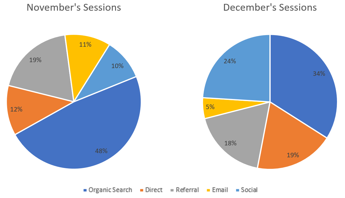
1. It is hard to visually evaluate size based on radial degrees.
How do you make clear the relative values of the segments?
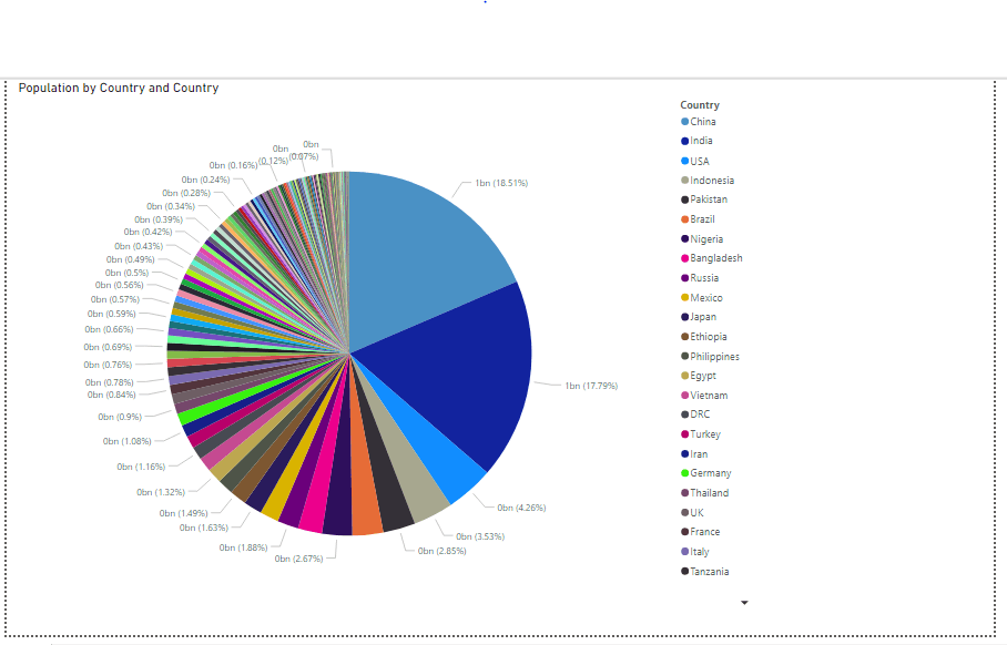
2. Pies can only be sliced so thin before they are unreadable.
How do you handle showing many items?
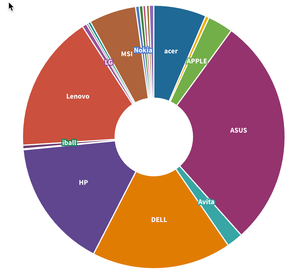
3. Labeling individual segments can be difficult.
How do you ensure the readability of labels and values?
4. Static pie charts provide little opportunity to answer a next level of questions.
How do you make the information shown in a pie chart more explorable?
5. Pie charts can become colorful to the point that readers feel like they need to file charges for assault-by-rainbow.
How do you ensure color contrast with appropriate restraint?

6. Pie charts can struggle to show all the information in the available space.
How do you fit in the important content without it feeling compressed?

To boil it down, a Better Pie Chart accomplishes the following:
READABILITY even with many data elements
COMPARABILITY for seeing differences in segment values
INTERACT-ABILITY to enable data exploration
SCAN-ABILITY using color, contrast, and layout
At Juice, we believe that pie charts don’t have to suck — with some clever design choices. I’m delighted to show you how our brilliant design and development team created a Better Pie Chart.
Here’s what it looks like:
Try it out for yourself in this app where we show how The Great British Bake-Off recipes break out by creator and type. When you do, you’ll notice some clever features:
If there are going to be a lot of segments in your pie, we automatically create an ‘Other’ category.
You can select one or many segments in the pie and see how the values aggregate with the display in the middle of the chart.
The legend and segments interact to make it easy to select items.
As with all our visualizations, the selections act as filters. It is easy and automatic to have one pie chart filter results in the next pie chart.
Check out this short video showing how quick it is to build your own:

Heck, if pie charts had started out like this, we could have saved ourselves a decade of complaining.
