Outliers Pruning Using Python
This article was published as a part of the Data Science Blogathon.
Introduction
When it comes to data cleaning, it is not always that we have to deal with NaN or Zero values so that we can remove them, and data cleaning is done! In real-time practical projects, things aren’t that simple. We have to do further analysis, and for the same Outliers, detection is one of the methods we have to focus on for every iteration of analysis.
In this article, we will do the Outliers pruning on three types of data, i.e., dimensional, two-dimensional, and Curve data, using some statistical methods like z-score, data distribution, and polynomial fit distribution. By the end of this article, one will be able to detect the outliers in all sorts of data (as mentioned), and this is not all. Along with working with scratch at the end, we will also use python’s famous sk-learn package to automate everything within a few lines of code. This way, one will have the mathematical knowledge behind the concept and the simple and steady practical implementation.
Inference: In this article, only NumPy and matplotlib libraries will be used when we are not automating stuff. We have the text-based dataset for all three types for that np. load txt() method is preferred. Then looking at the shape of the 1-D and 2-D datasets we can see both have 1010 rows (10 are outliers that I have deliberately added for analyzing the outliers).
We later plot the data points using a scatter plot, and in the output, there are two plots, one indicating the 1-D(blue) and 2-D(red) dataset, and the second one is curve fit. Though from the naked eye as well, some outliers are visible from the graph still, that is not the right way for outlier detection.
Steps for Outliers Pruning
The most basic and most common way of manually doing outlier pruning on data distributions is to:
- Using statistical measures to fit the model as a polynomial equation
- Find all points below a certain z-score
- Remove those outliers
- Refit the distributions and potentially run again from Step 1 (till all the outliers are removed).
mean, std = np.mean(d1), np.std(d1)
z_score = np.abs((d1 - mean) / std)
threshold = 3
good = z_score < threshold
print(f"Rejection {(~good).sum()} points")
from scipy.stats import norm
print(f"z-score of 3 corresponds to a prob of {100 * 2 * norm.sf(threshold):0.2f}%")
visual_scatter = np.random.normal(size=d1.size)
plt.scatter(d1[good], visual_scatter[good], s=2, label="Good", color="#4CAF50")
plt.scatter(d1[~good], visual_scatter[~good], s=8, label="Bad", color="#F44336")
plt.legend();
Output:
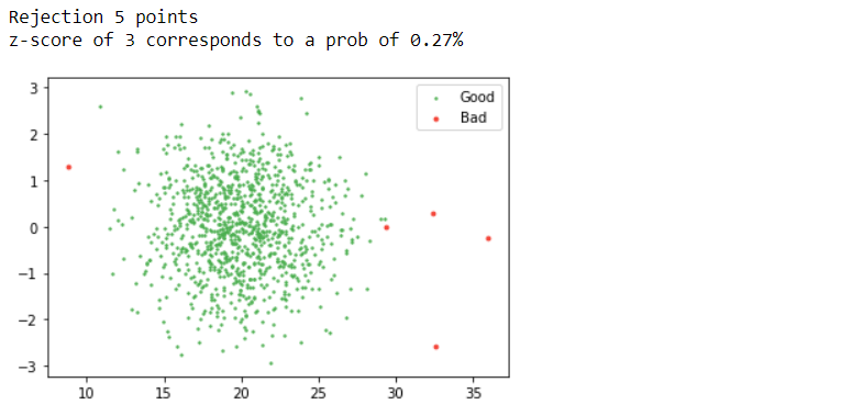
Inference: One of the best and most used methods for detecting outliers is the z-score. What is a z-score? A Z-score is a standard score that checks whether the data points lie within the range (between highest percentile and lower percentile). If the threshold value goes par z-score, that particular data point is an outlier.
In the above line of code, we are also following the same approach: firstly calculating the z-score with formula ((X-mean)/ standard deviation) where X is each data point, and if we want to traverse through each instance for that loop is mandatory. The plot says it all! According to the threshold value, we can see that the red dots are the outliers or the bad data, while the green ones are good data.
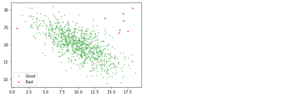
from scipy.stats import multivariate_normal as mn

mean, cov = np.mean(d2, axis=0), np.cov(d2.T)
good = mn(mean, cov).pdf(d2) > 0.01 / 100 # where "cov" is the covariance and "pdf" is pobability density function

plt.scatter(d2[good, 0], d2[good, 1], s=2, label="Good", color="#4CAF50")
plt.scatter(d2[~good, 0], d2[~good, 1], s=8, label="Bad", color="#F44336")
plt.legend();
Output:
So, how do we pick what our threshold should be? Visual inspection is hard to beat. You can argue for relating the number to the number of samples you have or how much of the data you are willing to cut but be warned that too much rejection will eat away at your actual data sample and bias your results.
Outliers in Curve Fitting
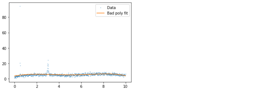
If you don’t have distribution but instead have data with uncertainties, you can do similar things. To take a real-world example, in one of the papers, we have values of xs, ys, and error (wavelength, flux, and flux) and want to subtract the smooth background. We wanted to do this with a simple polynomial fit. Still, unfortunately, the data had several emission lines and cosmic ray impacts in it (visible as spikes), which biased our poly fitting, so we had to remove them.
We fit a polynomial to it, remove all points more than three standard deviations from the polynomial from consideration, and loop until all points are within three standard deviations. In the example below, for simplicity, the data is normalized so all errors are one.
xs, ys = d3.T
p = np.polyfit(xs, ys,deg=5)
ps = np.polyval(p, xs)
plt.plot(xs, ys, ".", label="Data", ms=1)
plt.plot(xs, ps, label="Bad poly fit")
plt.legend();
Output:
x, y = xs.copy(), ys.copy()
for i in range(5):
    p = np.polyfit(x, y, deg=5)
    ps = np.polyval(p, x)
    good = y - ps < 3  # Here we will only remove positive outliers

    x_bad, y_bad = x[~good], y[~good]
    x, y = x[good], y[good]

    plt.plot(x, y, ".", label="Used Data", ms=1)
    plt.plot(x, np.polyval(p, x), label=f"Poly fit {i}")
    plt.plot(x_bad, y_bad, ".", label="Not used Data", ms=5, c="r")
    plt.legend()
    plt.show()

    if (~good).sum() == 0:
        break
Output:
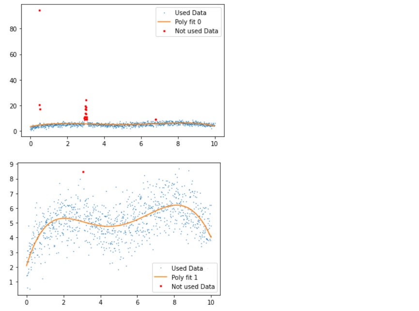
Inference: Before discussing the plots, let’s first see what statistical measures we have used via Python; so firstly, we fit the data points with the 5th degree of a polynomial within the range of 5 iterations (though at the end of the loop, we do have the breakpoint which will break the loop of the outliers are removed before 5th iteration).
- 1st plot: In this plot, we have good, bad data and polynomial fit, where we can see that due to the presence of an outlier, the fit line is not giving better insights.
- 2nd plot: In this plot, we applied the 5th-degree polynomial fit, which tends to detect the outliers and remove a few with a few left as residual.
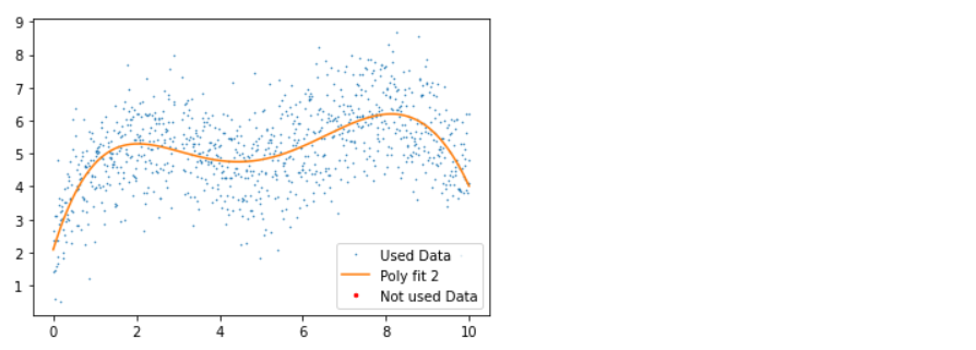
- 3rd plot: Here, in another iteration, we can see that all the outliers are removed with no red dots in the graph.
Automating it
Blessed sk-learn to the rescue. Check out the main page, which lists many ways you can do outlier detection. I think LOF (Local Outlier Factor) is great – it uses the distance from one point to its closest twenty neighbors to figure out point density and removes those in low-density regions.
from sklearn.neighbors import LocalOutlierFactor

lof = LocalOutlierFactor(n_neighbors=20, contamination=0.005)
good = lof.fit_predict(d2) == 1
plt.scatter(d2[good, 0], d2[good, 1], s=2, label="Good", color="#4CAF50")
plt.scatter(d2[~good, 0], d2[~good, 1], s=8, label="Bad", color="#F44336")
plt.legend();
Output:
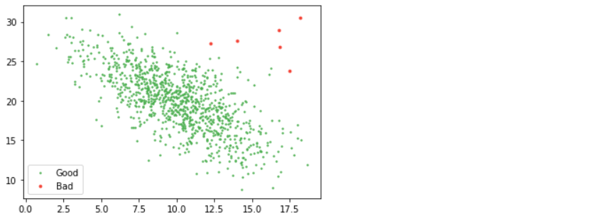
Inference: As mentioned for Automating the above process, we are using the LOF from sk-Learn’s neighbor’s module where we just have to call the LOF instance by passing in the number of neighbors and contamination rate than at last using the fit_predict method on top of the whole dataset (setting the threshold as well simultaneously) and boom! We got the same plot with red dots as bad data and another as good data.
Conclusion
We can far detect the outliers using both statistical methods (from scratch) and the sk-learn library. It’s been good learning as we have covered most of the things related to outlier detection and removal. Now in this section, we will discuss everything in a nutshell to give a brief about outlier pruning.
- Firstly we loaded all the data needed for the analysis using Numpy. Then we looked for the steps required for the outlier pruning/detection.
- Then we went for the practical implementation, where we detected the outliers and removed them in both N-Dimensional and uncertain curve data using various statistical measures.
- Finally, we covered the Automating section, where we learned how a simply python’s sk-learn library can execute the above long process in a matter of a few lines of code.
Here’s the repo link to this article. I hope you liked my article on Outliers pruning using python. If you have any opinions or questions, comment below.
Connect with me on LinkedIn for further discussion on Python for Data Science or otherwise.
The media shown in this article is not owned by Analytics Vidhya and is used at the Author’s discretion.


