Also known as an Impact Bubble Chart.
A Trail Bubble Chart is a variation of a regular Bubble Chart that shows the progression of data points over time by displaying bubbles with (typically) lighter trailing bubbles. This kind of visualisation is useful for printed visualisations, where the animation of the bubbles over time is not an option. Trail Bubble Charts allow for the visualisation of a category’s trajectory over time between three different variables (assigned for X, Y, and bubble size).
In a Trail Bubble Chart, each bubble represents a data point at a specific point in time or sequence step and colour is used to distinguish categories. The current or most up-to-date bubbles display a darker shade, while all of the previous bubbles are typically displayed lighter and reveal a trail path.
Some versions of this chart don’t display the outline for individual past bubbles in the trail path. Instead, they blend all the past bubbles into a single path shape.
Tools to generate this chart:
MS PowerBI
Examples
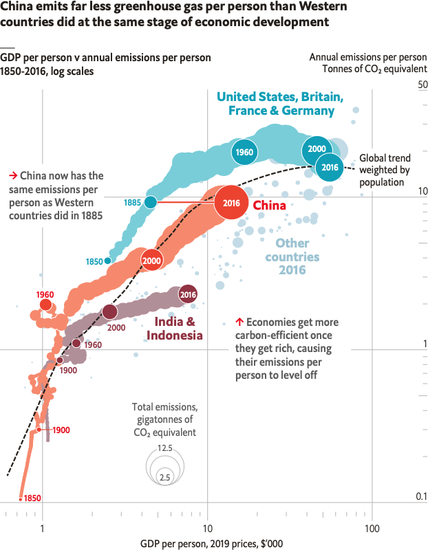
China emits far less greenhouse gas per person than Western countries did at the same stage of economic development.
A year in Graphic detail, October 2018 – December 2019 — The Economist
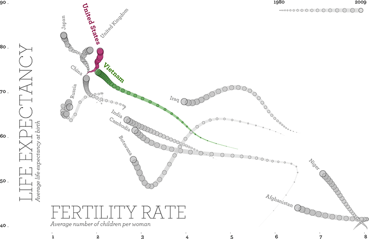
Fertility and life expectancy.
Remixing Rosling — TRUTH & BEAUTY, Moritz Stefaner