We’ve collected these high-quality examples of charts and graphs to help you learn from the best. For each example, we point out some of the smart design decisions that make them effective in communicating the data.
There is a lot of variety in styles and structures, but you may notice common elements across these well-designed data visualizations. For example, you’ll see…
Thoughtful use of color;
Few distracting elements that undermine the message;
Labels and legends that highlight how to interpret the results.
The following 20 charts have been divided into categories based on their shared purposes. We hope you find inspiration in these examples.
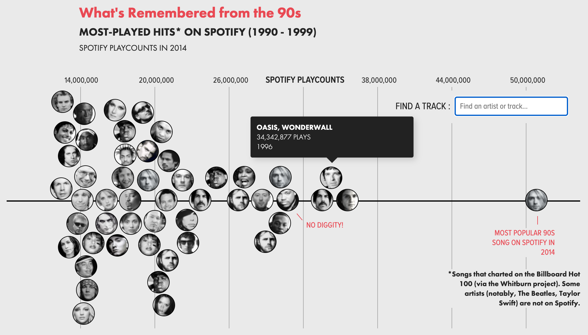
This chart shows how a bunch of items distributed across a single value — playcounts. It is a unique and fun example because:
The data points are represented using the musician’s faces, which draws the reader in.
The loose layout of the points emphasizes the informal nature of the graphic while still accurately representing the data.
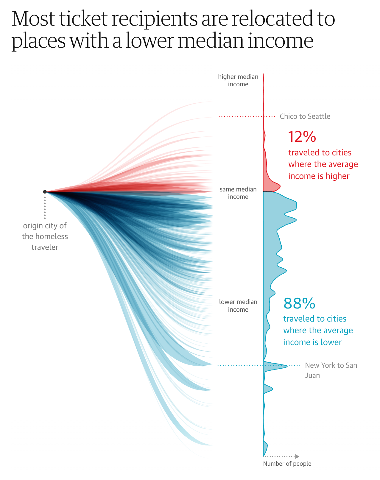
This is another, contrasting example of showing the distribution of values across a single axis. It is equally effective, though the design choices are radically different.
While the true distribution is represented on the right, the flows on the left help represent the human movement.
The labels on the chart highlight important insights.
The two-color theme emphasizes a distinct break in the data being shown.
Trending
Bubble Flow Chart — Economist
It is a difficult design challenge to show changes across time in a static bubble chart. This example does it beautifully.
The historical changes of bubble position and size are shown as a connected, colored flow.
The contextual labeling helps explain a complex chart that is showing four values simultaneously.

A classic multi-series trend chart with the attention-to-detail we expect from the New York Times. For example:
The on-chart legend makes it easy read.
Emphasizing the last value in each series.
Distinct and attractive color scheme.
Subtle gridlines are helpful, not distracting.

Alluvial Charts show composition and changes over times using flows. This example demonstrate the form well with…
Labels that are positioned for readability.
Call-outs for important moments in time.
Grouping of countries to avoid too much visual complexity.

Comparisons with Bar Charts
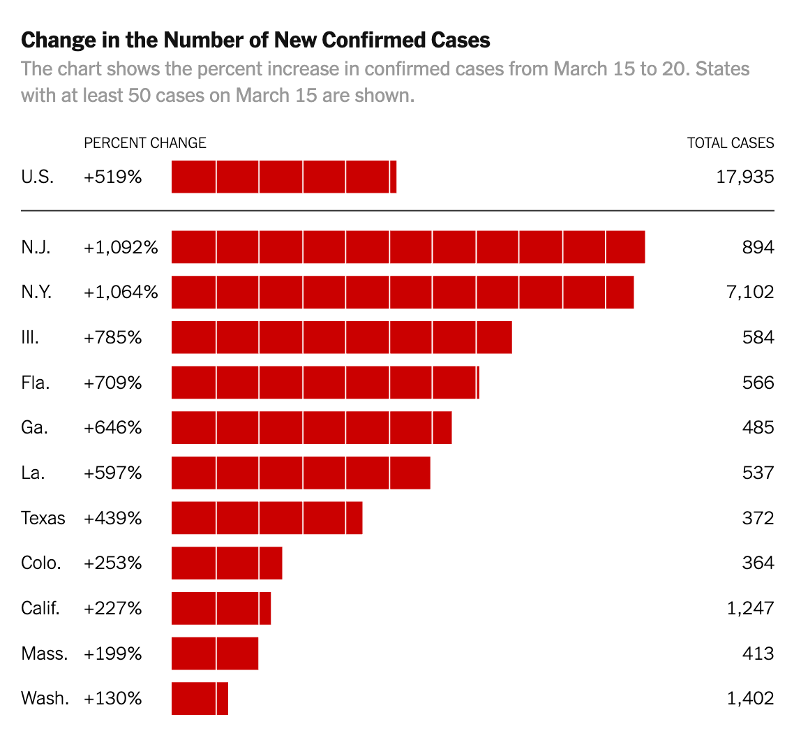
Unit Bar Chart — New York Times
The basic bar chart is elevated in this example through a series of design choices:
The bars are visually broken into units that make the size easier to compare.
The primary data values are associated with the States, while a secondary set of values on the right provides context.
The overall average is separated at the top to provide context to the rest of the bars.
Small Multiples show a series of simple, identically structured charts together for easy visual scanning.
The simplified bar chart design allows the reader to understand the relative values without distracting details.
The single example of the axis is understood to apply across all the charts.
The emphasis is on the labels over the specific number values.

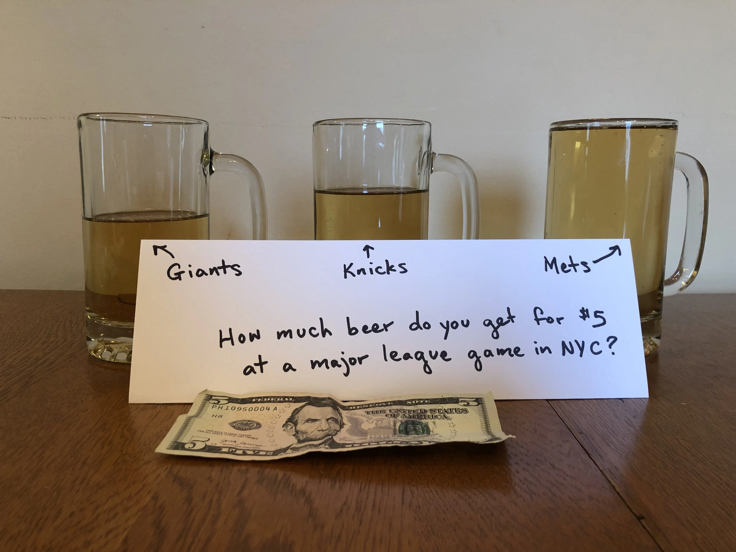
Charts can be composed of anything. In this case, beer in glasses provides a visual that is easy to understand.
The instigating question and $5 bill explain the context for the chart.
The individual beer mugs are clearly identified with labels.
Parts of a Whole
Pie Chart — MoveOn
Pie charts aren’t always bad — particularly when they convey a simple message. In this case, we like:
The title that underscores the message of the chart.
Linking the title color to the pie slice color.
Few slices gives it plenty of room for labels.

Waffle Chart — GE Health
This chart visualizes distributions by showing individual items, representing percentages of the population.
The people icons help the viewer stay connected to the meaning of the data.
Distinct colors make it easy to distinguish the different age ranges.
Cleverly positioned value labels delineate each of the population segments.

Bubble charts use the size of bubble to show how individual element compose a whole. This NYT example is a classic:
Distinct color bands group the bubbles into categories of change.
A prominent legend describes the values by bubble size.
Interactivity lets the reader see details by rolling over individual bubbles.

Like a Bubble Chart, the Treemap shows how individual items add up to the whole. However, the treemap can also show a hierarchy of values (e.g. industry sectors, companies within those sectors). These two examples demonstrate:
Clear labeling of individual sections of the treemap, without trying to label each box.
Interactive exploration by changing what values are used for size and color.
Color schemes make it possible to identify the outlier values.


Comparison by Multiple Metrics
Leaderboard — Juicebox
A Leaderboard shows a series of items items ranked in columns according to multiple different values or performance metrics.
In this Juicebox example, an item can be selected, which will highlight where it ranks in each column.
Items that are ranked outside of the top 10 are positioned at the bottom with a ranking value.

Radar Charts show how individual things perform across multiple measures or, in this case, across time. In this way, they are related to the leaderboard and flower chart (see below)
This example is elegantly designed with careful use of color and flowing lines.
It is also an example of repeating the same chart (small multiples) to allow for comparison.

This “Flower” visualization provides an intriguing model for showing the performance of individual countries by a series of scores.
The flowers in “full bloom” indicate countries with strong scores.
The height of each flower is also used to encode the overall score.

A Scatterplot Chart positions a collection of items in a matrix according to two values (shown on the two axes).
This example uses colored backgrounds on the 9-boxes to emphasize good or bad values.
Multiple mechanisms for selection allow the reader to choose which bubbles to focus on.

More Advanced Charts
Wind Map — Wattenberg and Viegas
This Wind Map is a unique and creative chart concept developed by a leading visualization thinkers, Martin Wattenburg and Fernanda Viegas.
One of the most effective characteristics is that the information being represented (wind patterns) is immediately obvious through the visual design.
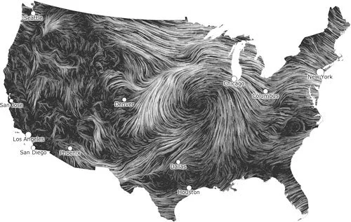
Chart animations are good for showing changes over time. In this example, the individual points represent people and their activities across time.
The prominent clock highlights the message of the chart.

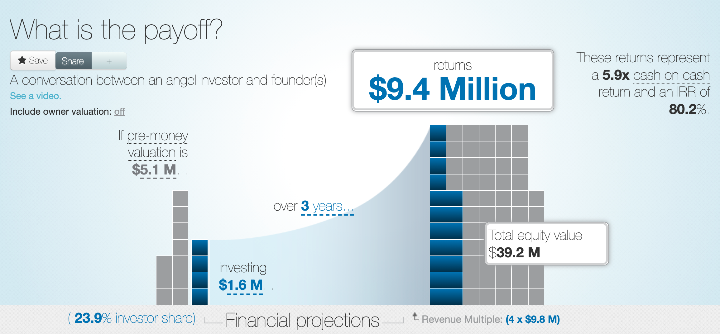
This interactive Waffle Chart shows the composition of two things — the value of a company before and after.
The interactive labels allow readers to drag to change values and see the results in real time.
The two stacks are beautifully connected with a curving visual element.
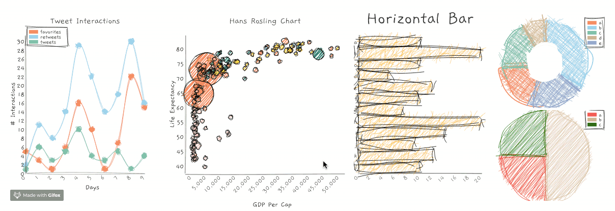
Your chart design needs to fit the audience and circumstances. This cool charting library gives a rough, sketched style. The charts and graphs suggest an unfinished nature that makes sense for prototyping or early presentations of data.