Building your First Power BI Report from Scratch
This article was published as a part of the Data Science Blogathon.
Introduction
In this article, we will explore one of Microsoft’s proprietary products, “PowerBI”, in-depth. PowerBI is used for Business intelligence.
What is equally important here is the ability to communicate the data and insights from your predictive models through reports and dashboards. And that’s what we’ll learn in this article with Power BI.
You can explore your organization’s data by creating, visualising, and building reports. Once You build the report, you can share it across your organization with streamlined publication capabilities or even embed those reports in your app or website. Power BI is a leader in the business intelligence space. Power BI is ahead of its competitors like Tableau and Qlik.
Here I’ll share some reasons you should learn about Power BI.
With Power BI, It’s easy to connect to a host of data sources, from a file on your machine to a data lake. Currently, Power BI allows connecting more to more sources. Lets you need to connect more than 120 connection sources which allow businesses to load data from wide-ranging platforms and cloud-based services.
Power BI has a powerful data modelling engine that helps you deal with many large columns or tables or even unstructured data sets like text data.
Power BI supports a wide range of visuals, but you can also connect to custom visuals which other users develop from the app source marketplace.
Finally, it can perform basic analytics like generating descriptive statistics to advanced analytics. It has the capability to connect to open source languages like r and python.
I hope you are excited to begin the journey to understand how Power BI helps to drive better business decision-making. But, before diving deep, let us first understand business intelligence. Let’s start.
What is Business Intelligence?
As per experts, business intelligence refers to tools and technologies of all processes that help businesses make data-informed decisions.
As a decision-maker, we will always focus on these points such as,
- A comprehensive view of data
- use data to make better business decisions
- Reduce inefficiencies
- Adaptions to changing scenarios
Before moving forward, we need to discuss the business intelligence use case.
Use cases of Business Intelligence
Let us try to understand the specific problems regularly faced by businesses. To do this, you need to get into the decision-makers. For example, Sales managers in a firm are responsible for higher sales or profits. To achieve this, they must constantly find new market growth avenues.
To achieve this goal, managers must find the best way to attract new customers, increase their customer base or existing customers, and not lose them to competitors.
Generally, to do this, he needs a deeper understanding of how your customers behave. Studying customer behaviour that how they decide, what to buy and when they buy.
Suppose there is some pattern to the customer’s behaviour. In that case, an organization’s sales and marketing teams can capture these psychographic patterns to attract new customers or retain existing ones.
Another critical decision is understanding how competitors behave and react to changing scenarios. We would be better positioned to make more informed decisions if we could track how our businesses compare to competitors.
Well, the utility of business intelligence doesn’t end here. There are many other use cases. As long as you utilize and analyze data to make decisions and plan strategically to improve your business operations and grow, you may have some form of business intelligence in place.
In the next section, we will understand the exact components of business intelligence like reports, dashboards and analytics.
Component of Power BI
Here we will understand how we can utilize business intelligence to make good decisions.
Now business intelligence doesn’t refer to a specific thing. It may include many components starting from collecting data, storing it, and finally analyzing it to get a comprehensive business view to help make actionable data-driven decisions.
The BI process includes several steps starting from collecting data from multiple sources, compiling them and identifying the variables to prepare the data for analysis. For example, to improve sales, we may need transaction data like a customer, product, financial, etc.
Once you have compiled data, we would be further interested in mining the data to uncover certain trends. Now this will involve visualizing the data through charts, graphs, and histograms to easily understand various components of the data. We need to prepare reports to be shared across teams.
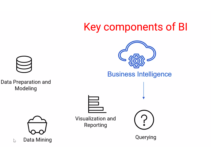
Performing descriptive statistical analysis to determine how and why something happened may form the basis of future decision-making. Further, we can track the current performance to what happened historically against goals or key performance indicators.
We may also extend this analysis and answer predictive questions like what will happen with a certain degree of confidence to reduce the uncertainty related to the future.
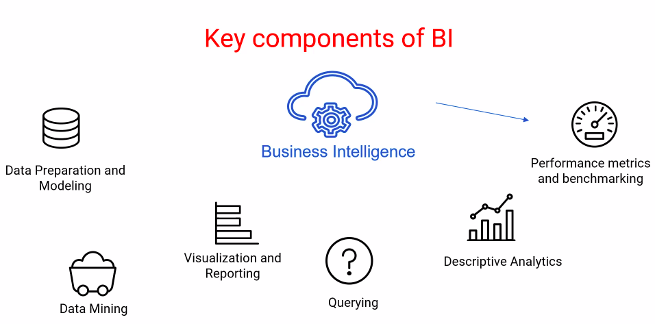
These can be typically achieved by using dashboards that stakeholders may use to influence and drive business decisions.
Now that you know, what are the key components carried out within the business intelligence process? We will look into Microsoft’s Power BI, a potent tool to perform each step.
What is Power BI?
As we know that Power BI is the most trendy and demanding skill. In my mind have lots of questions like:-
- Why is it so popular among data analysts and business intelligence professionals?
- What purpose does it serve for businesses?
- What are the critical components of Power BI?
- How to work with it?
As we have discussed in the previous section, It is compulsory for businesses to use data for decision-making and strategic initiatives.
Data can be considered as evidence that tells us about organisations’ past and present status.
Working with and analyzing data typically involves collecting, cleaning, discovering, analyzing, and finally visualizing to understand what happened in the past and why it happened.
If we go a little further, we can even answer questions like, “What is likely to happen in the future?” Power BI allows you to do it all with just a few clicks of a button.
Power BI is a Microsoft proprietary product for all your business intelligence tasks. If you are an advanced Excel user working with Power BI, this should be nothing more than an easy step.
Over the years, research agency Gartner has consistently touted Microsoft’s Power BI as a leader in analytics and business intelligence platforms, ahead of its competitors such as Tableau or Qlik.
With Power BI, you can connect to data from multiple sources and shape data with queries that build insightful data models and use those data models to create visualizations and reports.
Share your report for others to leverage or build upon and share it further for decisions.
Now that you understand how influential Power BI can be in driving data-powered decisions. In the next section, we’ll understand how to download and install Power BI and start using it.
Installation of Power BI
I hope you have started to understand the importance of business intelligence tools like Microsoft’s Power BI.
It can do everything from connecting to multiple data sources, importing data, cleaning it, transforming, analyzing and visualizing it, and finally creating reports and dashboards.
It has to be shared among stakeholders to make data-enabled decisions, and Microsoft’s Power BI does exactly that.
We will install a free version of Microsoft Power BI called Power BI Desktop on our machines. However, it can be done in a few ways if you want to upgrade Power BI for enterprise use.
One way is to use the Power BI pro version, which costs around 10 per user per month or the Power BI premium version, which can be purchased either on a per-user basis or per capacity per month basis.
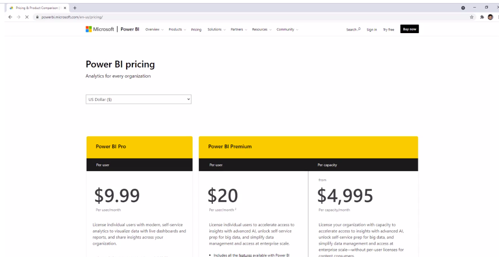
However, this article will use the free Power BI desktop version.
In fact, Microsoft allows a 60-day free trial period. To install Power BI Desktop, search the Microsoft Store in the search bar of your Windows machine. On the top right corner, you will find a search bar where you can type Power BI.
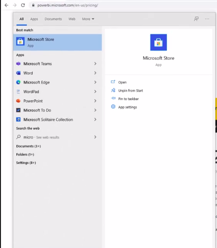
First search result found.
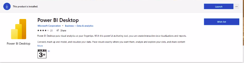
When you click the button, it will take you to the product page. Click “Install”, and the machine will do everything else for you. Once the installation is complete, you can launch Power BI Desktop by using the Launch button or by finding it in your apps.
If you don’t have a Microsoft Store on your machine, type Download Power BI on Google, which will basically take you to the Downloads section of Power BI.
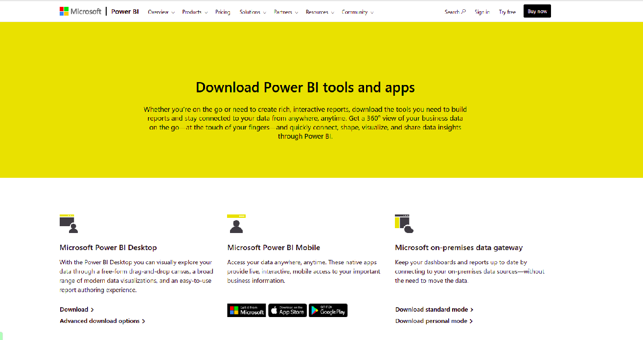
Now, scroll down and click on the ‘Advanced Download’ options of the Microsoft Power BI Desktop. Select the appropriate language and click on the download icon.
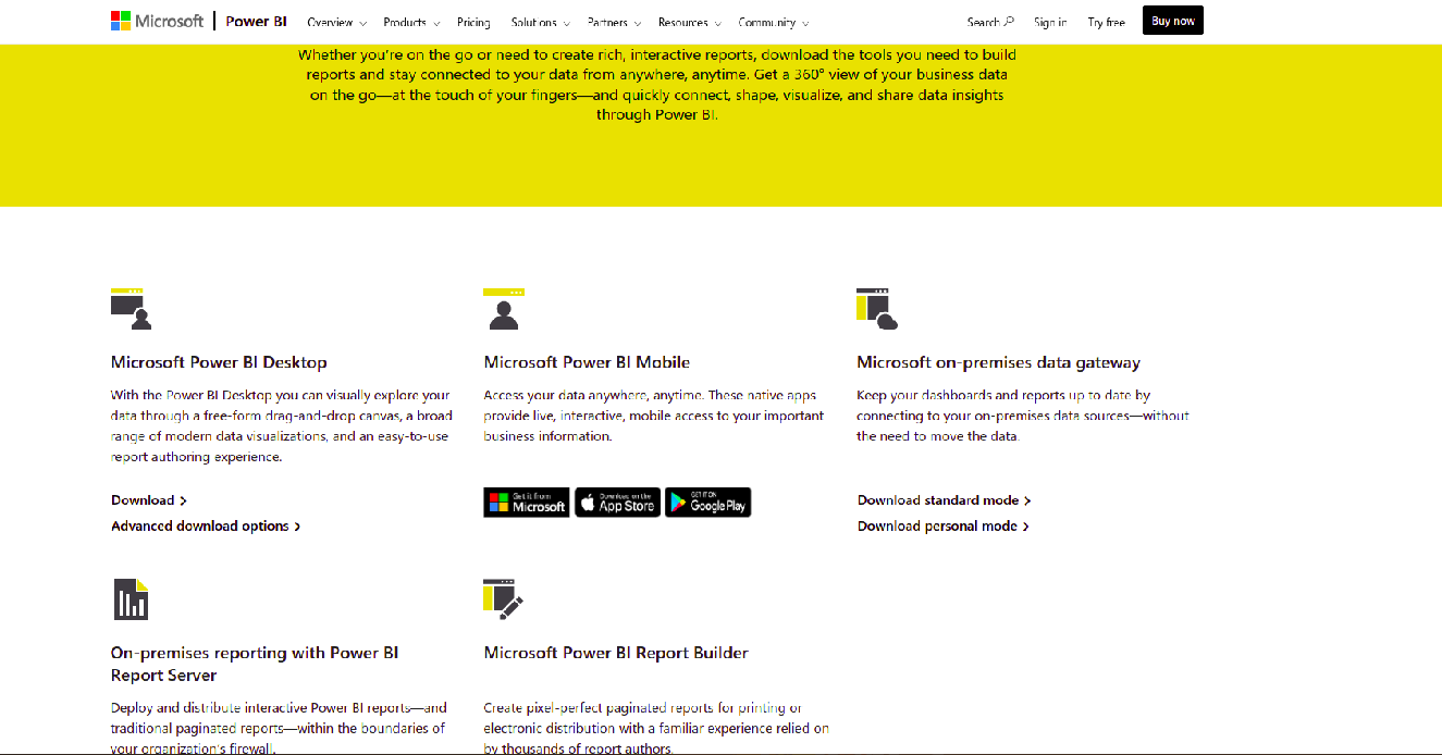
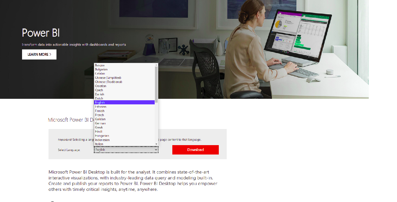
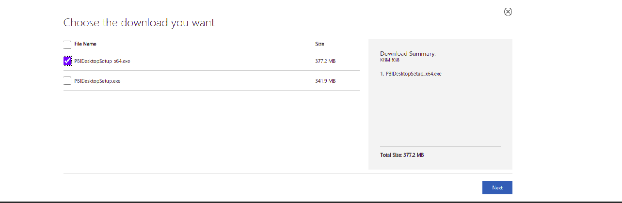
If you are using a 64-bit system, just ‘select’ the PBI desktop setup x64 .executable file. Else, choose the other one and click on ‘Next’.
The installation part is done. Now this time to learn PowerBI in detail.
Introduction to PowerBI Interface
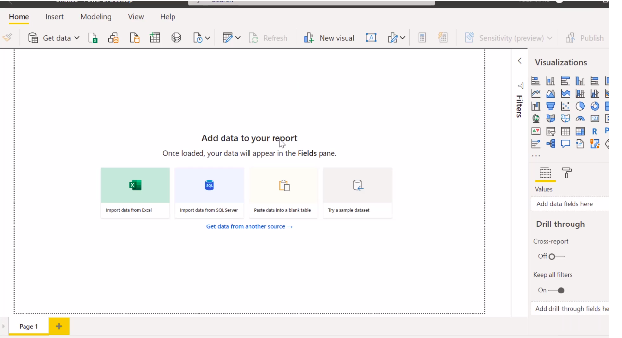
Once you have installed Power BI Desktop on your machine, it is time to activate the application. We’ll get our hands dirty to learn more about how Power BI works. When Power BI Desktop starts for the first time, it displays the welcome screen. You will see it on your machine like the picture given below.
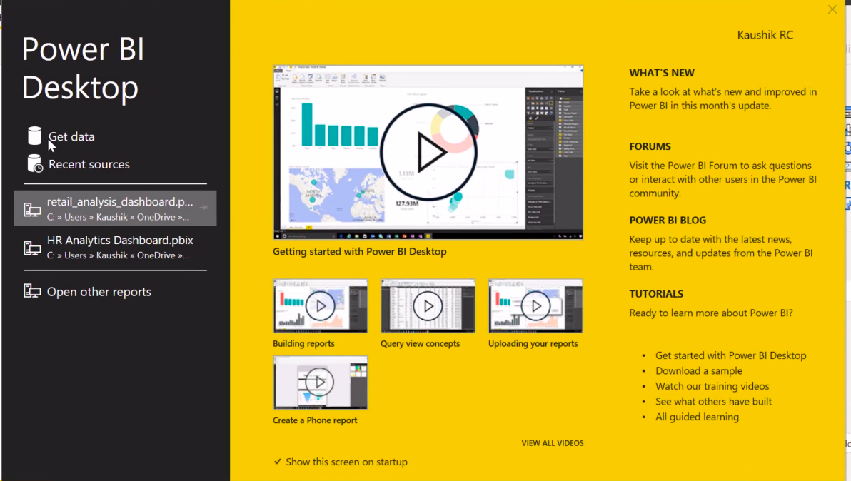
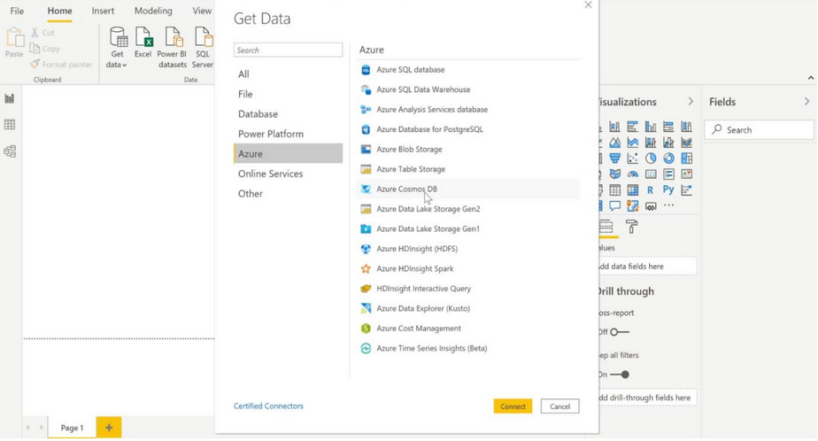
You can click on ‘Get Data’ on the left side from the welcome screen to import data from different sources. You can see recent sources; where did we import the data from? You can see the above image.
Open the Recent reports you used or other reports available in the Power BI setup provided by Microsoft.
I would also strongly suggest that you check out the Microsoft tutorials, as these are useful resources if you are stuck somewhere.
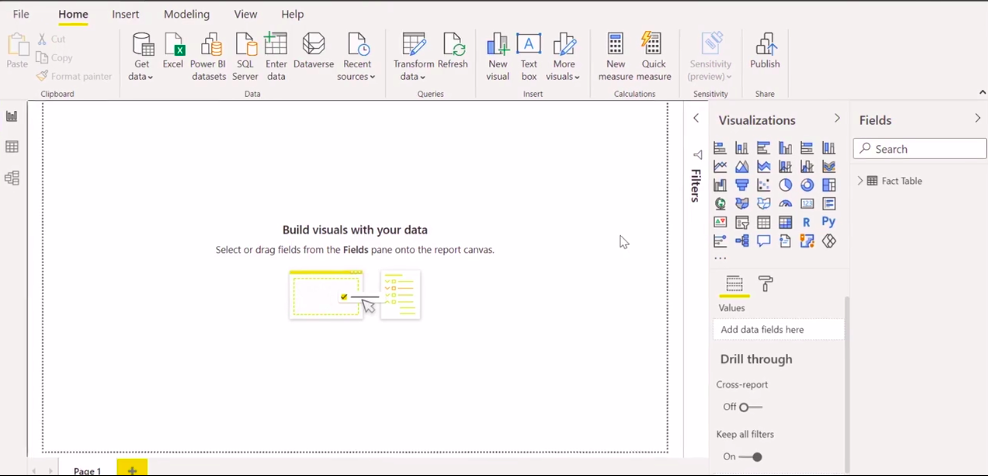
Now, select the Close icon to close the welcome screen. When you close the welcome screen, you enter the world of Power BI, and that’s it for you. You can see the image given below.
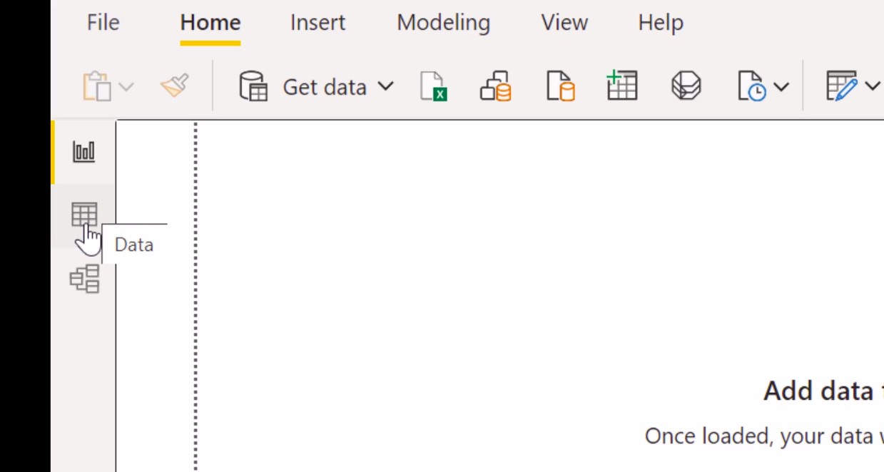
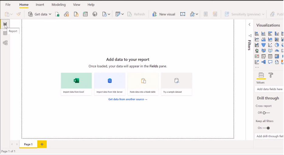
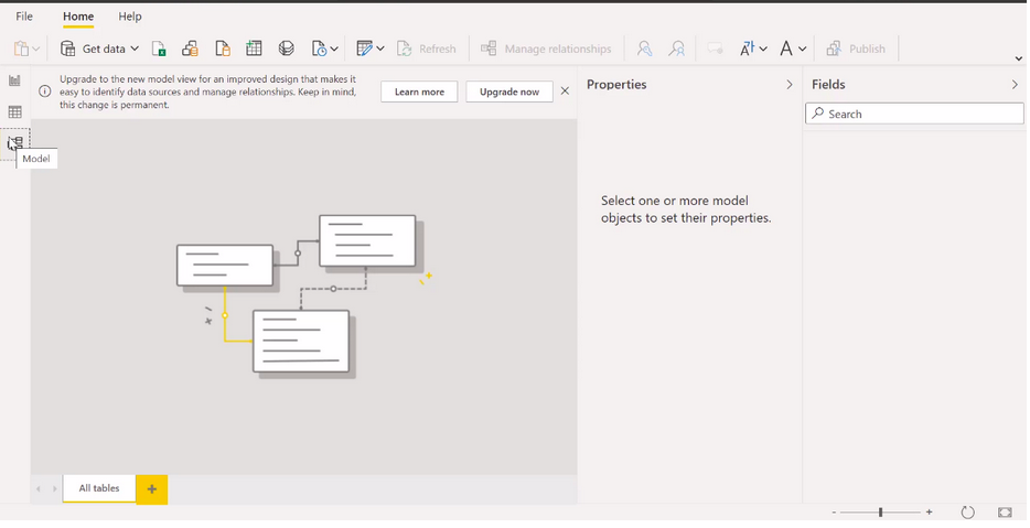
On the left side of the Power BI desktop, there are icons for the three Power BI desktop views. The first is the report, the second is the data view, and the third is the model or relational view, from top to bottom.
Now, the current view is indicated by a bar on the left, and you can change the view by selecting one of these icons. In Report View, you create reports and views where most of your creative time is spent.
In the data view, you get to see the tables, measurements, and other data used in the data model associated with your reports and transform the data for best use in the report model.
In a relational view, sometimes referred to as a model view, you can view and manage the relationships between tables in your data model.
We’ll explore all of these ideas as we move forward. The report view is the default view. On the right side of the report view, there are several visualization options available to you. With visualizations, you can add, change, or customize visualizations.
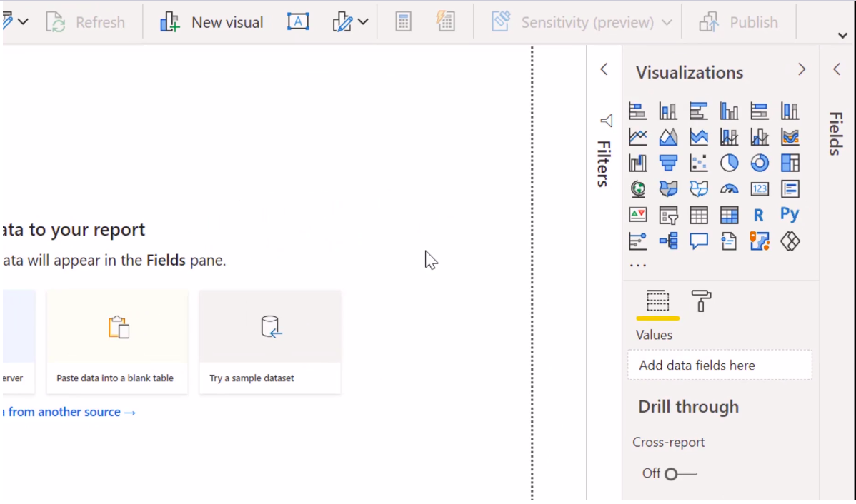
We’ll return to each of these panes when we’re ready to create our visualization.
Now, it is necessary to import the data to create the visualization. We will import a data set in an upcoming section.
This section demonstrates some of the common tasks associated with creating reports and visualizations. If you look in the top right corner, a sign-in option is available; it asks you to provide an email address. Currently, Power BI only provides institutional access.
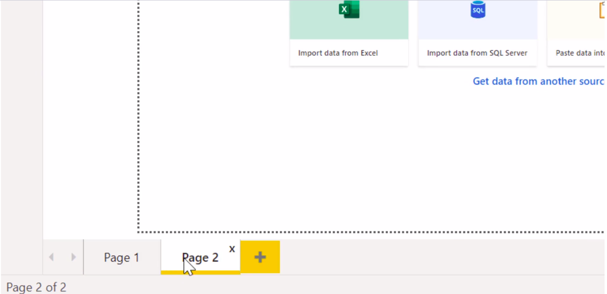
You must have an email ID with an organizational domain name. It does not accept sign-in from your Gmail or Yahoo accounts. Power BI Desktop must be signed in to integrate with the Power BI service. Another essential feature to show you here is to create a new page which is similar to opening a new Excel sheet as below image
In these sheets, you can create your reports. But again, to create a report, you need to have a data set. So in time, we will learn about how to import a data set into Power BI.
Understand the Problem Statement
We will first import a simple excel file into Power BI and play around with the data. Then I’ll go ahead and help you to build your first Power BI report using minimal visualizations. I will go through the steps one by one, and you can follow me alongside. So without further ado, let’s get started.
In this section, we will use the retailer data excel file. You can Power BI download the file from the link that has been provided below.
Data file link:-
https://import.cdn.thinkific.com/118220/courses/1356066/SuperRetailerData-210618-160903.xlsx
Once you import this data into Power BI. To ensure your analysis, let’s look and see what is in this Excel file.
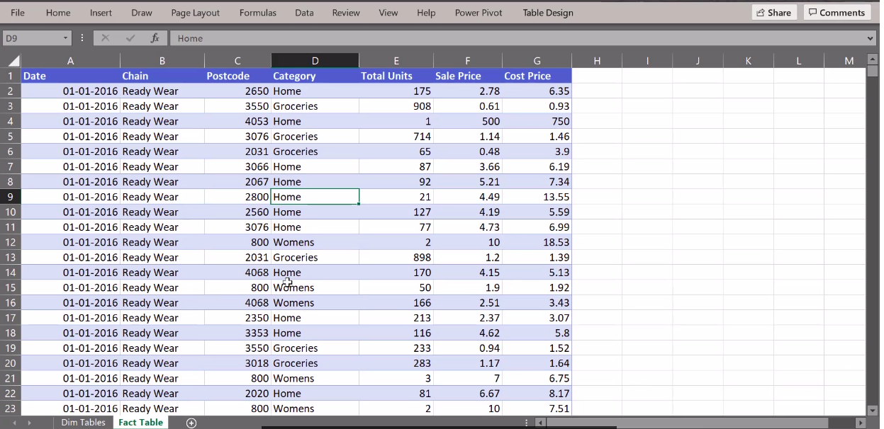
Once you open the data in the excel sheet, we will go to the fact table worksheet for this module. We will be using this sheet only.
I’ll also show you what is on the dim tables for the section. So let’s understand what information has been provided and what business problem we are trying to solve.
So let’s understand what information is provided and what business problem we are trying to solve.
As it is quite clear, this data set represents the sales transaction information of an organization. The organization is a retailer that sells a variety of ready-to-wear clothing, footwear and accessories for men, women and children.

Considering that this retailer sells many products, let us call this retailer a super retailer.
Super Retailer is the go-to retailer for all your fashion and home shopping needs. The retailer has done well in recent years and market expansion and revenue growth are the right moves now.
We are in the midst of a data-driven revolution. So the leadership of Super Retailers wants to grow. I bet your mind is already brimming with thoughts.
What could potentially be a good metric when deciding more? We will reach that very soon.
So we will spend time analyzing the data that makes up the different plots.
Maybe dive deeper into sales numbers and do a lot more analysis in Power BI to uncover some hidden trends. In the next section, we’ll load the data set up in Power BI and understand the various variables going on.
Importing Data in PowerBI
Now I will show you how to import an excel file and view your data in Power BI. Click on the get data button in the menu ribbon on the top, and you get to see a host of file options supported by Power BI. You can import data from excel sheets, XML files, JSON files, and pdf files.
If you scroll down, you can make a selection of the data stored in a database or on any online platform. You can clearly imagine the versatility of Power BI’s file import functionality. We will learn how to import an excel file as you are already quite familiar with excel. And it is one of the most commonly used ways of data storage and management if the data is manageable in size.
So I click on excel and then click on the yellow button below saying connect. Clicking on connect opens a pop-up window allowing me to connect to an excel file. I will go to the working directory where the super retailer data has been saved. I will click on the data and then say open.
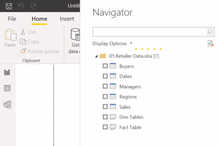
On asking it to open the file Power, BI displays a navigator so that you can view and select the appropriate sheet or a data table that has been stored in the file.
As you might see, there are quite a lot of tables that are present in the file. For the time being, we will use only the fact table to click on this. Once you click on the relevant sheet you want to import, Power BI displays the content of the sheet.
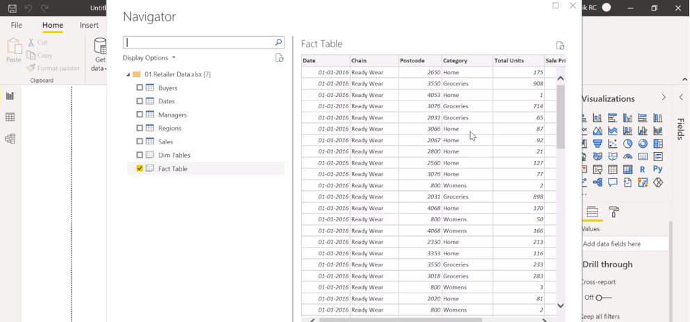
Now, suppose the data is not tidy enough to be used for analytical purposes. In that case, if it is not in a rectangular format or has some extra information on the sheet, you would want to transform the data by clicking on the transform data button.
But we notice that our data is fine and ready to be consumed by Power BI, so we click on load. Power BI may take a few seconds or a few minutes, depending on the size of the data to import it. Once imported, Power BI displays the report page to build visuals with your data.
On the right-hand side of the report view, under the fields screen, you can view what columns are available. By clicking on the data view, you can also check the contents of the data. If this doesn’t load properly, just click on the fact table, which is the name of the table that has been imported.

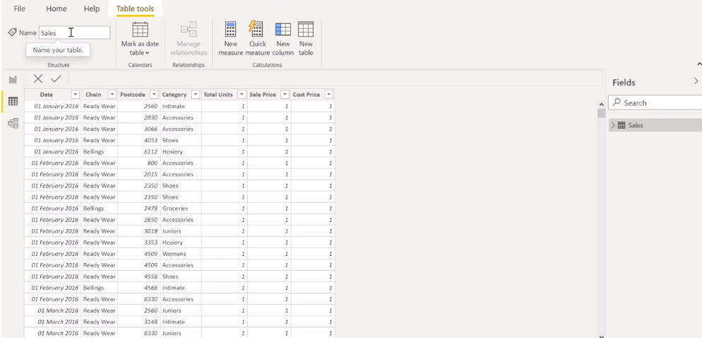
And fact table may not sound like a good name for a sales transaction data table, so we will go ahead and rename the data by clicking on the three dots showing the action button and clicking on rename. Power BI allows us to change the table’s name to manage multiple data. Well, naming conventions are fundamental when many people work on the same file.
It is also vital for managing your data correctly currently. You are working with one data asset, but when you import more files into Power BI, it is quite easy to get lost in sheet 1, sheet 2 and so on if the data is not named correctly.
So, we will name our table the sales table because it contains sales transaction data. So we rename it and press enter, and you also notice on the table tools that the name of the data has been converted into sales.
The very first step before analyzing the data is to understand the columns of the data well and find a fix if some information is missing.
Dataview and Formatting the Columns
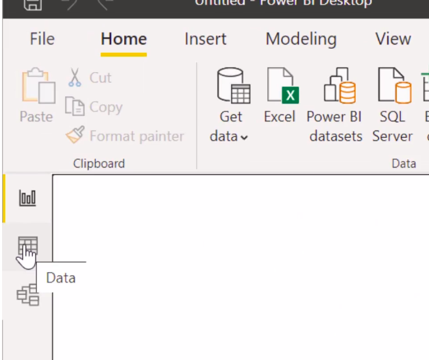
In this section, we will move from the default report view to the data view by clicking on the Data View button in the left corner to check and understand the column contents.
If possible, we will also get some additional data columns which will be useful for us to evaluate the current state of the business.
As soon as you click on Data View, you get an idea of the content of the data. You also get to see drop-down icons placed in front of each column to sort or filter relevant pieces of information.
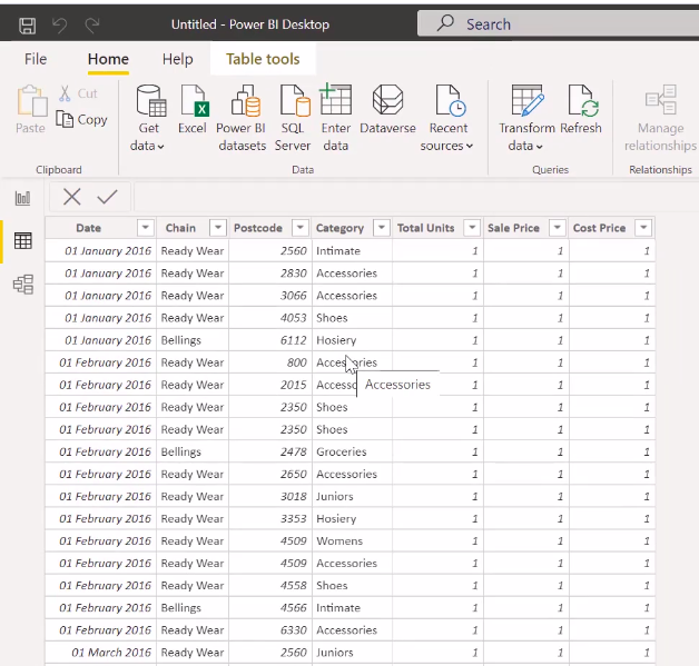
This is remarkably similar to adding a filter option to an Excel file. You will see at the bottom of the window that the total number of rows is displayed. If you select one column, it shows how many unique values are in the column.
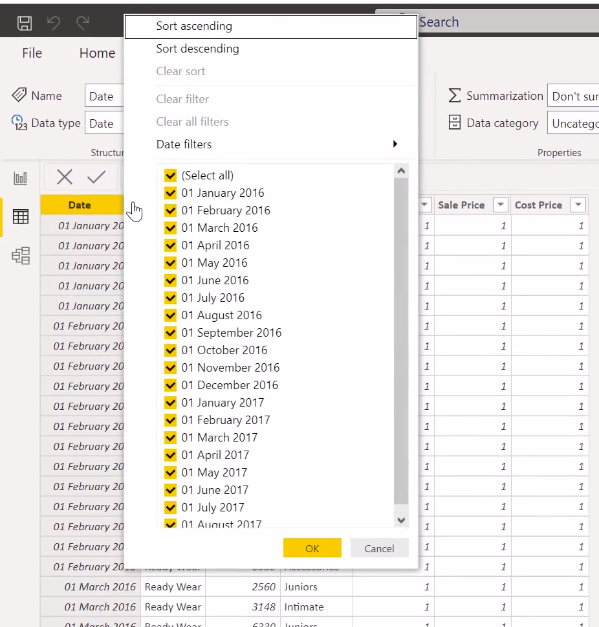
For example, the date has 20 different values, and the series has two values: ready and billing.
Click the drop-down button next to the chain column to get a filtered view of the data for ready-wear chains. Select all options and select ready wear only. Click OK.
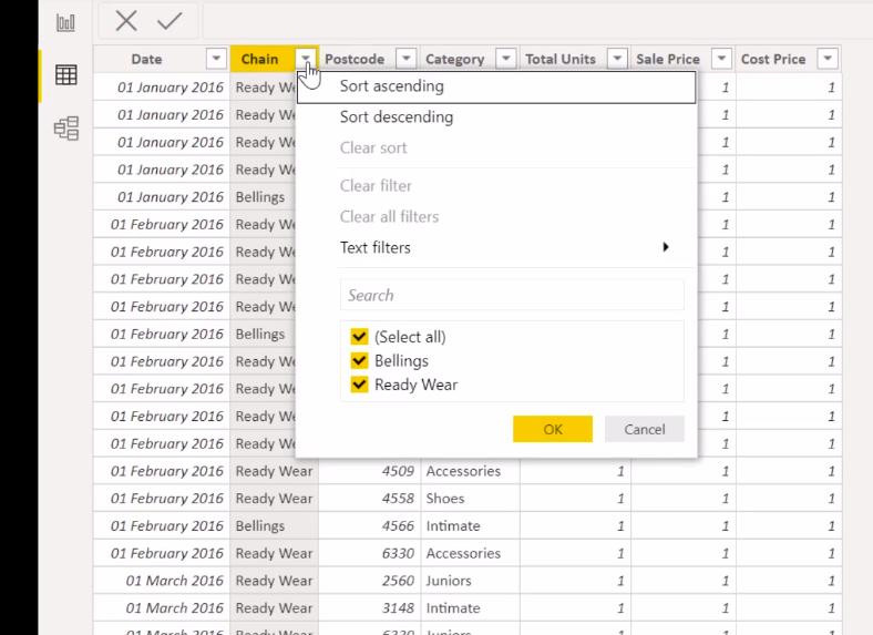
As you may have noticed, the data is now displayed only for ready-to-wear chains.
We’ll go ahead and clear all the filters for the time being. As you must have seen by now, Power BI is intelligent enough to recognize the format of the column. It has recognized the date column as a date type. You can view this information against the data type on the Column Tools ribbon.

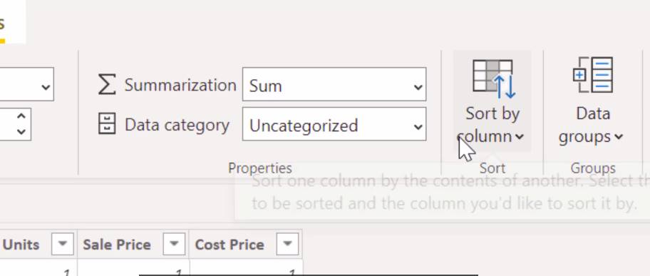
The total units are a whole number. The selling price and cost price are decimal numbers. Now, the same information can be seen on the right side of the Fields pane. You’ll notice that Cost Price, Postcode, Sales Price, and Total Units have a submission notation against them, suggesting that these are the columns that can be aggregated.
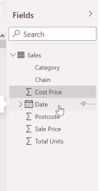
The date column has a calendar notation against it. In fact, the calendar variable has a detailed option showing the date hierarchy. This is a really cool feature of Power BI, and you don’t need to instruct Power BI to calculate the Quarter-Month Day column from a date variable.
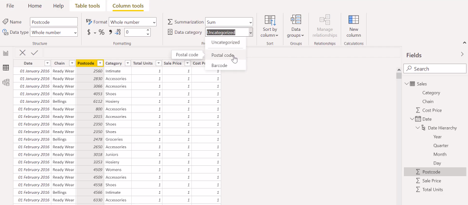
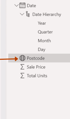
It will do this automatically. But, here comes the catch. Even though Power BI may have recognized the postcode variable as a numeric, it is not. Using the data categories property, we will convert the postcode variable to a postcode data category. Currently, it is unattainable. Once you do these steps, you will get the below image.
You should be careful about how Power BI identifies geographic variables like postal code, latitude or longitude, etc. As you classify the postcode variable as a postal code category, you will see a globe symbol appearing against the postcode variable, suggesting that this variable represents some geographic information.
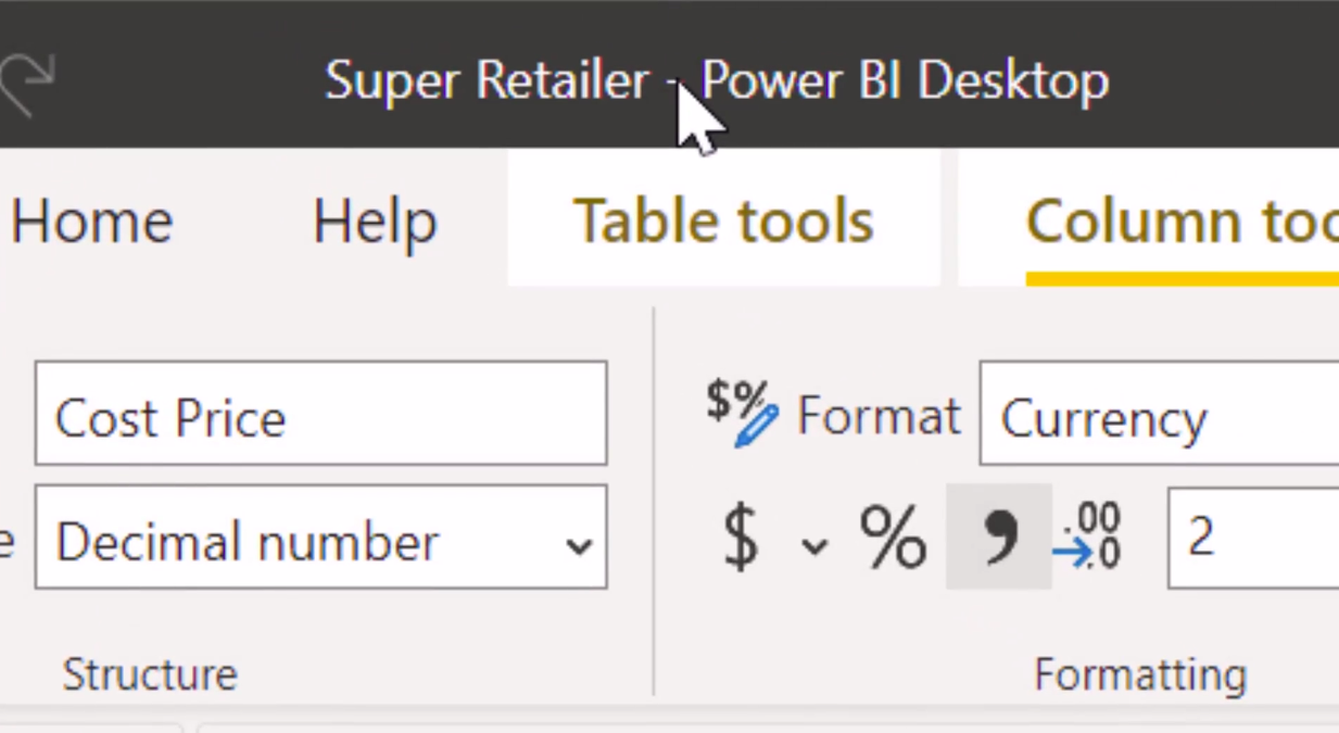
Now here is a quick change you will make. To change the formatting of the Sales Price and Cost Price columns in Australian Dollars. You can achieve this by clicking ‘Format’, changing the normal format to the currency, and selecting the appropriate currency by clicking the drop-down against the dollar sign. You can try this change.
Remember, the more you soil your hands with the tool, the better. You must have learned by now that this data set records sales transactions for each category from January 2016 to August 2017. It also contains information about the product’s sales and through which chain.
In addition, we have a record of the total units sold and the selling price and cost price.
So, what if this information is not present in the data?
We can always go ahead and calculate these. We will also trace this missing information. In the next section, we’ll learn how to create a simple report from the information we have, using some minimal visualization.
Building the First PowerBI Report
In the previous section, we made quite a few changes to the formatting of our sales table. If you don’t want to lose out on all the hard work that you did. Please save your work. To do this, we need to go to File and click on save or simply press ctrl s.
Now Power BI asks you to select a location for saving your file and to give a name to the file.
Let me name it a super retailer and save it on the desktop itself. If you notice, the file format of Power BI is PBIX stands for Power BI extension file.
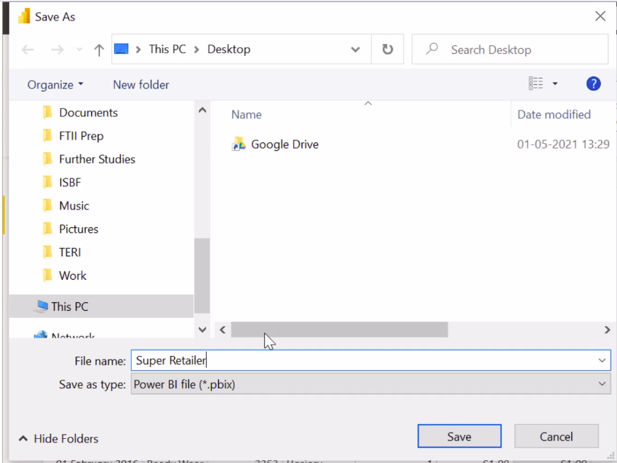
The name appears right at the top of the Power BI window when you save the file. Now that we have saved our work. Let’s go ahead and create our first report with minimal visualizations.
Let us go back to the report view where Power BI asks us to build visuals with our data.
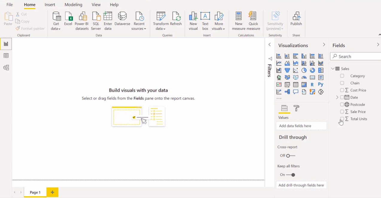
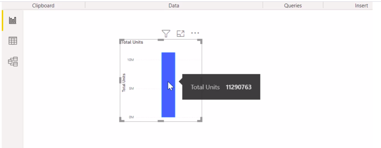
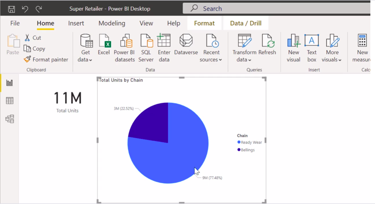
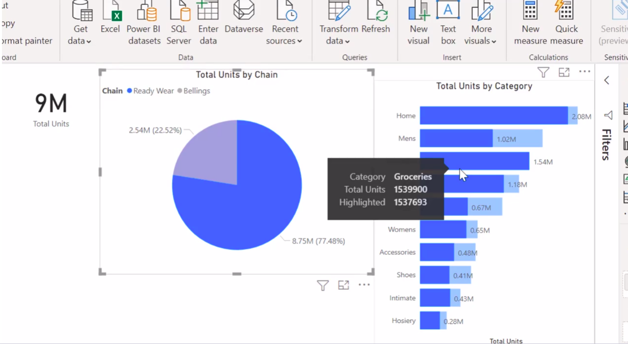
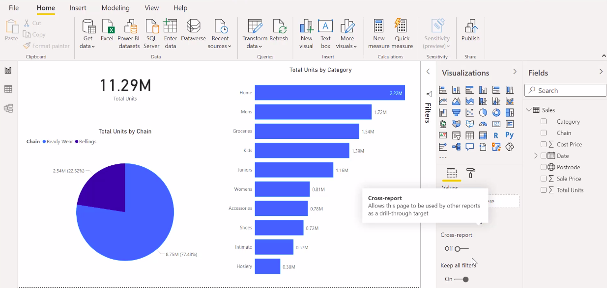
Let us drag total units somewhere on the page. As soon as you do that, you notice that a column chart displays the total units sold. If you hover over the bar, it shows the sum of the total units as 11.29 million. So Power BI automatically recognizes that we are trying to view or summarize the total units sold.
We will keep the visual selected, go to the visualization pane and click on a ‘card visual’. What just happened? Power BI changed the current column chart to a card that just displays the total units sold by the organization within the available period.
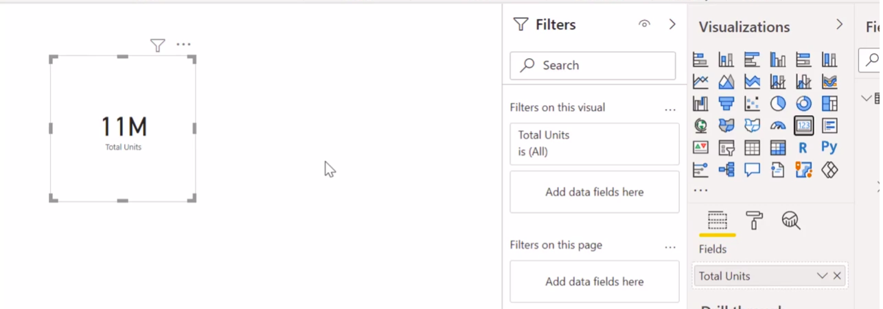
Now, if you look at the lower part of the visualization pane, you will see all the parameters that are required to create a specific visualization.
I recommend you carefully consider this section when we create a new visualization. Now we will go ahead and resize the card. You will notice the borders around the visual edges that can be dragged around to resize the visual.
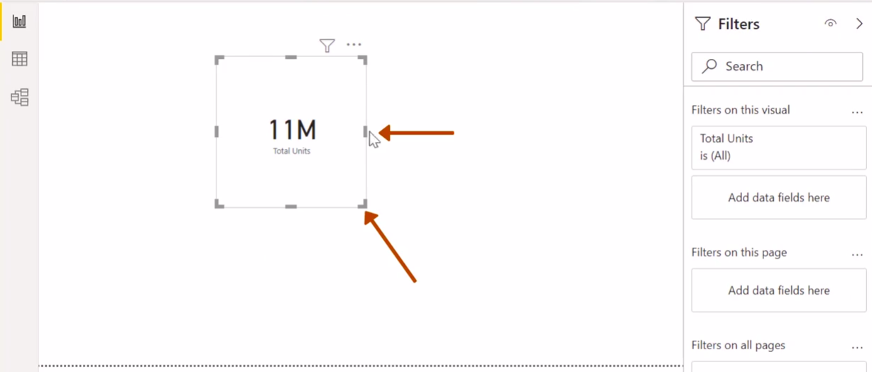
Now let us resize the card and place it in the top left corner. You would have also noticed that Power BI provides a name to the visual total units in this case, as it represents the information about the total units sold.
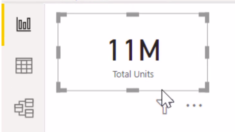
Now, we will deselect the visualization to prepare a new visual. To deselect left, click on the white space of the report. As soon as you do that, you will notice that the borders of the charts become invisible.
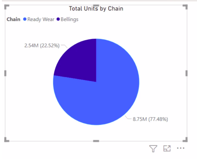
Next up, we would be interested in knowing the distribution of the quantity sold by each chain. Creating a pie chart is a simple visualization to get this information on your plate. Insert a pie chart, and make sure your previous visual is deselected. Go to the visualization pane and click on the pie chart.
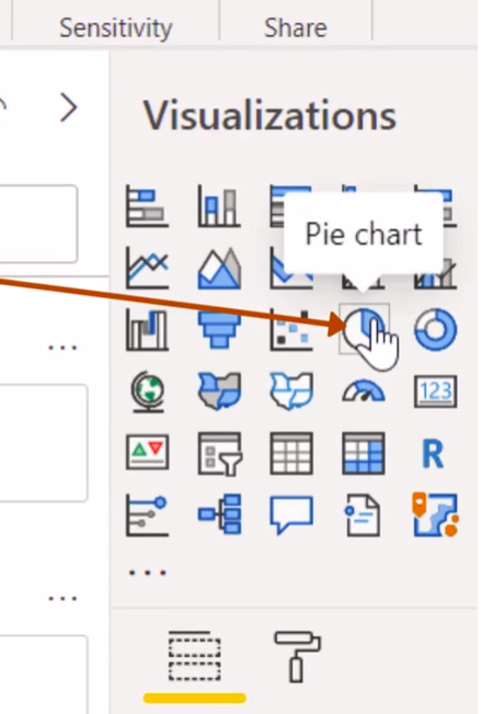
You will notice that an empty pie chart has been created, and the fields below the visualization pane are also empty. This time we will create our visualization by dragging the total units field into the values area and the chain into the legends area.
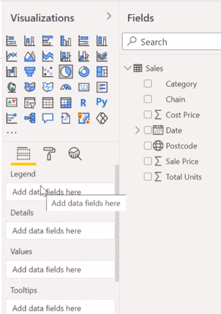
We’ll resize the chart and place it next to our card visual, and this visual displays the proportion of units contributed by the ready wear and belling’s chain.
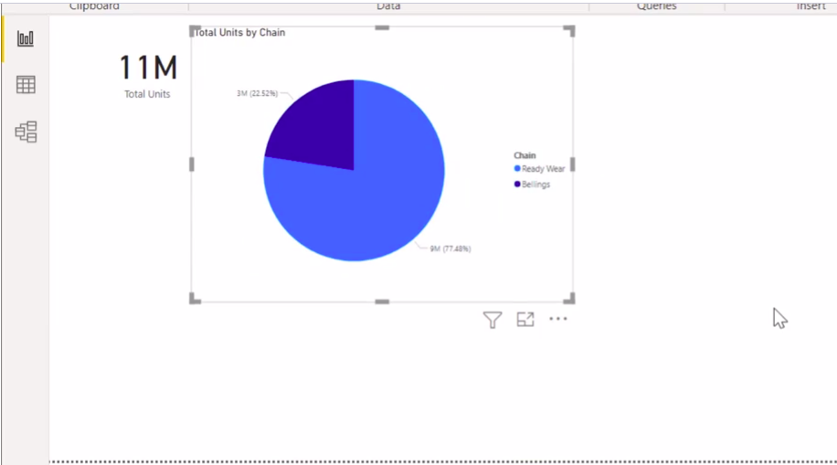
Chart Formatting and Other Visuals
I am pretty sure some of you would not be happy with the way Power BI has formatted the charts. The labels of the Legends and the title of the graph are too small in size to read.
A chart should be legible to make sense of it. Else what should a visualization be if stakeholders can’t gauge what information it contains? You would have also noticed that the pie segments show values of 9 million and 3 million, which add up to 12 million, whereas the total units sold, as shown in the card, is 11 million.
As some of you might have guessed correctly, this is happening due to rounding off for the corresponding values.
To correct this, let us go ahead and format the chart a bit to format any chart. Select the chart and notice it under the visualization pane. There is a sign on a brush that says format. Click on the Format Tab, and you will get to see a lot of drop-down options. I will click on Legend and shift the legend’s position to the top.
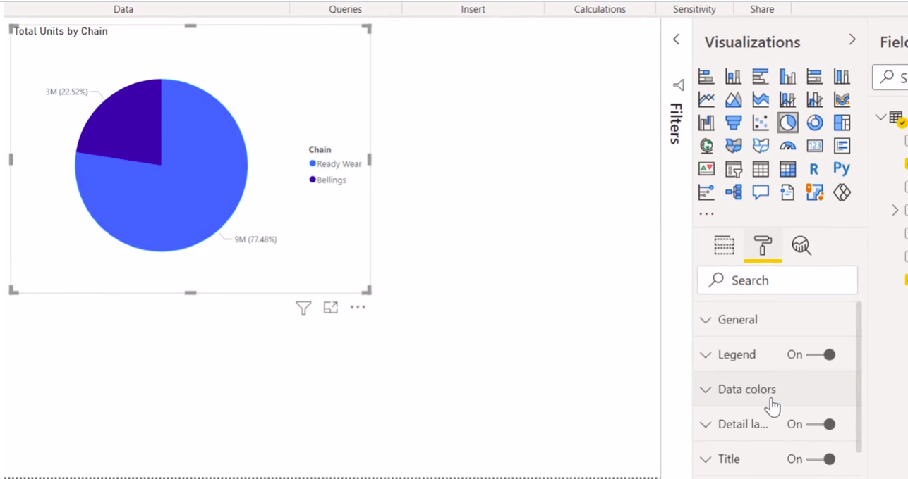
I will also increase the font size of the legend from the current 10 points to 12 points. Next, I go to the title. I aligned the title to the centre of the chart and then increased the font size to 16.
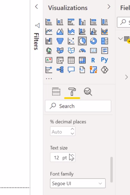
Finally, I go to the detailed labels and increase the value of the decimal places from the current Auto selection to a value of 2. I will also increase the text size from 9 points to 12 points to make the data labels visible.
You can clearly see how changing the formatting of the pie chart has been applied to the chart, and now the chart’s details are quite legible. Finally, I deselect the chart by clicking on the blank space.
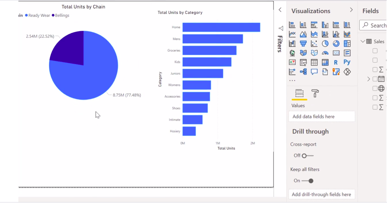
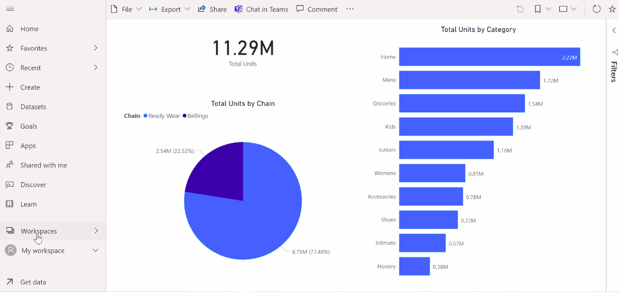
I would ask you to try out further formatting options to see what exactly changes and how can you make a chart more aesthetically pleasing. Next, we might be interested in checking how much each category sells. We will include a horizontal bar chart drag the category field to access and the total units to the values.
Resize the chart and place it at an appropriate location on the sheet. Clearly, we can see that the home category sells the most, followed by the men’s, and the Hosiery category sells the least.
To have consistent formatting for the report, I will go and format the bar chart. I would also ask you to do the same to get some practice in formatting.
Okay, I hope you have been able to format your chart to make it informative and Visually appealing. Notice I have removed the x-axis labels and added the data labels to display the units sold by each category.
I have also removed the title of the y-axis, which just displayed the category. I have further increased the font size of the y-axis label, the data labels, and the title to make it consistent with that of the total units by the Chain chart.
Now one of the most critical features of any bi tool is to have a filtered report view. We can now see the performance of the business in terms of the number of units so across both the chains.
If I go and select a ready-wear segment of the pi. I get to see a filtered view of the ready-wear chains across categories, and here we can clearly notice the grocery category is the second best performer for the ready-wear chain. In fact, grocery is not sold in the Billings chain.
To get back to the default view, click on the filtered by again, and the charts will revert to a default view. Thus, we have a minimalistic report ready.
In the next section, I will show you how to publish this report and share it with your other team members. After all, a report is useless unless stakeholders can view it and make reverend decisions.
Uploading Report to Power BI Services
In this section, we will look at how to upload a report that you have prepared into your Power BI workspace called the Power BI service. Power BI service is the software component of Power BI. Using the service helps you share reports with your colleagues to collaborate or even view certain reports. First, sign in to your Power BI through your organizational account
To sign in, click on the sign-in option at the top right corner of the Power BI desktop. It will ask for an email address. Enter your email address. Remember, the email address needs to have an organizational domain name. You can’t sign in from your yahoo or Gmail accounts. Now, if your email address is already registered with Microsoft, it will log in automatically.
Else, it will ask you to register your account. Once signed in, you will see your name appearing on top of the window. Now go to the report view where you have your report prepared.
Under the ‘home ribbon,’ you will notice the publish button under the share option Click on ‘publish’.
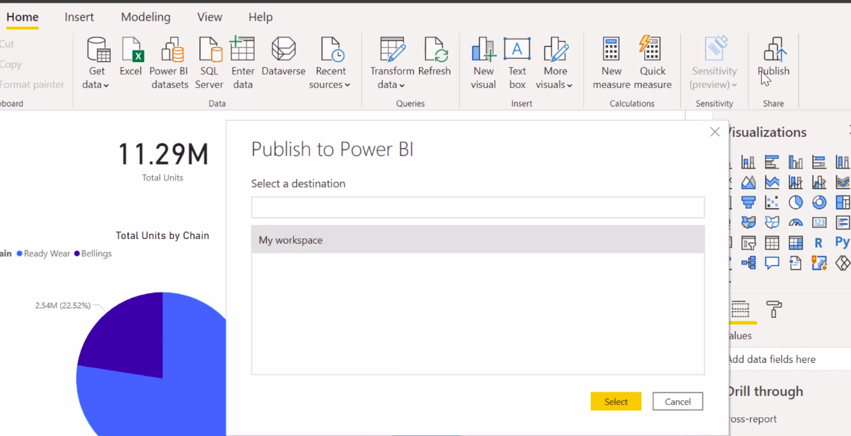
Power BI will ask you to select the destination. If you have already created a workspace, you can search for that workspace. Otherwise, click on ‘my workspace’ and the yellow ‘select’ button.

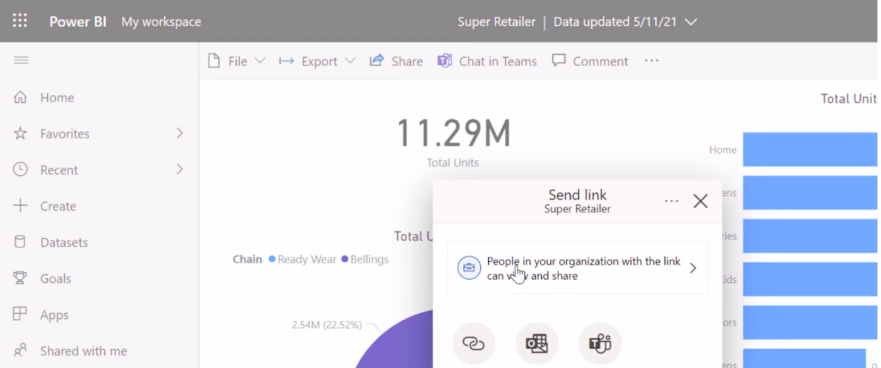
When publishing is complete, you receive a link to your report. Click on the link to go to the Power BI service and view the report. The Power BI service opens up in the browser showing the super retailer report published on that specific date.
Now, if you have a Power BI pro license, you can directly share your report with specific people in the organization or just copy the link and share the link with individuals. If you do not have Power BI Pro, clicking on the ‘share’ option will ask you to try out Power BI Pro.
Now Microsoft allows a 60-day trial period, so you can go ahead and try it out. In the Power BI service, you can create your workspace by clicking on this ‘workspace’ icon in the bottom left corner, and then you can create a workspace.
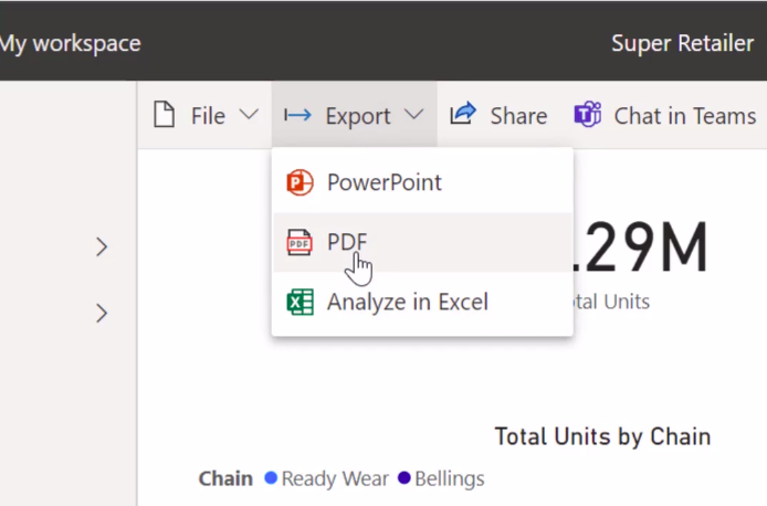
A workspace generally helps organize your reports well. You can also export your report into either a PowerPoint or excel pdf file. I click on ‘pdf’ and Power BI will ask me to export the current.
I clicked on ‘pdf’, and Power BI created a pdf from the current report. This may take a couple of minutes. Once the pdf is downloaded, you can share this pdf file with other users as well.
This is what the Power BI service has to offer.
I will show you how to use the Power BI service to build dashboards and interact with them so that they can be distributed as an application that can be viewed even on your mobile phones using Power BI mobile.
Conclusion
Nowadays, so many data science enthusiasts want to learn power bi to build reports. They want to present everything in a single report with visualization. This is a trendy topic for now, these days. As per my knowledge, very less content is available on the google search engine related to this topic. I face a lot of problems while learning power BI. So I decided to write one article on this topic to share knowledge.
In this article, I explained everything from scratch. This is a reporting tool for business intelligence and reporting to allow users to create reports. To solve business analytics problems, Many organizations are using power BI. According to Gartner’s report, by 2021, companies investing in analytics may observe an increase in their value compared to companies that are not.
If you propose using Microsoft Power BI Report Server in AWS, there’s also an established path forward. You’ll install the Microsoft Power BI Report Server within an Amazon VPC, near AWS data sources, and connectivity options exist for both authors and report users.
If you want to connect data sources in AWS to Microsoft Power BI Service, you ought to feel comfortable knowing this is an established architectural pattern. You’ll install the Microsoft on-premises data gateway within an Amazon VPC and seamlessly connect data sources such as Amazon RDS, Amazon Redshift, Amazon Athena, Amazon OpenSearch, and AWS Lake Formation to the service.
If you’re looking to use Microsoft Power BI Desktop, we generally find that customers start experimenting with the software on-premises, connecting to data sources over the web. While private connectivity options exist for using AWS VPN and Direct Connect, many purchasers have concluded that running Microsoft Power BI Desktop in Amazon WorkSpaces provides a better performing experience.
Power BI may be a cloud-based business analytics service for pulling together live views across all of your data. Connecting to data that resides on-premises in SQL Server Analysis Services, data from Microsoft Cloud properties like Dynamics and Office 365 or from Azure data services like SQL DB, Azure Stream Analytics, or from a partner solution hosted on Azure.
Here is my Linkedin profile if you want to connect with me.
I hope that you have enjoyed my article on the Power BI report. If you like it, share it with your friends also. Please feel free to comment if you have any thoughts that can improve my article writing.
You can read my previous published articles here.
The media shown in this article is not owned by Analytics Vidhya and is used at the Author’s discretion.


