So I finally got around to looking into ChatGPT and while I may be a month or so behind, it has allowed me to see what others are saying on this topic before I write about it. There’s been a lot of buzz on ChatGPT since December, not just from developers and copywriters, but also even people discussing the wider philosophical implications of tools like it. This is probably due to this tool demonstrating the potential to revolutionise the way we search and interact with information over the internet.
Therefore, I wanted to comment on the rise of ChatGPT and how I think AI tools could impact data visualisation work now and in the future, as I believe it’s significant. After consuming a number of YouTube videos, blog posts, articles, and playing around with ChatGPT, I felt the need to write down my thoughts and observations on the topic.
For those unaware, ChatGPT is a large language model developed by OpenAI. It uses a transformer-based neural network architecture and is trained on a gigantic dataset of human-generated text. It may be refined to do a range of tasks, including question-answering, copywriting, translation, and generating code.
ChatGPT has a simple interface, where all you need to do is type in any question or request, and ChatGPT will provide an answer to the best of its ability. The responses it provides are quite impressive, which demonstrates the potential there is to change the way we locate information from the internet. ChatGPT can provide answers far faster than searching through the search results produced by Google’s search engine. So it’s not hard to see the appeal of ChatGPT and how it could become massively popular. This is especially true in a world of decreasing attention spans.
Short attention spans and the expectation for quick, brief answers could change the way people would prefer to digest information, such as data and visualisations. If something like ChatGPT took off and replaced the behemoth that is the Google search engine, then this might be a reality as this tool would encourage that mentality.
I wanted to speculate on the potential impact ChatGPT and other AI tools might have in the future with data visualisation work, but I plan to do that in another post. While writing this post I found it was already getting too long. Therefore, I will first investigate what’s currently possible with ChatGPT and how useful it is for data visualisation work.
Exploring what’s possible with ChatGPT
Let’s explore what you can currently (in January 2023) do with ChatGPT. While ChatGPT is not designed for data visualisation, it still can be a useful tool for data visualisers. For now, ChatGPT is entirely free, so I had a play around with it to see what it could do and how well it performed those tasks.
Describe the design of a chart
If you ask ChatGPT to describe a particular chart, for example, a Bar Chart, it will write a pretty good description and mention any alternative names:
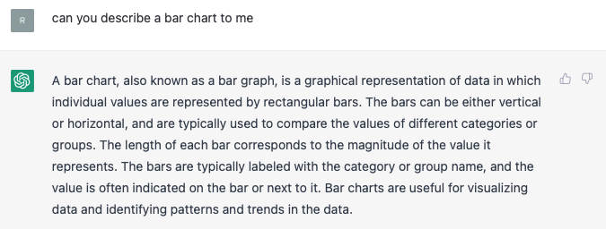
There are a few things I would tweak and take out, for example, the sentence “Bar charts are useful for visualizing data and identifying patterns and trends in the data” since trends are more related to time-focused charts. But apart from that, it’s pretty much like a description you would find on this website.
This demonstrates how ChatGPT could be useful for writing training materials. However, I still need to test how extensive ChatGPT’s knowledge is of many chart types. While it seems to know many of the established chart types, I suspect it will struggle with more obscure forms of data visualisation.
Tell you when to use a chart
After I asked ChatGPT when would it recommend a Bar Chart, I got this answer:
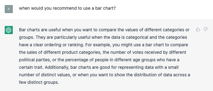
Maybe I would dispute whether Bar Charts are used for comparing groups. I think it would be better to mention Multi-set/Grouped Bar Charts for that task. Also, the sentence “…or when you want to show the distribution of data across a few distinct groups” is incorrect and may cause confusion with a Histogram. This response also fails to mention that Bar Charts are useful for discreet data.
However, apart for these points, this is a mostly correct response.
Inform on best chart practices
When I asked ChatGPT what are the best chart practices when using a Bar Chart, I got a response with a fairly long list of numbered bullet points:
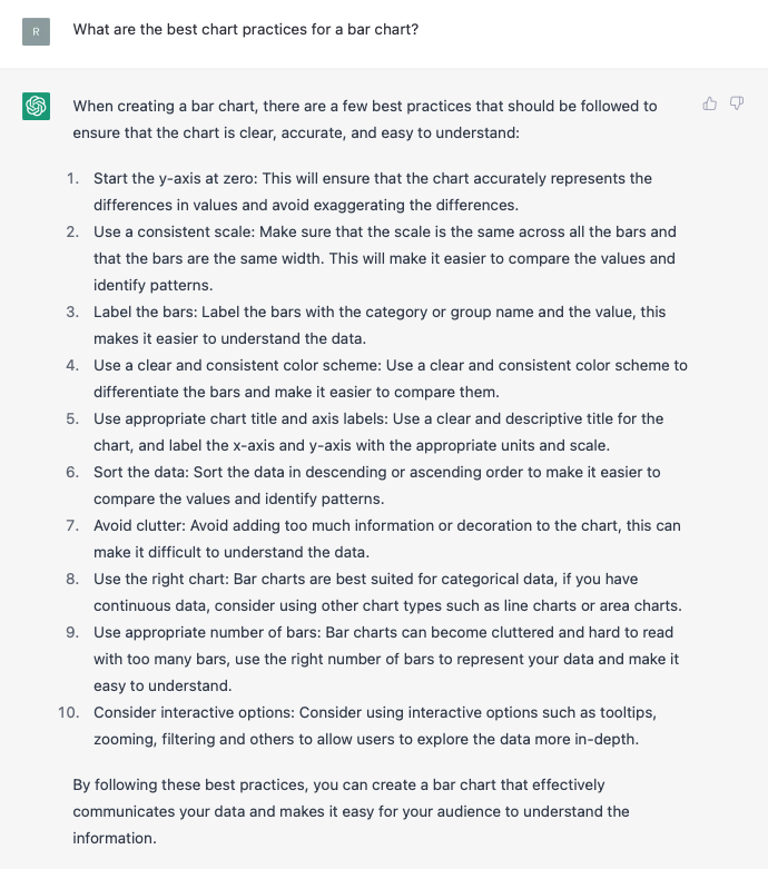
Overall, this list isn’t fantastic, but it’s not terrible either. But straight away I can see that point #1 should say that the value axis should start from zero, not only the y-axis.
Point #3 is kind of pointless or badly written because the category names should already be in the category axis. There’s no need to include a label inside of the bar and this won’t work anyway for really short bars. The only correct point here is on having a value label, but this isn’t a must.
Point #9 is weirdly worded. There isn’t an ‘appropriate’ number of bars. It depends on the amount of space you have available on a page or screen. Probably it would have been better here to write that Bar Charts can’t handle large datasets well.
In general, a lot of the advice mentioned in the points isn’t specific to Bar Charts and is more just general design advice. If you want to find a better list of best practices and tips, you can find it on the updated chart reference page for Bar Charts.
Pointing out chart weaknesses
I thought it would be interesting to ask ChatGPT what the weaknesses of Bar Charts are. I was provided with a series of bullet points:
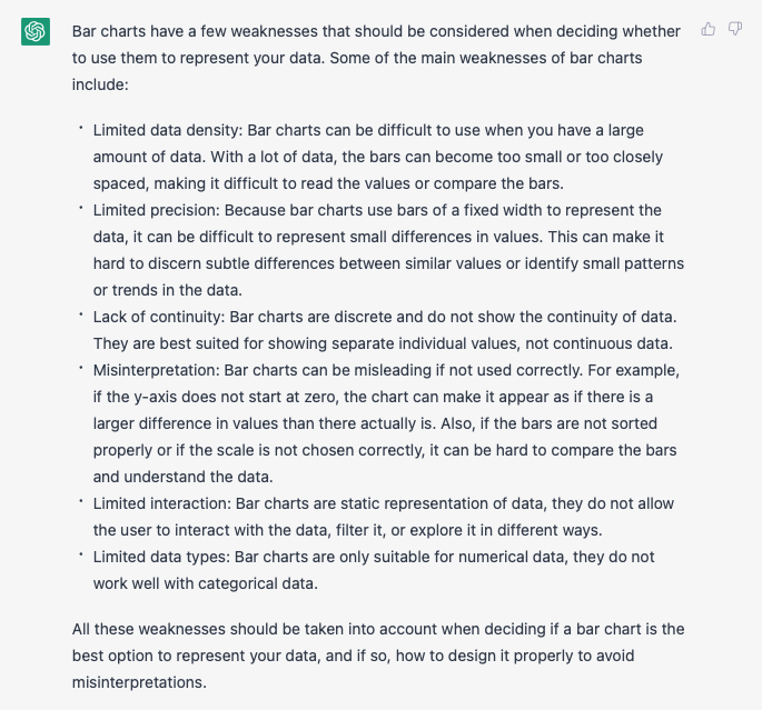
The first few responses are fairly good, but they still require some tweaking. However, the last three points contain either a repeated mistake (again saying ‘y-axis‘ instead of ‘value axis‘) or are flat out wrong (the last two points: ‘limited interaction’ and ‘limited data types’).
Providing code to draw charts and debugging
One of the major strengths of ChatGPT is its ability to easily provide code from a written request. Therefore, I asked it to provide me with the code for a chart that can be easily embedded into a WordPress post and I got this response:
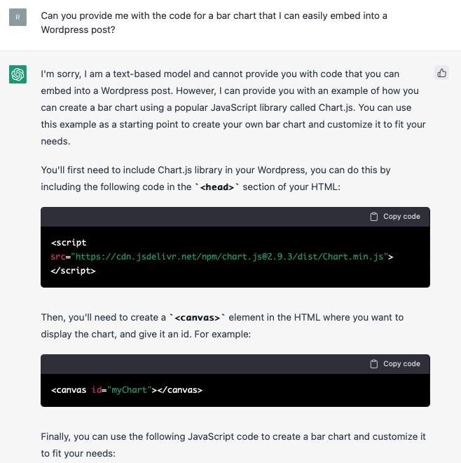
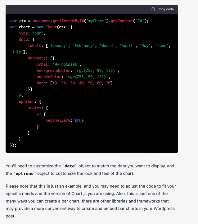
Although it doesn’t give me a single piece of code I can easily drop into any blog post, I do get a set of instructions and all the code I need to generate a Bar Chart.
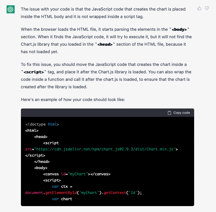
The instructions don’t specify that I need to include the JavaScript code within a <script> tag, so if I did not know JavaScript, I would make the mistake of copying and pasting the code into just the <body> tag. However, I can use ChatGPT to correct this mistake by copying and pasting all the code I had written on a separate HTML file into ChatGPT and asking what the issue is, which it conveniently provides back a response:
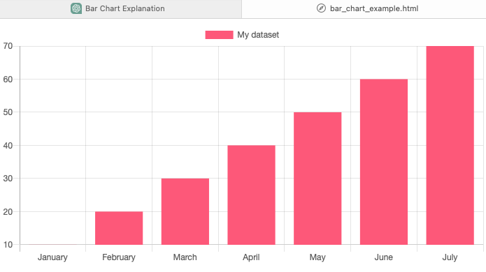
After correcting my HTML file and opening it in a browser, I get a nice Bar Chart example:
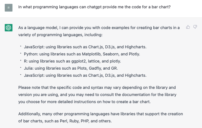
What other languages can ChatGPT generate for drawing charts? I wrote this question to it and got this response:
Change the format and styling
While doing the research for this post, I discovered in the blog post Iteratively Generating Data Visualization Code with ChatGPT by Conor McLaughlin that ChatGPT can mimic (to a certain degree) the style and formatting of certain well-established publications, such as The Economist.
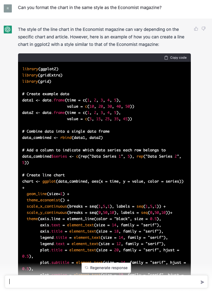
To test this out, I requested to format the previous Bar Chart, but unfortunately, I got this response:
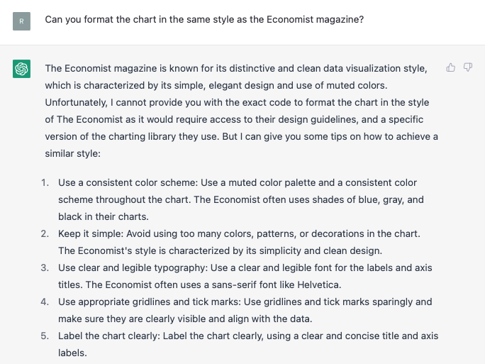
So this shows that ChatGPT can’t format the styling of any language. However, when I repeat the prompts used in McLaughlin’s guide, I don’t get the same R code for ggplot2, but ChatGPT does provide me with the formatting for The Economist:
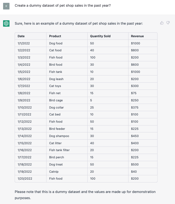
Create sample datasets
Another useful ability of ChatGPT is to generate sample datasets from made-up, dummy data. Just type in a prompt like “Create a dummy dataset of X” and you’ll get something like the example below:
Finding datasets
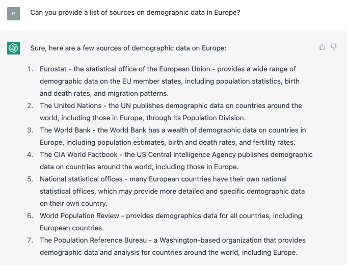
If you want to use ChatGPT to find a specific dataset or any related datasets to a particular subject, you’re going to be disappointed. ChatGPT can’t scan across the internet to find what you’re looking for and it can no longer provide URL links.
Despite this, ChatGPT can point you in the right direction if you ask it to find a data source or dataset on a topic. Often, it will provide a list of organisations and/or websites that are likely to contain the data you’re looking for.
Uploading datasets
On the ChatGPT interface, there isn’t an option to upload a spreadsheet or table of data. Although a solution to this limitation is to copy and paste the data in a text, tabulated format into ChatGPT. Usually, ChatGPT is able to recognise the text as a dataset and can interpret it as so. A couple of posts to read on this are: Templated Text Summaries From Data Using ChatGPT and its follow-up post More Conversations With ChatGPT About Pasted in Data.
Data analysis
From my research on ChatGPT, I found mix views on its data analysis abilities. ChatGPT seems to provide some basic level of analysis but sometimes it struggles. But I found a good video tutorial that demonstrates how ChatGPT can be used to analyse a dataset:
I also found from this post Using ChatGPT as a tool for the analysis of text data that ChatGPT can be very useful in analysing text-based data.
What are the limitations of ChatGPT?
Limited knowledge
ChatGPT is a machine learning model that was trained on a dataset of text up to the year 2021. Therefore, it’s not aware of any events or new information occurring after 2021. This makes it bad for finding information on recent events or new discoveries.
As you’ve probably seen earlier in the post, ChatGPT still makes mistakes and doesn’t always provide the right answers. Because of this, you can’t rely on ChatGPT 100% and you should always double-check the information yourself.
While ChatGPT may seem extremely knowledgeable about many subjects, its knowledge of most subjects is usually entry-level and there are many gaps in its knowledge base. Thus, ChatGPT isn’t a substitute for a subject expert or university professor. Of course, this may change in the future.
Mathematics
ChatGPT has been trained on a wide range of text, including mathematical content. However, it might not be as specialised or precise as a specialised mathematical solver. It can aid in comprehending and explaining mathematical concepts, but it was not developed to solve complex mathematical problems or give exact numerical solutions.
Conclusion
In summary, ChatGPT is a powerful tool that has the potential to revolutionise the way we search and interact with information on the internet. Its ability to provide answers quickly and efficiently could change the way people prefer to find and digest information, including data visualisations. While ChatGPT is not specifically designed for data visualisation, it can still be a useful tool for those working in the field.
Although ChatGPT’s knowledge of the theory side of data visualisation is limited, it excels as a resource for coding. ChatGPT can provide code for generating charts and for working on code through its debugging ability. It’s also great for learning how to code visualisations, as it provides guides on how to implement the code and can explain mistakes through the debugging process. Thus, utilising ChatGPT during a DataViz development project can help speed up your workflow.
Producing dummy datasets, providing potential data sources and some data analysis are some of the additional capabilities of ChatGPT.
However, you should bear in mind that ChatGPT, is limited in its knowledge and often makes mistakes. So as a tool it shouldn’t be heavily relied on and should instead be treated more as an assistant.
If you’re curious about ChatGPT and haven’t tried it yet, I’d recommend watching this video:
Relevant or interesting blog posts and web pages:
- Iteratively Generating Data Visualization Code with ChatGPT
- Using ChatGPT to Create Data Visualization with ggplot
- How can AI help with data visualization?
- Leveraging ChatGPT for Data-Driven Decision Making: Designing and Analyzing a Power BI Sales Report
- Using ChatGPT to fully plan a Realtime Dashboard App (Architecture, Stack, Implementation and Deployment as a Technical Founder)
- Insights from visualizing ChatGPT embeddings
- Generating Diagrams from Text Generated by ChatGPT
- ChatGPT can Create Datasets, Program in R… and when it makes an Error it can Fix that too!

