
When I speak to people new to the analytics field, they often wonder what skills will make them successful in their career. For all the data science skills, tools, and boot camps that are available, I still find that the missing link for many data analysts is the ability to communicate and convince after they’ve analyzed data. All your hard work is wasted if it doesn’t spur someone to change. The smart folks at MIT agree:
“The skill of data storytelling is removing the noise and focusing people's attention on the key insights.”
To be a good data storyteller and communicator of data, you need a collection of “soft skills” that are overlooked when people think of data analysis. Here are the 7 skills I think are most important:
1. Ask the tough questions
The common trap for data analysts is to become an order taker. Your boss asks a series of off-the-cuff questions, and you run off to answer them — only to find that the answers don’t get to the crux of the issue. The cycle continues.
A skilled analyst asks tough questions before they start getting into the data. “What actions could we take if you knew that answer?” Nancy Duarte, a leader in business storytelling, emphasizes the phrase “therefore we need to…” appended to the results of an analysis. Know the purpose of your work and how it will effect change.

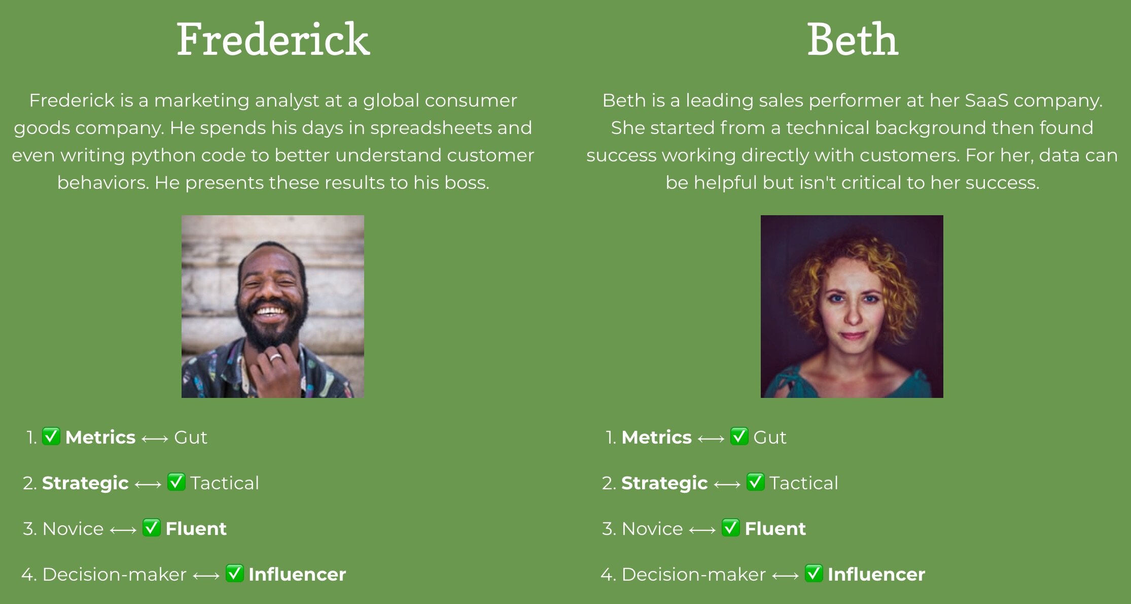
2. Develop audience understanding
As a data analyst, you need to get into the shoes of your audience. What are their priorities? What actions can they take in their role? The more you know about the people who will consume your insights, the more you’ll be able to shape them in a way that they are useful. Our Data Personality Profile is one way to build this type of understanding.
3. Basic visual design skills
When you are sharing your analysis, you will impress a lot of people if you apply some basic design principles.
Learn how to properly use color and contrast in your charts, apply our Simple Font Framework to make your text look great, and remove distracting visual elements (e.g. chartjunk). You’ll be considered the data artist 👩🏾🎨🎨in many organizations.

4. Edit and simplify to preserve attention
In your role as a data analyst, you will be challenged to get the attention of your manager or peers when you share data. Therefore it is incumbent on you to bring focus and clarity to your message. You’ll want to remove data that is merely interesting and guide attention to the data that is most actionable.
5. Practice rapid prototyping
When you first create a report, dashboard, or data presentation, you will inevitably leave some important questions unanswered. Your audience won’t fully understand your message or how to read you data visualizations. That’s ok. Putting data solutions in front of customer and then learning from their reactions is part of the process. Make sure to listen carefully and move quickly to respond.
6. Gather feedback
Delivering a presentation, analysis, or report can feel like the finish line. Often it is not. As noted above, you may need more cycles of refinement to ensure your hard work is having the impact it deserves.
Seek out feedback: Did they understand your metric definitions or the charts you used? Did they interpret the data in the same way as you? The more you ask, the more you will learn and grow.

7. Learn storytelling with data
Storytelling with data is a powerful skill for analysts to connect with their audiences. Our collection of lessons on data storytelling includes guidance around structuring your data stories, choosing the right metrics, and writing a guided narrative.


