A Spreadsheet that Generates Python: The Mito JupyterLab Extension
You can call Mito into your Jupyter Environment and each edit you make will generate the equivalent Python in the code cell below.
By Roman Orac, Senior Data Scientist

Photo by Joshua Sortino on Unsplash
Mito is a spreadsheet interface for Python
Mito allows you to pass your dataframes or CSV files into a spreadsheet interface. It has the feel of Excel, but each edit generates the equivalent Python in the code cell below. At its best, this can be a really fast way to get your data analysis done.
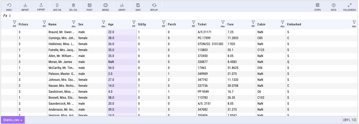
Exploratory Data Analysis with Mito (Visualization made by author)
In case you’ve missed my other articles about Mito:
Getting Started With Mito
Here are the full installation instructions.
To install the Mito package, run these commands in your terminal:
python -m pip install mitoinstaller
python -m mitoinstaller install
Then open a notebook in Jupyter Lab and call a mitosheet:
import mitosheet
mitosheet.sheet()
The Mitosheet can be called at any point in your analysis. You can pass in dataframes to the mitosheet as an argument in the sheet call.
mitosheet.sheet(df)
You can install pass in data from your local files with the import button.
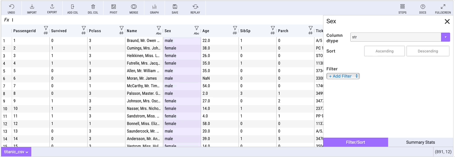
Mito Data Analysis Features
Mito offers a range of features that allow the users to clean, wrangle and explore their data. Each of these features generates the equivalent Python in the code cell below.
Within Mito, you can:
- Filter
- Pivot
- Merge
- Graph
- Look at summary statistics
- Use Spreadsheet Formulas
- and more…
For each of these edits, Mito generates Pandas code in the code cell below, that the user can carry forward in their analysis or send to a colleague.
Here is what it looks like to make a pivot table with Mito:

Pivot table with Mito (Visualization made by author)
Example generated pivot table code looks like this (the code is auto-documented):
# Pivoted ramen_ratings_csv into df3
unused_columns = ramen_ratings_csv.columns.difference(set(['Style']).union(set(['Brand'])).union(set({'Style'})))
tmp_df = ramen_ratings_csv.drop(unused_columns, axis=1)
pivot_table = tmp_df.pivot_table(
    index=['Style'],
    columns=['Brand'],
    values=['Style'],
    aggfunc={'Style': ['count']}
)# Flatten the column headers
pivot_table.columns = [flatten_column_header(col) for col in pivot_table.columns.values]
Here is the process for looking at summary statistics about a column:
Summary statistics with Mito (Vizualization made by author)
Generating Visualization Code
Getting the syntax correct for python data visualizations can be a time-consuming process. Mito allows you to generate graphs in a point and click environment and then gives you the equivalent code for those graphs.
Once you create a graph, click the copy graph code button:
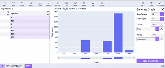
Making graphs with Mito (Image made by author)
Then paste the code in any code cell. Mito allows for a reproducible visualization process.

Mito generates code (Image made by author)
Conclusion
Mito is a fast way to generate Python code, especially for those familiar with Excel. It saves a lot of time on going to Stack Overflow or Google for correct syntax.
Mito is definitely worth a try, though it will be even more valuable as they introduce more graph types and a better ability for bulk editing (bulk column deletion, renaming etc.).
Before you go
If you enjoy reading these stories, why not become a Medium paying member? It is $5 per month, and you will get unlimited access to 10000s of stories and writers. If you sign up using my link, I will earn a small commission.

Photo by Courtney Hedger on Unsplash
Bio: Roman Orac is a Machine Learning engineer with notable successes in improving systems for document classification and item recommendation. Roman has experience with managing teams, mentoring beginners and explaining complex concepts to non-engineers.
Original. Reposted with permission.
Related:
- Analyze Python Code in Jupyter Notebooks
- 5 Advanced Tips on Python Sequences
- Easy Synthetic Data in Python with Faker